SlideMagic Blog

Frequent updates about all things presentations since 2008. Subscribe to never miss a post.

RSS
all posts

Category Presentation

·Keynote

Mixing and matching

Before starting a presentation design project, I need some basic guidance from my clients: dark or light background, custom fonts or not, Mac or Windows. Useful information.

A few times, I made the mistake of asking design (not content) input on specific slide elements: this way of putting pictures or that way, this type of titles or that, black & white or colour. It somehow did not work. As a designer you need to select the entire design approach in a consistent way.

I sometimes see something similar in interior designs of houses: individual elements look OK, but the whole composition together does not make sense.

Mixing and matching gives mediocre results.

·Keynote

Slow down impatient clickers

Here is another argument against dense bullet points.

Most business presentations today are read on a screen (increasingly a tablet), rather than watched live. You might think that bullet points are actually good for reading on a screen. They are, BUT. People have become so impatient, and overloaded with presentations that they just “page down” a document quickly, reading the headline and thinking “OK, I get it, next…” [click] [click] [click]

The only way to slow that reader down is to break up that bullet point chart in multiple slides and write the important messages clear and in her face, supported by the right visual.

·Keynote

The look and feel

The look and feel of your presentation is important. It contributes to 2 important communication objectives:

  1. Helping to make sure that your audience actually understands what you want (believe or not, many presentations fail to reach this threshold).
  2. Helping to make the audience do something (buy your product, invite you to the next meeting in the fund raising process, etc.)
  3. Remember your story

For all three of the above you could go for a “wow”-style presentation with no money,  animations, slick graphics, and other visual effects spared to blow your audience out of the room

But the look and feel signals other things about you as well:

  • Are you professional?
  • Are you prudent with the investments people put in you?
  • Are you trustworthy?
  • Etc.

Some of my clients want a dense bullet point deck because it looks similar to all the other serious consulting and banker presentations they have seen. For most business presentations, you need to find that middle ground between the two extremes.

·Images

Picfair

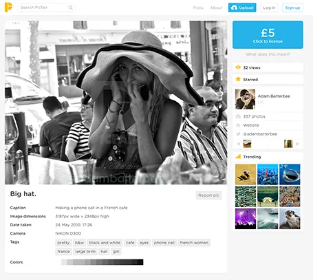
A new stock image site Picfair joins the crowded market. It is a market place where photographers set their own price for their work. You can search by theme and keywords.

The good: The site has not been invaded (yet?) by the producers of plastic, cheesy, generic stock images. Photographs are interesting, spontaneous, and original.

The bad: Because of the lack of stock libraries, the range is (still) limited, and this is not the site to find banal but practical images (a bucket on a white background).

Hopefully one of the many small sites that try to provide an alternative to the stock photo giants will rise to become a player that is big enough to serve as a one-stop-shop for quality images.

(Image in this screen shot by Adam Batterbee)

·Investor presentation

Cover letters

The cover letter of a fund raising letter for an academic institution I just received in the physical mail has the same mistakes as cover emails for fund raising presentations.

  • The first two paragraphs start with “I”
  • The letter is dated 4 weeks ago
  • These same paragraphs are full of generic marketing speak that all academic institutions are using, top-tier institution, remarkable faculty, break-through research, teaching excellence, prestigious awards.
  • Then comes the ask for funding
  • Then an appeal to share the values of the founders of the institution
  • The rest of the envelop contains reports and statistics (mostly text) on expensive, heavy paper

Here is what I would do different:

  1. Send the whole thing as a PDF document by email, heaving, expensive paper is not a good indicator that my money is spent wisely
  2. Write a very short first page: here is the annual fund raising mailing, we need your money to maintain our brand (and that means you, alumni, your own reputation). Obviously not as bluntly stated as here
  3. Add a very visual presentation: Images of the campus that remind my of my own time there, and see how it developed since then. Images of some students and/or faculty and the great things they are doing (the visual backup of the vague statements made in the letter). A visual presentation of the great things the institution is going to do with my money. Many tiny pictures/stories of students that have donated to build peer pressure to do the same.
·Delivery

Winging it

Fred Wilson can wing a presentation, scribble down 10 points, 10 minutes before going on stage, and delivering a great 10 minute presentation (see his blog post).

But is he really winging it? My guess is not. He has spoken about these issues dozens of time before, everything is completely prepared in his head. He just needs to decide what to talk about, and what not.

Fred cannot wing a presentation, neither can you.

·Keynote

Storytelling in business

Today, everyone is talking about “story telling” in presentations. That is great: stories are much more memorable than dry descriptive bullet points. But business presentations are not action-packed thriller movies, and when you force story telling on a business presentation, you will know, and the audience will know as well.

I take a pragmatic approach to story telling in business presentations. Rather than forcing myself to come up with a story, I take a step back and think about what makes a good story, and what makes a good story teller, and applies those elements to my business presentation.

  • Use human language, and cut all marketing speak and buzzwords
  • Establish some sort of connection to the audience before you dive into the content. Tell something personal that explains why you are passionate about the subject you are talking about.
  • At the starting point, set a setting, or a stage that is familiar to the audience. In a sales pitch, this is often the confirmation of a specific problem that a customer is facing.
  • From this starting point, build up to the surprise, the unexpected, the contrast. This tension makes a story stick. If possible you would go through multiple waves of the familiar setting, and the contrasting surprise. As a result you might well have to give up on your business school style logical presentation structure.
·Data visualization

Redesigning the Meeker deck

The Business Week magazine asked presentation designer Emiland de Cubber to redesign the information-loaded slides of Mary Meeker’s annual State of the Internet deck. Here is the original:

KPCB Internet Trends 2013 from Kleiner Perkins

You can see the result of the make-over here.

The Meeker presentation is a dense deck full of facts that can never be (and should never be) converted into a TED-style slide deck with a few words and some pretty pictures. And Emiland did a great job of making that information more visually powerful. Muted colours calm down the slides. The use of colours in the graphical language of KPCB eliminate the need to be reminded of KPCB by a huge logo on each page.

Here are some of my additional comments, the key point is that you can even be more radical in improving this presentation. These are all constructive ideas, Emiland did a great job!

I invite you to open the Business Week alongside this text, I am not sure whether I can copy all the slides into this post for copyright reasons.

The dark colour scheme does work better for large rooms and big projector screens. A huge wall of white light overpowers the stage presence of the presenter. However, I suspect the majority of the audience of this presentation will be sitting at a desk when watching the information, in that case sticking to the light background might keeps things more readable.

I disagree on the use of icons to simplify categories in slides. Icons simplify too much in these technical presentations. Instead, I would opt for dramatic text simplifications. Emiland did both, I would have taken the icons out, and put more emphasis on the shortened text. (The second make over example slide).


Continue reading →
·Investor presentation

"We will do that verbally"

Entrepreneurs are often so deep into their own story that they leave the supporting visuals for some of the most fundamental points of their business idea out of the presentation. “Oh, why Amazon would not do this? Well, I have a great story to tell that I usually do verbally when displaying the agenda page.”

Stories are great, verbal explanations without visuals are great, BUT. My two arguments why it might be a good idea to back up your story with visuals (in particular relevant for an investor presentation):

  1. You want people to remember your story, and a big bold visual might help anchor the idea in the mind of your audience. The visual does not necessarily have to explain the idea, it should just trigger the memory when you bring up that story of the banana peel back up 3 weeks later.
  2. The argument for going further than a visual anchor point is that you often lose control of what happens to your file with slides after you have emailed it to an investor. It gets forwarded to partners in the firm, industry experts, etc. Just in case, it is a good idea that someone who did not sit in the room still can understand the idea behind your business.
·Keynote

Content before structure

The other day I had a potential client on the phone who was under time pressure. She asked me whether I could work on the structure/framework of the presentation (and the template) while in parallel they would start filling things in.

When you start a project and need to cut up work among multiple team members, a skeleton or presentation framework can be really helpful: someone works on the market, someone works on the competition, while someone else takes on the financials.

When you get to the stage where you have to present your conclusions to others (i.e., the analytical work is done), putting structure before content is wrong. As a presentation designer you need to know the content first, translate that into a story, and in the process you come up with a structure which is engaging and convincing, a structure that often will deviate from business school presentation templates, consulting pyramid structures and other logical frameworks.

Problem solving: structure first, then content. Convincing: content first, then structure.