SlideMagic Blog

Frequent updates about all things presentations since 2008. Subscribe to never miss a post.

RSS
all posts

Category Presentation

·Keynote

"Get it down to 8 slides"

People want to be helpful in giving feedback on your presentation, and often when you send a draft to an experienced executive she will say to cut it down to 8 slides. She sat in far too many boring meetings where eager young managers try to pitch ideas with endless and endless pages of bullet point slides. She probably has not read the content of your slides, and just looked at the page count.

We have discussed many times that a 50 page visual presentation can be presented in the same time as an 8 page bullet point deck, but there is something else here.

A bullet point deck can easily be compressed: reduce font size and combine 2 slides into 1. With carefully designed visual slides, this approach will not work. The moment you start cutting and combining, you are back in bullet point land.

Instead of agreeing page count, agree the time you have to present the story.

·Keynote

Clear versus stunning

In presentations, clear and stunning are not the same thing. I have seen many stunning infographics that are not clear at all. And more importantly, it is perfectly possible to make a clear and convincing business presentations without stunning visual effects.

Especially in business presentations, people often want to go for stunning first, and commission expensive graphics design or video creation work. It is wiser to hold of with this until you have a simple presentation that 1) makes it clear what you want (touch the head) (believe me, I have seen many presentations that do not even pass this hurdle) and 2) convinces people to do something (touches the heart).

·Art

NY Met puts collection online

The New York Metropolitan Museum of Art has put 400,000 super high resolution images of their collection online, free to use. Great for use in presentations.

·Keynote

Screenshots are great

Aspect ratios, dots per inch, file formats and conversions, forgetting where you saved that file, these are all problems that are disrupting my creative workflow. More and more I just work with screen shots. If the image looks sharp on my big 27" monitor, I crop it as I want it, and use it in my presentation. It could have been a JPG, a PNG, a web page, a PDF document, a Keynote file, it does not matter. CMD-SHIFT-4- and “click”, done.

·Keynote

The green Mac OSX + button

The behaviour of the green + button at the top left of a window is unpredictable. I found out that option-clicking it will maximise the window to the full screen, every time, completely predictable, at last for non-Apple software (Keynote does not play along).

This has probably all to do with Apple’s full screen mode, the two arrows at the top right side of the screen. I use it rarely because this feature does not work very well with multiple monitors.

·Keynote

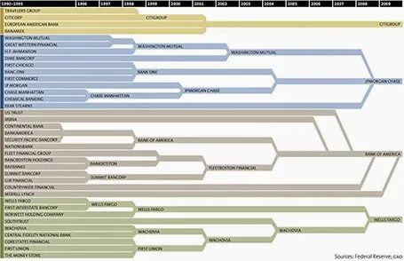
Consolidation chart

This is a nice way to show consolidation in an industry. You can digest the chart in 2 ways: on the podium you see the big picture of consolidating financial institutions, reading in close-up on the screen, you can see the details. The chart could have been better if the width of the arrows would represent the assets under management of the banks, some of these acquisitions were bigger than others.

[Off topic] There is a populist discussion going on in the comments of the original post. I did a lot of strategy work in banking mergers and there are different ways to look at the concentration in an industry. The top level player count is an easy statistic, but what is more relevant is the choice that customers (especially small businesses) have on the ground. How many different bank branches are within a 10km range at any point in the US? If there are 30 banks, but each concentrate on a specific state, then the market looks very competitive, but on the ground, customers face a monopoly. On the other, if all 4 banks are represented in most small villages, the market could be competitive.

·Keynote

The best briefing

The worst presentation briefing (and as a result most time-consuming presentation design project) is a long deck of slides full of bullet points that have been shortened (hey, we learned about being concise) to such an extend that they have turned into meaningless, generic prose.

The best presentation briefing (and start of a rapid presentation design project): the audio track of a 15 minute video of the actual presentation, the existing slides are not really needed.

·Keynote

7 time zones away

Yesterday was Independence Day in Israel, so I was not working. One of the costs of working with international suppliers; random holidays. Other drawbacks: time zone differences, and in the case of Israel, a weekend that does not overlap (Friday Saturday here). By the time a west coast client gets in her office by 09:00 on Monday morning, I clocked already two full working days, and will be heading into the weekend 08:00 AM PST Thursday (3 days later).

But the set up has its advantages:

  • Overnight turnarounds, send of input, and you will see it all done the next morning you come into the office
  • A less stressful workflow, once time zones dictate that you need to organise yourself: I have focussed calls with US clients in my afternoon, and have the mornings to do productive work. There is no opportunity for disruptive, live, last minute changes
  • Building on that, an end to time consuming meetings. Input gets collected much more efficiently than in calendar disrupting meetings (maker schedule versus manager schedule).

It turns out that there is virtually no difference in the way I interact with a Tel Aviv or a San Francisco client, apart maybe from that first get-to-know-you meeting.

But: clients self select, people that do not like to work remotely with their suppliers probably do not turn out to be my clients. But hey, the world is a big place.

·Keynote

No audience is the same

A company presentation will be used for many different audiences: investors, Board meetings, sales meetings, people who know the company, people who see the company for the first time. There is the temptation to start working on a different presentation for each different audience. Resist.

First of all, I hope your story is the same for all these audiences. I have seen companies that want to change the story depending on who they pitch to. I think it is very hard to build a successful with an inconsistent market positioning and purpose. So let us assume that there is one story.

Even though different audiences require different amounts of detail for specific parts of the story, each audience still needs to put everything in that overarching framework. Leaving things out will break the flow of the story. So, even for highly a knowledgeable scientist audience, I would still put in one (place holder) chart to remind us all of the very basics of a certain medical condition.

From a practical point of view, it is also very difficult to maintain multiple versions of the same presentation. A small correction on page 10, needs to be duplicated everywhere.

The bottom line, I create one overall master deck and sit down for before every presentation meeting to cut down the presentation to size.

·Keynote

Stories need fewer slides

Many clients come to me with fact-packed presentations full of dense bullet point slides, I recommend to break up each slide into multiple visuals that carry just one message. The result: slide count can go five fold, but the time to present them stays the same.

Some clients come to me with stories (much more effective than dry business content), but again, they are written out in bullet points. Here, I advise to do the opposite: cut the number of slides. Put up a picture of the person, situation, place, you are taking about, and give the story verbally. We can read a fiction book without a single illustration and build a rich visualisation of the story right in your head.

If you need to send this presentation full of stories without you having the ability to explain, you might consider adding a small point 12 text box at the bottom of your image with the slide narrative in full sentences.