SlideMagic Blog

Frequent updates about all things presentations since 2008. Subscribe to never miss a post.

RSS
all posts

Category Presentation

·Advertising

"Burning" typography that almost hurts the eye

I am more and more fascinated by design lessons from consumer advertising billboards. Take this ad for Tango (a UK soft drink):
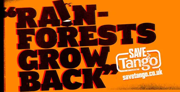
First of all the message. Confident, huge font, but the reader will discount the message completely “yeah right”. But it makes you think.

Then the typography. It almost hurts. Like watching a broken television screen. The onset of a migraine aura. Looking through the corner of your glasses and see how the lenses distort colors because of light refraction.

I argued before that slightly irritating the senses of your audience can help get your message across.

How did the typographer (Chris Chapman) do it? Clashing colors. Full orange background. Bright red shading. Colors that are very close on the color spectrum, but not similar. Like hitting 2 adjacent keys on a piano (harmonic dissonance). Grunch letter fill (hard to imitate in PowerPoint).

More on working with color wheels in a later post.

Via Ads of the world.

UPDATE after a comment. People should not misunderstand me. Any dissonance effect should serve a purpose. Simply screaming out a message does not make it stick. However, certain “painful” situations can be supported by a (one) “painful” chart.
·Advertising

One Lego visual - 2 insights about leveraging imagination

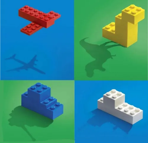
I found this great Lego ad yesterday on SlipperyBrick:

Sometimes relying on audience imagination can work, sometimes it does not.

  1. Sometimes it can work. Although adults might lose some of their imagination capabilities over time, it is still possible to get across visual messages with very simple graphics. Simple shapes, simple cartoons, even just creative typography. The mind will fill in the missing pieces
  2. Sometimes it does not work. The book Made to Stick introduces the concept of Curse of Knowledge. The presenter “hears”/imagines a tune in his head and taps it with his fingers on the table. All is perfectly clear to the presenter. All the audience can hear is… someone tapping.
·Creativity

Weekend reading: 127 RSS feeds about design

Creating PowerPoint presentations is all about design.

The COLORBURNED blog author shared the content of his RSS reader in this post with a list of 127 RSS feeds “that all designers should subscribe to” (the comments add a few more).

Not sure whether I will do that, but it does provide some good weekend reading.

·Design

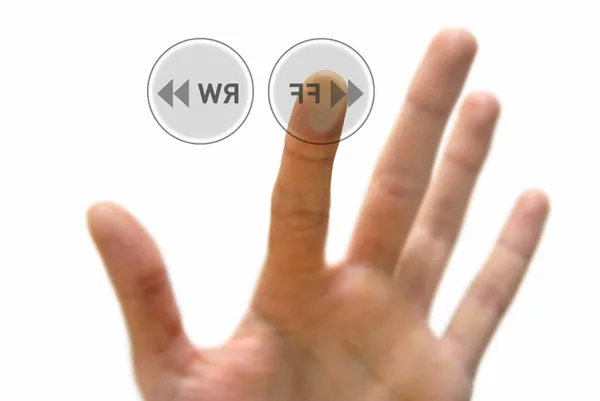
Chart concept: "fast forward" - a good summary chart is like a good headline

Putting a summary slide as page 1 in your PowerPoint presentation is tricky.

  • A diluted and boring summary might turn the audience off (“let’s check email on my phone”)
  • A summary chart might “give away the point” of your presentation too early
  • Some presenters might get stuck on page one and tell the whole story without using any other slides (sometimes this can be a good thing, a presentation with PowerPoint)

A good page one is a slide that gives the audience some clue about what’s going to happen and presents an interesting teaser about what is to come.

Now that I come to think of it - a good summary chart is like a good headline

The following image (purchased from iStockPhoto) adds another possibility to presentation opening concepts I discussed before (here, here, and here). “Let’s fast forward to the end before diving in”. Shrink the image to one side of the screen and add your teaser in big-font-text

·Design

Be consistent - $s, Euros, millions, bns, GBPs, 000s

There are many ways to spell monetary amounts. Pick one and use it consistently throughout your PowerPoint presentation:

  • $, US$, USD, I actually like these 3-letter abbreviations, no searching on keyboards, no need to search and insert symbols, every currency has one that looks consistent
  • Billion, bn
  • Million, M, m
  • 000, thousand, k
  • Decimal point, decimal comma
  • Thousand separator point, comma, or none
  • Negative number with “-”, or in between brackets

Unfortunately, detail does matter in presentation design…

·Design

Using "paste as PNG" to wash out complex PowerPoint objects

Going a bit (only a bit) against the “Zen” presentation philosophy, I have argued before that overwhelmingly complex PowerPoint charts could be used in a large keynote presentation, if (big if) they are positioned well.

One way to use it is as follows:

  • Put up the overwhelmingly complex chart, message: “it’s complex, don’t even try to understand this now”
  • In a subsequent chart, wash out the original object
  • Start highlighting individual components for further explanation

You can use the “paste as PNG” function in PowerPoint to transfer any object (including complex groupings) into a picture and subject it to the regular picture manipulation tools available to you: resize (a pain for complex PowerPoint objects with text in them), crop, and of course re-color.

Recoloring the image with a very light overlay creates a wash out effect that you then can use as a background for subsequent highlights. I have tried to explain all this in the following SlideShare presentation (click on “screen” image at bottom right for full screen mode).

·Design

Create a Twitter background using PowerPoint

There is a lot of (white) space for self expression on Twitter in its background image. (Not implying that “cluttering it up” will make it look better though) The “The Closet Entrepreneur” posted a tutorial how to create a Twitter background in PowerPoint. It includes a template with the areas you should leave blank for Twitter’s own content.

P.S.: follow me on Twitter. Via Digital Inspiration

·Animations

Source file of the bouncing PowerPoint equalizer now online

I have put the source file of the happily dancing equalizer in PowerPoint now online. I uploaded it to Slideshare, you can see the animations if you download the presentation (a PPS file), the regular SlideShare embed does not support it.

·Design

Seth Godin on "Blah, blah, blah, blah..."

No audience member […] has ever said, “it was exciting, useful and insightful but far too short.”

Read the full (short) post.

·Advertising

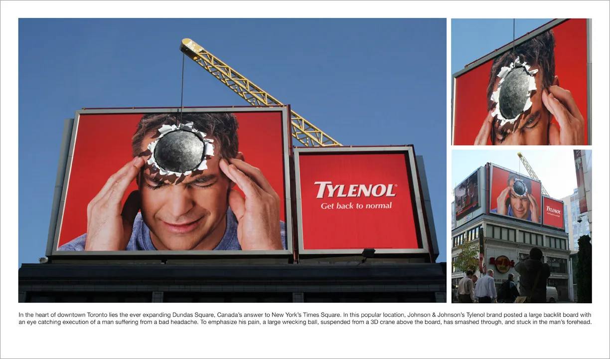
Great visual - you can almost feel the headache

I am adding adgoodness to my blog roll. This is another great find.