SlideMagic Blog

Frequent updates about all things presentations since 2008. Subscribe to never miss a post.

RSS
all posts

Category Presentation

·Design

Nokia E71 - great phone, screen graphics could be more "Zen"

My wife had to swap her mobile phone because my 2 year old son decided to empty a bottle of water on her previous one. These things happen. The new phone is a Nokia E71. Phone reviews are a bit out of the scope of this site (it is a great phone by the way), but I can comment on the graphics of the user interface.
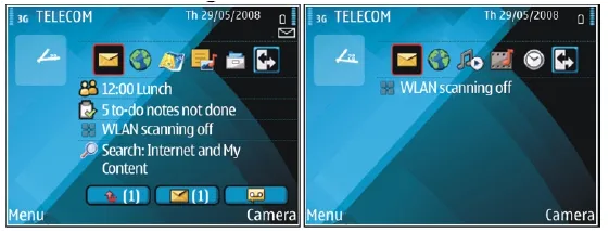
Nokia could have done so much better:

  • Like almost all mobiles, there is a busy wall paper crowding the display
  • Overly sophisticated icons with random colors
  • Different font (sizes), poorly aligned.

Mobile phone screens can also benefit from a “Zen” make-over to transform them into calmer and more minimalist user interfaces

PowerPoint and mobile phone interfaces are the same: the fact that you can make that sophisticated watermark background does not mean you have to use it!
·Design

Not all presentations are "Zen" - different formats for different settings

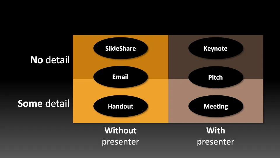
Not all presentation settings are the same. A “Presentation Zen” slide show with stunning images and the incidental word on a slide is great for a keynote, but might be a bit too much to discuss last quarter’s financial results. The 50 page deck with bullet point slides might be serve better as a printed business plan than the key communication tool for a 20 minute VC funding pitch. I have tried to describe 6 presentation scenarios and categorized them according to:

  • Whether the  presenter is present or not
  • The amount of detail/data inside the document

Here we go (click image for bigger picture):

  1. The key note is the classical “Zen” presentation. Huge fonts, dark background, few words, large images.
  2. The pitch is similar to the key note, with the difference that it might be shorter, and does contain some more data to answer questions from the much smaller audience.
  3. The meeting presentation is probably done on a light background, and contains much more facts and details. Over-simplified slides with beautiful pictures do not work in the small conference room with people ready to go through raw material. McKinsey and other consulting firm’s presentation often fit in this box.
  4. The slideshare (or online) presentation is something relatively new. People see it typically in small windows, i.e., fonts should be big, pictures should be nice. The audience of this presentation is highly impatient, clicking rapidly to reach the end, and aboning your presentation if it is not interesting enough. No animations here.
  5. The email attachment is similar to the key note presentatation with an important difference that it needs to stand on its own, titles need to explain the messages in the charts. Some animation could be used here (sparingly though). Detail is less than the handout.
  6. The handout contains the full detail, the full text. It should be prepared on a white background (people will often print it) and use no animation (again, does not come out in print). For VC pitch situations, the good handout makes the business plan “brick” obsolete (hardly anyone reads these anyway).
Continue reading →
·Design

How to align bullet points in PowerPoint

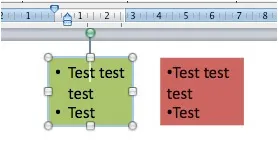
One of the PowerPoint annoyances is that bullet point paragraphs are not aligned properly when overflowing to the next line. It’s easy to fix.

Display the ruler (view menu), select the text, and move the little markers, leaving the top one to the left, and the bottom one at the desired indent. (See the image to the right).

That bullet points are NOT the main design concept to make PowerPoint presentations is clear, but a completely separate subject.

UPDATE February 2018. Another way to align bullet points in PowerPoint, is to use boxes with a very light background. This background shape gives the page a grid-like structure, compensating for differences in the length of text in a bullet point. Even if some bullet points stretch over 2 lines, and others consist of a few words, the page still looks evenly distributed.

I have added some examples of this layout style to the SlideMagic template store.