Drifting slide titles
A highly competent presentation designer asked me why I put my slide titles always at the same position (top left). Good question. My slide titles have started to drift, depending on the composition of the chart.


Frequent updates about all things presentations since 2008. Subscribe to never miss a post.
A highly competent presentation designer asked me why I put my slide titles always at the same position (top left). Good question. My slide titles have started to drift, depending on the composition of the chart.
Many presentations end in some sort of Q&A session. During this discussion, the slide show usually comes to a standstill, and the last visual used stays on the projector for a long time. Make sure it is a useful one, since it might be the image that the audience will remember best. To be avoided:
What could work: a visual that links back to a key point in your presentation. For example, if you spend 5 slides on describing how a teenager will use your mobile social network, just putting a picture of her back up will remind the audience of the story. (This time you can leave out the bullets arrows, boxes, just an image to refresh the memory).
Bullet points happen to the best, even Steve Jobs uses them. See the slide below from the iPad 2 launch presentation (thank you Engadget).
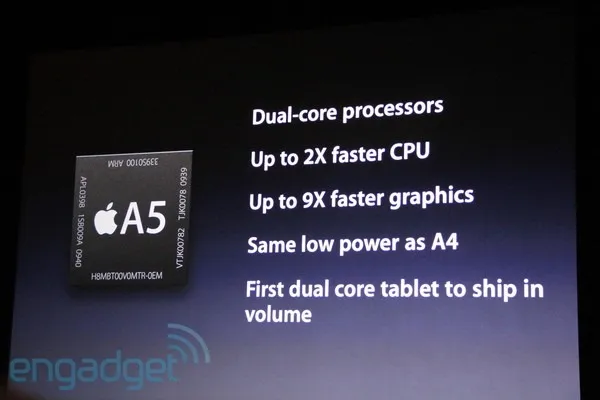
The good:
The bad:
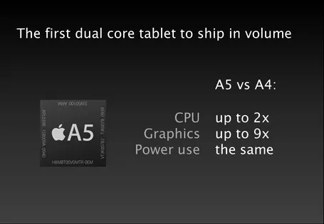
What do you think of this alternative?
Videos that are posted online often come with an explanation: “skip to 4:03”. Think about that when designing your presentation: the audience is watching a video without a remote control or Tivo. It should be interesting from 0:00 to 15:00.
A weekend post. Talking about cramming in a lot of information in 5 minutes… This entertaining video by Oliver Humpage manages to remind me about lots of math I forgot about a long time ago. I think the speaker could actually have done a better job by cutting out even more content from the story. Maybe it would have been possible in 4 minutes…
The Internet is full with layouts of investor pitches, they all go something like this:
Your pitch should address all these issues, but think about your potential investor’s mind when deciding about the structure. You might have to deviate from the text book approach.
Investors are constantly evaluating critical questions. And when they (think they) have answered them, they move on to the next one. Questions are not always in the order of your pitch deck.
If there is an obvious elephant in the room, you might as well address it early on in the pitch. Your audience will be calmer and more open to digest the other important points you want to make.
Far more important than sticking to the text book pitch structure.
Far more important than spending time repeating the obvious (i.e., stats on how big Facebook has become).
I stumbled on this post on the Dutch Presentatie Blog: 3 reasons why Prezi is not a PowerPoint killer. In short (and in English):
I must say, I tend to agree with the assessment for the traditional stand-up presentation. Does that mean Prezi should be written off? I am not sure either. Where it could be useful:
The structure of your presentation sets the flow of the story. There is no one fits all structure though. I am discussing three different types of structure here, the names are invented by me and do not refer to well established definitions.
Analytical structure. A rigorous and organized framework that cuts up the material in all the components required to solve a problem or run an analysis. Management consultants use issue trees, university text books have section headings going down three levels. It makes sure you covered everything, that there are no overlaps, and that it is very easy to find a piece of information without having to read through the entire text. Despite that this structure is too boring, and too exhaustive for a presentation, it is often used.
Logical structure. The sequence of facts that provides a rock solid proof of your point, every aspect is dealt with, the logical deductions and implications cannot be disputed. Not as exhaustive as the analytical structure, it still usually uses some sort of agenda or summary page that prepares people for the logical drill that is about to follow. Market is big, competitors s**ck, etc. Better, but lacking emotion.
Implicit structure. My preferred one for a presentation. You tell a story, the audience is captivated without a rigorous agenda page, your listeners are not aware of an underlying structure of the story. It’s there, it’s just hidden.
I use the analytical structure to solve the problem, the logical structure to develop the check list of points I need to cover, and then construct my story free of these rigorous frameworks. When I am done, I go back to the first two to see whether I covered everything.
I am not suffering (yet) from Fred Wilson’s blogger’s block, but his call for blog topics is a good idea. What presentation design issues would you like me to discuss on these pages? Let me know in the comments.
A post inspired by a question on Quora: how to talk about competitors in a VC pitch?
In short be honest, but have a good story at the same time.