SlideMagic Blog

Frequent updates about all things presentations since 2008. Subscribe to never miss a post.

RSS
all posts

Category Presentation design

·PowerPoint

The cliff

I have seen many presentations likes this one:

  1. Stunning slide
  2. Stunning slide
  3. Boring slide
  4. Boring slide
  5. Boring slide
  6. Boring slide
  7. Etc.

A shame. It shows that the designers of these decks understand slide design. Why not push it through to the entire presentation?

A great image of the Mohr cliffs by Christmas w/a K

·Investor presentation

Good VC pitch presentations

A copy of a new section I wrote for my corporate web site.

In the very beginning, the only asset a startup has is often the VC pitch deck. Here are some suggestions for designing good VC pitch presentations. In the end I will list some of the resources you can tap in. There is a lot of information and advice available about startup pitches.

Different pitches for different meetings There are different investor presentations in a fund raising process. There is the line up in a big conference where everyone has 1 minute to pitch (not very effective). There is the 10 minute phone call, the 20 minute coffee chat. The first meeting at the VC office, the presentation to the full partner group. Prepare your story and deck for each situation. As you go through the investment process funnel, your story will shift from talking about what the company is about, to how the company will do it.

Do a pitch without a deck Practice a 20 minute pitch without slides in front of a friend. Record yourself, listen to your self. What sequence did you use to tell your story? What examples did you use? Where did you have the urge to take a piece of paper and sketch a framework? Where were you tempted to open your laptop to show a detailed chart with financials? All this gives you a clue about the sort of visuals you need to support your natural story.

It is about you When an investor looks at entrepreneur, 50% of the attention will go to the content of the presentation, the other 50% will be spent on making a personal assessment of you, the presenter. Are you a good person to work with, who takes input from a Board? Do you have a sense of realism? Are you fired up for the roller coaster ride or hedging by keeping your day job? Can I trust you? Can you actually sell? Can you pull it off? These are all questions that cannot be answered by the slides you are presenting, they are answered by reading in between the lines.

Continue reading →
·PowerPoint

New web site!

Finally, I am happy with the design of my corporate web site. The previous one was still too cluttered, but now I have reached the appropriate level of minimalism.

·PowerPoint

PowerPoint 2011 for Mac review

I have been working for a few days with Microsoft Office for Mac 2011 now (affiliate link), having upgraded from the earlier version PowerPoint 2008. For me, the Mac is still a secondary machine, and testing this software is one of the key determinants whether I can move across all together to a Mac environment. All my clients use PC-based Microsoft Office software, so Keynote cannot replace office.

Initially I was a bit wary of Office 2011, having read some poor reviews on Amazon and by columnists such as David Pogue. Maybe it was because of this that I wrote this impulse post about stability issues of PowerPoint 2011.

I managed to solve the problem (after a lot of searching online). Somehow, PowerPoint 2011 can crash every time you enter slideshow mode after you have done some heavy toolbar customization. It happened to me a few times in a row. All fine, customize toolbars, crash, reset toolbars, all fine, customize toolbars, crash. At the moment I stopped the poker game (do I have the courage to add another toolbar customization or not, at the risk of having to reset all previous modifications?) at a level that I am happy with my current toolbars. So the issue remains.

For the rest, I must say that I actually like PowerPoint 2011. The differences with the PC version are minimal, someone with experience with PowerPoint on a PC can switch over instantly. The previous version (PowerPoint 2008) had a user interface that was different from the PC, and also lacked some functionality. Now there is a level playing field. (Well almost, for some reason you cannot change the spacing of the grid in PowerPoint 2011, making it hard to set a grid line exactly at 0 of your slide).

Continue reading →
·PowerPoint

Designing board presentations

Board presentations have a typical setting. The audience is usually relatively small and consists mainly of insiders in the company. Usually, Board papers get send around a few days before the actual meeting. Board members are experienced executives with busy schedules that want to make decisions and get to the point. They will not hesitate to urge you to move on when they think they got the message. (A big difference from a conference presentation where the audience can either walk out or check email on their mobile device if the presentation is not interesting).

The basis of the Board meeting material is usually a large slide deck full of facts and analysis. The most important recommendation is to put that aside as the basis for your presentation. Strategy documents are highly structured, highly organized, highly detailed, and exhaustive. As a result, they contain too much information, do not get to the point fast enough, and are frankly boring. This is great if you want to solve a problem, it is not effective if you want to communicate the solution.

Start off with thinking about what you want your Board to decide. Board meetings are all about decisions, not about fact sharing without a purpose. Set up the agenda, and put the decisions you want taken right upfront. The presentation challenge is now how to convince the Board that your suggested decisions are the right ones.

Every Board presentation usually has a few slides that form the stage for the group discussion. Anticipate what these slides should be and spend most of your effort on these ones. Key slides are usually those that map the possible options and shows the key trade-off that is required to chose the best one. Often, I use a heat map in these situations. A heat map is a simple table with the options as columns, and criteria on the rows. You can color the cells of the table with green, orange, or red to make the trade-off visible. Another way to show trade-offs is to plot your strategic options on some sort of 2x2 matrix, or show yourself on a 2x2 matrix now, and where you want to be in the future versus competitors.


Continue reading →
·Images

Small scenes showing big opportunities

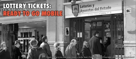
Most startups pitching for VC money would pound the audience with billion dollar market forecasts produced by market research firms such as IDC or Gartner. They are important, but they do not touch the gut feel of an investor. Often, showing a small street scene without a single number in it, does the trick.

As an example, take online gambling, and let’s go to Spain. Anyone who spend some time there has seen the numerous lottery stands scattered across the cities. What if all these people could get the same thrill of purchasing a lottery ticket on their mobile device, rather than standing (visibly annoyed) in a long line? The opportunity is staring you in the face, right in front of you. The VC is reminded of it every time he drives to the office, every day of the week.

If you are interested, a recent blog post by Seth Godin about why these people are not buying the ticket to win the big prize. Image credit to Paul and Jill.

·Images

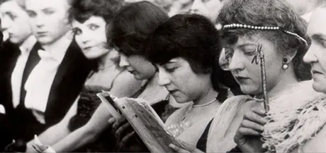
Images from the past

The majority of stock images are boring, why not look for real ones? The Internet offers now some interesting ways to get your hands on images from the past, great to transfer your audience to a point back in history. Here are a few of my favorite sources:

The images used here:

Creative commons images on Flickr, search by date
Vintage ads, watch out for copyright
Vintage magazine covers
Vintage websites (duarte.com ~2000)
·Delivery

Notice how you skip the introduction?

Have you noticed how, whenever you start reading an article with a promise in the headline “The 18 secrets to [x]”, “Why is it that [y]”, you usually skip the introduction and/or skim the text to find the answer the headline promised? Introductions usually repeat the headline and contain background information such as the bio of the speaker that we do not have time for. Not the interesting stuff the reader is looking for.

Your audience wants to do the same with your presentation, except, they cannot. Taking the clicker, fast forwarding and asking you to get to the point would be rude. Instead, they start checking email on their mobile device until it gets really interesting.

Detail of an image claimed by John McNab.

·PowerPoint

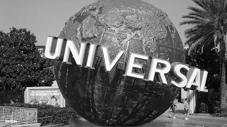
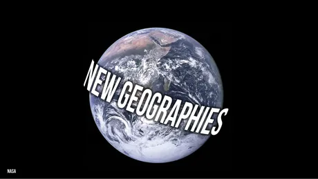
Slide idea - global expansion!

A startup has the master plan to spread out across the globe. A variant on the Universal globe

How to create this text effect in PowerPoint: select the text (in a narrow font if your text is long), go to format, text effect, “can down” (somewhere in the middle right). Go back to format, select glow, glow options and set a color (I picked black).

·PowerPoint

18 reasons why PowerPoint looks like PowerPoint

This question has been bugging me for years: why does PowerPoint look like PowerPoint and not like a well designed piece of graphics design work. The answer is obvious for poorly designed slides full of bullet points. But still, even when slides are designed by a professional designer (including me), they will not reach the professional and designer look of a good piece of print design.

I have not found the answer yet, but am getting closer (maybe). Especially after reading an enormous amount of books on graphics design and typography, and a renewed interest in graphics used in television productions (Fox is horrible, MTV is good). Here we go (written in random order):

  1. PowerPoint presentations use over-used fonts. Arial, Verdana, Calibri, it just does not look as good as Helvetica or other print classics
  2. Presentation design = filling Microsoft’s default bullet template
  3. PowerPoint presentations are stuck in between text and display sizes. An average presentation sentence is so short that we can put it in bigger characters than a text-size, but still too long to put it in an enormous display font. Fonts are not designed for this twilight zone. (Helvetica is an example)
  4. Most good PowerPoint designers understand the concept of white space, and use it. However, we still tend to keep margins around the slide very small, making the whole composition look cramped.
  5. It is tedious to change the leading(the vertical distance between lines of text) in PowerPoint, so we end up using the standard proportion that was designed for small font sizes (and too large for display font sizes)
  6. Nobody really uses a consistent grid structure slide after slide
  7. PowerPoint designers hardly break up a text string to play around with a sentence’s typography. Lower part of the sentence, color part of the sentence, flip parts of the sentence. For example: if you want to visualize squeezed, you could pick a cliche stock image of a squished orange, or your could crush the typography of the word “squeezed” in between 2 forces.
  8. Presentation designers pick images that are too powerful, overwhelming, creating a constant barrage of inconsistent visuals with too much going on. Look at a quality piece of print: calmer images, with consistent colors, more white space, more coherent.
  9. We use too much color. Quality graphics design often has muted colors, with a few bright accents. Presentation designers cannot resist the urge to use the full spectrum of colors forcefully on every slide in the presentation
  10. Presenting like Steve Jobs is making your presentation white on black
  11. Images always have the standard rectangular shape, roughly the same as the screen aspect ratio. Why not use very narrow images, round ones? Something different
  12. Presentation designers mostly use text size to emphasize what text is important, and what text is less. Subtle color differences that are so important in print graphics design are not used
  13. Text sizes should always be the maximum possible. Cutting words is great, but why not use the extra space to create more white space on the slide, instead of filling it all up with a bigger text size?
  14. Too much symmetry. Most objects are still centered in the page.
  15. Not used to mixing fonts (partly because of the text/display size twilight zone). Good graphics design uses a few on a page to give interesting contrast. Presentation designers use one (usually).
  16. The limitations of the 4:3 and 16:9 screen, we presentation designers have to do without the vertical dimension that a poster designer can leverage
  17. The one-distance-has-to-fit-all situation. When you look at a poster you can view it from a distance and see the big characters and shapes, intrigued, you can come closer to read the details in the fine print. No such thing in PowerPoint. You sit where you sit, in a fixed distance from the screen.
  18. Presentation designers always hold back and never go to the creative edge a poster designer would go. We have seen too many bar/column/pie charts, bullet point lists, boxes and arrows. It is hard to leave the classical slide compositions behind, and to come up with something daring and new (for 20 slides in the deck).
Continue reading →