SlideMagic Blog

Frequent updates about all things presentations since 2008. Subscribe to never miss a post.

RSS
all posts

Category Presentation design

·PowerPoint

I think I found the cause of the Office 2011 toolbar bug

I was in the process of designing a beautiful chart on my new Mac when I got too confident and decided to modify the toolbars of PowerPoint 2011 and… lost all my work again (see my previous rant about this bug)

In sbort: if you customize your toolbar in PowerPoint 2011 for Mac, the program will crash as soon as you enter slideshow mode. Googling around reveals that many users have similar problems: corrupt toolbar files that cause crashing. I decided to dig a bit deeper and through a process of trial and error found that the offending customization button are the straight arrow ones that you find in the autoshape menu. The icon of these bars still have the old PowerPoint 2008 look, I think Microsoft forgot to update them.

They are probably not that many geeky PowerPoint users that would customize their toolbar with straight arrow connector buttons so it would have been hard to uncover the bug. :-)

I am forwarding this post to someone in Microsoft I know, but if there are any Microsoft MVPs reading this post, please pass it on and ask Microsoft to fix the bug.

The post that I originally planned to post will to have to wait a bit…
·PowerPoint

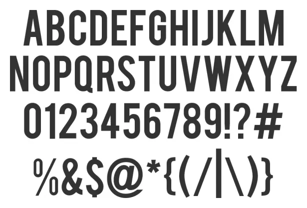
Narrow fonts: Beebas

Some fonts are suitable for small text, some for large text, and some for headlines. Narrow fonts are especially useful for the latter. You can still fit in a lot of information, even for large type sizes. See the differences below. Beebas Neue is a free font that is very space efficient, you can download it here.

·PowerPoint

Mindmapping on the iPad: iThoughtsHD versus DropMind

Triggered by the iPad touch interface, I started to use mindmapping for the first time in presentation design. Mindmapping is a process in which you jot down ideas and the connections between them quickly, and edit, clean up, and move things around later to get a more organized picture. I must say, it works a lot better than my previous approach: the pencil and a piece of paper. Especially since it is a lot harder to lose that piece of paper with your notes on it.

I purchased 2 iPad apps: iThoughtsHD and DropMind. iThoughtsHD was designed specifically for the iPad, and is the cheaper of the 2 ($10 versus $50 for DropMind). The DropMind app is an extension from an existing suite of desktop and web applications. The latter probably explains why it took a relatively long time for DropMind to come out with the app, a working iOS 4.2 version only appeared last week in the app store.

When reading my impressions remember that I am a light-weight mind mapper, just using it to structure ideas for a presentation. Reading around on the Internet it looks like mindmapping is a whole design approach taking things much further than I do.

For the purpose I use it for, iThoughtsHD works perfectly fine. The interface is straightforward and clean, and it is every easy to export mindmaps to PDF or sync them using a Dropbox account.

DropMind’s user interface looks a little bit more sophisticated with more graphical options. When you buy the iPad app, they also offer a perpetual license for the desktop client, and the web app. You can exchange mindmaps between the applications. There is a wide arsenal of tools available that I did not yet have time for to explore. The one drawback I found is that when you export a map to PDF or JPG, the resolution seems to be very low (not an issue with iThoughtsHD). I think this is a bug, or maybe I did not configure the settings correctly).

Continue reading →
·Delivery

No thank you, we will just ask questions

A story. I just finished designing a sales presentation for a client that is pitching in a major mobile-related services tender. I started off with minimalist slides for a standup presentation that would be perfect to support the facts that were all written down in the tender submission documents. Rather than focusing on the details of the system specification, I focused on the track record of the company, the many reference installations, the experience in preparing for a successful launch.

Then came the call: “Don’t bother to present, we will email your slides to everyone involved and just use the time to ask some questions.”

It is actually understandable. The tender issuer can read product documentation, read web sites, and is overloaded with (the same) facts about the industry from all the companies competing for the tender. It would be have been polite to let a tender candidate speak, but it is not the most efficient use of the time.

So, I u-turned on slide design, as I feared that many of the tender committee participants would not bother to read through the full documentation and would rather rely on a PowerPoint file as preparation for the pitch. I added more slides, and added explanatory text on the slides.

Lesson learned: with these multi-million dollar tenders, stay in close contact with the person organizing the pitch meetings to make sure that you carry the right type of presentation document with you.

·PowerPoint

Presentation suffering, live

Just searching for “boring presentation” in Twitter gives you an idea of the suffering that presentations are causing right now, wait a few seconds for the tweets to come in.

·Images

Clockwise or counter-clockwise

I do not understand software applications that do not use small arrows in their menus for rotating pages 90 degrees clockwise or counter-clockwise. It creates the exact same visual delay as bullet points:

  1. Read “clock wise”
  2. Imagine clock movement
  3. Project movement on image
  4. Think: “No I need the other one”
  5. Select menu option “counter-clockwise”

A visual shortcut is needed (i.e., a simple arrow)

·Images

Visuals are emotional shortcuts

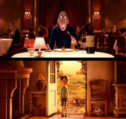
Visual slides are emotional shortcuts. A powerful image or visual concept unlocks something that was already (at least partially) stored in our memory. This scene from the movie Ratatouille (affiliate link)is perfect example: a taste sensation that unlocks a childhood flashback.

·Delivery

I will be speaking in NY 5-6 April [details]

I will be speaking in New York on 5 and 6 April (click the bullets for full details):

The events will take place from 18:30 to 20:30 at the NYU Stern School of Business. Tickets are $25, but readers of this blog can get a 40% discount by applying promotion code  “ideatransplant”.

I am honored to be invited by Sean Black, CEO of SalesCrunch, the organizer of these events. SalesCrunch is a social selling platform in which online presentations play a central role. The business has 3 elements (my seminars are part of #3):

  1. CrunchConnect  makes it easy to share sales presentations with prospects. Moreover, it tracks to what extent they are viewed and how effective the presentations are. The service blends web conferencing, presentation sharing, social networking into one platform that salesforces can use to interact with prospective clients.
  2. CrunchTrainer uses presentation sharing to create a powerful online salesforce training tool
  3. SalesSchool is a community that organizes events about sales-related topics, my 2 seminars are an example of these.
·PowerPoint

The logic is more important than the number

A claim in a sales presentation: “we will save you $10m over 5 years”. A nice statement, but it does not have instant credibility. How can you make it credible?

  • The best option: show real case studies of other customers where you managed to pull it off. Not every company has this data ready though (especially startups).
  • The second best option: show the logic of you how you got to the number with a simple and transparent multiplication of a few numbers. “We save 10 minutes per procedure, we estimate you do [x] procedures, therefore we get to this cost saving.” You shift the debate from arguing about the absolute number, to how your product adds value.
·Delivery

Khan Academy: Prezi in action at TED?

You should watch this TED talk by Salman Khan, a former hedge fund analyst who is now fully devoted to turning the education system upside down (see his Khan Academy). His key concept is to humanize the class room using technology: have kids watch videos at home at their own pace and use the time of the teacher in the class room to provide individual support instead of one-size-fits-all lectures.

Now to Prezi. I think Salman is using it as his presentation engine. I am still not convinced that it is a good large audience presentation tool (see an earlier discussion on whether Prezi is a PowerPoint killer). However, the tool does a good job in visualizing the enormous video library Salman has constructed, and the carefully thought-through construction of the curriculum he is proposing. What do you think?