

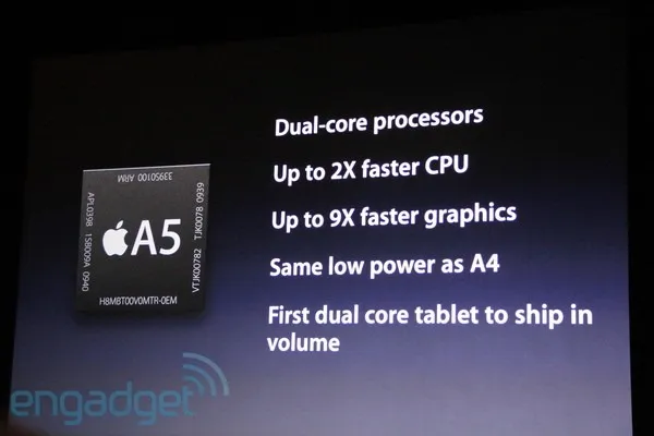
Bullet points happen to the best, even Steve Jobs uses them. See the slide below from the iPad 2 launch presentation (thank you Engadget).
The good:
- They are short
- They do not have a bullet in front of them
- He has them pop up as he speaks, so you can’t read ahead (good here, but not recommended for all presentations though)
The bad:
- The “volume” orphan at the bottom
- All those “dual core”, “2x”, “9x”, “CPU” makes it a bit hard to read
- You can see Steve Jobs looking down, pausing to read them off a screen
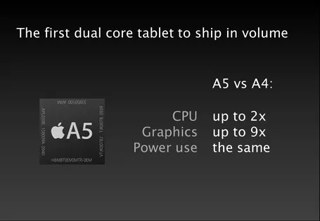
What do you think of this alternative?
10 comments
Compared to what I usually interact with, it's hard to dis Steve.
1. Volume shipping is not a WOW title. Would it have been better just spoken, and the slide title would be 'See how the new processor compares to the old' or something like that.
2. Your 2x and 9x lose some meaning. If we didn't see the original people wouldn't know that it was 2x FASTER. It could be read that it has 2 processors.
Also you might want to consider the facebook commenting system.
I agree that the dual core shipment statement is too much on this slide.
Another suggestion would be to make the comparison visual. Not completely satisfied with the result, but to give an idea: a slide with visual comparison.
Also, I would underline the *low* power usage.