SlideMagic Blog

Frequent updates about all things presentations since 2008. Subscribe to never miss a post.

RSS
all posts

Category Presentation design

·Concepts

Something is missing...

Almost every pitch presentation talks about something that is missing. A simple image of a paper hole is a great way to visualize it. You can have one, you can have fifteen, you can cut out the white background and put the whole into something else. You can find hundreds of paper holes on stock image sites.

·Gadgets

iPhone Keynote remote

I recently used my iPhone as a remote control to move between slides for an on-stage Keynote presentation.

This is one of 2 ways you can now use an iPhone/iPad to give a presentation. The first is to run the presentation in the device itself and connect it to a screen via an Apple TV (or a cable if you are sitting around a conference table). The second, is to use your iPhone/iPad to control a computer via WiFi or Bluetooth.

I used the latter. While it did work there are 3 glitches, one of which is a big one:

  1. Both your iPhone and your computer need to be hooked up to the same WiFi network, which requires some fiddling with technology. For some reason Bluetooth failed to connect the devices. So it is different from using a standard plug and play Logitech remote that works always in a second. Budget time to make it work.
  2. You move between slides by sliding the screen, which is a movement that is a bit hard to do with one hand. I would have preferred it when the volume + and - buttons would have been allocated to do this, like in the camera application.
  3. And here is the big one, your remote can get stuck in the middle of a presentation. It happened to me twice where I had to wait for some buffer to clear before I could move on to the next slide. Not good when you are standing in front of a big audience.
Continue reading →
·Colors

Ugly colors

When your company has an ugly corporate color scheme it can be hard to make good looking charts. Here is one solution: go mainly for shades and grey and use one or two of the corporate colors as an accent color to highlight things. In 99% of cases this will look very elegant and nobody can accuse you of deviating from the prescribed colors.

·PowerPoint

The CEO can edit

CEOs should not spend time writing their own PowerPoint presentations and as a result, most of them did not get around learning how to use the software. That is a shame. I recommend that every CEO should familiarize herself with some basics: editing text,  moving/deleting/pasting slides and inserting big comment boxes electronically on slides. It can be picked up in a 2 hour training and will make life so much easier for them when they fine tune the final 1% of the deck before going on stage.

·Concepts

Scalable

Using a visual cliché can happen to the best of us… I recently was guilty of this one. “We are scalable!”

·Data visualization

Breaking conventions

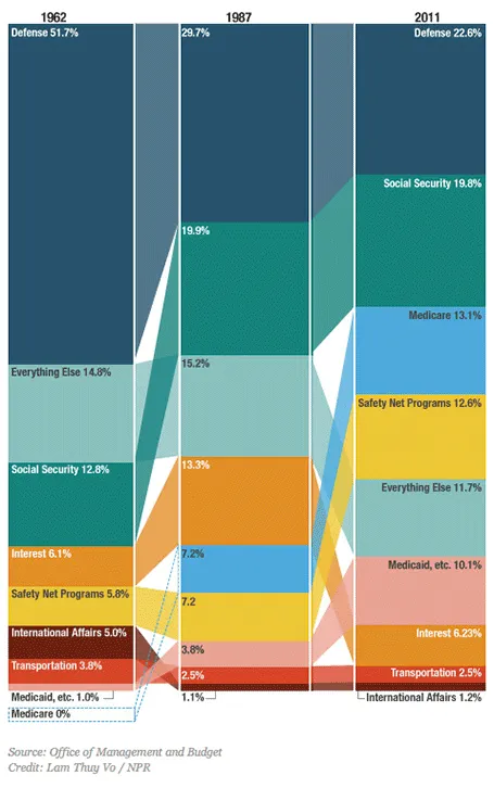
This column chart about government spending on NPR breaks a lot of conventions. Years at the top, no totals, data labels inside, not on the second column, repeated in the third, and it tries to visualize both the size of the values and the order in which they appear with the semi-transparent connections. For an on-screen presentation it is too much to digest, for careful on-screen reading it might be OK. What do you think?

·Data visualization

Facebook IPO comparison

The NYT published an infographic that compares technology IPOs over time, including the facebook IPO of last week. At first, it looks really nice, it resembles bubbles going up in the air (a sentiment shared by many left out in the golden rain). It shows just how many of these IPOs we have had, and the billions in value they have created. And that is probably all the casual reader is left with when clicking to the next page.
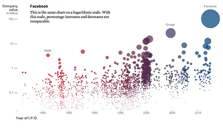
On closer inspection, things are less clear. The value on the y-axis is the same as the size of the bubble. A good description of the axis labels is missing. And the things that the graph wants to display, could be visualized much better in a dedicated data chart for each conclusion:

  • How many IPOs in what year: column chart
  • Top ranking of IPOs by value at the opening day: bar chart
  • Top ranking of IPOs by value in 2012 $: bar chart
  • % share price movement on day 1: bar chart (probably only show big, well-known offerings)
  • % return on investment 3 years later: bar chart (again for household name IPOs)

Still, if you are a newspaper, maybe getting across that bubbly feeling is more important than the visualizing the insight.


·Advertising

Star burst

The star burst is often used in retro advertising. You can pick one up from any stock image site to create a background for a composition with a lot of depth.

·PowerPoint

Photoshop/Illustrator CS6

Adobe has released its new Creative Suite 6 software (Photoshop, Illustrator, etc.). I am only a casual user of this software, my core design work is in PowerPoint and Keynote. Still now and then, I need capabilities that are not available in these slideware solutions and dive into the world of Adobe. I have been working with the software for a week now, and here are some of the features that might be interesting for a presentation designer:

In Photoshop CS6

  • Better context-aware fill and the ability to take objects entirely out of an image (not very useful), or move the object around in an image (very useful). I am desperately looking for a way to extend the background of an image, stock image photographers always crop to narrowly around a subject, leaving no space for text. The current tools are not there yet.
  • Sometimes it might be the hidden things that are best. I have just the impression that the general selection engine to isolated subjects from their backgrounds is better.

In Illustrator CS6

  • The pattern generation engine is much better. It is cumbersome to generate patterns of repeating objects in PowerPoint or Keynote. In Illustrator it is easy, and you can apply them to any shape as a fill.
  • Photo tracing. It is now very simple to turn a photo or hand-drawn sketch into a scalable vector image. This will make it easy to convert images into more neutral silhouettes in presentations.

There are a lot more new features that will appeal to heavy users of both programs. Should you upgrade as a casual user? Your call. Since I am a professional presentation designer, I just install the latest software without really making the trade off every time. What do you think, if you have upgraded, was it worth the investment?

·Gadgets

The best iPad stylus

I now have almost completely eliminated paper from my workflow after I switched to hand writing on the iPad. My meeting notes are better organized and searchable, and I can now make design doodles in multiple colors on which it is much easier to erase part of your sketch. I have tested 3 iPad styli extensively and the best one is the Adonit Jot:

  • The Cosmonaut is a cute, beautifully designed, fat pen that resembles a whiteboard marker. Nice for my kids to draw, but not suitable for writing or precision drawing. The fat tip makes it impossible to see what you are writing. I am also not a big fan of the rubbery material on the outside.
  • The Wacom stylus is built of quality materials, feels nice and light and writes comfortably. A close second. The soft tip wears off quickly.
  • The Adonit Jot is my favorite. A small, flat, transparent disk protects your screen while giving completely visibility what you are doing. A very nice, heavy build quality. The disk makes a clacking sound when you write, some if you might find this inappropriate in meetings with other people. I bought the Flip version that has a pen on the back (which I actually never use).

I did extensive research on the web before buying my own styli, and discovered that there is a huge difference in personal preferences. So you are likely to buy a few before finding the one that fits you best. (The links in this posts are affiliate links).

Continue reading →