SlideMagic Blog

Frequent updates about all things presentations since 2008. Subscribe to never miss a post.

RSS
all posts

Category Presentation design

·Concepts

Nothing ever changes...

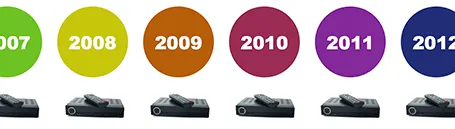
Here is a simple concept to visualize a problem that the cable television industry has: replacement cycles of hardware sitting in the people’s homes is really loooooong, especially compared to how often we upgrade our mobile devices. In this slide I used repetition plus cropped the years on both sides of the page to create that sense of continuity.

·PowerPoint

Changing PowerPoint shapes

Another hard to find feature in PowerPoint. It is possible to change a shape, for example turn a rectangle into an oval. Select the rectangle, go into the SmartArt menu, select the shapes button, and the select the shape you want instead.

·PowerPoint

Office 365: not there yet

I signed up for a trial of Microsoft Office 365, the cloud-based version of Microsoft Office to see whether it could be a work-around to get the Windows version of PowerPoint to run on my Mac. (There are a few bits missing in the Mac-version of PowerPoint).

Not every Office user is the same. For the corporate user that needs access to files on any device, plus the ability to make some small edits to Office documents that are created on desktop applications, the Office 365 offering makes perfect sense.

But Office 365 is not ready yet to become a core design platform. I tested only PowerPoint, and ran the web app in Google Chrome on Mac OSX, please correct me if some of the limitations were due to hardware/software issues:

  • The availability shapes and functions in PowerPoint are extremely limited when compared to the desktop version. Now, I am all in favor of cutting PowerPoint features but here basic elements were left out (creating data charts  or cropping pictures for example)
  • Fonts are a big issue, if purchased custom fonts that are installed on my computer, but they are not present on Microsoft’s Office 365 server, so your presentations become garbled
  • The preview of slides are low-res and slightly blurry (I am using a 2500 pixel monitor), only when you click to edit an object does the full resolution kick in.

In a few years from now, Microsoft Office applications will run smoothly across devices and platforms, we need a little bit more patience.

·Advertising

Everyone can design

Advertising agency RPA made a bunch of Apple-style ads for common products, probably intending to show that the world would be boring of all ads looked like this. I actually disagree, and would welcome to see the clutter in advertising go.

You see how easy it is to create professional looking slides by just applying a bit of white space and picking the right crop for your images. You do not need to be an advertising professional to do this, you do not need sophisticated software to do this.

Via AdFreak.

·Images

Keynote discoveries

I am a PowerPoint veteran who only recently started to design presentations in Keynote. Here are some of the little things that were hard to find:

  • Connecting shapes with a line: select both shapes go to the insert menu and select connecting lines
  • Remove an image background: go to the format menu and select instant alpha
  • Edit an image (make it B&W for example): select the image and click the tiny button with the levers (next to the stroke buttons).
·Investor presentation

The pitch bottleneck

Sometimes a startup idea is already stuck in the mind of a potential investor. I think pretty much any VC is convinced that ultimately mobile payments or social friend-to-friend shopping recommendations could be huge businesses. The bottle neck is: how to make it work. When you pitch your startup idea in one of these fields, you will be welcomed by a healthy dose of cynicism.  Do not waste your time on preaching to the converted, but have your pitch target the bottle neck in the mind of the investor.

·PowerPoint

Re-discovering Smart Art

Smart art inside PowerPoint is a semi-automated template engine for diagrams. It easy to add and remove boxes/bubbles, edit text. The idea is good, but I have not used them a lot:

  • The standard out-of-the-box formatting is ugly
  • Although there are many frameworks to chose from, none of them usually really work for my particular presentation problem
  • I have seen them too many times in presentations where designers simply dump in a smart art graphic to replace a bullet point chart (the result is still a bullet point chart that looks a bit different)

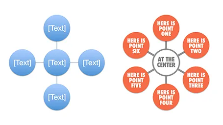
Recently, I have started to use smart art in my presentations, but in a different way. I use them to position objects on a slide by picking only the very basic configurations and reformat the slide items heavily so you can hardly recognize it is a smart art object anymore. An example below:  

Well, I said before: your PowerPoint is really good PowerPoint if your audience cannot tell it is PowerPoint…

More about smart art on the Microsoft site, or over at the PowerPoint Ninja blog.

·Delivery

In between the lines

One of the most important criteria for an investor to invest in your business is you, the entrepreneur, and the in-person presentation is an excellent way to figure you out as a person. Information about all the other elements of your company is covered in the slides, your business plan and/or your website. Investors can read about your CV, but the only way to figure you out is attending that 45 minute presentation. What you present is important, but the other 50%, how you are as a person is also vital. How is to work with you as a Board member with you, the CEO, at the helm of the company?

Can you be trusted? Trust and integrity are one of the most important things a potential investor is looking for. And it does not really work to put a slide on the projector that says “I never lie”. The investor needs other clues that come out in between the lines of your slides. Maybe an investor knows the answer to a question, but asks it any way. If you do not know the answer it is better to say so than make something up. Do you start to gossip, leak information, to people you have just met 20 minutes ago? If you do it to the potential investor, you are likely to do it to others as well.

There is no upside in bending the truth. So maybe you were successful in getting away with some form of reality distortion in the pitch meeting, the investor will eventually find out during the extended due diligence in the weeks (or sometimes) months to come. You enter an exclusivity period, you continue to burn money, and at the end the investors finds out and withdraws from the deal (integrity issues are a huge red flag). Then you are left without an investor, without funds, and a tarnished reputation as you have to explain to other potential investors why this one pulled out. Your entire company is at risk.


Continue reading →
·Images

Smartphone screen shots

The best way to make a slide with a smartphone screenshot:

  • Get a stock image of a smartphone without the device maker brand (using Google Image search might get you into copy right issues)
  • Take the actual screenshot on your smartphone, in my case I use my iPhone browser to go to the web page and press the home and on/off button at the same time. Email yourself the image
  • And here comes the trick: apply a subtle inner shadow to the image. You see the difference in the image below, the left side one looks a little bit bland, the right side looks much more natural

·Presentation design

The Idea Transplant blog turns 4

It all started with this post back in the summer of 2008. Now, 4 years and almost 1,200 posts later I have a great reader community, an international client base, and switched what I call myself from strategy consultant to presentation designer. Thank you for reading.