SlideMagic Blog

Frequent updates about all things presentations since 2008. Subscribe to never miss a post.

RSS
all posts

Category Presentation design

·Keynote

All the big points by page 3

Many clients insist on making sure that all the big points of a presentation are made by page 3. Why? Decades of boring PowerPoint has shown them that things past page 3 get lost in an endless stream of bullet points. Making sure your point gets made by page 3 means making sure that your point gets made in the first 20 minutes of a pitch.

The result: you are stuck in the middle. The story up to page 3 is too long to serve as a really crisp summary, and falls short on conveying the message with full impact (the real killer chart sits on page 37). A shame that people will switch off on page 4 and beyond.

Here is a better strategy: design a deck that takes 20 minutes to present with all the important points inside, telling your story once instead of saying what you will tell them (by page 3), saying it, saying what you just told them (slide 78).
·Data visualization

Infographic hieroglyphs

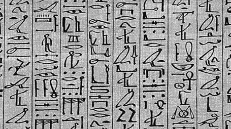
Sometimes I come across slides that simply try too hard. A stunning image with a hard to understand analogy, or an infographic-style rebus that looks like ancient Egyptian hieroglyphs. OK, it is a visualisation, but a puzzle does not make it easier for your audience to understand what you try to say. Even worse, an overly simplistic symbol might play down the seriousness of the business you are trying to pitch. Instead of creating a puzzle, why not simply write down what you want to say. Image via WikiPedia

·Colors

Hey, where is the colour?

A recent client was wondering why I turned all images in his presentation to B&W.

The answer: because I matched the colours of the presentation to the colours of his brand; shades of grey plus a strong blue as accent color. These type of colour schemes are actually my favourite ones. They look elegant, are recognisable, and it is very easy to create a harmonious, consistent set of slides through the deck with out the distraction of clashing colours. Definitely not a presentation with a 1980s, pre-colour monitor, look and feel.

·Data visualization

Data chart make over

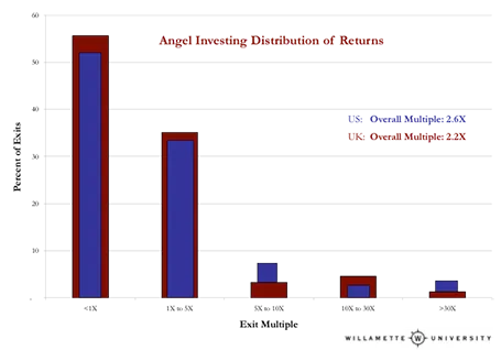
Here is diagram published on TechCrunch about the financial returns of angel investors. There are 2 ways to improve the diagram:

  1. Make it a simple stacked column diagram that adds up to 100%, 1 column for the US, 1 column for the UK next to it.
  2. Use more contrasting colours than the dark blue and red

Then there are a few more things you can do to make it look less like Excel: tick marks out, big title at the top left, replace the Times Roman font from something sans serif, value axis title below the main title (i.e., no vertical text).

·Investor presentation

Slides from Barcelona

Following requests, I uploaded the slides I used for my talk in Barcelona about investor presentations. They are pretty minimal, so it will be hard for those who did not attend to grasp the full meaning, sorry. (I am working on documenting its content though, watch this space) Thank you Barcelona entrepreneurs for a great event!

·Investor presentation

Too generic to sink in

Opening slide bullets:

  • Industry #1
  • 15 consecutive quarters with growth
  • 40% EBIT margin
  • Offices in 35 countries

Pretty impressive, but when you put on a slide like this the audience is unlikely to digest the numbers fully. Almost every opening slide of almost every corporate presentation has numbers that look like this (something about growth, something about margin, something about locations, we do not pay that much attention to the actual numbers).

Instead, break up the slide, show that you are bigger than IBM, show a column chart with growth in the past 15 quarters, show that competitors are struggling to achieve 5% EBIT margin, show a map with 35 dots. It takes the same time to present, but your audience will remember.

·Keynote

The conversation first

Yes, many of the slide decks I design for clients are meant as support for a stand up presentation. But I think these cases are the minority.

What most clients are after is a different concept: the documentation of their story. The idea in their head, captured, recorded, somehow. This story can then be emailed, shared online, discussed in a 1-on-1 meeting and yes, presented live.

And when I stand back and see from which perspective I design, I think - to my surprise - that it actually is the 1-on-1 personal dialogue. When that conversation is nailed, I make the adjustments for bigger audiences.

Maybe not so strange after all though. Everything starts with a simple human conversation.

·Delivery

Handling an unfriendly audience

Audience members are not always friendly. Unfriendliness comes in 2 types:

  1. the civilised audience who is reluctant to agree with your proposal (I faced many of those as a management consultant) and
  2. the heckler who is out there to interrupt and derail your presentation (probably on his own).

Audience 1. A fatal mistake with audiences that do not agree with you is to invite the full debate before you have had a chance to tell your story. Highlight all the points and data quickly before you get to some slide that presents the trade off your making. That trade off slide is very important. Many of these strategy debates go in circles and keep on repeating the same points. If you have written down the point on the slide you can point at it and say “You are right, I have captured that here.”. Group/isolate/give less space to the points everyone agrees to and focus on trading off the difficult ones.

Audience 2. Hecklers are difficult. The best strategy is to try to get the audience on your side. If you ask - after 3 detailed questions - whether the audience agrees that these points are better discussed one-on-one after the presentation, there is a good chance that the heckler will stay quiet.  In addition, after you answered the heckler’s question, turn away from her, and make eye contact with another person with a question.

·Keynote

Stick to your grid

The grid is the imaginary set of horizontal and vertical lines along which the objects on your slides are aligned. Breaking the grid is a key tool that designers use to add an interesting tension to a page layout. But in most cases, it is better just to stick to it. See the example below, your eye will immediately pick up that there is something wrong with the layout of these head shots.

·Delivery

Do I actually need a deck?

Good question, and the answer is “Not always”. TED talks are a good example of people delivering complex messages without the support of slides. But:

  • In order to give that naked talk, you need to understand your presentation insight-out, you need to live and breathe your presentation. In the early phase of your learning curve, slides will give you a good backbone to hold on to. You start by presenting your slides, you end by telling your story. A lot of practice can of course make you jump straight to the end of this process.
  • Certain types of information have to be conveyed visually. Examples are graphs with data, the latest quarterly results, or an image of a surgical procedure.
  • In many cases the live presentation is actually not the main purpose of why we design slides, often we send out material ahead of our discussion. It is hard to avoid slides, unless you have the confidence to email a short recorded video of you explaining your idea (without slides).