Gestures
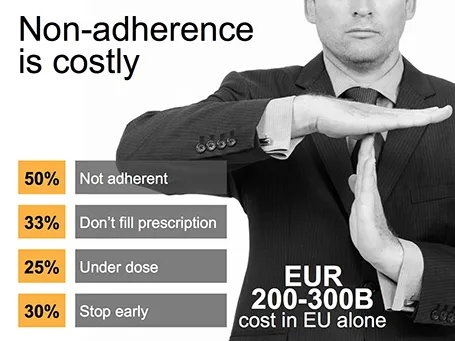
Sometimes simple human gestures make the most powerful background images. See the example below about people not being compliant with their medical prescription.


Frequent updates about all things presentations since 2008. Subscribe to never miss a post.
Sometimes simple human gestures make the most powerful background images. See the example below about people not being compliant with their medical prescription.
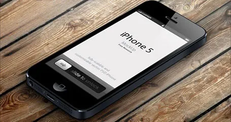
Many high-tech presentations involve some sort of show casing of a mobile phone app. This site has a number of iPhone mock ups that could work great in presentations. With elementary image editing skills, you can take a front-facing image and past your device screen shot in. More advanced Photoshop users can probably get the 3D tilting to work.
The full list of iPhone mock ups are here on Design Beep.
Someone suggested this link on Twitter, but I forgot who it was… If it was you let me know and I will give you credit.
In case you want to use laser beams in your presentation, they are easy to make: red lines, black background and a small dot with a huge red, semi-transparent glow.

I sometimes think back of the early 1990s, before we started putting Microsoft Word text pages on overhead transparencies using a photo copier. The only thing you had was an empty transparency and a big marker. The resulting slides were a lot more creative than many of the bullet point slides of today.
A client was using a presentation to explain the presentation to people who had to present it. After a short discussion, it was decided to try to design a presentation that could be understood instantly by the presenter. If the presenter gets it, the audience probably understands it as well.
Some corporates manage by strategy frameworks and push down a prescribed template down the hierarchy lines: “Tell your story by filling this out”. Should you obey and stock to SWOTs, 7Ss, Porter boxes?
Strategy frameworks are useful to solve a problem. Managers can make sure that everyone covers all the right things. If a framework worked before in a similar business, or during last year’ strategy discussion, then there is a good chance it will work here as well. If you are the CEO of a number of similar businesses, having all your strategy presentations come to you in the same strategy template makes it easy to compare them.
The problem is that strategy frameworks are often too dense to present to a live audience, and that generic templates often do not completely fit the specific situation of a business.
My suggestion: if you are somewhere in the middle management layer of a big company, it is probably best to do your homework and fill out the boring strategy templates. But I would not stop there.
After you created the required pages, do not invest any effort to make them look more interesting, but rather stick them all in the appendix section. Then step back and start crafting your story from scratch ignoring the prescribed frameworks if you have to. When submitting your presentation call your tailor-made presentation the - overused word alert - “Executive Summary” and say in the body of your email that your homework is still featured as the appendix of the document.
Sometimes, putting up a slide that says explicitly “We are a robust company!” might make the audience actually think the exact opposite. “Hey, so far this was a fantastic and professional presentation, I did not realize these guys are a tiny startup, that is until now…”
Nancy Duarte is probably the only person in the world that has managed to create a very large business in the presentation design market. As a result, she is a true authority on the subject because of here experience with designing presentations ranging from the high profile money-no-issue keynote presentations to the day-to-day high volume make-overs of slides for internal management meetings.
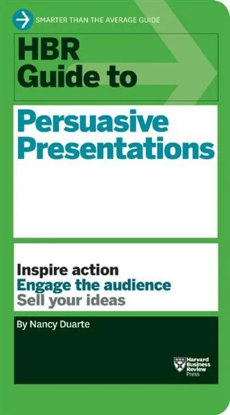
Her new book HBR Guide to Persuasive Presentations is different from the previous two (Slide:ology and Resonate): it is far more practical. Out goes the glossy paper, the beautiful diagrams, the client case examples, and instead we have a highly useful list of tips and tricks that can help you make better presentations the moment you put the book down. Almost every paragraph starts with an action verb, a recommendation of something that you can do better.
The book covers a wide range of subjects related to presentation design, from analysing your audience to building an online social media following for your decks, but the core of the book is in story and slide design. Some new ideas that I got out of the book:
One point of disagreement, the book advocates using a 10% rule for executive summary slides, so a 50 slide deck needs 5 summary slides (5 minutes), and 45 appendix slides. Pretty much what we tried to do at McKinsey. I increasingly try to shorten that executive summary to one super short summary, and follow it to a slightly longer story that encapsulates the entire story, hoping to be able to hang on to senior management attention for maybe 10 or 15 minutes instead of 5 when the cross fire of questions begins and your slide presentation in the conference room basically ends.
Although I have switched to a Mac, I dip into the world of Windows now and then on a virtual machine, for such things as running .EXE CD ROMs with medical images on them, or editing a chart for a client still on PowerPoint 2003. The latter is no longer necessary, and that is a good thing, since Windows 8 is no longer supporting PowerPoint 2003.
So, I took the plunge and installed Windows 8 on my Parallels 8 virtual machine. I ignored all the scary warnings on the Parallels web site and managed to get a perfect install.
As a non-Hebrew speaker in Israel I always have an additional issue when installing new software. Trying to change the system language on a computer without being able to read most of the text on the screen. Gambling, plus comparing English and Hebrew screen shots finally did the job, but my computer science undergraduate degree came in handy. Not something for novice computer users as languages for application screens, keyboards, user accounts and welcome screens all seemed to be controlled in a slightly different way.
OK, back to the software. I will not describe the ins and outs of the new operating system here, but stick to my personal impressions. Detailed descriptions can be found in other reviews.
I really like the new Microsoft graphical look and feel of the new Metro interface. It is calm and clean, with simple clean graphics without shadings, gradients, drop shadows and near-realistic leather or paper effects. Some of the tiles on your home screen update in real time with weather, stock market information and a flow of pictures of your facebook and Twitter friends. I switched these live updates off, too distracting.
Marketing messages cannot be translated 1-on-1 into a presentation. Do not forget to make the translation. The language translation requirement is obvious (everyone can see that marketing jargon does not resonate with a consumer). Sometimes though, you have to further than that and cut messages out, or move them from the explicit text, to the implicit part of your presentation: in between the lines, or told in the verbal explanation of the slides.
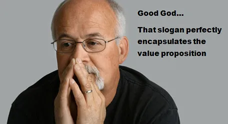
Image found on Things real people do not say about advertising.