SlideMagic Blog

Frequent updates about all things presentations since 2008. Subscribe to never miss a post.

RSS
all posts

Category Presentation design

·Keynote

Is it really about the presentation?

“My boss wants me to make a presentation about our strategy next Wednesday, help!”.

What does she mean? In most of cases (especially for an internal audience), she probably does not want you to focus all your energy on making the slides as pretty as possible (that would be a nice-to-have).

Instead, she needs to have the strategy itself ready and nailed. And the process of designing the presentation-that-presents-the-strategy might reveal holes, inconsistencies, and ambiguities in the strategy itself.

Your boss wants the strategy to be ready by next Wednesday. (Help!)

·Keynote

Uniform logos

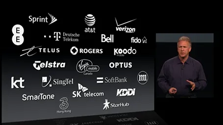
A page full of logos in different colours can look cluttered. Apple re-did their partner logos in white on black in their recent product presentation. I am not sure whether all the graphic designers that were behind the logos would agree to this, but it sure looks better. I would have taken the slide design one step further though, and organise the logos in a rigid grid.

·Delivery

Light or dark background?

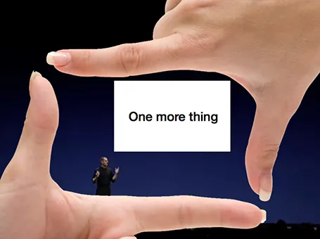
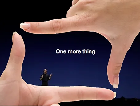
For big audiences, you need to get the entire look of the stage right, not just your slides. Below you see that a dark background works better. A light background on a huge screen overpowers the presenter. For small conference rooms, a light background will do fine, and for reading on screen, a light background is actually better.

·Keynote

Presenting to your CEO

You are the country manager of one of a company’s 100 territories, and the CEO is coming to visit. You probably have a deck somewhere that you can use to Frankenstein the all encompassing presentation about your country organisation.

But maybe it might be better to start from scratch for this new audience.

Some content can go, all the tactical details about combatting that local competitor really excites you, but is not that interesting to the CEO.

Some extra content is required. What is special about your country compared to others? You never had to worry about that before when presenting inside your own market. It might be good to take a step back and go further back in time than the last 2 quarters to show the evolution of your market. Your staff knows it, but the CEO does not. Adding some pictures of staff, or some examples of marketing material will add even more flavour to your story. Maybe it is necessary to  convert all financials in a different currency.

In short, Frankensteining is not enough.

·Images

How to position a logo

Many logos come with tag lines and/or ® or ™ attachments. When positioning a logo on a page, ignore these and focus only on the main text or graphic to align the image on a slide (even better: violate the logo style rules and crop them out). For horizontal alignment of a number of logos in a row, draw a temporary line and make sure the text of all the logos sits right on it.

·Investor presentation

"Hot"

Some sectors of the technology market are “hot”, everyone wants to buy the products, all investors want to get in.

But writing that sentence explicitly in your presentation might just give the impression that you are in a bubble that is about to pop. Get the sizzling temperature of your market across without saying it directly.

·Keynote

Your James Bond opening?

James Bond movies always start with an opening scene before the title roll. You get lifted out of our audience chair and thrown into the action. In presentation design, you have a similar option.

The conventional route is to put up a summary chart with the key messages you want to give. The James Bond option is to start with some interesting stories and case examples that are not completely tight together in some logical structure. After that short introduction you can put up the page that puts it all together.

·Keynote

Story procrastination

Life is tough in the corporate world today. Endless (often useless) meetings, short-term requests that frustrate your attention to get the big job done, a relentless stream of emails. With all these distractions, it is hard to find the time to simply sit down and design/write/dream the story you want to tell. And on top of that, managers assume (correctly) that they know what they want to say, so there is no point wasting two hours to go over the obvious. Incorrect.

Managers suffer from the Curse of Knowledge. Yes, they do know the substance inside out, but cannot explain it to outsiders. Buzzwords and corporate speak have become a morse code, a short cut, that management understands perfectly, but that does not stick with outsiders.

Moreover, outsiders might have difficult questions that do not follow the business-school-like structure a manager would use to explain her business. Writing a story to lecture someone on a new topic is different from writing a story to address the concerns of a highly cynical audience.

And finally, writing a presentation without a proper story brainstorm takes out those personal anecdotes and jokes that can make your presentation so much more interesting.

In the end, many corporate presentations work out and are great. But very often this is the result of a reset in the middle of the design process. After the presentation is almost ready to go, people take a step back and start discussing the story, which often in  a complete redesign of the deck.

Continue reading →
·Keynote

One framework fits all?

Some presentations are a series of ideas, a number of products, a string of business unit updates. Most people try to force some sort of uniform framework to discuss all options: market potential, challenges, next steps, etc. But often you find that that one framework does not work for all the stories you want to tell. In those cases, feel free to drop the uniformity and pick the visualisation that fits best for that particular story.

·Investor presentation

VCs can also improve their pitch!

As a startup you are used to sitting in the hot seat while the VC (venture capitalist) is grilling you on your business idea, and in the process gives you some advice on how to pitch it better. True, VCs probably know best how it is to pitch to them.

But VCs themselves can improve their pitches as well. I have designed many fund raising presentations for VCs and later-stage private equity (PE) funds pitching their next fund to institutional investors and high net worth individuals. Here are some of the common mistakes in version 1.0 that comes across my desk:

  • A lot of attention to the mechanics of the fund; how the due investment process works, and how the fund is organised.
  • Very generic descriptions of what sort of companies the fund will be looking for: great product, great management, no competition, sound business model
  • (Every fund does this) a chart emphasising that the fund (unlike all other funds) will actually be really hands-on with their portfolio companies
  • A dry summary of the investments made and financial returns, forced in the same generic framework that is applied to all the portfolio companies (with completely different stories) often lacking the real story behind the investment decisions and the portfolio’s company progress over time
  • Investment banker-style, dense, bullet point slides that are meant for printing and reading, not for presenting.

Investors in VC funds have heard the exact same story from all the other funds that are pitching for their money. VC/PE funds need to really think hard and articulate their story, and how it stands out from other funds.

Continue reading →