SlideMagic Blog

Frequent updates about all things presentations since 2008. Subscribe to never miss a post.

RSS
all posts

Category Presentation design

·Keynote

The best briefing

The worst presentation briefing (and as a result most time-consuming presentation design project) is a long deck of slides full of bullet points that have been shortened (hey, we learned about being concise) to such an extend that they have turned into meaningless, generic prose.

The best presentation briefing (and start of a rapid presentation design project): the audio track of a 15 minute video of the actual presentation, the existing slides are not really needed.

·Gadgets

Adobe Voice

Adobe launched a new iPad app, Adobe Voice, that enables you to create narrated story videos. There are many apps that help you build animated videos, but this is one of the best I have seen.

  • It is incredibly simple to use (unlike most of Adobe software), with a beautiful user interface that breaks the conventional approach to video editing
  • It comes with dozens of pre-set story lines: tell what happened, follow a hero’s journey, share a growth moment, promote an idea, etc. Once a story line has been selected, the app prompts the user on each slide with a question to answer (why did the hero set out on his journey?).
  • After recording the audio, you can add images, icons, or text
  • The app comes with a large library of background templates and sounds.

There is an 80/20 rule here, in 20% of the time, you get your video 80% right. Still if you want to get to 100% perfection (something that you are confident to share professionally), you need to get put in the other 80% of the effort. Prepare your visuals and images, and prepare your script.

It is cute that this app was developed for iPad, but for professional use Adobe should create a browser version as well for desktop. It can have the exact UI (except for resizing of images etc.). It is a bit tricky to extract your creation out of your iPad at the moment, and usually people do not have their image databanks stored on iPad.

Continue reading →
·Keynote

7 time zones away

Yesterday was Independence Day in Israel, so I was not working. One of the costs of working with international suppliers; random holidays. Other drawbacks: time zone differences, and in the case of Israel, a weekend that does not overlap (Friday Saturday here). By the time a west coast client gets in her office by 09:00 on Monday morning, I clocked already two full working days, and will be heading into the weekend 08:00 AM PST Thursday (3 days later).

But the set up has its advantages:

  • Overnight turnarounds, send of input, and you will see it all done the next morning you come into the office
  • A less stressful workflow, once time zones dictate that you need to organise yourself: I have focussed calls with US clients in my afternoon, and have the mornings to do productive work. There is no opportunity for disruptive, live, last minute changes
  • Building on that, an end to time consuming meetings. Input gets collected much more efficiently than in calendar disrupting meetings (maker schedule versus manager schedule).

It turns out that there is virtually no difference in the way I interact with a Tel Aviv or a San Francisco client, apart maybe from that first get-to-know-you meeting.

But: clients self select, people that do not like to work remotely with their suppliers probably do not turn out to be my clients. But hey, the world is a big place.

·Keynote

No audience is the same

A company presentation will be used for many different audiences: investors, Board meetings, sales meetings, people who know the company, people who see the company for the first time. There is the temptation to start working on a different presentation for each different audience. Resist.

First of all, I hope your story is the same for all these audiences. I have seen companies that want to change the story depending on who they pitch to. I think it is very hard to build a successful with an inconsistent market positioning and purpose. So let us assume that there is one story.

Even though different audiences require different amounts of detail for specific parts of the story, each audience still needs to put everything in that overarching framework. Leaving things out will break the flow of the story. So, even for highly a knowledgeable scientist audience, I would still put in one (place holder) chart to remind us all of the very basics of a certain medical condition.

From a practical point of view, it is also very difficult to maintain multiple versions of the same presentation. A small correction on page 10, needs to be duplicated everywhere.

The bottom line, I create one overall master deck and sit down for before every presentation meeting to cut down the presentation to size.


·Keynote

Stories need fewer slides

Many clients come to me with fact-packed presentations full of dense bullet point slides, I recommend to break up each slide into multiple visuals that carry just one message. The result: slide count can go five fold, but the time to present them stays the same.

Some clients come to me with stories (much more effective than dry business content), but again, they are written out in bullet points. Here, I advise to do the opposite: cut the number of slides. Put up a picture of the person, situation, place, you are taking about, and give the story verbally. We can read a fiction book without a single illustration and build a rich visualisation of the story right in your head.

If you need to send this presentation full of stories without you having the ability to explain, you might consider adding a small point 12 text box at the bottom of your image with the slide narrative in full sentences.

·Data visualization

Boring frameworks

If your business has 15 sales channels, it makes sense to review their performance using the same framework: easy to compare, and you make sure that you are covering everything that needs to be covered.

If you work with management consultants, you will notice that they love this approach. You get presented with a framework, asked to fill it out and then - here is the mistake - the 15 analyses are put on the overhead projector for a nice morning-filling channel performance review session.

Analysis slides are not the same as presentation slides. Keep the boring, structured deck as reference material. But, when presenting: try to break the logical structure. Focus on what is different, remarkable, requires attention. And since each of the 15 channels are different, you will find that these stories do not fit into one framework.

·Keynote

How did she spot that?

When I just started out as a junior analyst at McKinsey I always wondered how my project manager was able to spot a mistake or inconsistency in my slides in a second. I had been working on this all night (sometimes literally), build all the spreadsheets, mastered all the detail, and in she comes and says after a few seconds: “that number looks wrong to me”, and yes, there was a bug in my analysis.

The secret is take some distance from your work. Look through the slides without connecting them to your Excel sheet. Sales numbers on page 3, should be the same as sales numbers on page 16. A soft drink can is unlikely to cost $50. Simple checks and a cool head.

If you do not check your slides, your manager, or your client will for sure.

·Data visualization

Word repetition

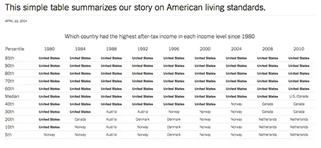
Some busy charts can still be highly effective. See the one below about the declining relative income of wealth classes in the US. The repetitive “United States” could have been replaced with something visually calmer, but the current works actually pretty well.

See that this charts presents other information as well (which countries did well), but the viewer is unlikely to take notice (and she does not need to).

The original article in the New York Times can be found here.

·PowerPoint

Microsoft Office Mix

Microsoft is working to add interactive features to PowerPoint presentations: real-time hand writing, audio/video of the presenter for off line viewing, analytics (who looked at what slide for how long), etc. A more elaborate description here on ZD Net. At the moment, Mix is just an add-in, but it could be a preview of what directions Microsoft will be taking future versions of PowerPoint.

Microsoft has opened Mix for preview, but it requires PowerPoint 2013 (i.e., does not work on a Mac).

My hunch is that the world needs simpler presentation software (working on it), not more complicated, but I am open to be convinced of the opposite.

·Data visualization

Funny

Most infographics are a bombastic compilations of overcomplicated, trying-too-hard, visualisations of facts that are not always that insightful. These simple graphs by Danish writer/artist duo Mikael Wulff and Anders Morgenthale are well executed and actually pretty funny.

A compilation of charts here on the Zero Hedge blog, and here is the web site of the original creators Wumo.