SlideMagic Blog

Frequent updates about all things presentations since 2008. Subscribe to never miss a post.

RSS
all posts

Category Presentation design

·Keynote

Clear versus stunning

In presentations, clear and stunning are not the same thing. I have seen many stunning infographics that are not clear at all. And more importantly, it is perfectly possible to make a clear and convincing business presentations without stunning visual effects.

Especially in business presentations, people often want to go for stunning first, and commission expensive graphics design or video creation work. It is wiser to hold of with this until you have a simple presentation that 1) makes it clear what you want (touch the head) (believe me, I have seen many presentations that do not even pass this hurdle) and 2) convinces people to do something (touches the heart).

·Art

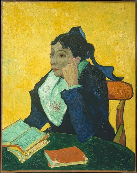
NY Met puts collection online

The New York Metropolitan Museum of Art has put 400,000 super high resolution images of their collection online, free to use. Great for use in presentations.

·Keynote

Keynote with Dropbox/Box/Gmail

The new Keynote creates files that look like a single file on a Mac, but on other machine appear as a folder with multiple files in them. This has implications for online file sharing:

  • Gmail: emailing a Keynote file as attachment does not work
  • Box: file syncing, or sharing a download link does not work
  • Dropbox: seems to have fixed the issue.

Has anyone had issues or is it just me?

·Keynote

Screenshots are great

Aspect ratios, dots per inch, file formats and conversions, forgetting where you saved that file, these are all problems that are disrupting my creative workflow. More and more I just work with screen shots. If the image looks sharp on my big 27" monitor, I crop it as I want it, and use it in my presentation. It could have been a JPG, a PNG, a web page, a PDF document, a Keynote file, it does not matter. CMD-SHIFT-4- and “click”, done.

·Keynote

The green Mac OSX + button

The behaviour of the green + button at the top left of a window is unpredictable. I found out that option-clicking it will maximise the window to the full screen, every time, completely predictable, at last for non-Apple software (Keynote does not play along).

This has probably all to do with Apple’s full screen mode, the two arrows at the top right side of the screen. I use it rarely because this feature does not work very well with multiple monitors.

·Keynote

Bunkr presentation design app

The presentation creation and sharing app Bunkr has not appeared on my radar screen until recently. The company raised EUR 1m in a recent fund raising round. In the not too distant future, I am becoming a player in the market myself, so I am watching developments with interest.

I clicked around a little bit in the application and here is my impression. Things I like:

  • Snappy, fast, clean user interface
  • Nice intelligent rulers to snap your objects against
  • Social technology integration (Disqus comments on slides)
  • Online image search integration (Google images, Flickr), but watch those usage rights
  • Easy sharing and embedding
  • Different objects for titles and paragraphs, not just a text box
  • No bullet point template when you create a new slide

My main comment is, is that all PowerPoint alternatives in the market, still stick with the same fundamental approach to slide design and drawing on a computer screen that has been around since the 1980s. And that is the problem I am trying to solve 24/7, and it is not easy…

·Keynote

Confusing Keynote?

Apple is known for making beautiful and easy-to-use software, but I am struggling with the new Keynote, especially with the simple task of colouring shapes, and the text inside them. I always pick the wrong colour box, and need to switch a number of different menus to complete very basic actions.

From a UI design perspective the user interface looks perfectly clean and organised. For power-editing at very high speed, it breaks down. This is the reason that the QWERTY keyboard was invented: the logical thing would have been to make ABCDEF keyboards, at high speed though they are less efficient.

Maybe it is me or is it that “the emperor has no clothes”? I got used to working in a certain way? I am in my mid-40s and my ability to learn new UIs slows down? I am not a typical Keynote user and it works perfectly fine for everyone else?

·Investor presentation

Polite VC feedback

A venture capitalist needs to turn down people all the time. Sometimes decisions are scientific, most of the times they are not. Sometimes they are made after extensive deliberations, most of the time in the first minutes of meeting you. It can be that they do not like the sector, do not believe in the idea, do not like you, have a bad day, do not believe that you can pull it of, anything.

When you ask them for feedback, most of them will not tell you the real story. But, VCs want to be helpful. So, some of them will give constructive feedback about your business or the presentation. Some feedback is helpful, some less so. When they do suggest that you include 5 more breakdowns in the year 5 revenue forecast, they were nice to you in giving you a suggestion, but I very much doubt that if you had included those numbers in your first presentation, she would have changed her mind.

Filter feedback and try to drill down to the real issue.

·Investor presentation

Business plan outlines

The Internet is full of business plan/investor pitch outlines (here is a nice one from Sequoia). Use these guidelines as a check list to see whether you covered all the content that investors expect. But do not stick to them too literally. A rigid, generic, structure kills the spontaneity of your specific story. Do not simply copy the sections of the structure and use them as (boring) headlines for your slides, instead write headlines that mean something (The Solution is not very meaningful). The text book approach to TAM calculation might not exactly fit your specific market.

All advice (including the one you will find on this blog) is given to help you. In the end, it is you who makes the call what to use, and what not.

·Keynote

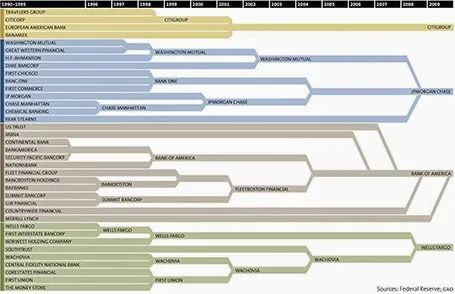
Consolidation chart

This is a nice way to show consolidation in an industry. You can digest the chart in 2 ways: on the podium you see the big picture of consolidating financial institutions, reading in close-up on the screen, you can see the details. The chart could have been better if the width of the arrows would represent the assets under management of the banks, some of these acquisitions were bigger than others.

[Off topic] There is a populist discussion going on in the comments of the original post. I did a lot of strategy work in banking mergers and there are different ways to look at the concentration in an industry. The top level player count is an easy statistic, but what is more relevant is the choice that customers (especially small businesses) have on the ground. How many different bank branches are within a 10km range at any point in the US? If there are 30 banks, but each concentrate on a specific state, then the market looks very competitive, but on the ground, customers face a monopoly. On the other, if all 4 banks are represented in most small villages, the market could be competitive.