SlideMagic Blog

Frequent updates about all things presentations since 2008. Subscribe to never miss a post.

RSS
all posts

Category Presentation design

·Design

Don't be a bleary-eyed presenter

Fred Wilson got it so right in a recent blog post: postponing the preparation of your presentation slides to the very last minute and showing up exhausted to the meeting does not pay off. Books such as Brain Rules provide scientific evidence that an exhausted brain is perfectly able to survive (i.e., run away from tigers that chase you), but not really good at coming up with great ideas anymore.

Get organized, finish the work in advance.

And if you are running out of time (these things happen), make the trade-off what would contribute most to a successful meeting:

  1. Fine tuning those bullet points or re-shuffling the deck one more time
  2. Showing up well-rested, energized and able to handle the most difficult questions confidently

Your call.
·Concepts

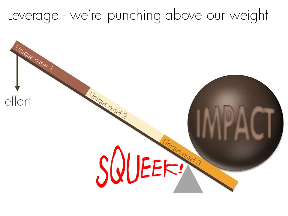
Chart concept - punching above our weight

OK, I admit, a previous chart concept on leverage might have been a bit hard to get for someone who forgot the physics of pulley systems that was discussed in highschool. This chart says the same thing, but simpler.

·Animations

Beautiful motion graphics: "Did you know 4.0" video by Xplane

This video by Xplane (link to their blog with details) is making the rounds on the Internet. (Watch it in the original format on YouTube as blogger cuts off the right side of the wide screen video)

It’s a beautiful example of kinetic type or motion graphics. Some comments.

  • It is made with software available to everyone, the source files are here.
  • There are some interesting visualization concepts, for example pie chart overlays abour 2:30 minutes into the video (thank you Steven Levy for pointing this out)
  • Quotes are great to get one number across. Still I believe that comparing two numbers is not very powerful in 2 consecutive quotes. Rather the good old bar chart does a better job.
  • The real artistic power in this presentation is the subtle use of informal cartoon drawing techniques, I style that I like.
·Design

Breaking that imaginary slide border

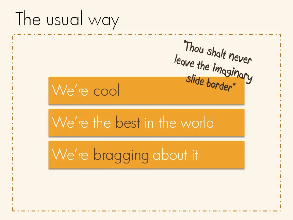
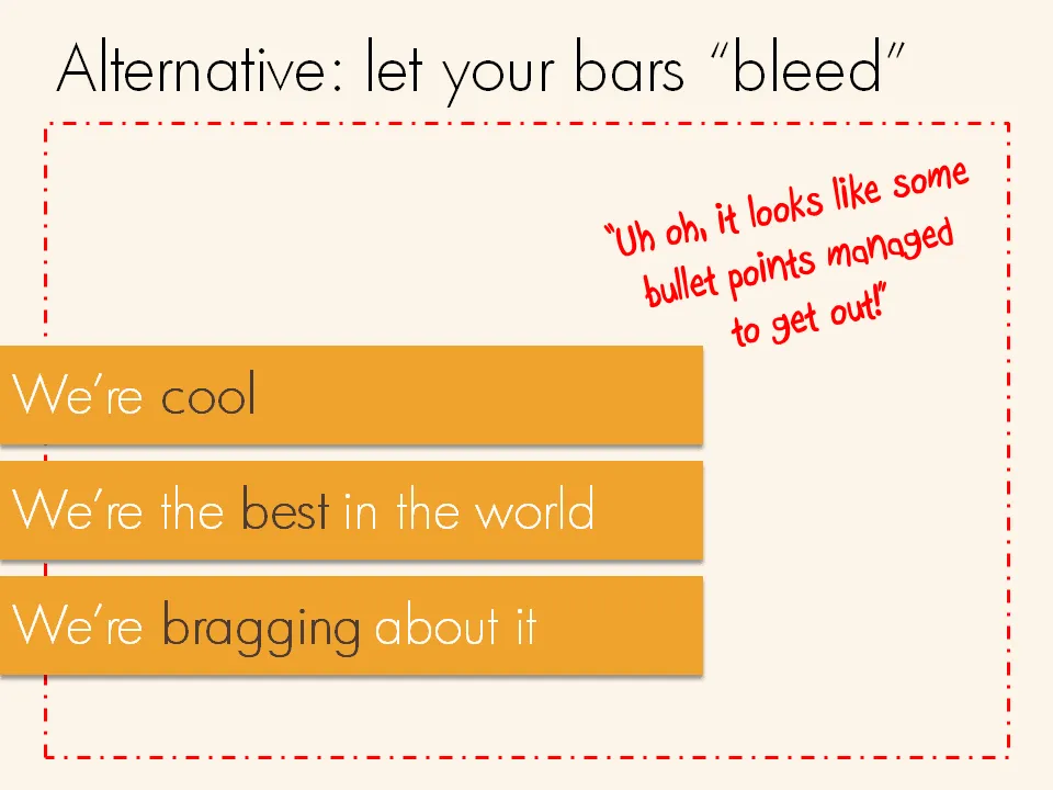
Pictures are not the only objects that you can have “bleeding” off the slide. Regular text boxes work as well. Especially beautiful over an image.

·Design

How many PowerPoint decks does it take to pitch to a VC?

This post was triggered by another excellent post by Mark Suster (Do you need a PowerPoint deck for a VC meeting? - spoiler: the answer is yes), and a meeting I had today with a client. There is an almost endless amount of different VC pitch settings, each single one requiring a different type of presentation deck (ideally).

Although I have a clear economic interest as a presentation designer to develop the VC pitch presentation of a startup in 10 completely different formats, I won’t recommend that approach here. It is however good to be aware of these formats, and in most cases it is relatively simple to adjust your main pitch desk to the context of a specific meeting.

Here we go:

  • The "page down presentation" gets emailed cold to a VC you do not know very well. Hopefully the attached PPT gets opened without you being there to explain and speed read using the PGDN key (probably not in presentation mode, so don’t rely on animations). Don’t assume that people will bother to read the body of the email (they might after having reached the last page of the deck). Since the reader spends little time on a page, each slide should contain little information (but you can use many slides). The presentation should focus on explaining the basic idea of your startup and the credibility of your team. All other stuff (detailed financials, etc.) can be discussed if you make to the next phase in the VC selection process.
Continue reading →
·Design

Keeping titles readable over busy images

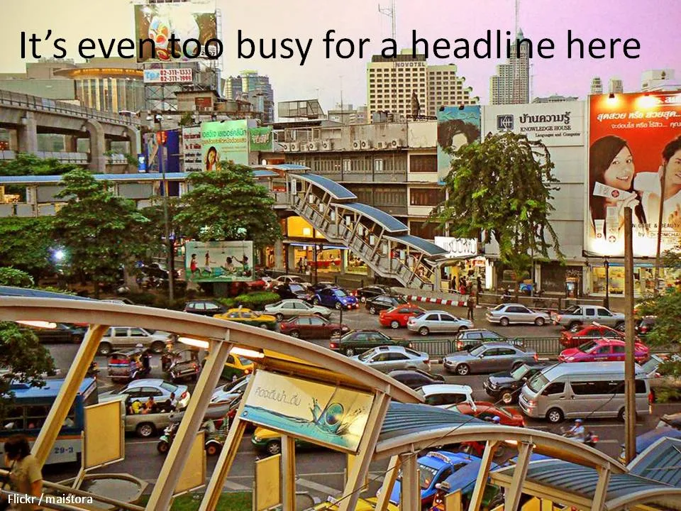
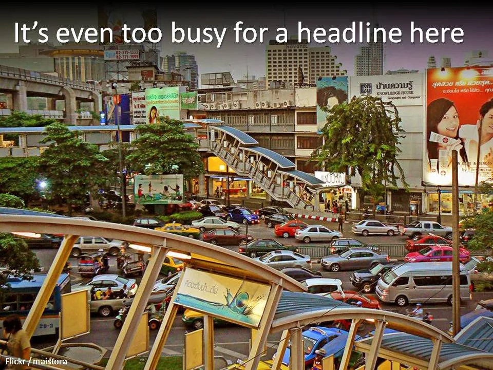
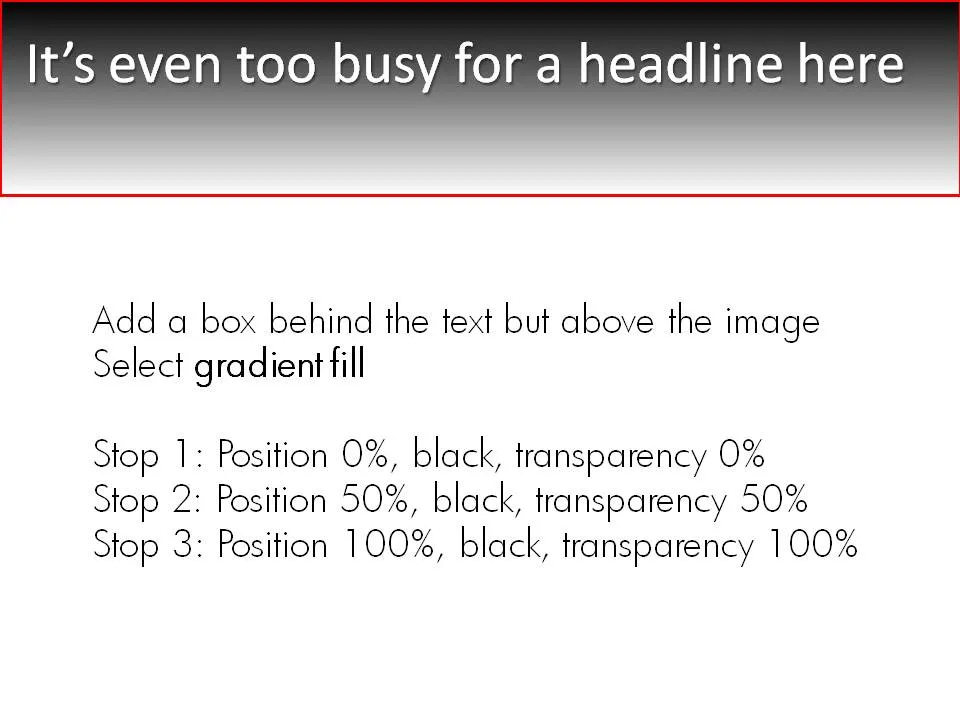
A simple gradient box behind an image title can make sure it stays readable, even if the background is very busy. Image under a CC license by maistora on Flickr.

·Concepts

Chart concept - why now?

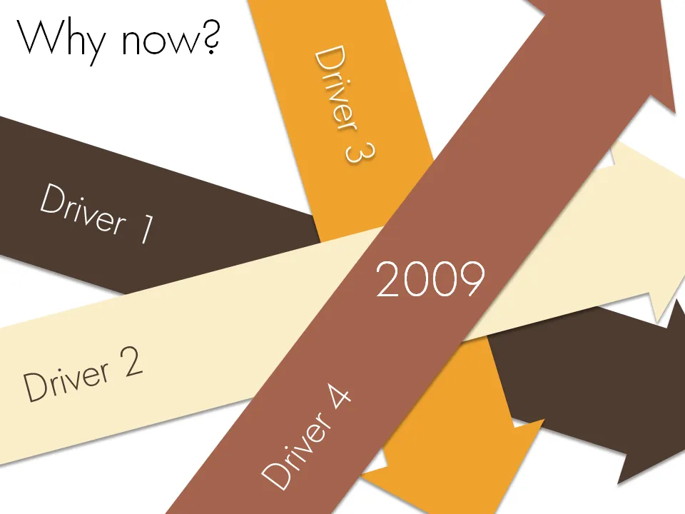
Sometimes it just comes all together, right now. Everything falls in place. And investors better move fast to benefit from the opportunity before it’s gone. A set of big simple arrows can visualize this.

·Concepts

Chart concept - leverage and pulleys

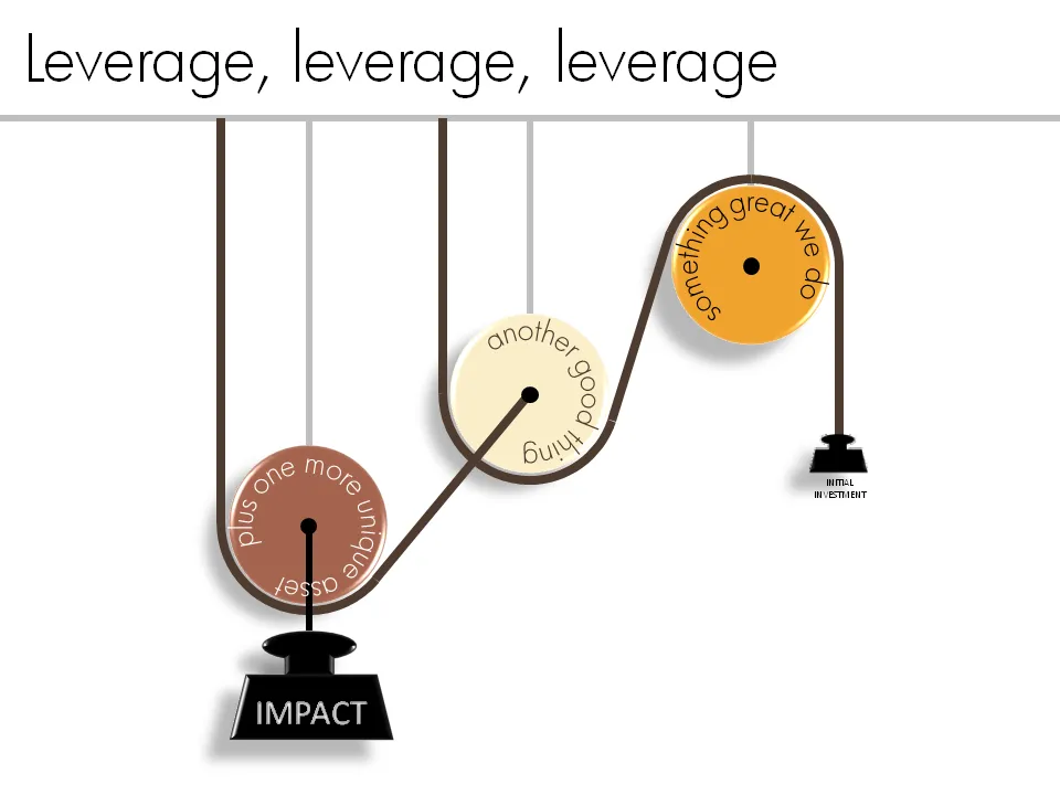
Smart companies leverage money and man power invested in them to do great things. How to visualize this?

One option is to go back to high school physics class and use a good old pulley system.

See a previous post about how to get circular text in PowerPoint.

·Books

Book review - "Influence - the psychology of persuasion"

The book Influence: The Psychology of Persuasion by Robert Cialdini was added to my Squidoo lens with presentation resources (thank you anonymous reader!). I finally managed to read it. The book aims to teach anyone who needs to influence other people (that includes presentation designers like me) to leverage learnings from the field of psychology.

Like most business classics, the real-life case examples are really valuable; the attempts to draw generic conclusions and insights from them somehow make less interesting reading (although they still are valuable). Just a few examples:

  • A jeweller selling all his slow-moving inventory by accidentally doubling its consumer price
  • Charities harassing people in airports by offering them a flower as a gift, and “forcing” them to contribute a few dollars to the cause
  • Cults and mass suicides
  • Normal people willing to give 220V electrical shocks to other people in the name of science
  • How you can make sure that a crowd of bystanders actually helps you when you need them (spoiler: ask a very specific person to do a very specific thing, crowds usually think that help is already on its way)

The six principles discussed in the book (where possible I added lessons specifically for presentation design)

  1. Do a favor, cash in later.
  2. Get people to commit early on. Presentation use: have people write an objective down on a piece of paper as a group exercise, construct an argument in stages, have them buy into something small early on before the big idea comes later
  3. Social proof, we do what we think others do. Watch out in presentations to make cases like “100m Americans have not signed up to donate blood”. It might just backfire.
  4. We say yes to people we like, we like people who are similar to us. Find a connection with your audience early in the presentation, even if it is a very weak one (“my nephew went to high school in Springfield”)
  5. Use authority. Establish your credibility early in the presentation, as specific as possible. OK: “I am a VC with firm x”. Better: “I personally invested $300m in 35 early stage tech deals”. Quote sources for the analysis and data you are using in your presentations
  6. Scarcity, we like things that are hard to get
Continue reading →
·Design

Storybird - collaborative story telling for familes and friends

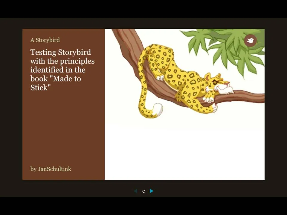
More and more online presentation tools are popping up. A recent one is Story Bird. You select artwork from an artist and are offered a simple interface to weave images of your choice together into a story.

The service is targeted at family/children and works well. Narrowing down the degrees of freedom (artwork in a consistent style, simple page layout [image + big font text]) makes it easy to create and share professional looking stories. You can invite others to collaborate with you as well.

Maybe the biggest application of this service is in education? There is a business presentation version of this application possible as well. Replace the image bank with non-cheesy useful presentation images (you only need a few hundred to cover most business presentations) and you have an alternative template to the PowerPoint bullet points. “Ayne can make Presentation Zen-style presentations”). Cutting the available slideware tools to the minimum helps focus the presentation design amateur on the story.

My first creation can be found here.

Via Orli