SlideMagic Blog

Frequent updates about all things presentations since 2008. Subscribe to never miss a post.

RSS
all posts

Category Presentation design

·Design

Playing around with fonts in section separators

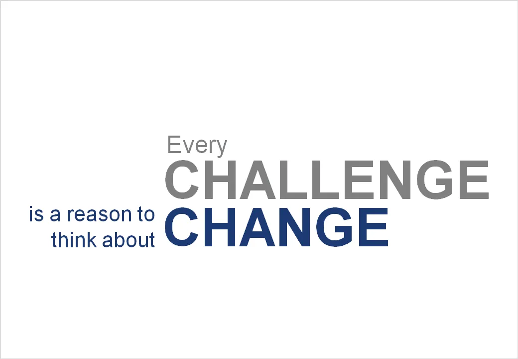
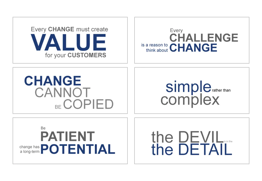
Sometimes a presentation is just a discussion of a series of beliefs or points. Each section of the presentation is devoted to one statement. Big-font section separators are followed with a few more charts adding detail and explanations. Why not play around with fonts a bit on these separators? A summary page could consist of PNG captures of the all the tracker pages in the presentation. In this way, it looks a bit more interesting than six bullet points.

·Advertising

Chart concept: size does not matter, numbers do

This ad uses a concept that can easily be replicated in presentation slides. Find a silhouette of let’s say a shark, and fill it with small gold fish shapes and you’re done.

I used something like this once to show how small individual components of an information security architecture can create a formidable defense against cyber crime if they coordinate their activities well.

A larger image can be found on Ads of the World.

·Design

Intimate 1 on 1's: the PowerPoint/napkin hybrid presentation

Seth Godin nailed the perfect format for a one-on-one presentation in a recent blog post.

  • Full-blown PowerPoint presentations are overkill in an intimate coffee chat
  • Taking an empty note pad and sketching the entire presentation from scratch while you are talking is definitely more intimate, but also high risk. (A bit like the concept used in the book “The back of the napkin
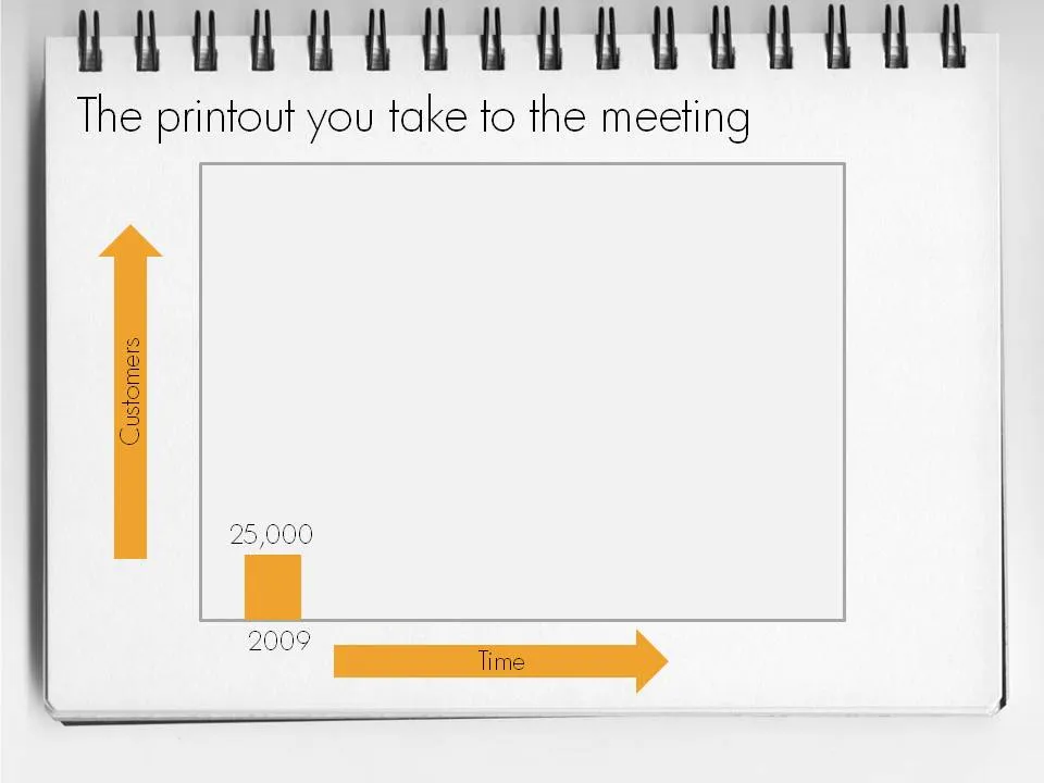
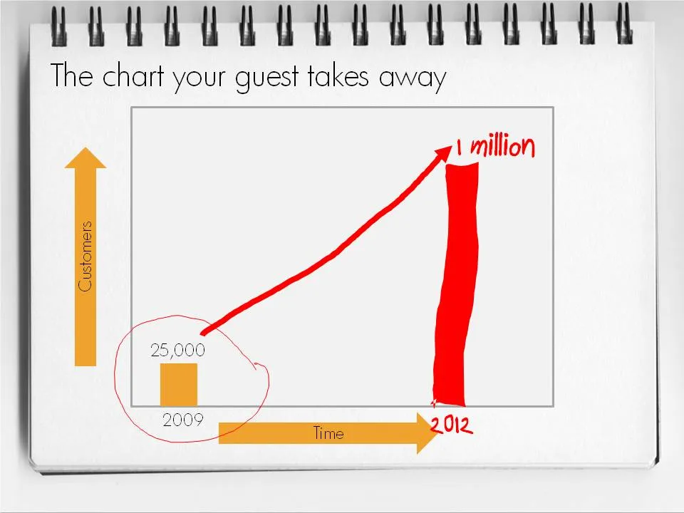
  • Seth’s hybrid of a print out of PowerPoint slides with key numbers, circles, and marks missing is the perfect compromise. Hand-write the key missing pieces during the meeting. Your meeting partner will remember them better, and he can take a nice and personal “coloring book” home.

This type of presentation is ideal for short 15 minute coffee chats with venture capitalists where you try to pitch for a more in-depth meeting.

To make a hybrid napkin presentation, I suggest that you actually design all the slides, including the version with the comments and drawings put on them electronically so that the story flows logically and it is easy to prepare for the meeting. Just before your presentation, you decide which slides to print or not.

·Books

Book review - "A whole new Mind"

Slowly, I am catching up on reading presentation-related classics. This holiday I read through Daniel Pink’s A Whole New Mind.
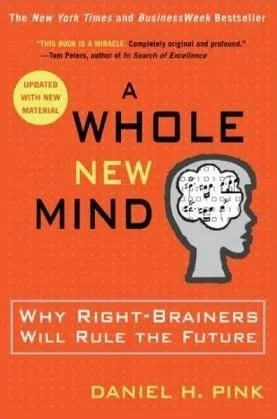
The subtitle of the book: “why right-brainers will rule the future” is an overly simplistic summary of the main idea. The book’s content is more nuanced. In the “conceptual age” 2 skills are essential:

  • Solving problems in a way that nobody has ever done before
  • Persuading other people, spreading ideas [here is where the link to presentation design comes in]

Why? In current society, supply of goods and ideas is overwhelming. In order to stand out you need to develop a unique edge. The only way to get this edge is through developing “right-brain” skills such as desgn and story telling. “Left-brain” skills such as accounting, diagnosing a patient, applying legal rules are repitive and can increasingly be automated or outsourced to countries with much lower labor cost. A whole new mind is a mind that has a combination of left-brain and right-brain skills.

Some additional thoughts:

  • I think that people will have to learn the boring, repetitive left-brain skills in order to reach the next level of creativity. You need to read and write in order to write a book. You need to understand financial accounting in order to solve a strategy problem. You need to understand how large corporate structures work in order to deliver a presentation that convinces the Board. For example in the field of presentation, I think it is actually the entry of left-brainers into the field that was traditionally dominated by “creatives” that is causing the changes that we see now.
  • There will always be a large number of repetitive left-brain jobs that will not be automated/outsourced, and unfortunately a large group of people that have to do them.
  • It is hard for people to cut themselves free of left-brain corporate environments econcomically. Academia pay is poor. There are only so many spots available at companies such as Google that give their employees free time to work on whatever they want. Not everyone can build up skills that can be marketed in a freelance model profitably.
  • The most successful engineers, accountants, lawyers, surgeons had the combination of left and right brain skills that Daniel is talking about.

Continue reading →
·Design

Presentation lessons from cluttered French brasserie placemats

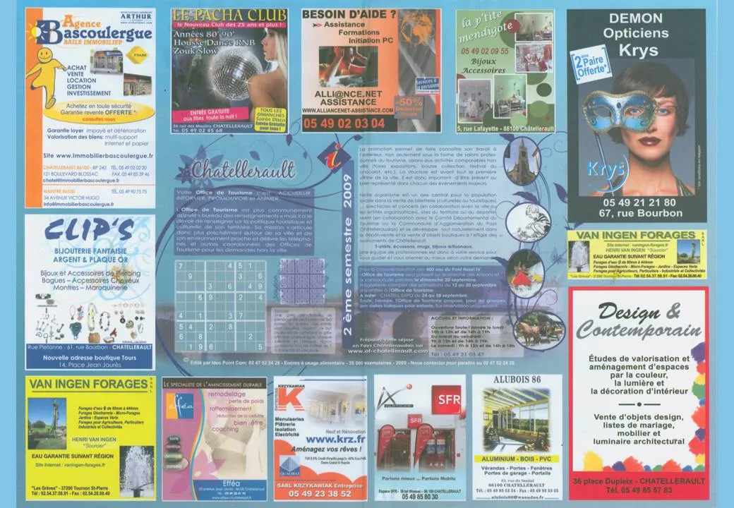
I just returned from a beautiful and relaxing family holiday in western France (apologies for limited posting and replies to comments). My 2 year old son’s fondness of cars required us to venture to the car museum in Chatellerault. (About the only thing to see in this town).

Lunch was in a local brasserie (not recommended). The placemat (click on the scan below for a larger image) reminded me of the slide sort sorter view of many poor PowerPoint presentations. Ads screaming for attention by using big, colorful and different fonts. With as much information crammed into it as possible.

Few got it right with some exceptions. The power of pictures does work in France as well. Many men will be drawn to the Le Pacha Club, fashion-conscious women might check out the Krys optician. I was disappointed with the interior design study institutue though (bottom right).

·Design

Visit my Squidoo lens - useful and donates to charity

More light summer posting. My Squidoo lens is filled with useful resources for presenters (blogs, books, presentater tools, videos). Have a look. Add more content. Vote existing content up or down. You can even buy some useful things, affiliate link proceeds are donated to charity.

·Design

Maximizing screen real estate in PowerPoint

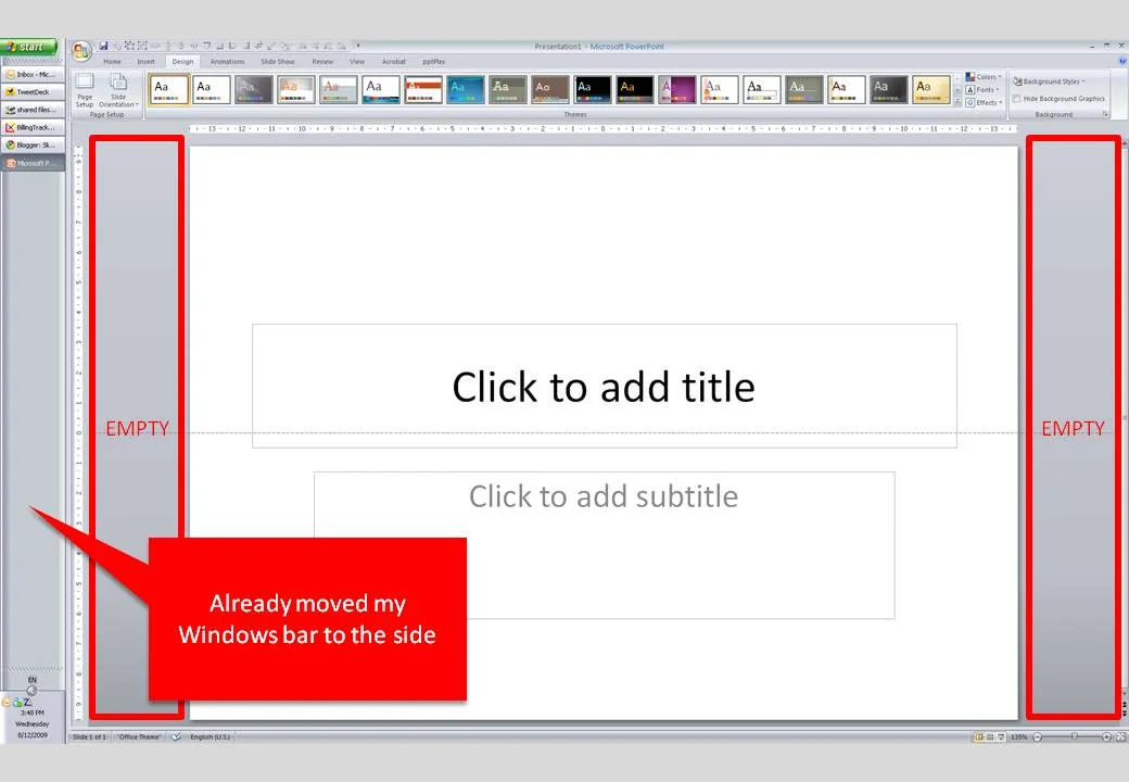
Many people have 16:9 computer monitors by now. Most of the time, we still design slides in 4:3 or A4/letter mode. As a result, a lot of space is available on the left and right of the PowerPoint slide in editing mode.

PowerPoint, like most software, is designed for the 4:3 screen by adding the ribbon and status bars at the top and the bottom of the screen. A lot of screen real estate is wasted. Adobe does a better job, tool bars are positioned to the left and to the right of the work area.

I already moved my Windows bar to the side. Is there a way to do the same thing with the PowerPoint ribbon? I don’t think so. A feature request for PowerPoint 2010.

·Concepts

Most of my "chart concepts" on Flickr

Apologies for the lighter post content during the summer break. I scraped images of the various examples slides I have been using on this blog over the past year and put them on Flickr as one set.

·Design

iStock photo free images expire

More light summer posting. I only recently discovered that the weekly iStockPhoto free images expire after a number of weeks. Do not forget to download them on a regular basis, and pick the very large size enabling you to zoom in dramatically if needed.

The fact that they are picked by iStock editors adds a nice bit of randomness to the stream of images. For example, here is last week’s:

·Design

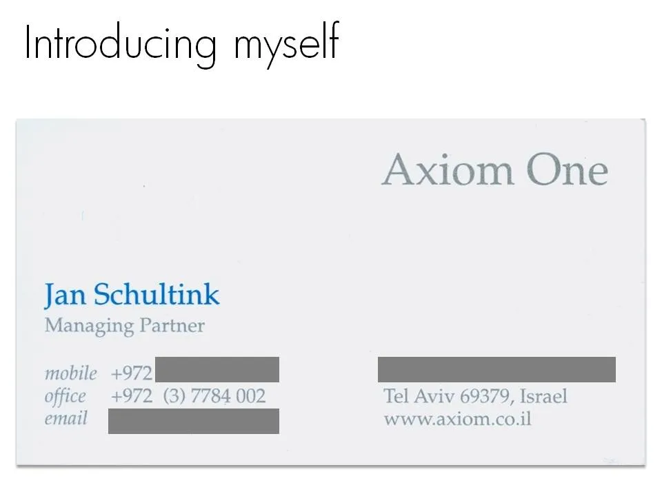
A scan of your business card as prsentation slide 1

Right at the start of a presentation I always create an opportunity for the speaker to introduce herself. What visual to use for this? Definitely not a boring bullet point summary of your CV. Put a personal image that describes something unique about yourself. It can be frivolous in an informal setting, and in more formal presentations, a scan of your business card (“so last century”) can be a good background.

Apologies for blacking out spam-sensitive details.