SlideMagic Blog

Frequent updates about all things presentations since 2008. Subscribe to never miss a post.

RSS
all posts

Category Presentation design

·Design

Visual Bee: attempt at PowerPoint automation

Visual Bee is an Israeli startup that offers a plugin for PowerPoint that can improve slides automatically. At the click of a button it does 2 things:

  1. Transform list of bullets into shapes that are distributed evenly over the slide
  2. Analyzes the words in your bullet points and picks an appropriate background image

The user can choose from a number of styles, that will be applied consistently through your document.
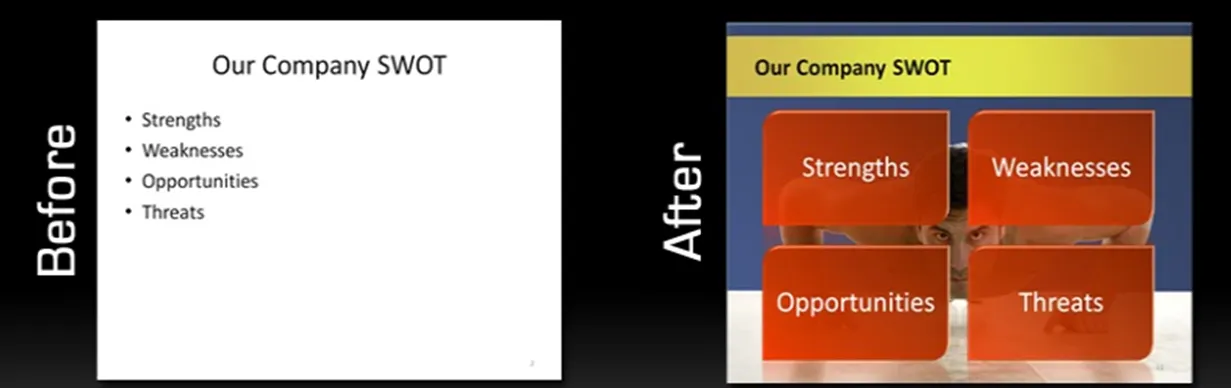
The style of the transformed slides is not exactly my personal favorite (“standard” stock images, lots of effects), but having said that, they do look a lot better than the original bullets. The best results are achieved if the original slide is actually already in pretty good shape. For example in the bullet slide above, the words have been cut to an absolute minimum. The tool will work less good when applied to dense slides.

As a professional designer, I would value a tool that automatically creates harmonious structures of 4, 5, 6, 7 objects. Fitting shapes around a pentagon is tricky.

For the non-professional designer, maybe the best thing that this tool does is to encourage you to improve the quality of the input slides: cutting text without worrying about the layout of the slide.

·Advertising

Chart concept - mystery door

This ad reminds us how easy it is to create a visual concept with elementary shapes and nothing more than basic drawing skills.

Via Ads of the World.

·Advertising

Buzz word abuse

Wonderful, a top 100 of the most over-used buzz words in press releases compiled by Adam Sherk:

Leader, leading, leading, best, top, unique, great, solution, largest, innovative, innovator, award winning, exclusive, premier, extensive, leading provider, innovation, real-time, fastest, easy to use, dynamic, state of the art, smart, flexible, cutting edge, biggest, world class, amazing, next generation, revolutionary, sustainable, best practices, leverage, thrilled, robust, delighted, cloud, user friendly, extraordinary, breakthrough, savvy, ROI, transform, seamless, groundbreaking, empower, scalable, one of a kind, proactive, best in class, return on investment, market leading, turnkey, mission critical, strategic partnership, ground breaking, dashboard, iconic, industry standard, never before, re-purpose, ecosytem, win-win, best of breed, enterprise class, empowerment, magical, synergy, out of the box, feature-rich, stack, cross-platform, value proposition, well positioned, disruptive, hit the ground running, disruption, mindshare, space-age, bleeding edge, exit strategy, customer-centric, sea change, sticky, silo, synergistic, client-centric, outside the box, paradigm shift, peak performance, perfect storm, organic growth, top-down, next-gen, never been done, bottom-up, solution-driven, secret sauce, low hanging fruit.

People hear/see/read them so often that nobody pays attention anymore. Think about that in your next presentation or white paper. (Hmm, not sure what to think about “sticky” featuring prominently in there.)

Via Advertising is Good for You.

·Design

2 years of Sticky Slides

Today is the second anniversary of my blog, thank you for reading, commenting, and contributing!

·Cartoons

Dilbert and presentations

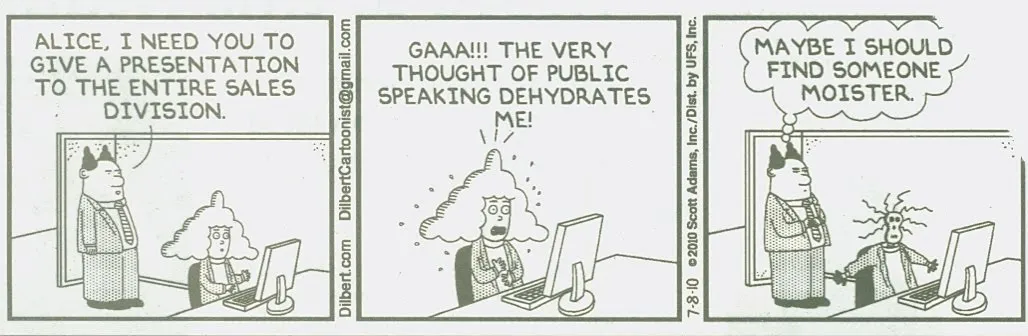
Presentations and PowerPoint are an integral part of corporate suffering in cubicles, the reason why they get featured often in Dilbert cartoons. Here is today’s cartoon.

A reminder of the excellent post by PowerPoint Ninja back in 2009 with dozens of cartoons on the subject. In exchange for using the comic, here is an (affiliate) link to everything Dilbert on Amazon.

UPDATE. After a comment by Rowan below: the Dilbert site is now searchable, and you can actually buy comics for your PowerPoint presentation, for a reasonable price. As an example, here is a search for all PowerPoint-related Dilbert cartoons going all the way back to 1989.

·Design

Centroids

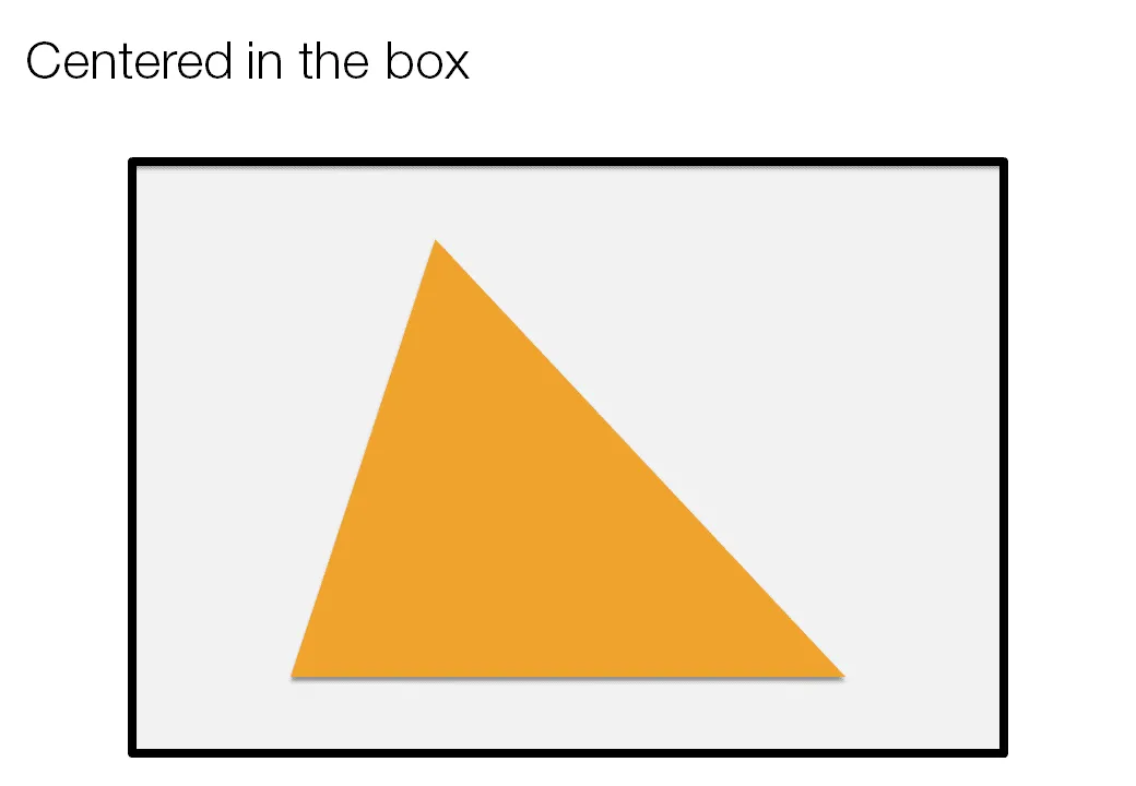
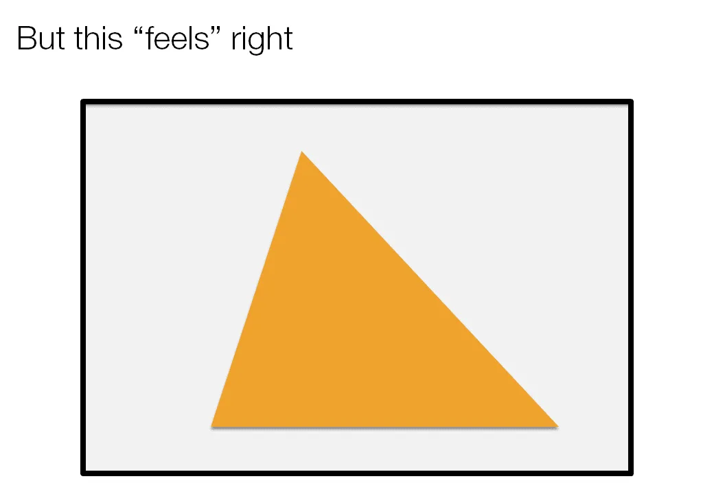
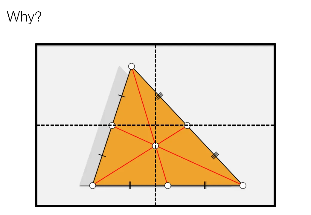
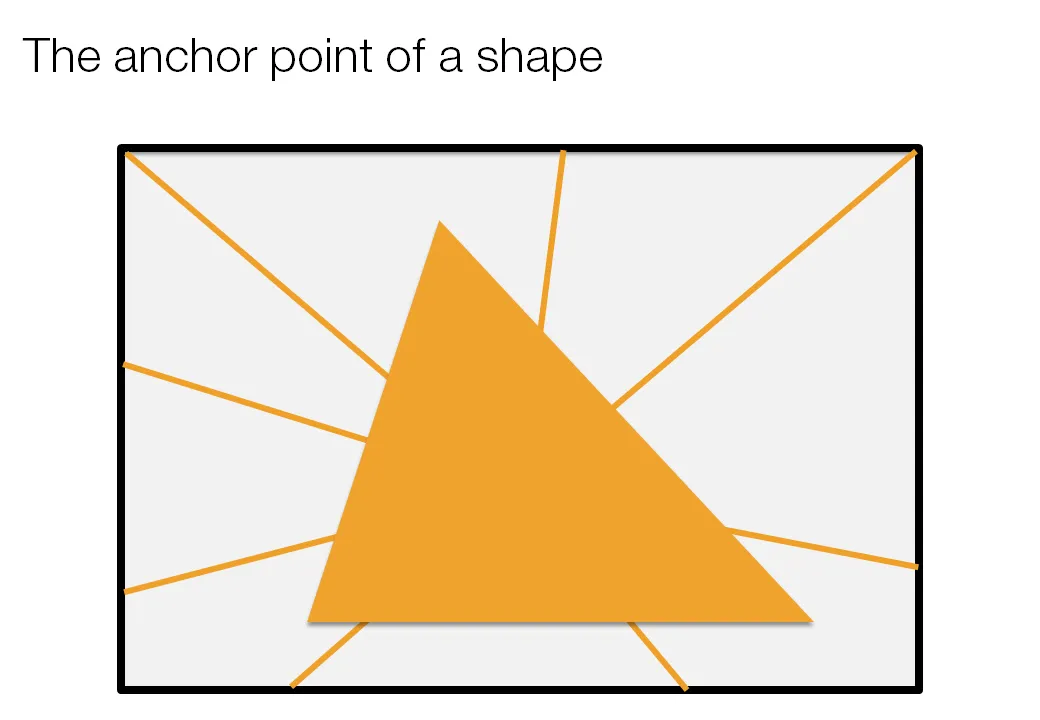
Call me a nit picker, but I always feel this urge to fix the direction of a connecting line or an arrow pointing to an object in a slide, or to position an object exactly where it feels right.

Intuitively, I am looking for the centroid of a shape. Running complex mathematical analysis every time you need to place an object on your slide would be overkill, however, keep the concept in mind.

·Design

Brilliant: image cut outs in PowerPoint

PowerPoint does not have the rich image clipping and cropping tools that PhotoShop has. To take the background out of an image, you can set its background color to transparent and hope that the image edge come out reasonably clean.

Jose Arriaga recently started blogging about presentations on PowerPoint Symphony. He discusses an original alternative method: drawing a shape similar to an image and then fill it with the source picture as a background. Full details in his post here.

·Colors

Setting the colors for Excel 2003 users

Increasingly, I use color schemes in Excel models as well. While I am about to switch to Microsoft Office 2010, I find that the majority of my clients (especially the large corporate ones) are still on Office 2003. Buried down in the Excel menus is a feature to set the colors that Excel 2003 users will see when they open files created in Excel 2007.

  1. Click the office button
  2. Go to the bottom and select “Excel options”
  3. Select “save”
  4. Click the “colors” button under “preserve visual appearance of the workbook”
·Design

A different perspective

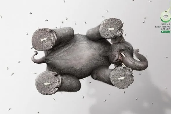
Most images have the perspective of someone who, well, stands up and look around. These 2 different ads (one here, and another one here) reminded me to look out for unusual compositions to keep your slides interesting.

Via Ads of the World.

·Design

"She"

The majority of presentations I see use “he” when referring to a customer, an employee, a user, a patient. I decided to use “she” whenever I can to compensate for this. Maybe you can as well.