SlideMagic Blog

Frequent updates about all things presentations since 2008. Subscribe to never miss a post.

RSS
all posts

Category Presentation design

·Design

Oops, I thought I deleted that?

PowerPoint files can still contain information that you thought was long gone. Watch out with this, especially when sharing files with outsiders via email, or on content sharing platforms such as SlideShare.
The easy solution is to convert PowerPoint files to PDF. If you want to stick to the PowerPoint format, here are some things to watch out for:

  • Data charts (bars, pies, columns) in PowerPoint are generated via an embedded Excel spreadsheet. Even if you did not include data in the graph, the source still sits in the Exel file. Open the spread sheet behind each chart and check whether it contains redundant data you do not want to disclose. (For example breakdowns by category, or in case of public investor presentations, forecast of financials beyond the current reporting period).
  • Cropped pictures that were not compressed still remain in PowerPoint in their full size, if you reset the image it comes back in its original form. If you do not want that, select the image, then compress, then ask PowerPoint to remove the cropped areas of the image.
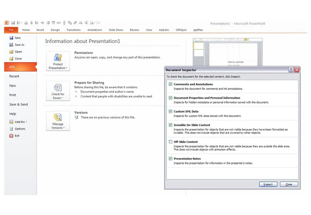
  • Hidden content such as author information, speaker notes with informal side comments such as (“not sure whether this is true, I made it up for the moment”), or objects that are outside the canvas of the slide. In PowerPoint 2010 you can inspect your presentation for things like this in file, info, prepare for sharing.

P.S. Image tags can be an unwanted piece of information in PDFs, here is how to get rid of them.
·Design

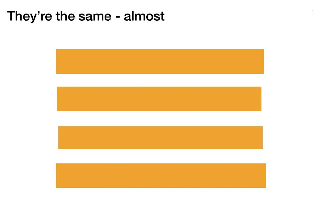
Almost the same size is not good enough

Making similar boxes the exact same size, and exactly aligned matters a  lot in slide design. The brain gets distracted when object alignments is just a bit off.

Usually the slide starts out OK, ctrl-C/ctrl-V a bunch of objects and they are all exactly identical. Over time, things start to degrade. Accidentally resizing things a bit, moving a box a bit, etc.

You need to train your eye to spot the imperfections. The quickest fix is usually to select a group of objects, select “format” and then give them all the same size in centimeters (hight, width, both). In the Arrange / Align menu you will tools to spread objects out evenly.

Little effort, big result.

·Design

"Let's start with our history" Uh oh...

You’re the owner/founder of the company and you are pitching to a potential investor. When introducing the company, you always start with its history:

How you started straight out of university, renamed the company after a waterfall you visited in Africa a year later, developed a 2nd product line, but then dropped that again in year 4, re-branded again, moved to a different city, and hey, that’s how we ended up where we are today.

To you it makes perfect sense. The story is how the company became what it is, how you became what you are. To the outsider, it is not that relevant, and even potentially confusing as the audience tries to figure out what you are about.

Skip the history and start with today. Except - if needed - a short reference to a useful link to the past: “the fact that we started out as a piece of 3D home design software in 1998 comes in handy today as we move forward to build the world’s best 3D gaming engine”.

A chronological story line is not always the best story line.

·Data visualization

Undoing PowerPoint 2003 data chart font squeeze

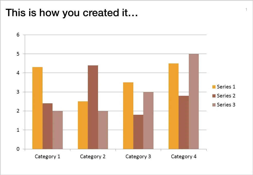
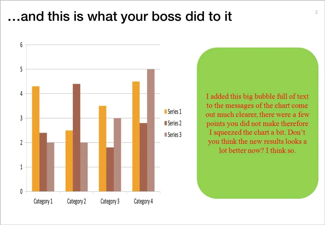
One the biggest hassle of PowerPoint 2003 was that when you resized a data chart, all the fonts got completely squeezed. Only PowerPoint pros new that you had to open the chart, and once it’s open in Microsoft Graph, you can resize the object without doing damage. Any other person (99.99% of the population) went for the squeeze.

If there is one reason to upgrade to PowerPoint 2010 (2007 also solves this), this is it.

But here you are, the corporate IT department insists on keeping the company on Office 2003, and you just got your 45-page back from your boss who “edited things for clarity” and you’re on to present tomorrow morning 9:00.

This will save you:

  1. Right click the chart
  2. Go to the bottom: “format object”
  3. Now resize the chart back to 100% by 100%
  4. Close the object
  5. Open it as you would do normally (you are 0.01% of the population) and resize properly.
·Design

File naming

The number of images on my hard drive is spinning out of control and I never got around to using dedicated software with image tags for my images (maybe I should). Lately, I am paying more attention when naming an image file. And the one thing that helped me most is to put the noun first. For example:

  • sky_sunny.jpg
  • sunny_sky.jpg.

The latter is how we are used to think, the first is best for sorting and finding things on a computer.

·Design

In Paris this summer

I will be around Paris some time this August. I am not sure whether it will work out in the end, but maybe we can organize a meetup in one of my favorite places there. If you are interested mail me at contact [at] axiom [dot] co [dot] il. (Image credit bfraz)

·Concepts

Chart concept - overwhelmed

It is important to pay attention to camera positions when selecting images for your presentation. This wave that is about to crash on top of the photographer is a great example. Add some dramatic typography and the audience can almost feel the need to swim to the shore before it’s too late.

Image via iStockPhoto.com.

·Design

De-cluttering this blog

The reading experience on the iPad has influenced the design of this blog. I cut the share buttons, retweet counters, time stamps, etc. What’s left is a clean sheet of paper with some ideas to make you a better presentation designer. Now it’s purely up to the quality of the content whether ideas here will spread or not. What do you think?

·Concepts

Chart concept - sky writing

You take a picture of a cloudy sky, and hand write a text with a healthy dose of “glow” and you can create your own skywriting images.

Here is how people used to do this before the age of PowerPoint:

·Design

PowerPoint 2010 mini review - the little differences

I have been working with PowerPoint 2010 for a few days now, here are some of my first impressions. I am discussing the upgrade from PowerPoint 2007 to 2010. (2003 users: see my earlier post on upgrading to 2007.)

For heavy PowerPoint users, I recommend upgrading to PowerPoint 2010 not so much about the advertised “big” new features, but amount a number of minor changes that make a big difference. Here are a few that I have discovered so far:

  • Finally the “hanging bullet” issue does not require complicated ruler manipulations: you click a bullet style, and the 2nd line of your paragraph gets aligned properly without a need for manual intervention.
  • Like in PowerPoint 2008 for the Mac, when you drag around objects lines appear that make it easier to snap objects together or align them
  • PowerPoint 2007 used to crash a lot when editing complex data charts (in Excel): no longer (fingers crossed)
  • You can now customize the ribbon without having to rely solely on this hack.
  • Apparently, PowerPoint 2010 saves a backup file somewhere even if you say “don’t save”, which can be a life saver.
  • The user interface is a bit calmer and more “Zen”
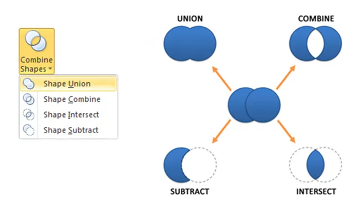
  • Finally, PowerPoint can now join and subtract shapes.
  • The tool to take the background color out of an image got a lot more sophisticated

Should 2003 users upgrade: definitely, 2007 users, probably only the heavy users. An (affiliate) link to everything Microsoft Office 2010 on Amazon.