Ltd. NV. Inc. AG. SA. Gmbh.
OK, officially these company names include these legal classifications, but on slides they just create extra clutter. Take them out.


Frequent updates about all things presentations since 2008. Subscribe to never miss a post.
OK, officially these company names include these legal classifications, but on slides they just create extra clutter. Take them out.
Ryan Spoon of Polaris Ventures wrote this guest post on TechCrunch about designing a VC pitch presentation for early-stage startups. Most of his guidelines are valid. I have a few comments on some. It is interesting to take a step back and read between the lines how a VC is analyzing a presentation. Ryan does not say everything explicitly.
Reading through the book The a-z of visual ideas, I came across this tip: do not hesitate to make a fool of yourself in a creative briefing. So true. I think the largest part of my contribution as a presentation designer is asking the stupid questions, and having the courage to take a fresh perspective on things.
If you design your own presentation, ask a friend or colleague to take the role of asking the stupid questions. If you are working in a big corporation and need to design a presentation for a senior executive, maybe try to get a few minutes of 1-on-1 time to ask the stupid questions, it easier to make a fool of yourself there then in a huge meeting.
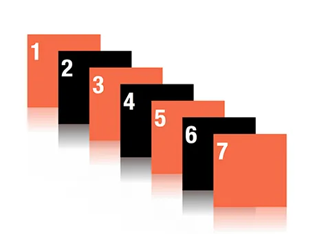
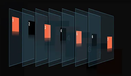
Despite my 10,000 hours of PowerPoint I never bothered to push the re-order objects button in the arrange menu (Mac). Hey, and out came a nice interface to make things to the front or to the back of the slide.
Last week I did my presentation design workshop to this year’s class of MEET (more details in an earlier post) in Jerusalem. I used grown-up stuff for these 15-16 year olds, a slightly modified version of my deck about investor and sales presentations designed for a senior managers. The results surprised me.
Despite being a 09:30am speaker (teenagers do not get a lot of sleep when they stay away from home in a large group), 95% of eyes were hooked on me (5% were deeply a sleep). In my usual audiences I rarely find someone really sleeping, but there are a lot more people distracted, even if your story is interesting.

Afterwards, I coached the students in the design of the pitch presentation of their ideas. It was interesting to see how these kids were sponges of ideas: the presentations were stitched together over the course of 3 hours and often looked better than finalized version 1s of pitch decks that clients sent me at the start of a project. The new generation has not been programmed by overhead transparencies and Microsoft PowerPoint bullet point templates, but is ready to try a fresh approach to design.
Teaching to present your ideas should be introduced in education much earlier than it is today.
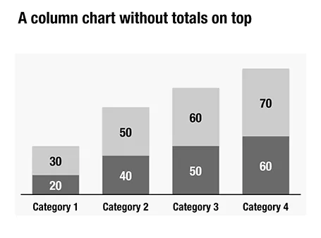
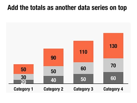
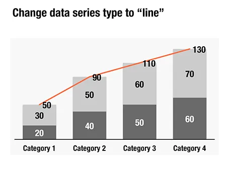
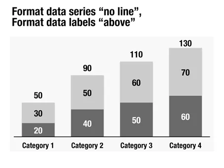
Here is a little trick to create automatic totals on top of column charts. This is an alternative to placing text labels manually, and especially useful when the data in the column charts is changing frequently.
An A-Z of Visual Ideas: How to Solve Any Creative Brief (affiliate link) by John Ingledew, aims to help you solve visual creative deadlock. Organized in 26 sections following the letters of the alphabet, it introduces a number of concepts that you can use as the basis of your design. Examples: counter-intuition, eyes, juxtaposition, and zeitgeist.

It is written more with advertising or poster design in mind, but still it can help you broaden your creative mind with the concepts provided in the book, or by encouraging to think out of the (visual) box yourself.
Sometimes there is little time to do your pitch. You meet an investor in the corridor, you got a slot at a pitch competition. Seth Godin said the other day that no one has ever bought anything in an elevator: in other words a very short elevator pitch consisting of 2 sentences with hollow buzz words is not going to excite an investor.
Instead, you need to add more specifics to intrigue the investor to invite you to another occasion where there is more time to discuss your idea.
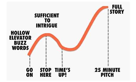
But sometimes, elevator pitches become less effective when you take too much time. You start adding details, provide facts, that take the energy out of your presentation, that require time to close all all the plot lines. There is a dip between the perfect short pitch, and the full-length 25 minute story. Do not get stopped in the middle, it is better to keep it short.
A room that is too warm will put your audience to sleep, even when you have the most exciting presentation in the world. Climate control is one more thing to add to the pre-presentation technology check list.
The other day a client showed me a pitch deck that a management consulting firm had prepared for them. Having been a consultant myself, I recognized it immediately: structured, organized, logical, dense. Great to solve a problem and/or convince an analytical audience with lots of facts.
Not good enough to make the sale: a good sales presentations needs to touch both the heart and the mind. Consulting presentations touch the latter, not the first.
Instead, put the consulting deck aside and start from scratch. What is the story you would like to tell? Sketch visuals without borrowing / Frankensteining / recycling charts from the consulting presentation.