SlideMagic Blog

Frequent updates about all things presentations since 2008. Subscribe to never miss a post.

RSS
all posts

Category PowerPoint

·Design

Chart concept - the audience as the patient

Some images can literally make the audience feel that they are the patient. Suffering, helpless. Other variations on the theme: a dentist with a buzzing drill, or less medical, someone “zapping” you away to another channel with a television remote control.

Image via BigStockPhoto. The good thing about a medical picture is that the most of the faces of the models in the image are covered, hiding that this is not a “real” image.

Update, here a version of the remote control image:

·Design

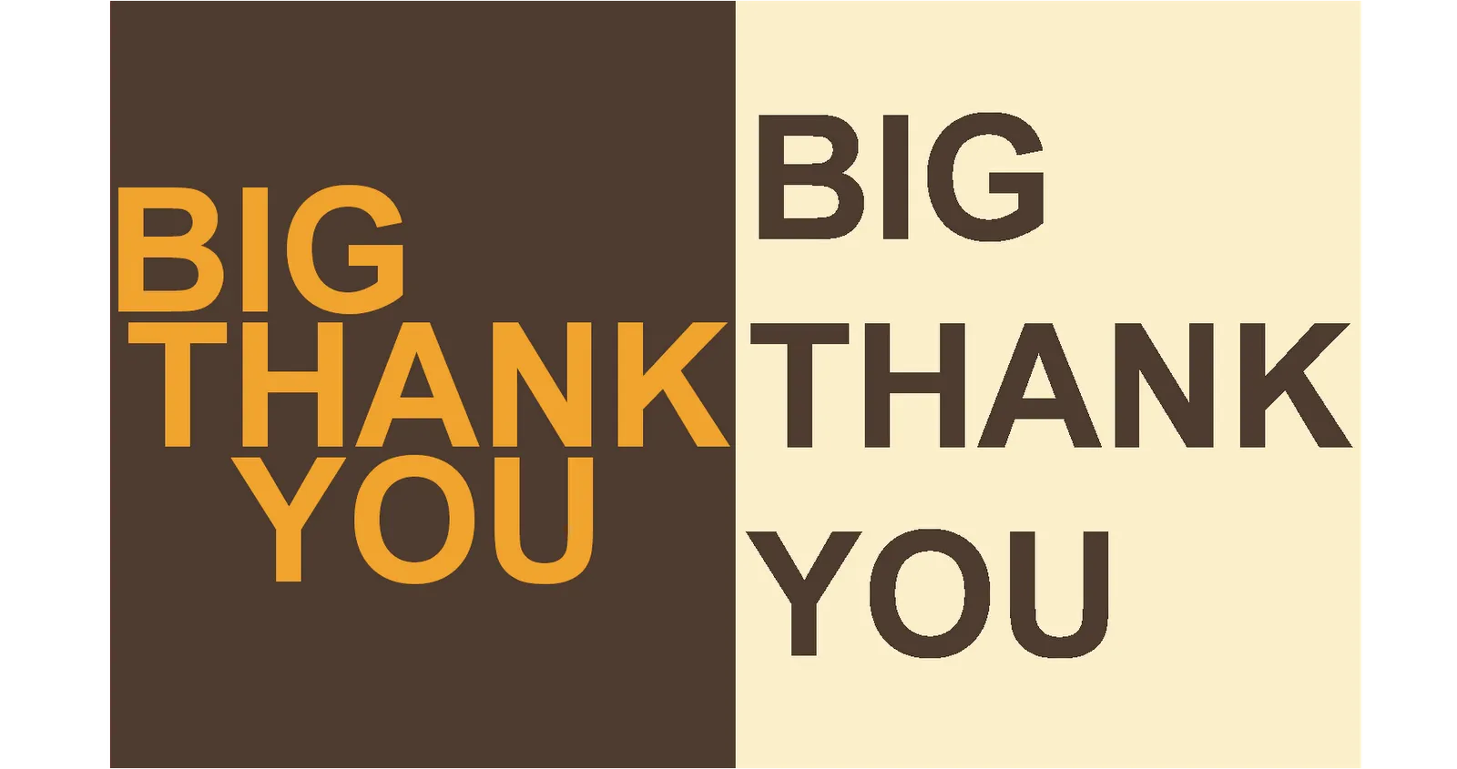
Experiment with typography - slice up those paragraphs

Typography is a major under-utilized tool in PowerPoint. On the right a standard PowerPoint display of a large 100pt text. Wide distances between lines, not very interesting. On the left, I cut it up in 3 pieces and started to re-align characters vertically. I am only starting to learn.

·PowerPoint

Remote presentation tool: Dimdim - the best one around?

I need to host an international web-based PowerPoint presentation and I searched around to find Dimdim.

  • It’s free for meetings up to 20 people.
  • Neither the host, nor the participant needs to install any software on his/her computer.
  • And it’s open source.

Sounds great. Does anyone have experience with this tool, or alternatives? In any case I will report back.

·Design

The problem with design and computers

I just watched this entertaining TED presentation by John Maeda, president of the Rhode Island School of Design, reflecting on his career as a designer (more information about him in the linked TED post).

The most interesting bit comes mid-way in the presentation. John shows a video how he orchestrates an excercise where people need to get other people to draw things on white board using their “voice commands”. After some miscommunications the groups starts designing a coordinate or grid system (similar to a PowerPoint canvas). The maximum output of the excercise was a completely boring, 2-dimensional drawing of a house.

I often feel the same. How to make this 3D composition? How to add quality hand-drawing or artwork? How blend different images? Computer constraints determine the majority of my slide designs. Something is still missing in the human-computer interface.

·Design

Make big things look huge by adding something small

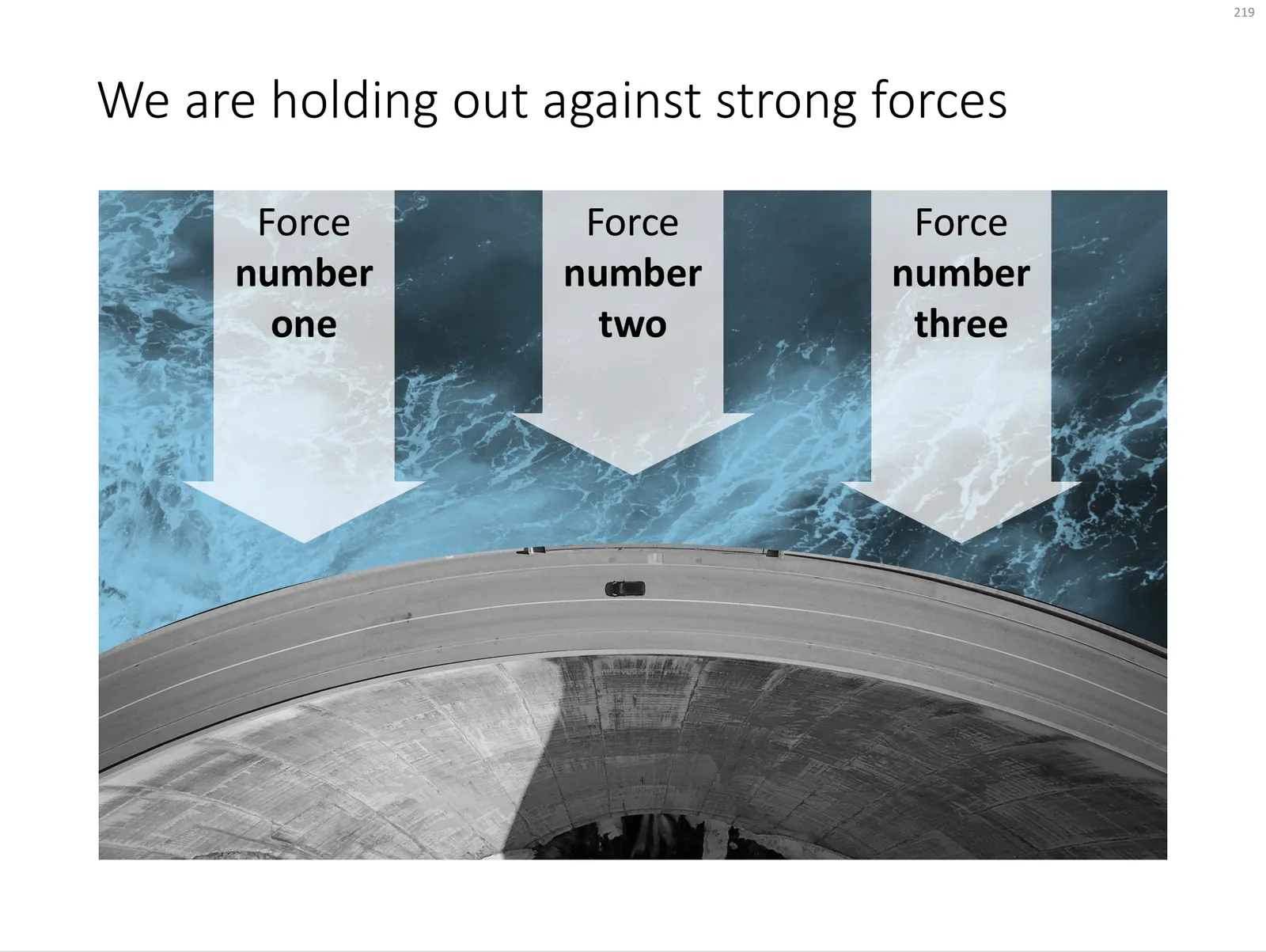
The 2 tiny people, and their 2 tiny shadows make the whole dam look huge. You probably remember your highschool physics teacher explain: “if the nucleus of an atom is a strawberry, its electrons would be flying around the football field”.

Something to think about when making your next slide composition. Image purchased from iStockPhoto

UPDATE: I have now added a chart concept featuring a dam in the SlideMagic template store, you can download it here.

 A PowerPoint slide template featuring a dam

A PowerPoint slide template featuring a dam

·Design

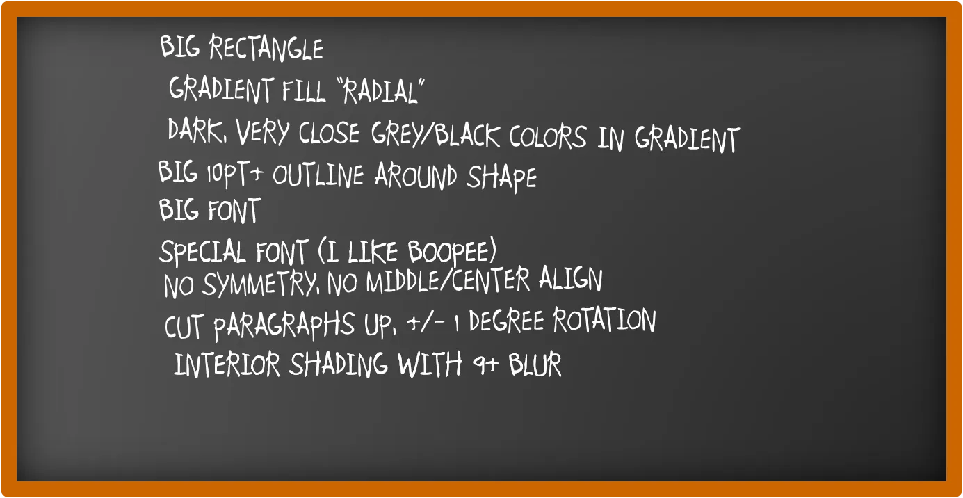
How to recreate a realistic looking chalk board in PowerPoint

After graffiti, now the less permanent graphics of the chalk board. I scribbled some suggestions on a black board below (click image for a larger picture):

Now that we are on the subject, check out my favorite Bart Simpson chalkboard generator as well.

·Advertising

So hard to do - "real" art in PowerPoint

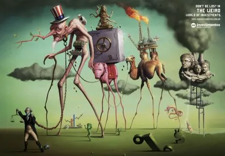
PowerPoint effects, PhotoShop, and a bit of typography/fonts enable an amateur to create PowerPoint slides that start approaching the capabilities of a graphics professional. Not so fast.

This ad for a financial services firm shows that good artwork cannot (yet) be matched by a PowerPoint slide.

  • Taking someone like Dali as the inspiriation for a slide
  • Creating the characters and the elaborate backgrounds
  • Insert the detail and small “jokes”

You immediately “get” this ad. Another one I took from Ads of the World (larger image here).

·Design

Squeezing more text inside a PowerPoint shape

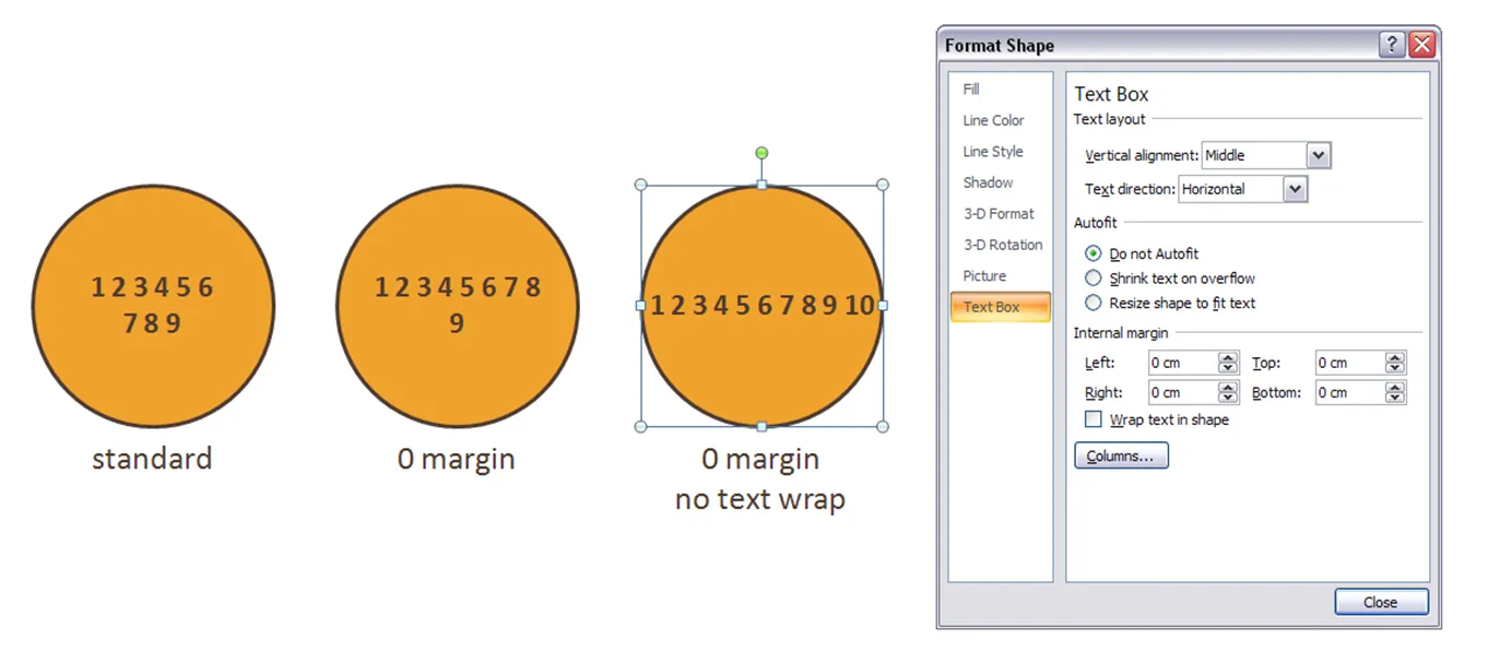
Circles are beautiful shapes to work with. Unfortunately, PowerPoint’s standard settings make it hard to fit in text. To get a bit more space, got to “format shape”->“text box”:

  • Set the internal margin to zero
  • Switch off automatic word wrap

·Design

Symmetrical shapes - hold shift while drawing

Symmetry should be avoided in slide layout. Symmetry in shapes on the other hand is beautiful. Hold-down shift while drawing to create a shape with equal hight and width, and in the “size ribbon” click the box to lock the aspect ratio.

·Design

Almost all presentation bloggers are introverts

A little fun on January 1. I ran the typealyzer test on a number of presentation, speaking and communication blogs tonight.

In case you are unfamiliar with Myers Brigs personality types, you can catch up here, and do a test here.

ISTP - “Mechanics”

Me (!!!) [a bit different from my test results]

Slide:ology

Speaking about presenting

Breaking Murphy’s Law

Speak Schmeak

ISTJ - “Duty fullfillers”

David Padani

Xplane

INTP - “Thinkers”

Presentation Zen

Bert Decker

Guy Kawasaki

Mike Pulsifer

INTJ - “Scientists”

Seth Godin

PowerPoint Ninja

All of these great communicators are introverts? And now for the only extrovert in the pack:

ENTP - “Visionaires”

Empoweryourpoint

It is great to have so many excellent presentation blogs around. I am looking forward to exchanging ideas with you in the new year.