SlideMagic Blog

Frequent updates about all things presentations since 2008. Subscribe to never miss a post.

RSS
all posts

Category Layout

·Keynote

The 2-line slide heading

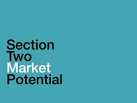
In some presentations, I use a template with a 2-line slide title, giving me more screen real estate to spell the key message of a chart. The format is very similar to exhibits I drew at McKinsey, where the message of the slide was written in a paragraph that could span 2-3 lines of text in point 12 font above the chart headline.

When to experiment with this format? Smaller audiences, lots of complicated data charts, chart messages with nuances that are hard to capture in a newspaper-style article heading.

Oh, and when you use the longer headlines, there is not reason to re-write that same sentence in a big bubble or box on the right of the chart.
·Keynote

A good PowerPoint template

I just gave a client some feedback on new PowerPoint template options, I might as well share my thoughts with all of you:

  • Flat: no drop shadows behind fints, no gradients, no reflections. These look dirty in a world of razor sharp retina displays
  • Out with the subtle waves and watermarks, they 1) make slides hard to read and interfere with the slide design and 2) make your presentation look like 2003
  • Lighter fonts: there is no need to scream to get your point across. Keep a lot of white space around the slide title.
  • If you have to put a logo on each slide, put it at the bottom right, not top right (or even left), you want to leave the maximum space for the slide title.
  • The client spent a lot of time on the cover page, but my suggestion is to worry about it last.
  • Design your template around a real presentation rather than empty pages.
·Keynote

Flat design: good news for you

Flat design is the big trend in graphic design at the moment, and it is great news for the layman designer. You can stop worrying about what you thought were “sophisticated” graphics: 3D, drop shadows, gradients, reflections.

Take the Microsoft approach for example: blacks and greys, one bright accent color, tiles spaced out in a grid, thin font, sharp edges. Perfect for a presentation look and very easy to replicate. Resist the temptation to make it “sophisticated” again…

If you are interested in the Microsoft design revamp, here is a 45 minute video that provides a look in the kitchen:

·Investor presentation

Add a face to an endorsement

The common way to present people that endorse you is a bullet point list of names and titles. Make that much more powerful by changing that to a mosaic of faces. Avoid the uniform conference-speaker-headshot-gallery, rather:

  • Use different image formats (B&W-color, suit-jeans, etc.)
  • Use a different aspect ratio than the 3:2 passport picture (landscape for example)
  • Use action shots (people presenting standing on stage)

Now this makes for a much more dynamic visualisation of the people who support you.

·Art

Table with fat lines

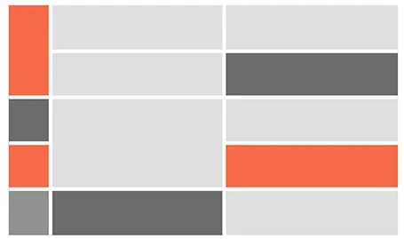
For boxy charts, I find it very convenient to use tables as the basic organising structure. Use big fat lines to separate the cells. In this way, it is easy to add, delete cells, combine, and split them. The Mondriaan look.

·Data visualization

Infographic overload

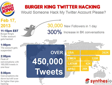
This infographic by Synthesio about the positive side effects of the Burger King Twitter hack is a good example of what - in my opinion - is often wrong with infographics: too much noise (facts, breakdowns, inconsistent graphics), not enough signal.

A better visualisation would be a simple time line at the top, below that a horizontal bar with the Burger King logo, followed by a horizontal bar with the McDonald’s logo, below that one stat (maybe number of mentions). This shows that as soon as the logo flips, traffic goes through the roof.

·Keynote

Design inspiration

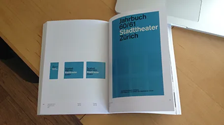
See how easy it is to use a classic design into a beautiful presentation template. A 1962 brochure designed by Josef Mueller-Brockmann (read more about him in this book), image of the girls by H-Huynh.

·Keynote

Stepping back

In the heat of the design process it is easy to let go of your ambition to design beautiful slides. Take a break, flip through a design coffee table book, and remember why work by great graphics designers looks so great.

  • White space, even if that means smaller font size
  • Custom fonts (if technology allows it)
  • Font weights (very thin, very heavy)
  • Font color (black, grey shades)
  • Words per line, where to break a line
  • Positioning of text on the canvas
  • Artistic, subtle, instead of blunt photography
  • Minimal use of colours
  • Leading between lines
  • Take it easy on drop shadows, gradients, and reflections

Nothing is rocket science here, just trying, and trying, until you have found out why it somehow does not look right…

·Advertising

Cover those ads

Screen shots of news articles are useful to give your audience a sense of the sign of the times. To make them look more interesting, I reduce the zoom of the screen to get a nice long, vertical shot of the article with the headline and the newspaper logo still readable. On a page with a non-white background, I title it a bit and cover and distracting ads or facebook and Twitter buttons with a white box.

·Advertising

Anticipation

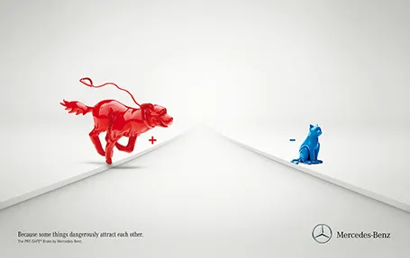
Most of the time, it is more powerful to show events that are about to happen rather than the event itself. It is very well done in the ad below for an automatic braking system that anticipates the movement of objects on the road. It brings great tension to the visual, almost making the still image move.

Commenters on Ads of the World were less enthusiastic though. Maybe the plusses and minuses should have been made a bit bigger. And well, if there is something wrong with the chart, it is in its 3D composition. The dog is too close and actually not running towards the cat. But I am probably the only one who bothers about that…