SlideMagic Blog

Frequent updates about all things presentations since 2008. Subscribe to never miss a post.

RSS
all posts

Category Layout

·Layout

Adding structure to text

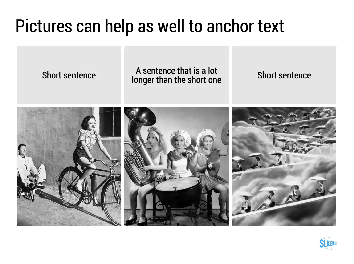
Sentences or titles never have the same length, so putting them on a page without some form of framing makes the whole slide look unbalanced. My solution: a light grey background  creates a box that gives structure to the text. You can also use images to reinforce the slide’s grid layout. Many people use an outline, a frame around text for the same purpose. I think a light box fill looks a lot better.
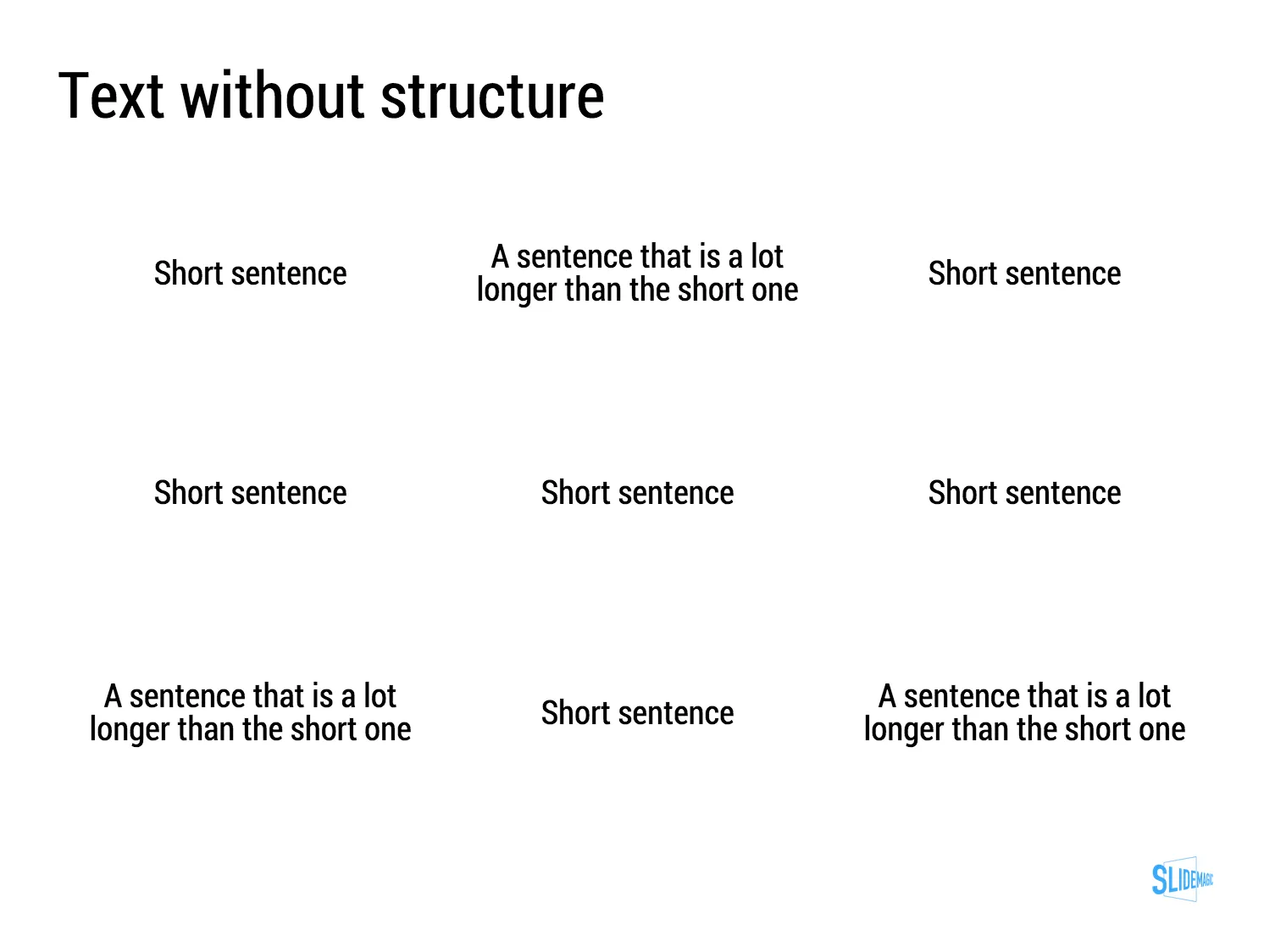
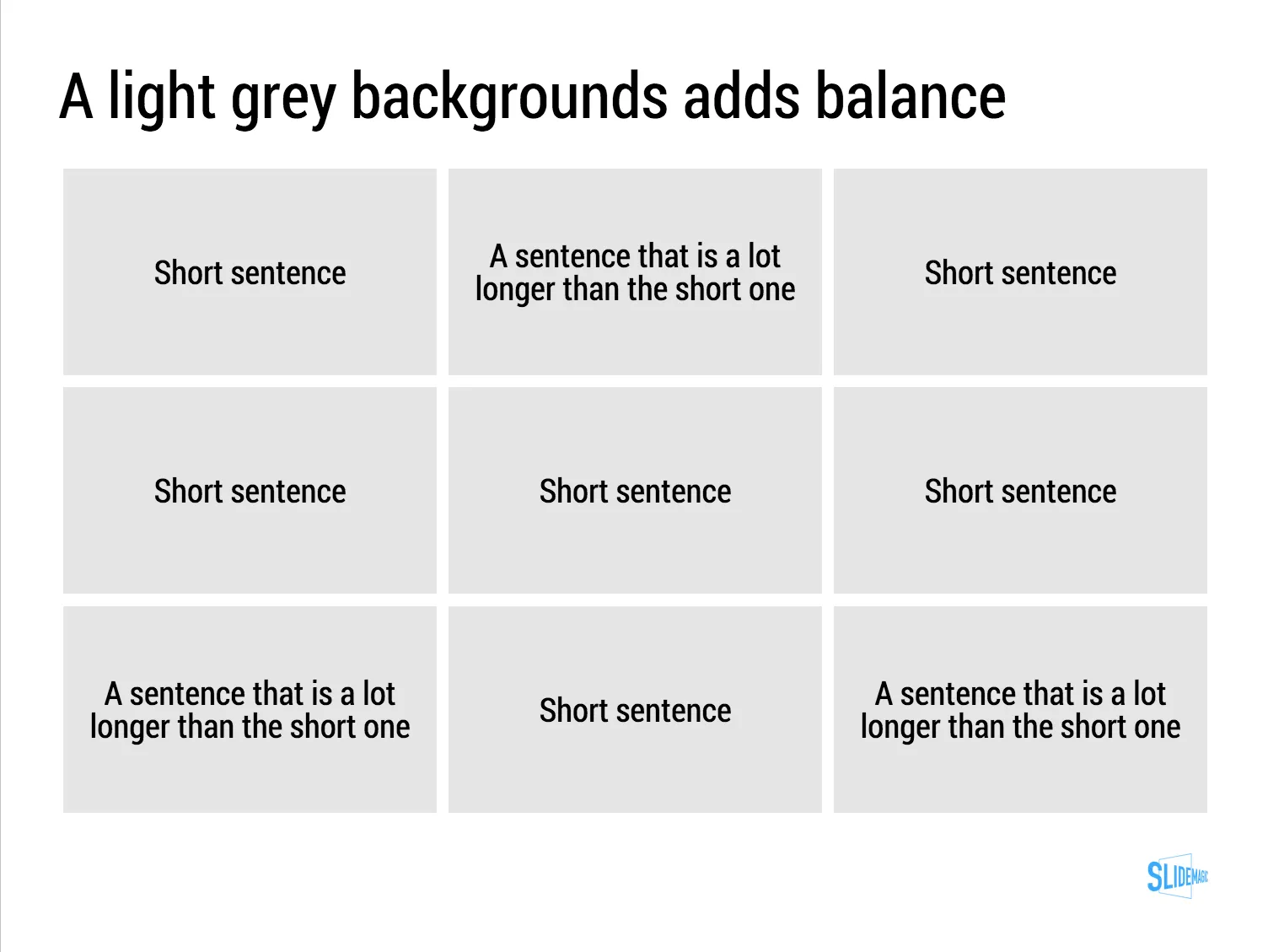
The light grey box is one of the key structuring elements in my presentation design app SlideMagic. Traditional presentation design software is not very well set up to changing grids of text boxes and images. Try doing it in PowerPoint, then try to do the same thing in SlideMagic.

Art: Piet Mondriaan, Broadway Boogie Woogie, 1942
·Investor presentation

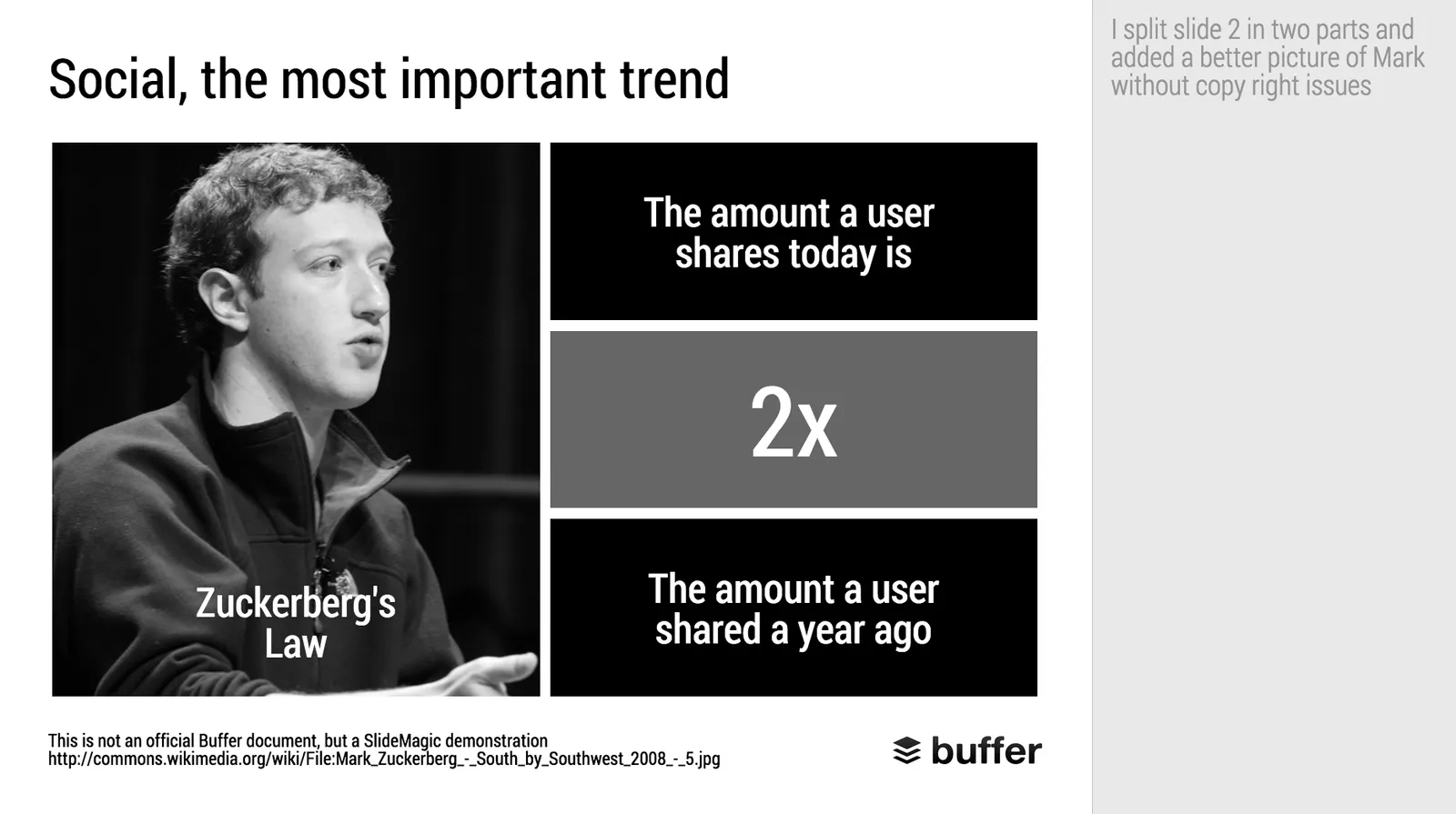
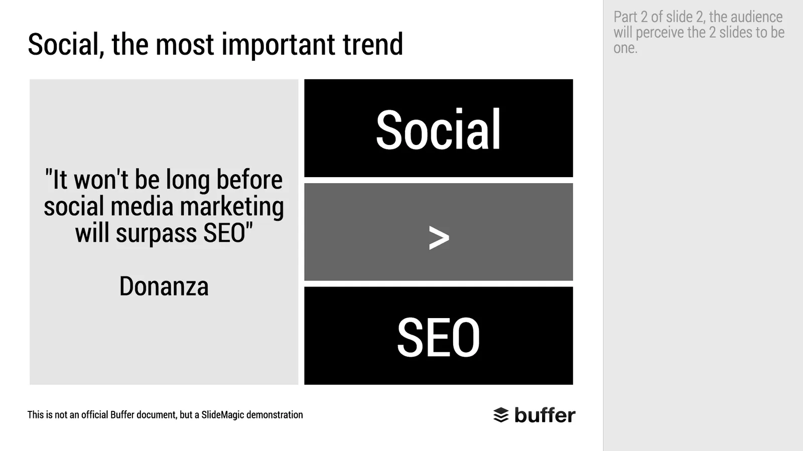
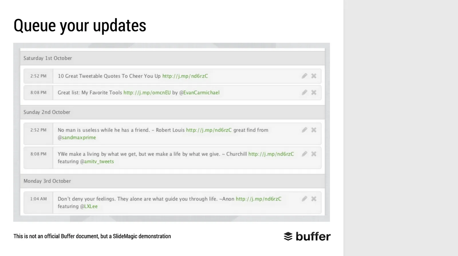
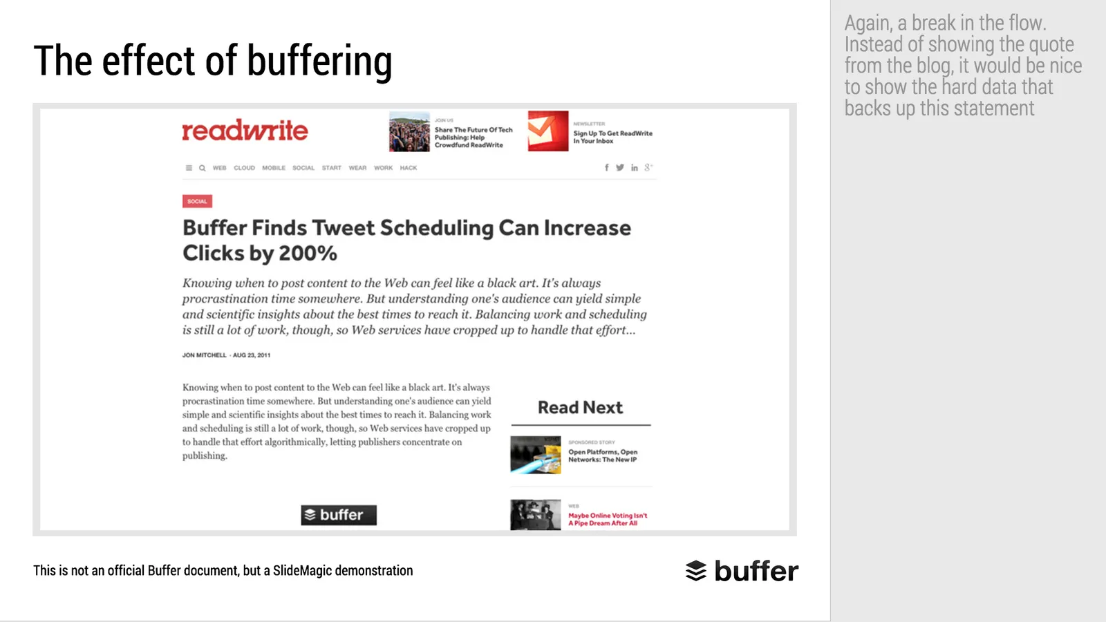
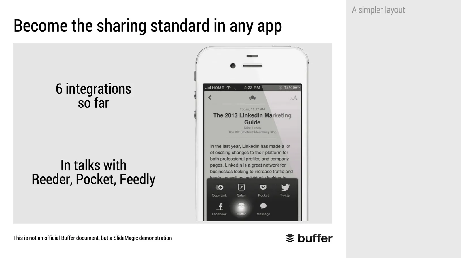
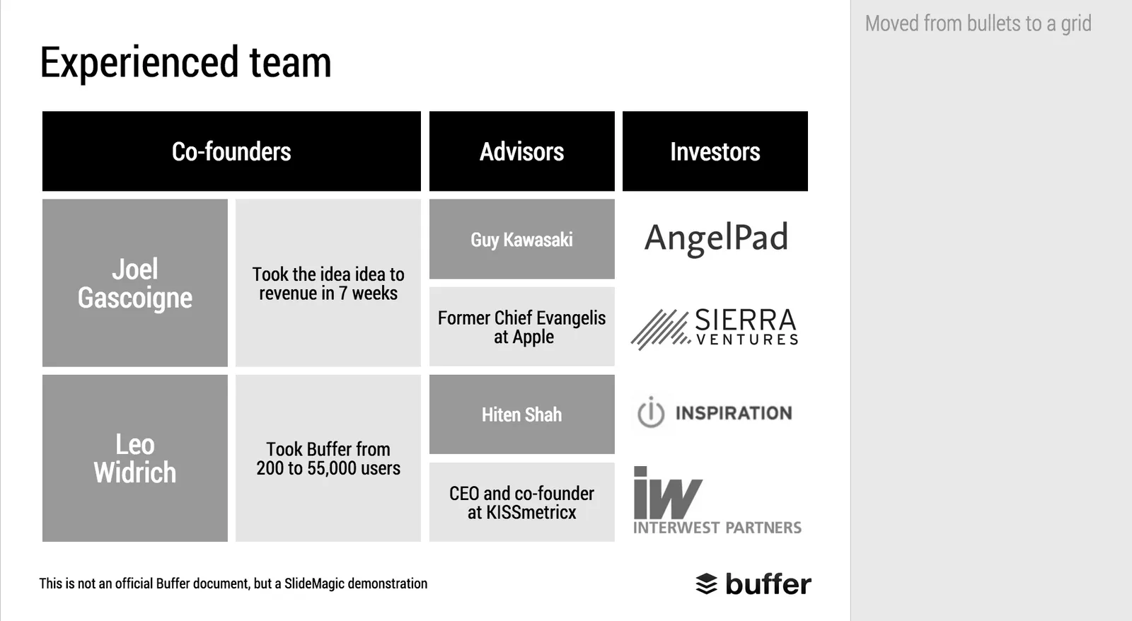
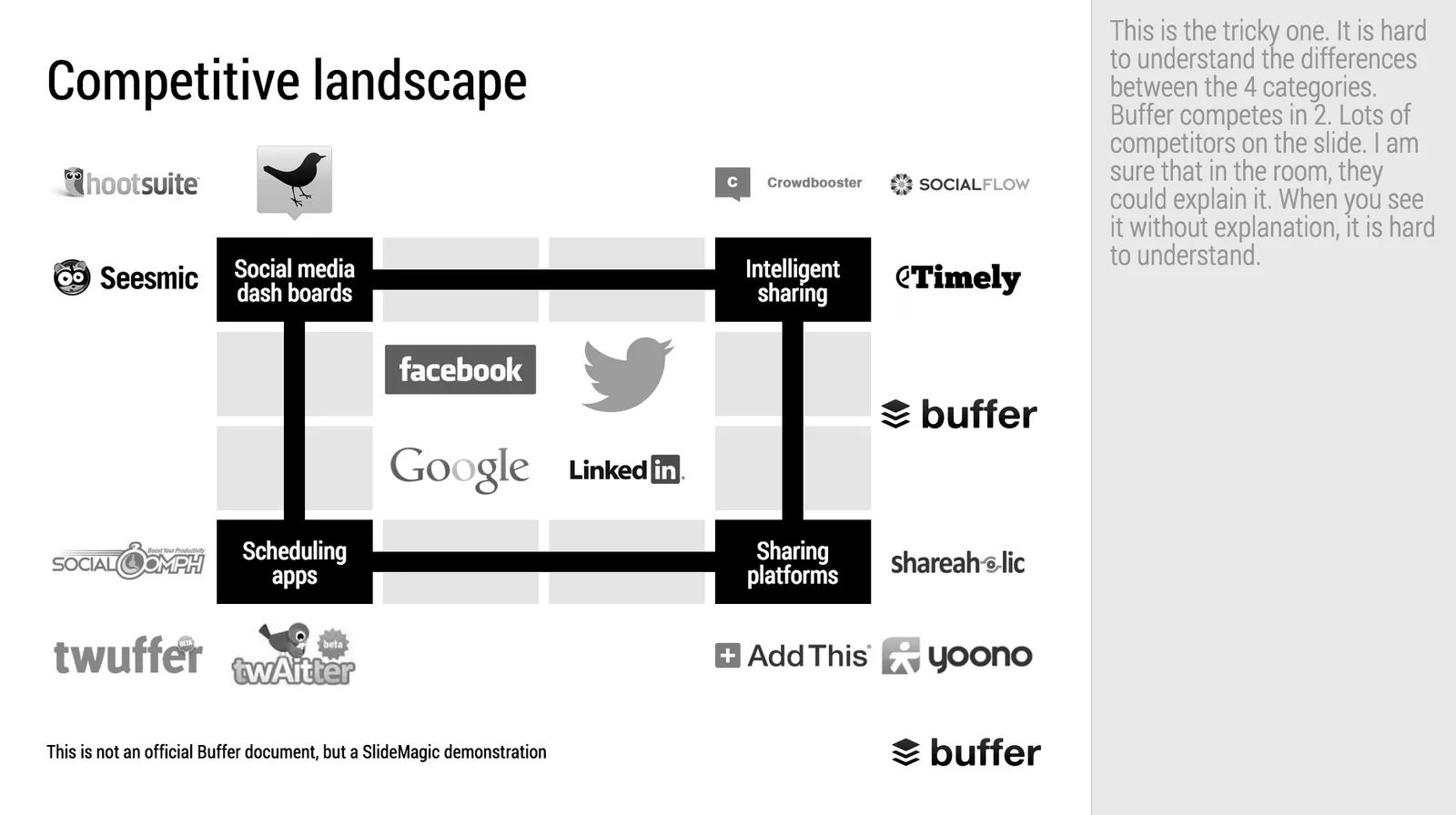
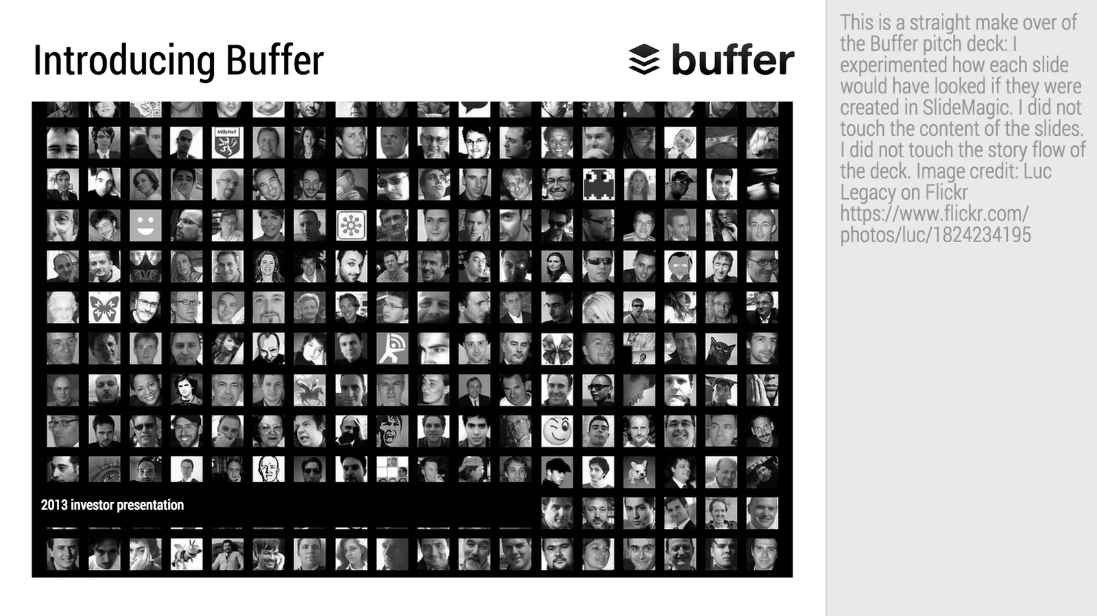
Makeover of the Buffer pitch deck that landed them $500k

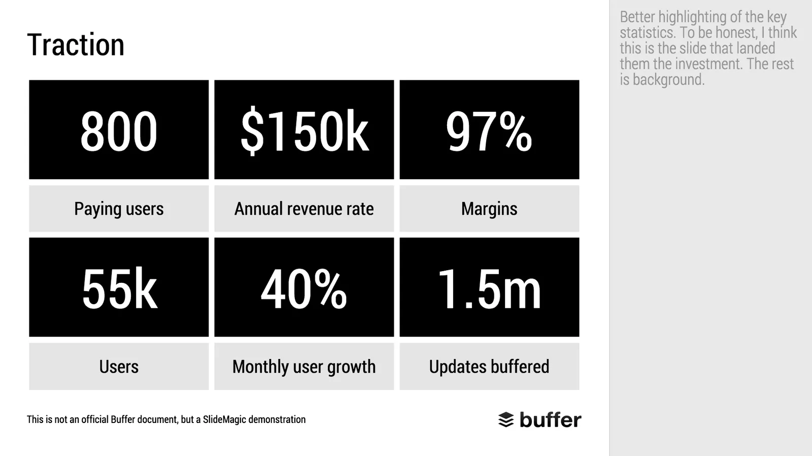
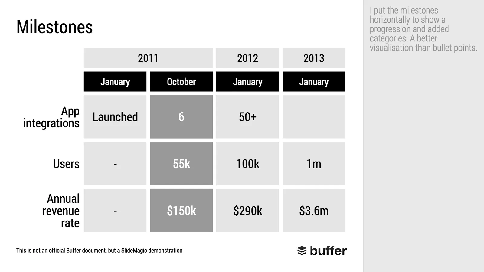
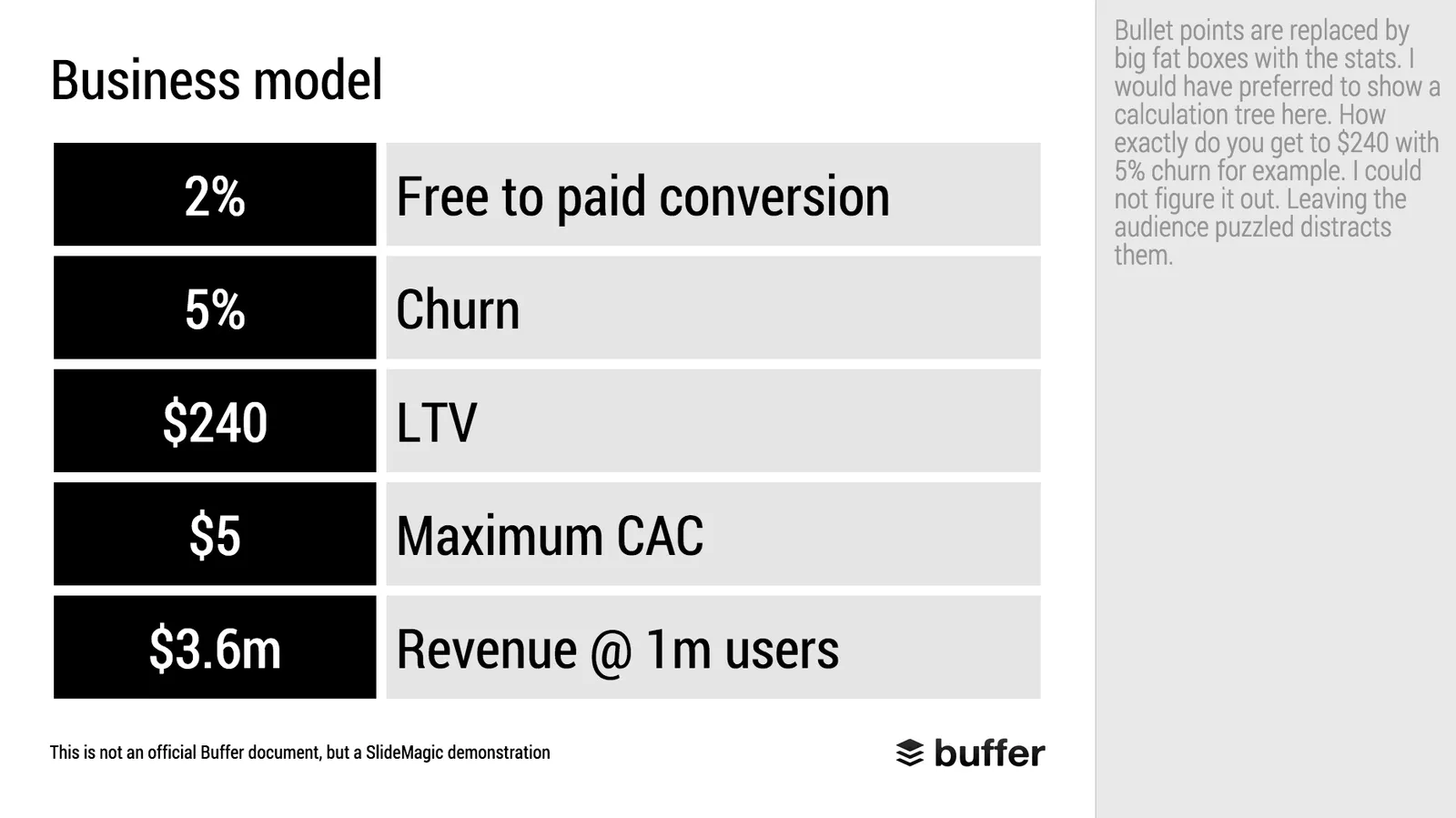
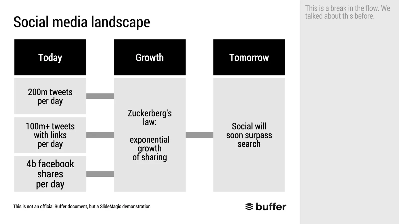
When Googling for examples of VC pitch decks, the on that Buffer used to raise $500k in 2013 ranks high. I decided to give it the SlideMagic treatment: how would the deck have looked when the slides would have been created in SlideMagic.

  • I changed the slide design to fit SlideMagic
  • I did not change the slide content
  • I did not change the story flow

I have a few comments on the slides that I have put in the SlideMagic explanation boxes.

Here is the original:

Here is the same deck in SlideMagic. You can clone this presentation to your own SlideMagic account by **clicking this link**and use some of the slide concepts in your own presentations. I have also added this presentation as a template in SlideMagic’s template library.

Art: Johann Zoffany paints a group of Englishmen in Rome for the Grand Tour, united only by their wealth and love of art; unlike most conversation pieces, this was not a commissioned work

·Layout

"All presentations will look the same"

I get this feedback from early SlideMagic beta testers. SlideMagic supports one accent colour, one font, and encourages you to work in a strict slide layout grid. For certain presentations, this feedback is valid. I think we will not see any Apple product launch presentations designed in SlideMagic (yet).

For 99% of presentations though, it is actually precisely what I tried to achieve:

  • When the software tool you use for presentations is incredibly simple, you spend most of your time worrying about the content rather than searching support web sites how to align the second line of a bullet point paragraph. I want 90% of SlideMagic users to master 100% of its features.
  • If all presentations use more or less the same visual concepts to show trade offs, contrasts, sales over time, etc. then people will be able to read and understand them quicker

Today, I would argue that PowerPoint presentations look more similar to each other than the SlideMagic decks: lists of bullet points on a white background using the standard Microsoft Office (olive, blue, red, green) colour scheme.

Below are examples how the same SlideMagic chart would look when used in different companies. You see the impact of consistent use of colours. All SlideMagic charts will be updated instantly after a colour and logo change.

If you want to try SlideMagic for yourself, you can sign up here as a beta user.

Art: Salomon de Bray, The Twins Clara and Aelbert de Bray, 1646

·Layout

Slide icons

Repeating the whole story of your presentation on the last slide is boring. You want to end with a “boom” and quickly remind people of the most important message in the presentation. I usually do that with repeating a key visual (just one). Using (the cliche) that a picture says more than a 1,000 words, the repeated image brings back the full richness of the discussion you had in one millisecond. Much more efficient than writing a bullet point.

If you have to repeat multiple messages, here is another trick: use small screen shots of slides. At the end, the audience does not need to be able to read the entire slide anymore. The thumbnail is a quick visual reminder of the content. Below an example that I created in SlideMagic.

I have added this slide design to the template file of all slides I created for the blog. You can open it in the SlideMagic app here and use it for your own designs. Just change the images.

Art: The Flute Concert of Sanssouci by Adolph Menzel, 1852, depicts Frederick playing the flute in his music room at SanssouciC. P. E. Bach accompanies him on the harpsichord.

·Layout

Fancy management theory

Your Group CEO has asked you to present her your strategy for the next 3 years. While you have a pretty good idea what you want to do, you are not sure how to present it on slides. You call in the Internet to the rescue and Google delivers an endless stream of Harvard, McKinsey, and other management gurus’ perspectives of what a strategy should contain.

The problem is when you put it on a slide, your strategy sounds like a page out of a management theory book. All is in there: visions, missions, governance, change management, stakeholder involvement. In the middle of all the buzzwords it is hard to find your own story.

The other way to present it? Do not use the frameworks to tell the big idea behind your strategy. Tell it in your own way. Once you have done that, use the fancy frameworks as a check list to compare your full strategic plan against. Have you thought about everything?

Frameworks are great for work planning, not for making convincing presentations.

Art: Nicolas de Largillierre, (Details of artist on Google Art Project), Portrait of a Boy in Fancy Dress, 1710. Sign up for SlideMagic, subscribe to this blog, follow on Twitter.

·Layout

2x2 matrix clarity in presentations

The 2x2 matrix is a favourite layout for differentiating yourself from others. 'We, the good guys, are in the top right corner".

But people sometime force the framework somewhat. If you are having trouble filling the bottom left box, consider using a Venn diagram (a “best of both worlds concept”).

If it is going to be a 2x2 matrix and your axis choice is a bit tricky, write things out in full. Rather than “ease of deployment, low, high” consider ignoring the axis name and write the 2 categories: “Big system integration project”, “Up and running in 5 minutes”. You can also write explicitly in the 4 boxes what they are about (BCG did that with their brand matrix: “dogs, cows, stars, question marks”)

Framework in pitch presentation are different from those in a micro economics Phd thesis.

UPDATE January 2018: we have now added 2x2 presentation templates to the SlideMagic template store.

Art: Peterka Vlada, Sunset at Liberty Square, Oil on canvas, 40x28 inches ( 100x70 cm ), 2012 Subscribe to this blog, follow me on Twitter

·Layout

The final clean up

Some things to check once you think you have finished your presentation:

  • Are the fonts consistent throughout the presentation? Are have default Arials/Calibris managed to sneak in?
  • Are font sizes in comparable boxes the same?
  • Are the headlines all in the same place on every slide?
  • Are objects in each slide aligned, and properly distributed?
  • Are the proper colours used on every slide, including data charts, or do you still see standard PowerPoint colours anywhere?
  • Are all images in the proper aspect ratio, without distortion?
  • Did you include an attribution to creative common images?
  • In case you will be displaying the presentation on another computer, have you checked Windows/Mac rendering issues? Sometimes fonts are rendered in slightly different sizes, causing words to drop to the second line.
  • Is data properly rounded up?

Now you see why SlideMagic has 1 font, 1 accent colour, and a strict grid that makes it impossible to misalign objects or put titles in the wrong places.

Art: Berthe Morisot, Hanging the Laundry out to Dry, 1875 Subscribe to this blog, follow me on Twitter

·Layout

Squarespace versus wix

There are two popular web site template providers: squarespace and wix. I like to think of presentation design software SlideMagic as “squarespace for presentations”. Many other PowerPoint alternatives (such as prezi) are “wix for presentations”. What is the difference?

  • Wix offers a lot of features, colours, fonts, pre-programmed templates for specific sectors (vets and pets for example)
  • Squarespace is muted, has far fewer choices, fewer colours, bells & whistles.

The great thing is that the design restrictions of squarespace actually result in better web designs. People have to think how (whether) to put that content on the page. A professional designer will pick a style and restrict herself to stay in that framework. That is why it looks so good. The layman designer cannot resist to add more stuff. Squarespace and SlideMagic protect the non-designer from herself.

P.S. Squarespace powers the SlideMagic landing pages and blog.

Art: The Stadhuis under construction, by Johannes Lingelbach, 1656 Subscribe to this blog, follow me on Twitter

·SlideMagic

The catch up slide

Here is a concept that you can use in many investor and/or sales pitches for technology:

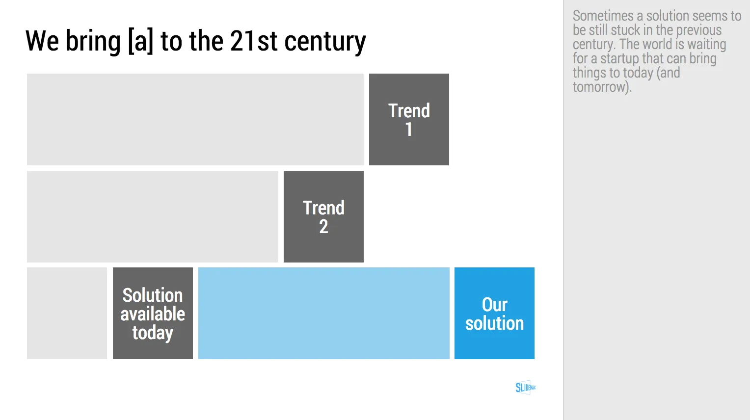
While [a] and [b] have moved on, [c] is still pretty much stuck in the 1950s despite a lot of technological development. Our company is going to fix that.

I have added a slide to the SlideMagic startup pitch template library that reflects this idea, Two “arrows” moving to the right, and a third one which is catching up. Look at the simplicity of the graphics which exactly fits the philosophy of SlideMagic. It looks pretty, it gets the message across, is easy to design. A new business language that does not need arrows, drop shadows, and gradients. It is almost a Lego-like abstractification (is that a word?) of a complex visual.

Art: Le derby d’Epsom, painting by Théodore Géricault, 1821 Subscribe to this blog, follow me on Twitter

·Layout

Learning from Swiss graphic designers

Most presentation design software today is the result of someone in the 1980s thinking: “hey, this mouse is cool, you can use it to draw things!”. We can move, drag, stretch, place things freely across our drawing canvas.

Presentation software SlideMagic aims to close this tangent and go back 20 years earlier to the 1960s when graphics designers in Switzerland developed a clean and crisp style of communication and design that does in many cases the exact opposite of the freedom the mouse offers: tight grids, limited font choices, limited colours. simple shapes.

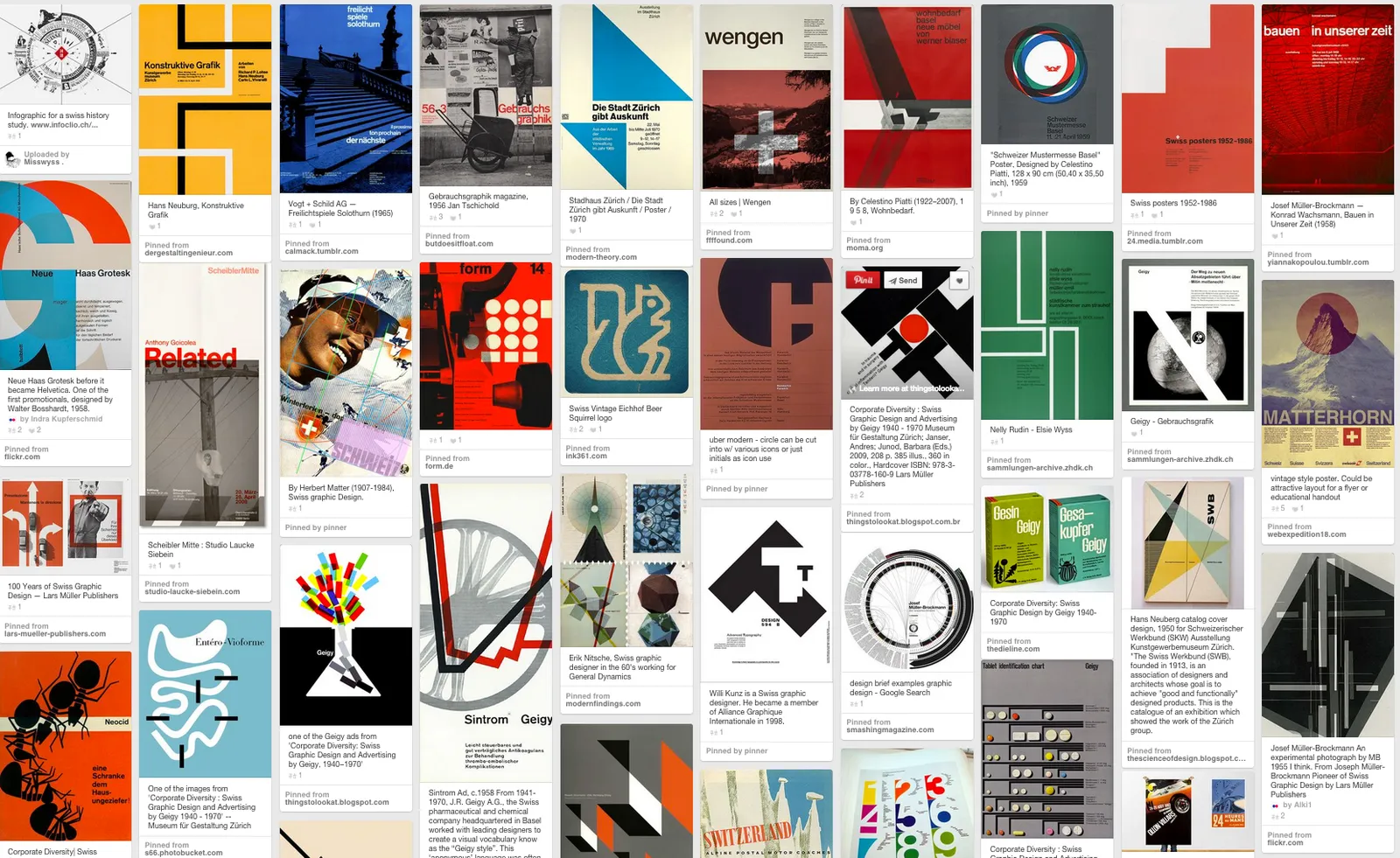
Eyeball the posters on this Pinterest board by Misswyss and see what you can learn form them for your own designs. Which one do you like? Which one does a better job at communicating than others? Why is it that some of these very simple designs look very pretty?

 Examples of posters designed in the Swiss style

Examples of posters designed in the Swiss style

Some of the features they have in common:

  • Limited number of colours
  • Sans serif font (only one)
  • A strict grid alignment throughout the page
  • Relatively small headlines
  • De-emphasising (making things grey) rather than emphasising (making things bold) text
  • Flat shapes, no gradients, drop shadows, textures
  • Big silhouettes, simple shapes

Why not steal some of these ideas in your slide designs?

Art: Albert Anker, The walk to school, 1872, 90 x 150 cm Subscribe to this blog, follow me on Twitter