SlideMagic Blog

Frequent updates about all things presentations since 2008. Subscribe to never miss a post.

RSS
all posts

Category Layout

·Story

What is wrong with your presentation summary page

In every client project, I try to get rid of the dreaded summary page in front of the presentation. Instead, I give a very clear description of what we are actually talking about, and a teaser of what the presentation is going to show.

Here is a check list of things I regularly see on first pages.

  • It is written in font size 8, in looooong sentences that stretch over the screen (especially on 16:9 wide screens)
  • It is an invitation to tell the entire story (too detailed for a summary, but not detailed enough to cover the content correctly)
  • It is written in chronological order, then we did this, then we did that, then we did this, rather than an order that makes sense to the audience
  • The same point / bit of information is repeated multiple times
  • It is loaded with quantitative data, but because of the text format, this data is impossible to understand / relate to each other
  • It contains dry information, and no encouragement what so ever to be excited about the content that is going to follow
  • It is full of values, mission statements, generic trends, buzzwords and other vague concepts that are context, rather than the core of your idea
  • It is full of details (number of employees, founding year, etc.) that are not a crucial part of the “summary” of your story
  • It has sub bullets, and worse bullets that have just 1 sub bullet hanging below it. It uses different font sizes for the main bullets, and the sub bullets. Bullets are not properly intended, (space space space space)

Continue reading →
·Layout

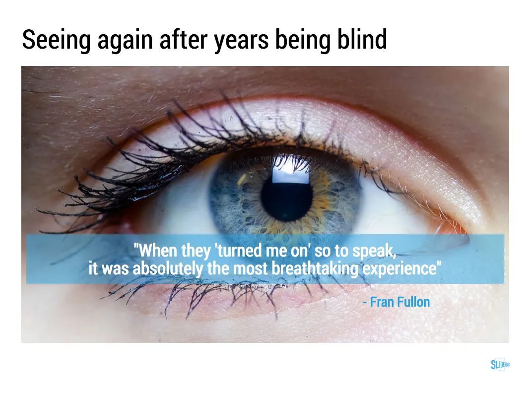
I like to frame images

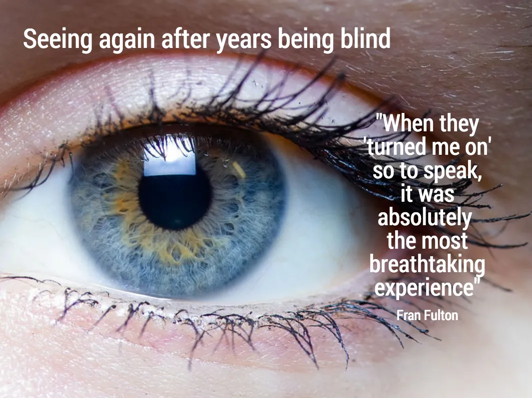
Big, confident images look better on a presentation slide. The maximum size of your image is achieved when you let it “bleed” of the page (the term comes from the age of print, where the ink would drip of the corner).

These full size images look great if your presentation is just images. In most cases, my client work is not. Hence, I prefer to frame my images within a box of white (or black). Some people say it is bad practice, I disagree:

  • You do not have to worry about legibility of slide titles
  • Photo slides look consistent with other slides in the presentation
  • I think, it actually looks very distinguised

My presentation app SlideMagic caters for both formats, so don’t worry if you disagree with me. You can clone the slides below (and all other slides I have used on the blog) into your own SlideMagic presentation via this link.

The image was found on unsplash, free images under a do-whatever-you-want license

·Layout

Lining up logos with tag lines

Often, graphics design is about details. It is difficult to pin down why something just does not look right. The answer: small little things. See the bottom of a magazine ad below. The logos on the left and right have tag lines/sub brands: above on the left, and below on the right. The graphics designer simply centred the image files, but our eyes wants to centre not the entire image, but the main text of the logo. It looks like the logo on the right is positioned too high.

If you cannot get excited by this you should not become a graphics designer…

Illustration: Gemini constellation

·Story

3 steps to a good slide

Here are the basic 3 steps to come to a good presentation slide. And for 2, you do not have to be a stellar designer to get them right. For step 3, you can use my presentation design app SlideMagic)

  1. Decide on one message, one message only. Here is where most people go wrong: they try to put more than one idea on a slide. Too many things to grasp at once, too much content/clutter on the slide. Only if your message is: “There are 15 reasons why you should stop smoking”) might you consider a list of 15 small bullet points.
  2. Decide on a basic slide structure. The only structure most people use is the list. But there are other (simple) ones that you should consider. A contrast (box on the left, box on the right), a ranking (bar chart), an overlap (Venn diagram), pros and cons (table), cause effect. They are not that hard to put on a slide.
  3. Get the design right. Now, here it might be trickier for the layman. Fixing alignment, proportions, grids, colours, white space, etc. etc. SlideMagic users won’t have to worry much about this, for everyone else, here are some of the guidelines I have implemented in SlideMagic:
    1. Everything lines up
    2. Everything lines up according to a grid
    3. Calm colours: one accent, lots of shades of grey
    4. Safe (sans serif) font
    5. Slides look similar in one presentation (positioning of titles, margins, etc.)

There is no reason to get 1. or 2. wrong, and you can learn 3. over time.

Continue reading →
·Layout

Image captions

What do people read in text? Big headlines (if there are not too many of them), and tiny captions under a photo. So watch out what you put right under the image, people might read before the other beautiful things you have written down.

 A screen shot from an  article on TechCrunch

A screen shot from an article on TechCrunch

Art: In 1928-1929, Belgian artist René Magritte painted this piece called The Treachery of Images. Below the image of the pipe he painted the French words for “This is not a pipe.” Photo by Daryl Mitchell on Flicker

·Layout

The web page has become the style guide

A decade ago, a company’s look & feel could be tightly controlled by the corporate communications department, with tight brand guidelines and consistently executed print advertising.

Today that design capability is fragmenting: PowerPoint presentations, product PDFs, web pages, mobile apps. Design is everywhere. Especially in large corporates that span multiple countries/continents it becomes hard to find what the corporate language actually is.

When in doubt, I revert to the corporate web page to get inspiration for a PowerPoint design.

Art: Gerard van Honthorst, The Concert, 1623

·Delivery

Designing presentations for print

In some industry sectors, especially financial services, people still insist on printing the presentation slides and handing out booklets at the start of the meeting. You can have groups of 10-20 people sitting around a conference table flicking through pages.

It is great for taking notes, analysing detailed financials, but it is not that great for a close connection between speaker and audience, and that last minute typo in the name of the CEO cannot be corrected once on paper.

Sometimes you have to pick your battles and if print is the way to go, think about these issues when starting the design of your slides. The bottom line, get a slide to look good on paper on day 1 of the design project, not at 3AM the night before the meeting.

  • Colours appear different on screen than on paper, especially on cheaper, older, or almost-out-of-toner printers. Bright blue can turn into faded grey, lively orange can become girly pink, subtle grey shadings turn into bright white, just to name a few potential problems.
  • Hole punchers for binding machines require extra space at the top of your page, test it.
  • Dark back grounds empty toner cartridges and make make the fingers of your audience black.
  • You can get away with low res images on a 15 year old VGA overhead projector, on paper though, you will get caught. Use high resolution images.
  • A monitor frame, or the light rectangle on a projection screen provide an implicit frame for your slide. Paper should do the same in theory, but A4/letter/4:3 and other issues makes it highly unpredictable how your slides are scaled on paper. In the worst case you might have draw a tiny grey line around your slides to anchor things (yes really).
Continue reading →
·Layout

Team introduction pages are not CVs

The team introduction page in a presentation is always a tricky one. Some much information (text) that can be shown, so many logos, so many pictures. How to make it all fit?

First of all, it is important to realise that team introduction slides do not equal CVs. They are not meant to provide the full background of someone’s career, rather you want to present specific strong points of your team.

Things you can cut: personal interests, not every bio needs to cover every year of someone’s career (unlike HR people that are always on the look out for holes), academic degrees if they are no longer that relevant (i.e., the person is older than 35). Job descriptions usually have very long titles (that makes them look more important). In your team slide, you need to do the opposite cut them down to save space.

Before you design your team introduction page, think about what it needs to say, and plan your design accordingly:

  • We worked at big blue chip companies before: put the logos of the big blue chip companies on the page (and leave other logos out)
  • We worked at the same companies: put the logos of these same companies multiple times on the slide (next to each team member’s name), this repetition will drive the message home
  • We did something really amazing at a company no one has ever heard of: leave the logos out, go for a more elaborate text description
  • We have lots of experience with lots of companies: fill the page with logos, even if they are not that well-known
  • We worked at an amazing company that no one outside country [x] knows: forget about the logo, add explanation about that company
Continue reading →
·Layout

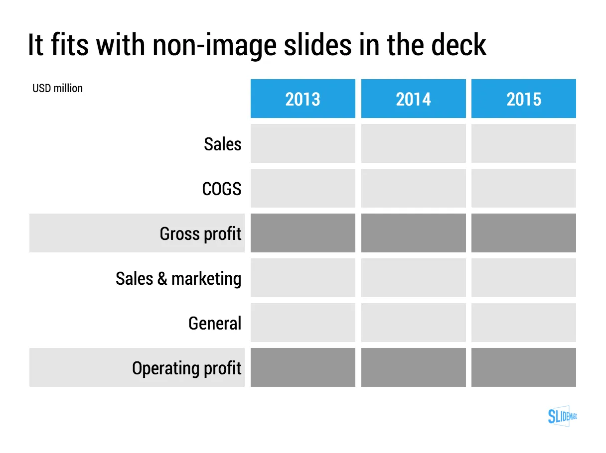
Columns versus rows and other table design issues

When making a table, what to put in columns, what to put in rows? There is no absolute rule here, but this is what I consider when deciding (some of these can contradict each other).

  • It easier to fit lots of rows then lots of columns.
  • Long labels go in rows
  • Year on year trend: years go in columns
  • Feature/competitor comparison: features in the rows

The most important things is that you never should assume that the layout in which the source data was presented to you is the best way to put that table on a slide. Next to swapping rows and columns consider:

  • Shortening column labels
  • Re-sorting rows and columns so that check marks / similar table content is grouped together
  • Group together multiple rows, or multiple columns if their content is the same as the neighbour
  • Cut text as much as you can in table cells. Side comments and sentences can go in the footnote
  • Design a table at 2 levels: Level 1 (using colouring of cells) to communicate the pattern/conclusion, level 2 (using text) the explanation of the colouring for when people read the slides after the presentation
  • Harmonise column widths and row heights to get a grid pattern that is as calm as possible
  • Avoid boxes/outline lines, rather work with light grey boxes

Users of my presentation design app SlideMagic do not have to worry about a lot of these things, the app will do it form them.

Continue reading →
·Images

Putting text on images

This image that I saw on Twitter has composition problems that you often see in presentation slides:

  • The text in the box does not have enough breathing space,
  • The quotation marks disturb the balance and alignment of the text box
  • The line breaks are not placed carefully enough, breaking apart words that belong together.

I tried to come up with an alternative design in SlideMagic (which does not support the giant quotation marks [yet]). You clone these two slides to your own SlideMagic account here and use them in your presentations if you want. Image taken from WikiPedia.

Art: detail of the Mona Lisa