SlideMagic Blog

Frequent updates about all things presentations since 2008. Subscribe to never miss a post.

RSS
all posts

Category Layout

·Images

The cover image that needs to say it all

The cover page of a presentation is an important page. It sits on the projector as the audience walks in the room. It is featured in the thumbnail of an email attachment. It sets the look and feel of your presentation.

Many clients want to have a cover page that says it all. A perfect image that reflects the entire story. In the absence of this image (99% of the cases), they want to do the next best thing: make a collage of smaller images that together tell the story.

I think it is better to pick just one, imperfect, image as a cover page. A collage of tiny images without explanation does not mean anything to the audience, and looks very cluttered. If people could get your message by just looking at a picture collage for 15 seconds, there would be no need for your presentation?

Art: David Teniers, The art collection of Leopold, 1651
Click here to subscribe to the blog

·Data visualization

Design is detail

In management, being detail-oriented is not the behaviour that is considered good. Detail-oriented people get lost in tangents, loose track of the big picture, cannot focus to make decisions. Saying that you are not afraid of detail in a job interview will cost you points.

I think it all depends. Yes, staying stuck in unimportant tangents is not helpful, but when it comes to design, it is all about the detail.

You see this now best in mobile application user interface design. The screen is so small that you need to worry about every button or item you put in front of the user. I personally went through this experience when designing SlideMagic.

But slide design is the same. It is actually helpful to think of your slide as a visual on the screen of a mobile phone. This is sort of the perspective of an audience member who sits in the back row. Everything you put on the slide, everything, should be thought through:

  • What words to use in the text box, can you cut more without losing the meaning, do you need to add more because it is too vague?
  • The rounding of the data
  • The order of the bars in the bar chart
  • The order of the columns and rows in a table
  • Are there duplicate messages? Does a text box say the same thing as the title?
  • Do we need icons, or shall we call customers, well, customers?

All the detail will add up to a great slide that gives the big picture.

Continue reading →
·Keynote

Text on 16:9

Many people think that the wide screen 16:9 format looks modern for presentations, a slide fills the entire LCD screen, rather than being framed by 2 black bars or worse: stretched/distorted while you cannot find the screen remote in the conference room.

There is a problem though. Widescreen was designed with movies in mind. For text it is a disaster. Even at a decent font size, there are too many words on a single line, it is hard to follow for the eye.

Solutions:

  1. Even bigger fonts
  2. Rather than list things vertically, try putting them in boxes that are horizontally spaced out
  3. Stick to 4:3 and find that sticky, dusty, old, remote control in the conference room (look for the ASP button)
·Keynote

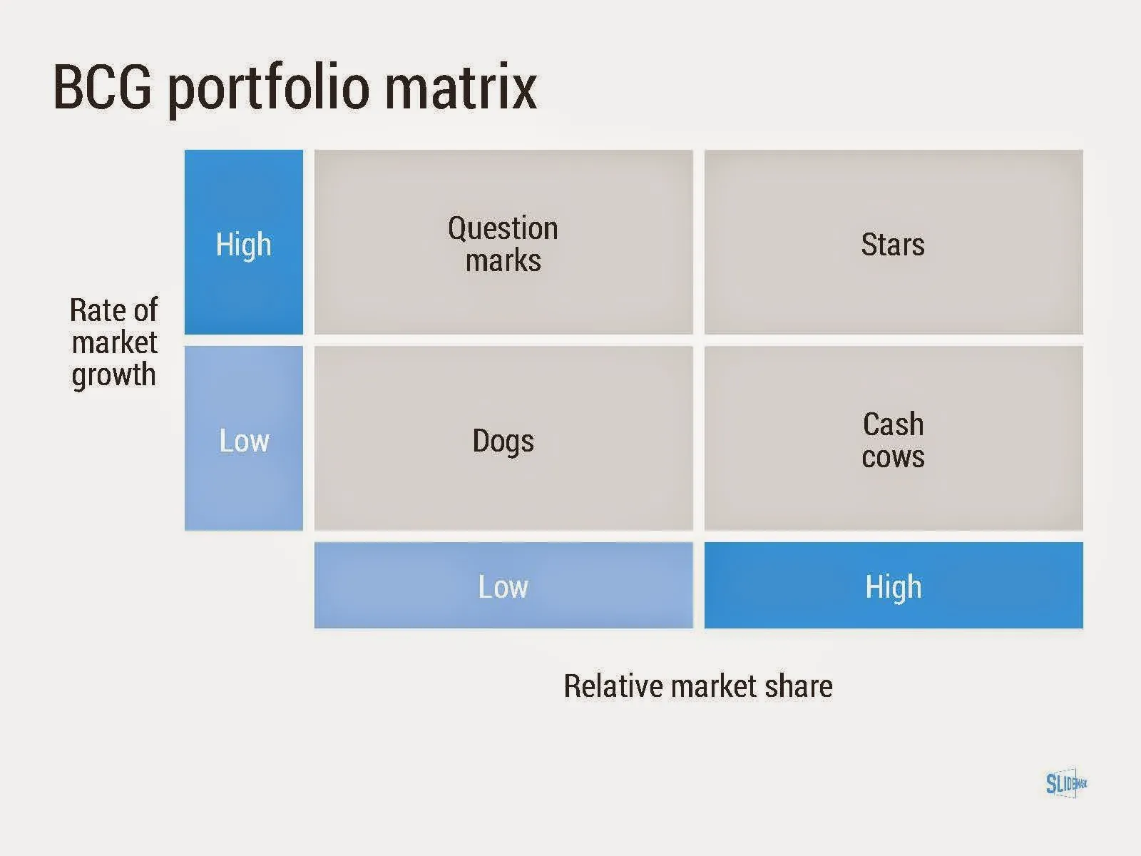
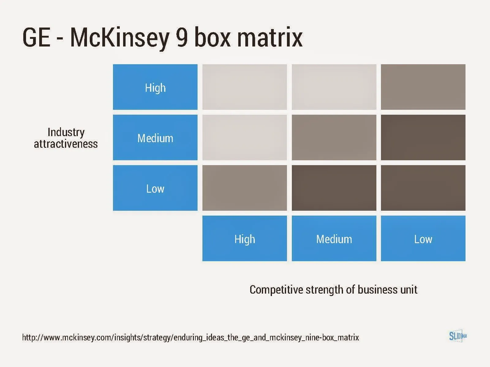
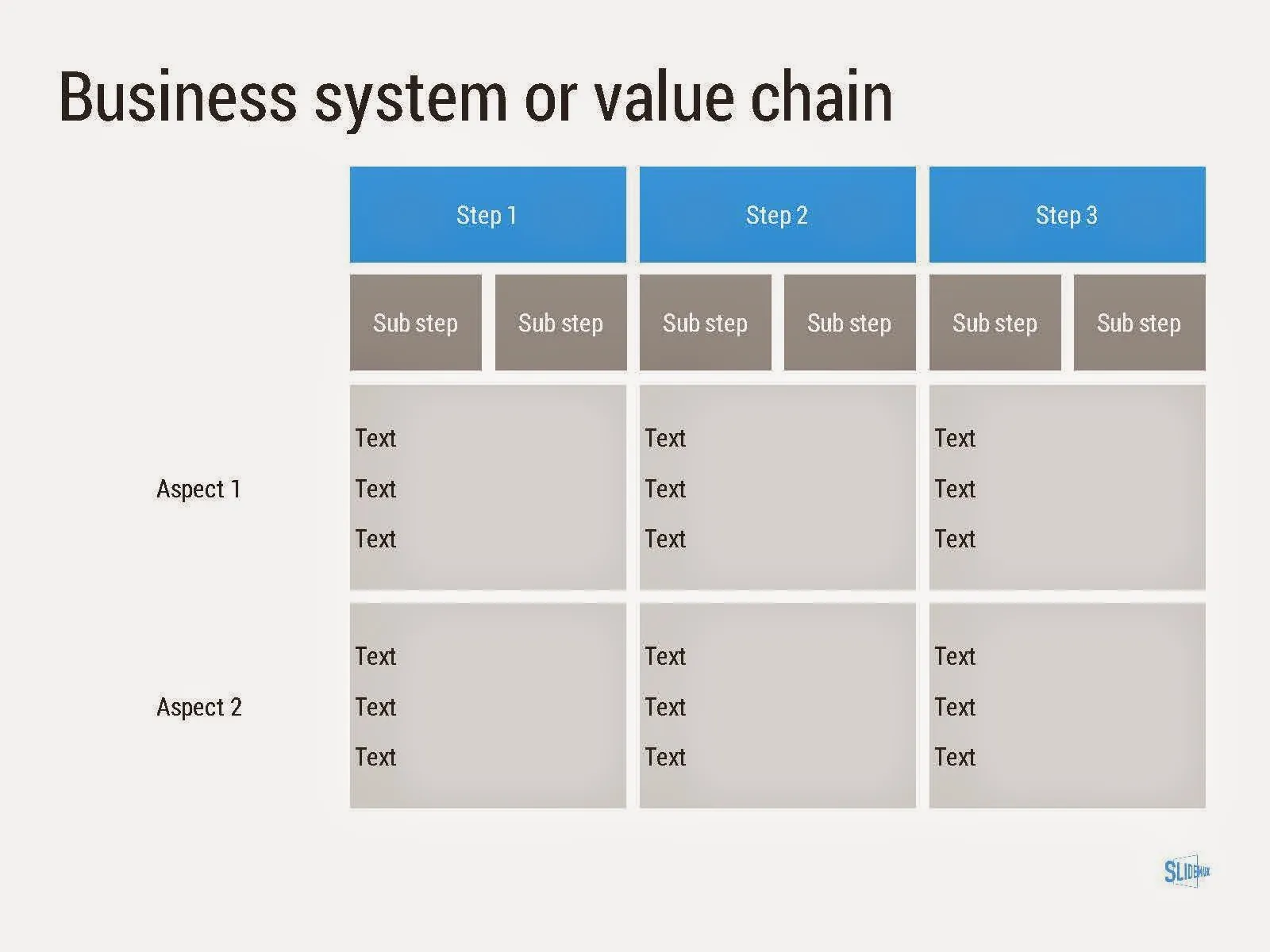
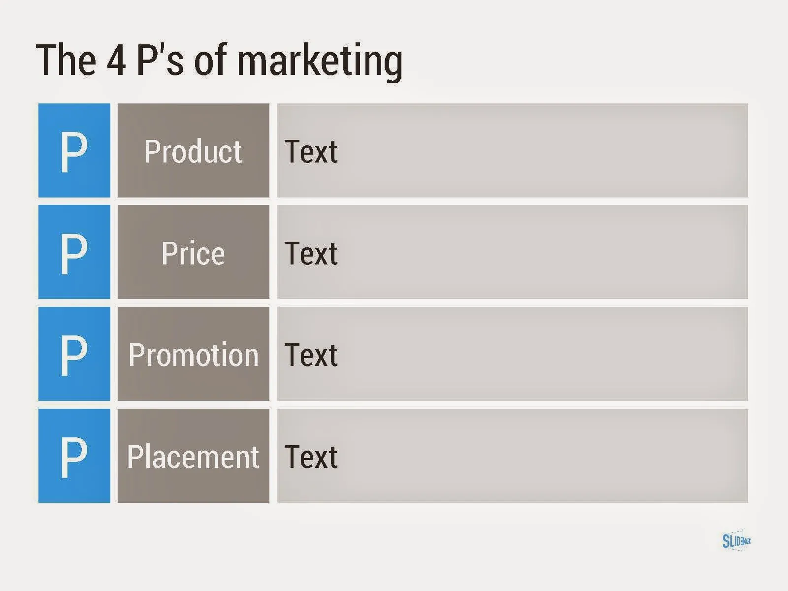
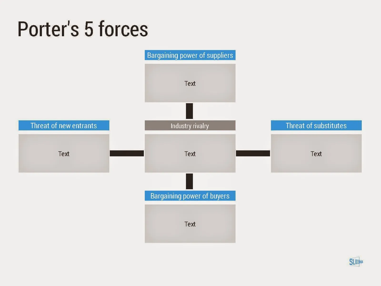
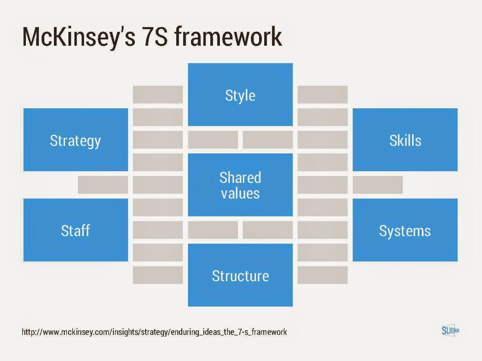
Consulting frameworks

I added a new set of templates to my presentation design app SlideMagic: consulting frameworks. It was an interesting journey back in time (I used to work for 10 years at McKinsey back in the 1990s).

Putting them in SlideMagic was interesting, it shows exactly what SlideMagic is supposed to do for business presentations. Take unnecessary complexity out of visual designs down to a level that the chart still says what it needs to say, but that you do not need to have a degree in graphics design to make them. I had to make slight deviations from the original here and there (Both SlideMagic and layman designers do not like curved shapes for example), but the end result is pretty good.

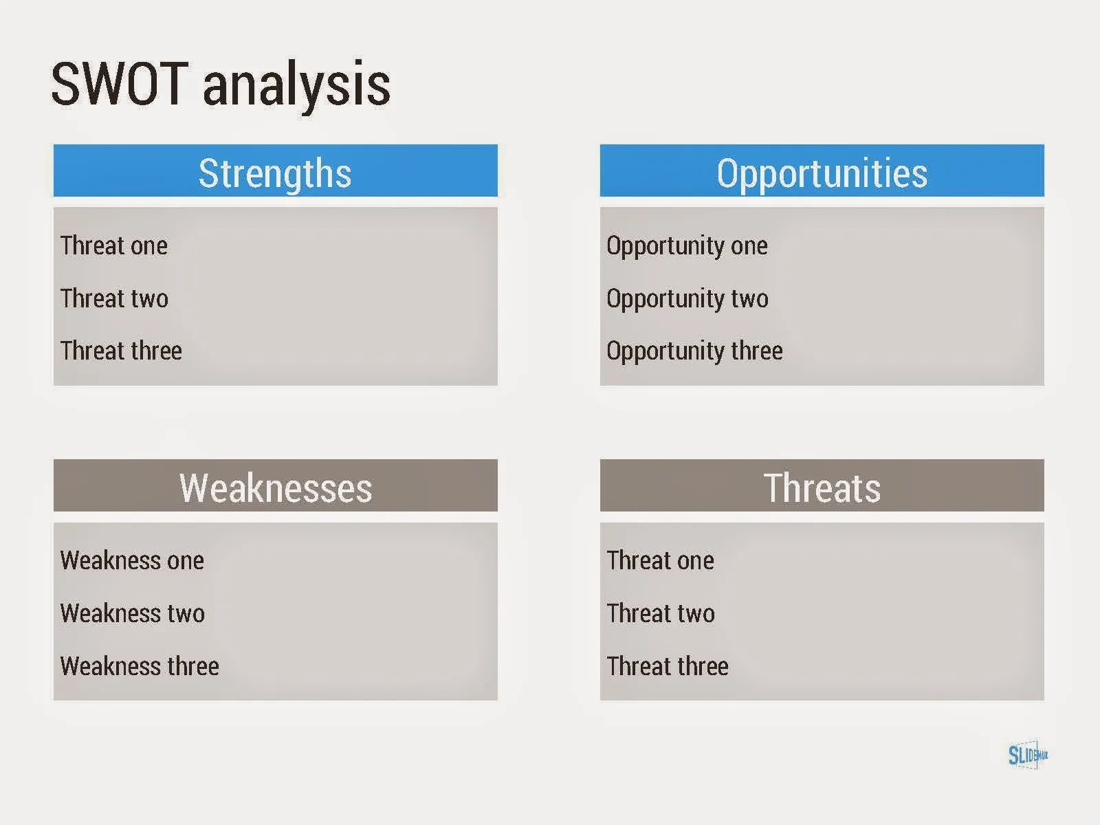
As to the content of these frameworks. They are more tools to help you think about a problem than slides that will get your audience jumping out of their chairs. Many of them are linked to classic micro-economics theory (demand/supply/competition). I think the strategic issues of many companies today have moved beyond these problems. Still some frameworks can work to kick start a discussion, they good old SWOT works great in group white board discussions.

·Keynote

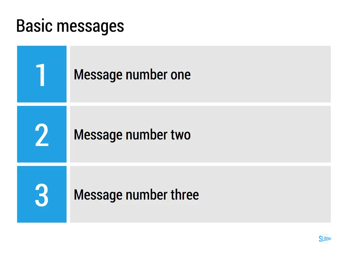
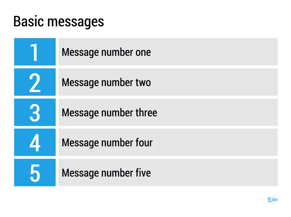
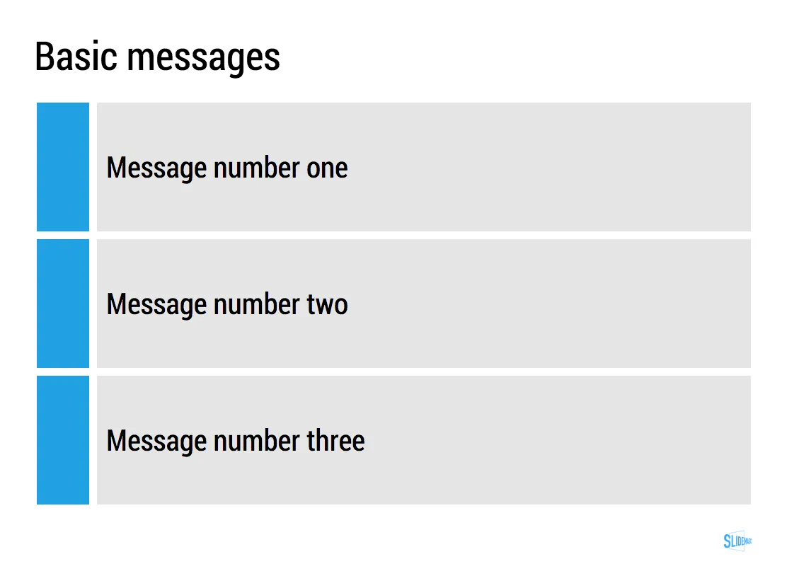
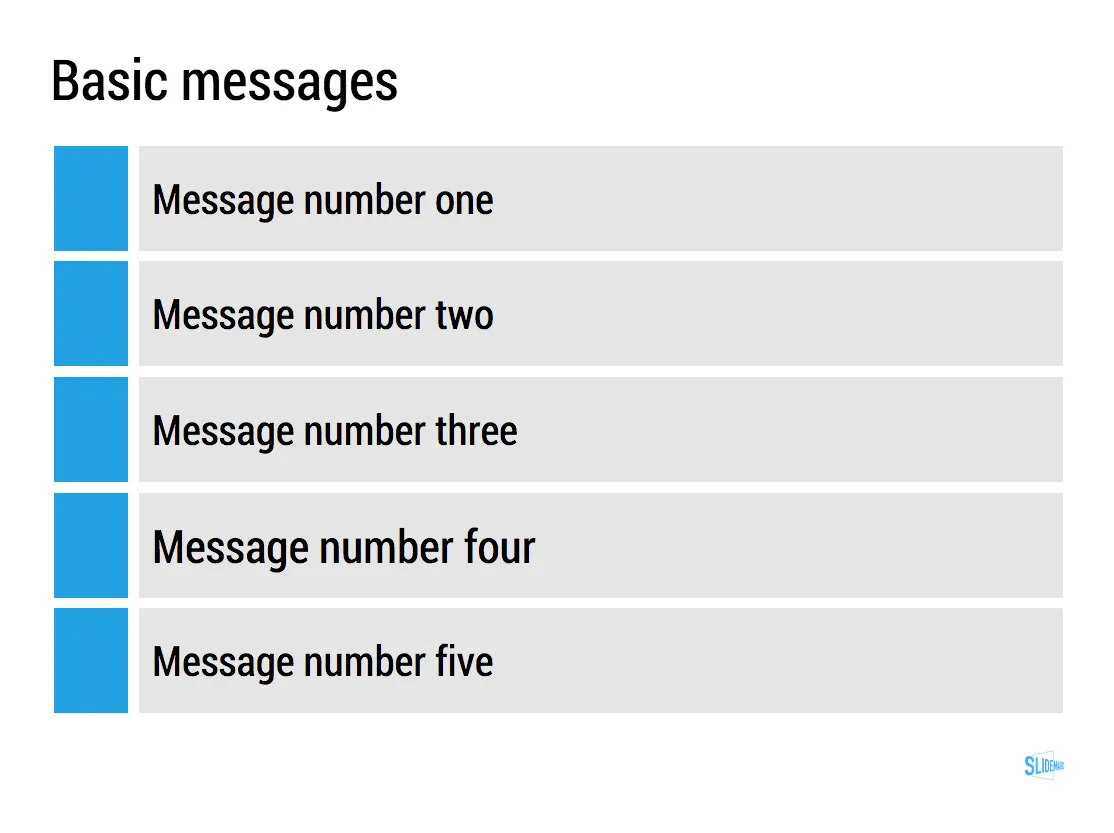
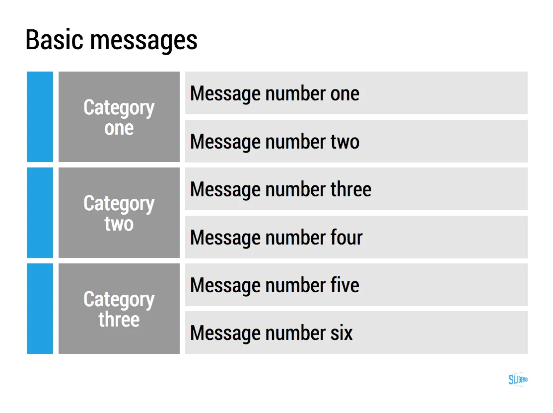
Making bullet points look good

Yes, you heard it from a pro: sometimes bullet points are hard to avoid!

  • In a document meant for reading rather than presenting
  • In a quick internal presentation that is more a decision document than a heart and mind captivating piece of visual art
  • In a document that you use to hammer out a legal agreement before handing it over to the lawyers who will expand the basic ideas into fine print
  • A first and/or last page in a presentation that summarises what you want to achieve

The key to make them look pretty is stop viewing them as text, but rather see each bullet as a slide object.

  • Use some light background colour to make them appear equal in size to the eye
  • Spread them out big over the entire page
  • Use as little words as you can, but use enough words not to sound generic

In PowerPoint or Keynote, you can use rectangular shapes for this. Even easier is it to use a table with fat white divider lines (the new

Keynote has lost some of its shine

, but the table editing functionality is really good).

In

SlideMagic, my presentation app

, it is really easy to do. Whatever you do, the app will force you to stick to a grid, it ships with a number of templates for text slides, which makes it easy to add and subtract lines.

UPDATE February 2018: I have no added many of the above bullet point slides to the SlideMagic template store, read the blog post about formatting bullet points here.

·Keynote

It reminds them

When confronted with something new, our brains instantly compare what we see, hear, feel, taste with all the 500 million previous experiences we had in our lives. This is why our intuition can say that we do not like/trust the person in front of us, without being able to say why. Apparently, we had bad experiences with these type of characters before somewhere, sometime.

The same is trie for the look and feel of a presentation. If it reminds us of boring experiences we had before, we switch off and anticipate a replay.  A bullet point first slide, a stale clip art image, a cheesy stock photo, all tell-tale signs that what is about to follow is unlikely to be interesting.

There is a positive side to this as well: you can interest your audience, simply by being different. Even if different means that your slides are not very pretty.

·Layout

The basics

Here is a checklist of basic PowerPoint design skills. If you master these, you are all set to designing great business presentations:

  • Program your company colours in the theme
  • Set default shapes and lines to fit your company colours
  • Delete all slides in a template master until you have just the title page and an empty page left
  • Know how to add text to boxes
  • Know how to make compositions of text boxes (including aligning and distributing them)
  • Know how to crop images (instead of stretching them)
  • Know how to make basic bar and column charts in your company colours

No need to learn anything more…

·Keynote

90 degrees

Nature prefers curves and round shapes. Steve Jobs likes rounded edges. White board sketches are curved and fluid. People prefer rounded shapes in architecture.

But: curved shapes are a pain to design. It is hard to fit text. It is hard to align them properly. They waste space (the Japanese invented the square water melon that makes better use of fridge space).

This is the reason that I “squarify” almost all diagrams and white board scribbles when designing presentation slides. Circles/ovals become squares/rectangles. Curved connecters become elbow connectors. Business presentations need to be efficient, and as a result they might not always be artistic master pieces.

·Advertising

Building signage

I drove by a big office tower the other day that featured a new signage:

  • The biggest font size possible, covering the entire width of the building, no (white) space left what so ever.
  • As close as possible to the top, no white space here either
  • The characters’ rhythm and spacing seemed to clash with the repeating patterns of the window.

Typical corporate executive thinking: big and high. What should they have discussed with the architect and the signage supplier instead?

  • Give the logo space, more white (stone, concrete) space around the graphics creates a much stronger presence
  • Adjust the size of the logo based on the characteristics of the building: time the spacing of the characters in such a way that disturbing repeating window patterns are neutralised.
  • Avoid the logo being an after thought, instead explicitly reserve space for building signage when designing the exterior of the building
·Keynote

One chart, multiple levels

A good novel has multiple levels of depth, the basic story, below that the deeper themes.

In presentation design I often apply similar techniques. The top level message screams from the chart through the use of colours (target: the listener), but for the reader, there are ways to find richer information to back up the bold conclusions you draw.

One example could be a simple table of pros and cons. Big colour contrasts indicate “in favour” and “against” for each of the criteria, but small text inside the boxes that is not meant to be readable for a live audience gives the more detailed explanation.

For TED-like big budget presentations, you it is worth to take out the detail. But most business presentations are used in multiple settings, it is just more efficient to have one set of slides supporting both of them.