SlideMagic Blog

Frequent updates about all things presentations since 2008. Subscribe to never miss a post.

RSS
all posts

Category Layout

·Concepts

Concentric circles in PowerPoint

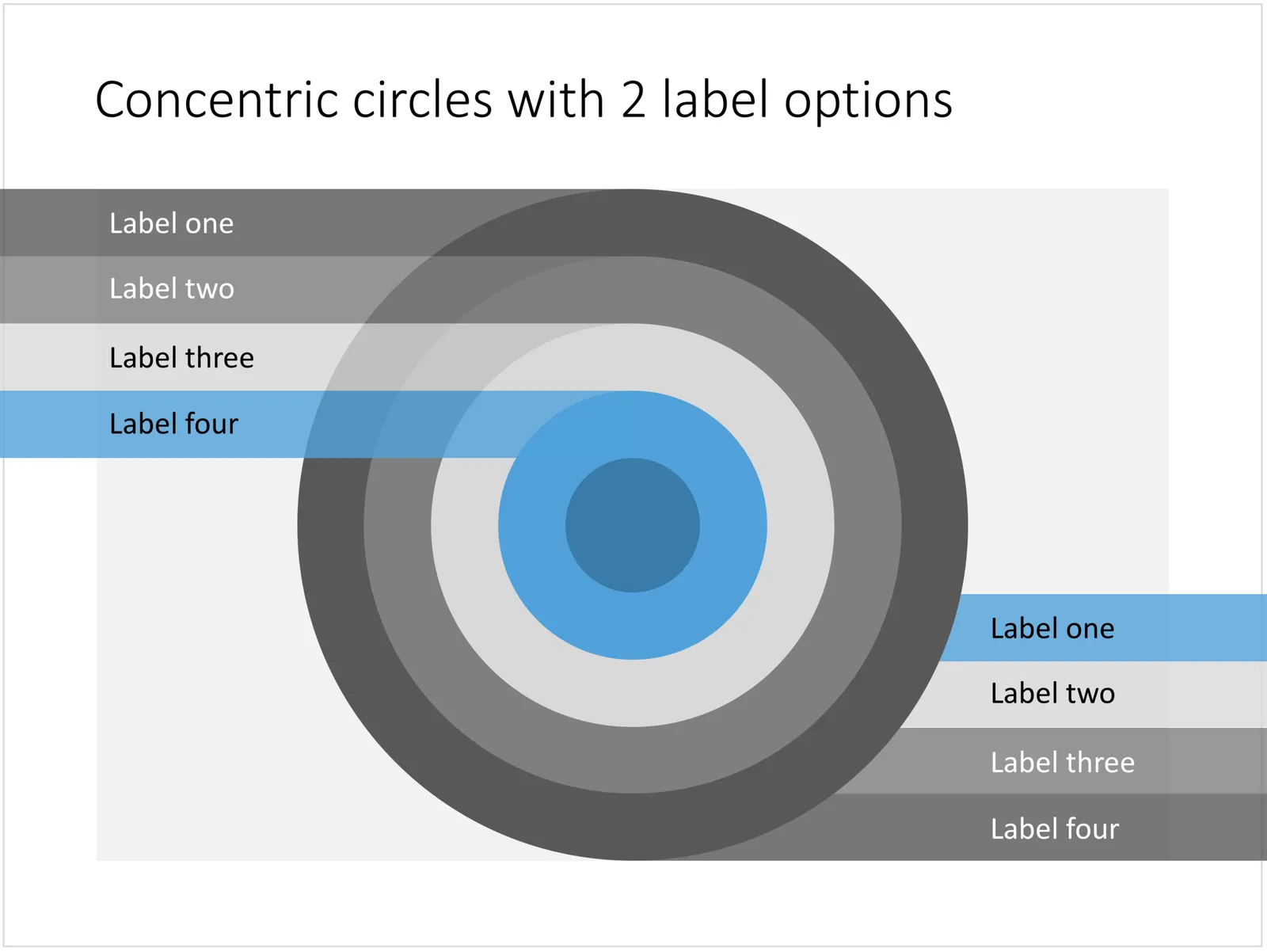
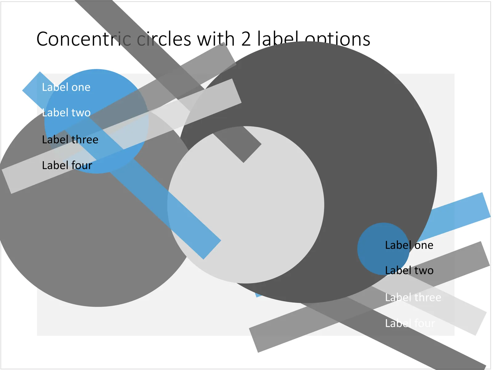
You can create very beautiful compositions by just using basic shapes and a few colours. Below is a presentation slide with concentric circles, and an image that shows how it is constructed. Feel free to borrow the design approach, or you can download the finished slide here.

This technique was often used by the Swiss graphics designers in the 1960s. You can use the slide concept below in a number of ways: show some sort of layering, show multiple layers of security or protection, show a whirl or rolling dynamic. You can take the labels of and just use the circles.

 Concentric circles in PowerPoint

Concentric circles in PowerPoint

 How to make concentric circles in PowerPoint

How to make concentric circles in PowerPoint

·PowerPoint

Quote slides in presentations

Quotes can add credibility to your presentation. If experts, celebrities, and/or customers agree with you, you must be right. But, not all quotes have equal weight. They have been overused in many PowerPoint decks. (Anyone can find a picture of a serious-looking person and get her to say what you want her to say in a few mouse clicks).

Here is a check list:

  • The person needs to be relevant and credible (third tier social media “experts” do not carry much weight)
  • The person needs to be identifiable (“Senior marketing executive at major high tech firm” can be anyone and is most likely you)
  • The quote needs to be interesting, cut the buzzwords and marketing language, cut the cliches (“Wow,  these guys really have a targeted value proposition that resonates with my medium-term return on investment objectives”)
  • The text needs to be long enough that it is specific, and short enough that it reads like a headline. A full page of verbatim will not come across
  • The quote needs to be relevant, a generic motivational quote might not help close that enterprise software contract.

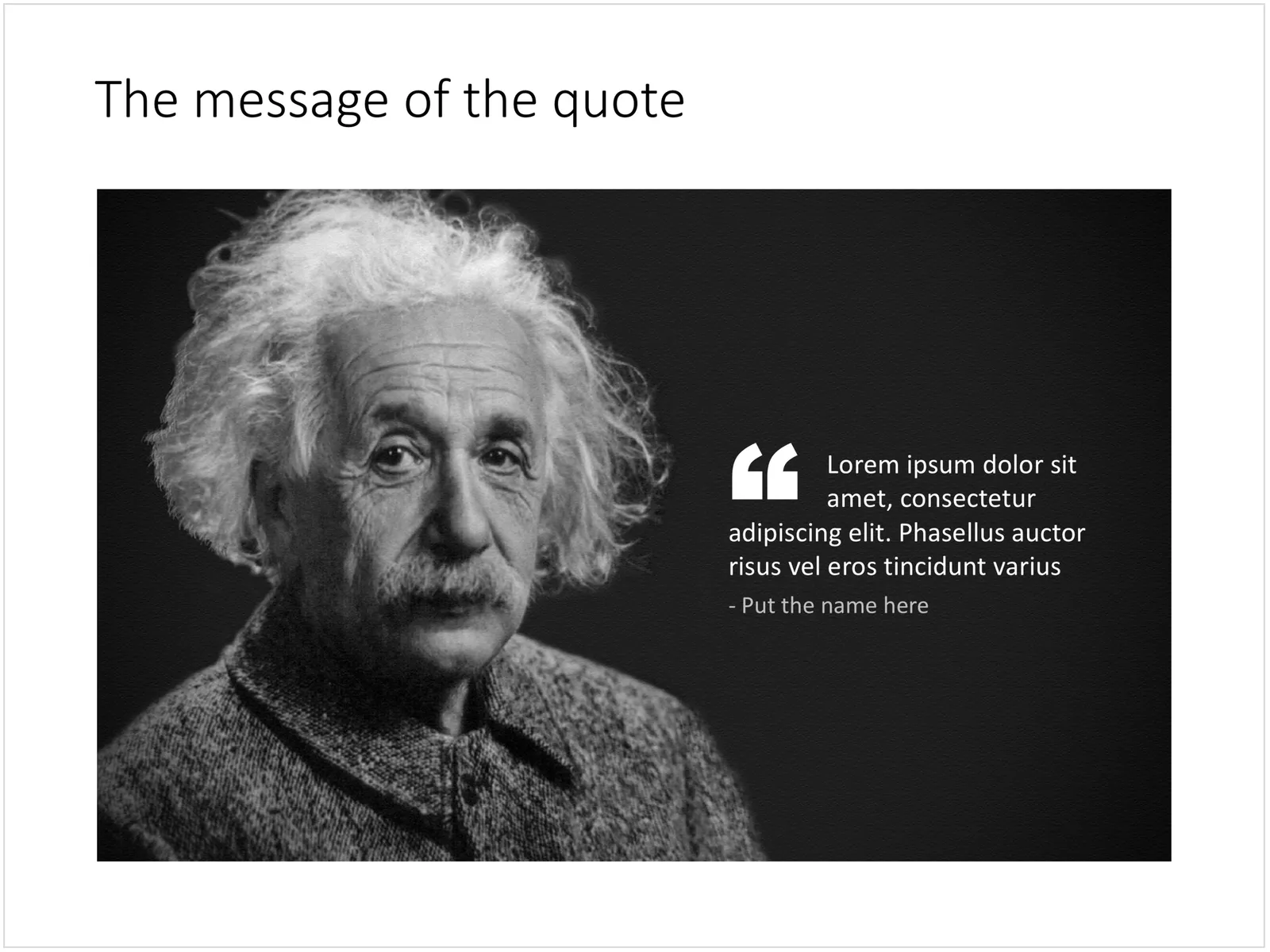
Quote slides are (and should be) pretty simple: a nice big image with a big text overlay. Still there are some things to watch out for. Below is a quote slide that I have added to the SlideMagic template store. Let’s go through the design process.

 A template for a quote slide

  • The image should have a calm background with enough “white” space for text. You don’t need to be a Photoshop guru to extend the background of an image in PowerPoint, it is easy to add a black or white box next to images. You can use the colour picker to match the precise colour, or use semi transparent overlays for the best effects
  • Make the quote symbol stand out. Regular quotes are too small, and the layout does not look good, as the quote pushes the start of the paragraph in. There are endless ways to do it and I settled on this one. One big quote at the beginning of the paragraph with a text indent. Take some time to find a quote in a good font. In the above slide, the text font is the Microsoft Office standard Calibri, but the quotes of this font don’t look that “fat”, I used Arial.
  • This slide is a framed image slide, which gives me the opportunity to add a big headline at the top of the slide with the main message (the headline can say “Customers are really happy”, the quote can say “With product [x], I no longer need to use a pencil”.
Continue reading →
·Concepts

The iceberg in PowerPoint, presentation cliches

I think people are spending way too much time on creating corporate presentation documents for internal company  meetings where the objective is to get your colleagues to agree on something that needs to happen next. Not every meeting is your all company annual sales kick off.

Presentation cliches can be effective visual shortcuts to get your point across. People have seen them before, instantly connect to the concept, and you can move on. The challenge is to make your slide look decent, maybe even referring to the cliche in a tongue-in-cheek way.

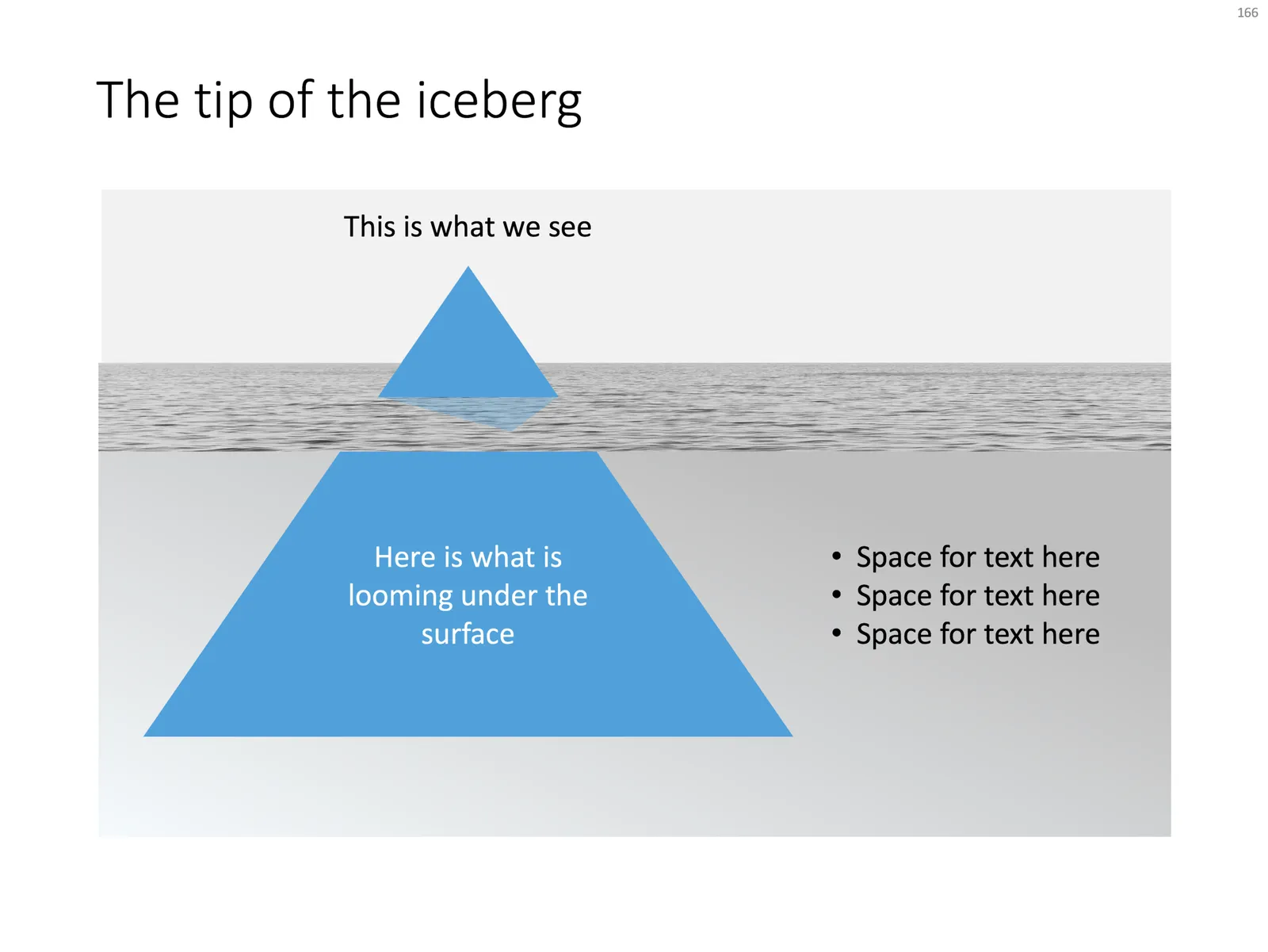
Below is what I tried to do to the infamous tip of the iceberg slide.

 The tip of the iceberg presentation

The tip of the iceberg presentation “classic” (or cliche?)

  • Don’t try to make it look too photo realistic, but rather use an abstract simple geometrical shape, and use the presentation accent color (instead of white against a dark background)
  • Keep the slide very simple, but the depth effect is actually created with clever layering of (partly semitransparent) shapes and image crops, it took me some head scratching to figure out
  • Shift the whole composition to the side to leave some more space for text, if you need it.

All in all, this chart looks better than a boring list of bullet points that describe some looming threat you want to warn your colleagues about. Just resist the temptation to fill that empty piece of arctic ocean on the right or the crisp polar sky with text.

Continue reading →
·Layout

The pillars and other PowerPoint cliches

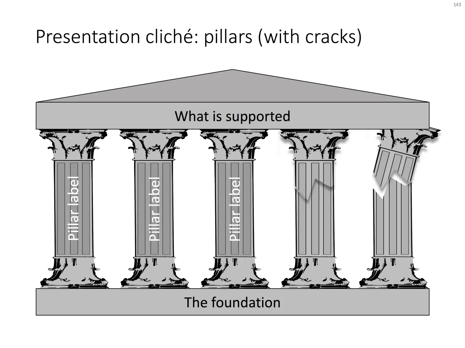
Some presentation slide layouts have been used so many times that they have become a cliche. You know it, when you see one. In very high profile presentations, it is a good idea to take them out and replace them with a different design, to prevent the audience from thinking “Oops, it’s going to be one of those decks again”.

I am pragmatic though, and I you need to stitch together a quick deck for tomorrow’s strategy meeting, and yes, you have a case that your strategy depends on 5 pillars, I will forgive you for digging up that temple slide from the archives.

For your convenience, I have created a downloadable pillar/temple slide in the template store. This version can also come in handy when you need to address not totally stable strategies. In case you  are curious, I  have labeled some other slides as “cliche” in the template store, you can a run a search for the keyword “cliche” and see what comes up. Do you agree?

·Concepts

How to create Harvey Balls in PowerPoint

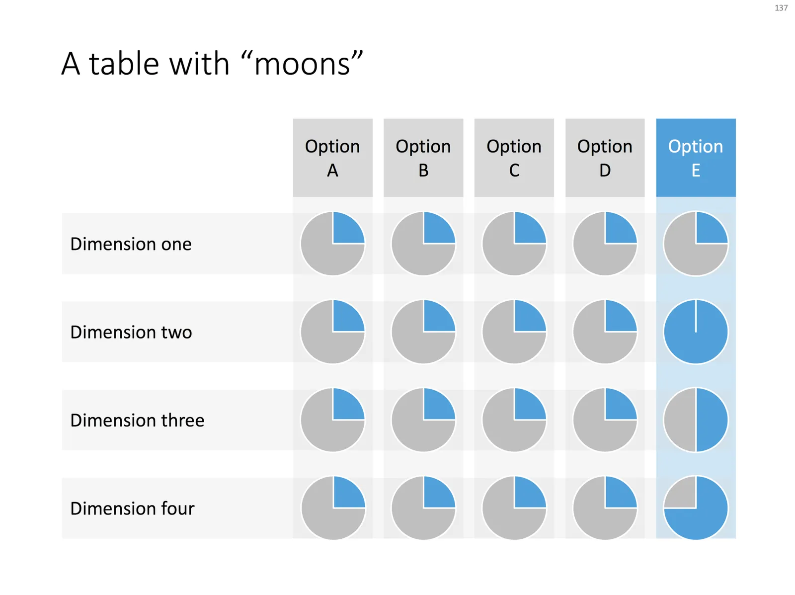
Harvey Balls are a repeating pattern of simple pie diagrams to score options among different access. Strategy consultants love them because it allows you to make qualitative assessments quickly. They work great on group discussion whiteboards as well: draw the empty circles and have the meeting participants colour them in.

Apparently they were invented at Booz Allen in the 1970s, which is probably why we at McKinsey referred to them as “moons”.

In PowerPoint they are a bit tricky to make, in the template below I tried to make an effort. To change the values, you need to open each pie diagram and change its value, make sure that you are not moving or re-scaling any of the pie diagrams in the process.

At McKinsey, I remember always keeping a “moon” diagram somewhere in my hard drive, so I could easily re-use the various shapes (these were not Excel pie diagrams, but graphic icons that came in the four stages).

Visually, I think they are not perfect. Maybe in the early 1990s, with primitive computer graphics, Harvey balls served a purpose, but now the same effect can equally be achieved by applying different colour shadings in the background colour of the cells in your table.

As always, feel free to copy the design, or download the ready-made slide from the template store.

·Layout

Pop out of the box

My slide layouts usually have a white frame around them, even big images I don not let “bleed” of the page. Why? My slide decks are usually a mix of these minimalist big image slides and more traditional, dense, consulting-type slides. The big pictures usually go in the front of the deck to sell the idea, but for financials, roadmaps, etc. I need a different format. Mixing two styles of presentations gives the deck an inconsistent look.

(The exception would be tracker pages, or section separators, which I usually stretch over a full page).

That “box” gives you some new design opportunities though; you can make things pop out by putting them outside the frame on purpose. This is technique that is often used on magazine covers. Below are some slides from the store where I used this technique (clicking them takes you to the store).

·Concepts

SWOT analysis

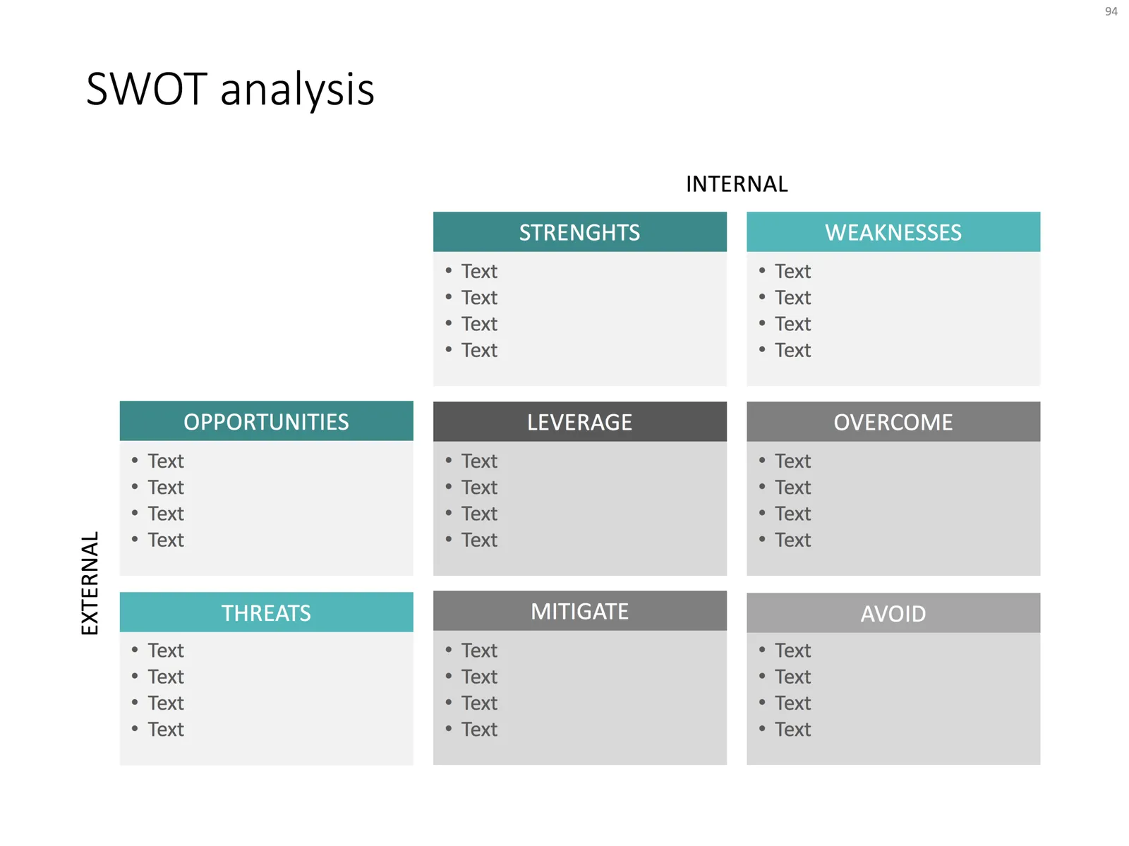
You have been searching “SWOT” a lot in my slide template store, and got blank results. So, by popular demand, I added a SWOT slide template.

The slide is a bit too dense to put up in your next TEDTalk, but that is never the purpose of a Strengths-Weaknesses-Threats-Opportunities analysis. A SWOT is an analysis rather than a presentation tool. In my life as a strategy consultant at McKinsey, a SWOT analysis rarely solved a big strategic problem start to finish, but it is usually a great tool to get people started.

It can be especially useful in big group discussions where strategic debates can go all over the place. Putting an empty SWOT framework on a flip chart immediately calms the group down and focuses the meeting.

I expanded a bit on the traditional 2x2 (4 boxes) model: the SW, and OT boxes are now put on the side of the matrix, leaving space for 4 new boxes in the center that enable you to scribble what you are actually going to do about all these internal and external factors.

(I vividly remember that 50% of the group discussions around a SWOT whiteboard were about in which box to throw a particular thought).

Feel free to copy the design, or download the SWOT analysis ready made from the template store. You can find there more examples of strategic frameworks as well.

·Investor presentation

Presenting your team

Team slides are tricky: there is so much to tell when you have 3 people with a 20 year career. Where to start?

I tend to split the problem in 2: put complete bio slides in the presentation appendix, and focus on a few messages about what makes that team special in the main presentation. What is the story of the team?

  • Do they have diverse, complimentary backgrounds?
  • Have they worked for very famous companies?
  • Have they founded and sold a lot of businesses before?
  • Do they have very unique scientific knowledge?
  • Do they have a particularly long work experience?
  • Are they a proven team, that has worked together in the past?

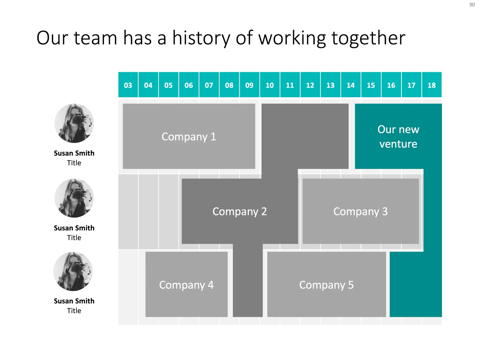
Each of these messages merits a completely different slide. The slide below would be an example that covers the last of the above points, a team that goes back a long time together. Rather than dry bullet points describing their background, I laid out the “CVs” horizontally on a timeline, and make very strong visual connections for periods where people overlapped at a company.

Feel free to copy the design, or download the slide from the SlideMagic template store.

·PowerPoint

Turning a bar chart into a Gantt diagram

Project Gantt charts are a pain to create in PowerPoint. Screen dumps from professional project management software are too detailed and don’t have the right look & feel. Manually resizing blocks is tedious, and oh boy, what if you have to add or change an activity…

I often use a disguised stacked bar chart to create project flow charts in PowerPoint.

First, you need to look at the content. Like my approach with all data charts, project plans should not be copy pasted directly into PowerPoint. Project planning, data analysis, is not the same as presenting the result to an audience, you need to disconnect the two activities. This means in most cases starting with a blank sheet of paper.

Purely from the stand point of communication (not planning): which activities should be grouped together, which separated? What is a logical phasing? Sometimes, nitty gritty activity details are crucial for planning purposes (exact roll outs for each city), but can get pretty boring in a presentation. Sometimes the opposite is true, a small pilot might be worth highlighting in the presentation.

Once you have this sketch, you can transfer it to PowerPoint. PowerPoint does not have pre-configured Gantt chart templates, but the stacked bar chart can provide a solution. See the chart below as an example:
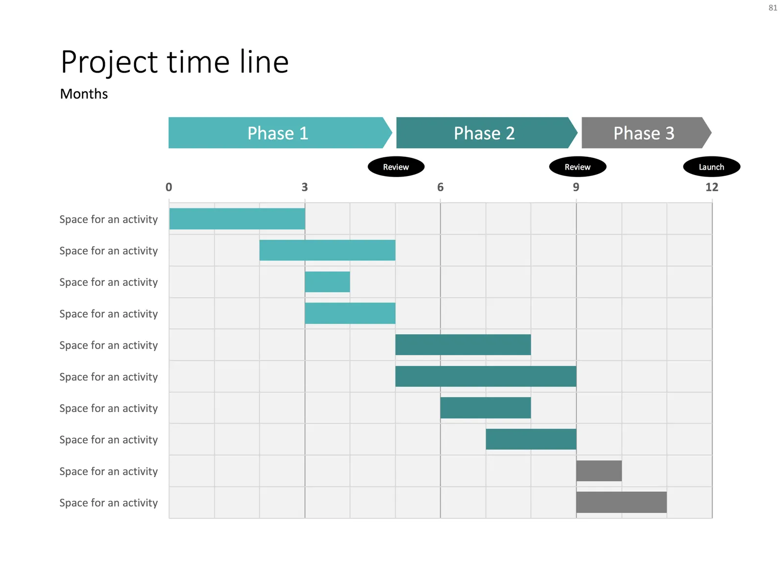
It takes a bit of thinking to set up, but once in place, it is easy to make small changes to the length of the bars and/or add and subtract activities without having to go through the hassle of lining up everything again.


Continue reading →
·Layout

Evidence from press clippings

Here is a slide I often encounter in draft publications: a screen shot of a news web page, with a few words circled in the middle of the article. There are a few problems with this:

  • The circled quote is often impossible to read
  • The other elements of the web page screen shot compete for attention: the big headline, the photo. The article was not designed to focus the attention on your circled text
  • Today’s web pages are crammed with screen elements that you don’t need on your slide: social media like buttons, advertising
  • A screen shot of a random news web site does not carry the same credibility anymore as a cut out article of the 1935 New York Times once did

There are better way to show that piece of evidence:

  • Incorporate data in a bar chart, comparing it to something, and putting the news web site in the bottom source line
  • Creating a big quote page, again quoting the news web site as a source

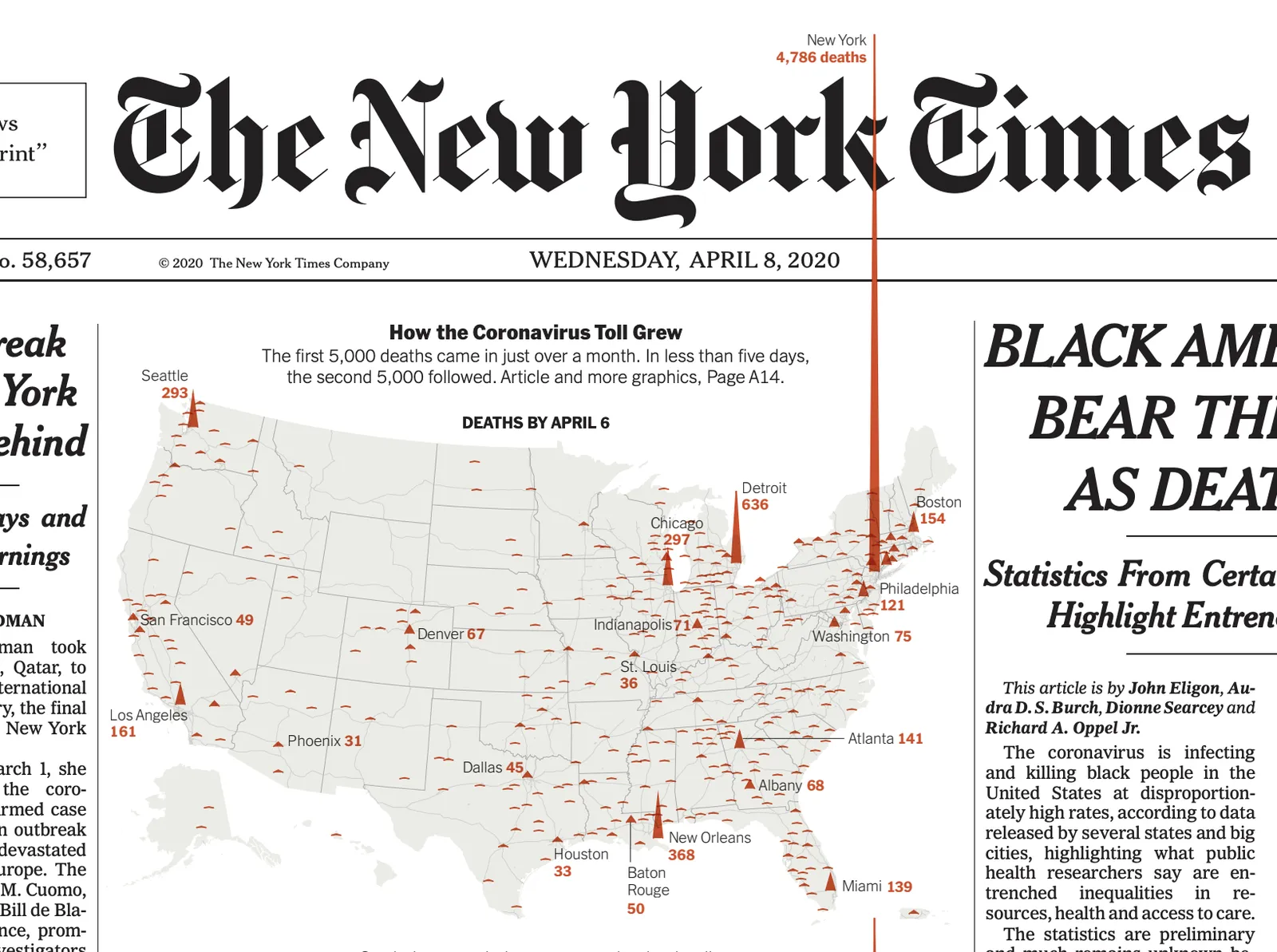
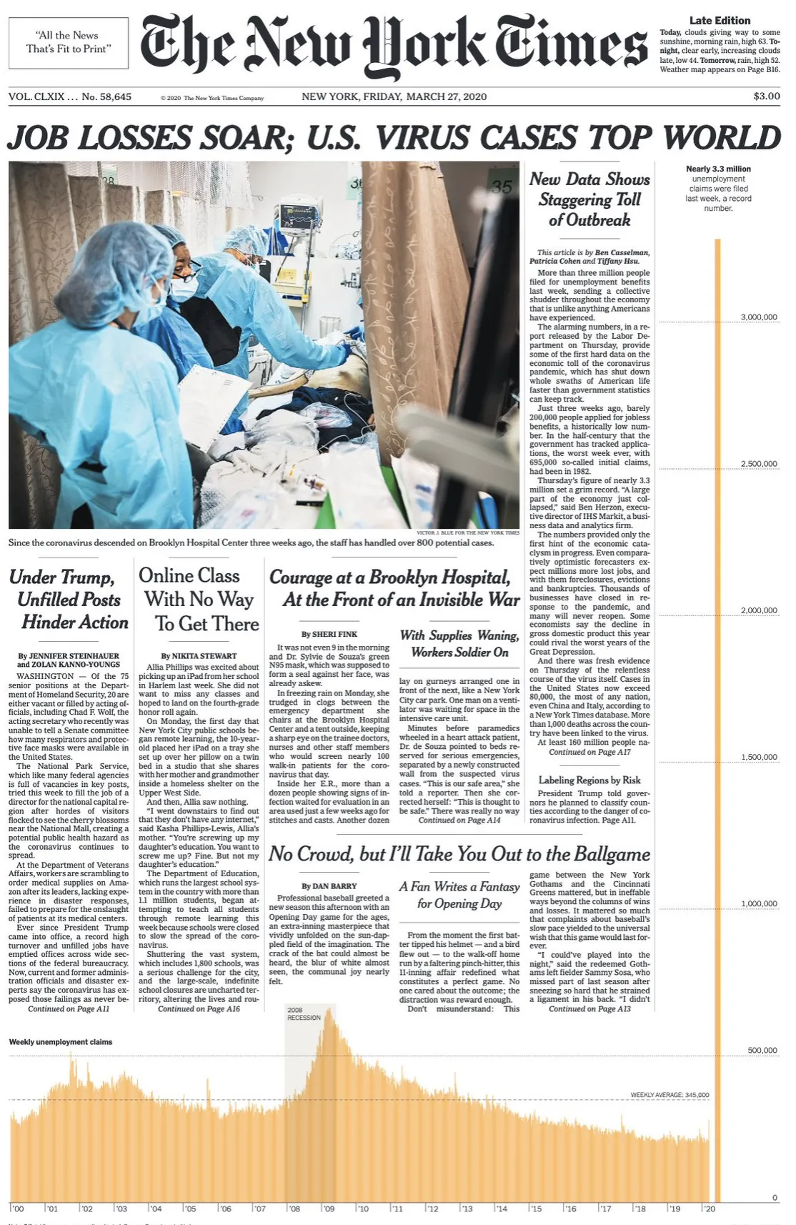
When should you use news web sites? Maybe if the headline in a very credible news source is what you need. But then, cover unwanted screen clutter with white boxes to draw the attention of the audience to that headline, and nothing else. Here is an earlier blog post about formatting newspaper screenshots.

Photo by G. Crescoli on Unsplash