SlideMagic Blog

Frequent updates about all things presentations since 2008. Subscribe to never miss a post.

RSS
all posts

Category Keynote

·Investor presentation

Your presentation objective?

To many, this might sound as an obvious question. “Hey, this deck is here to get my idea funded!” While this might be the ultimate goal of your presentation, it is usual to break down the process in its individual steps.

The objective of a short elevator-pitch-like-chat or coffee discussion is not to receive the investment, it is to get to the next meeting. And reaching that next stage involves intriguing your audience enough, maybe leaving out some of the tedious detail, while not forgetting to completely  nail that big elephant-in-the-room-issue (even if it means going into excruciating detail).
·Keynote

Page numbers?

Big graphical elements that are repeating on every page obstruct your slide design. Examples are legal disclaimers, company logos, banners, and yes: page numbers. I am not a purist here, and will most of the time put a tiny page number in light grey at the top right of the page. Too small for a keynote audience to see, but big enough to guide a page switch in a phone conversation.

·Data visualization

Excel on the front page

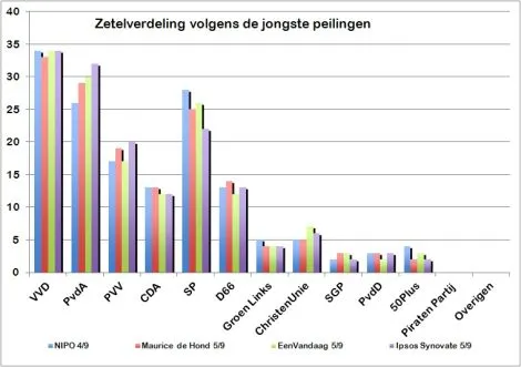
It is shocking to see that pre-election poll results on the cover of a large Dutch newspaper are presented in a plain standard Excel template and colours with one adjustment: add some 3D effects, which makes it even worse.

·Images

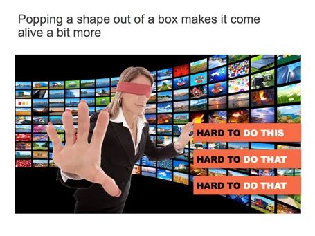
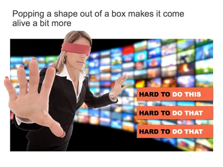
Pop out of the box

If you have a person or an object standing in front of a background, make it pop out a bit: increase the size, and fade the background.

·Investor presentation

The deck is not always the issue

Some stories are really good but complicated to explain. Here, a well-designed slide deck can make a big impact.

Other stories are relatively easy to explain, but have a few big questions inside them. In these cases, effort is better spent on providing answers to the questions, rather than investing it in making the slide deck look and flow better.

If you have limited resources, choose where you are.

·Gadgets

Trackpad U-turn: back to the mouse

With the advent of Mac OSX Lion I moved to using a track pad for all those fancy swiping features. However, I am back to a regular mouse. For intensive design work, a track pad strains my wrist too much. You constantly need to lift your hand slightly above the track pad, which starts to hurt. Using a mouse, I can put my hand and wrist in a completely neutral position without straining any muscle.

·Keynote

It does not have to be pretty

You have limited time, you have limited budget, and you are not a natural-born designer. Still you can design an effective presentation. Keep it minimal and tasteful.

  1. No bullet points
  2. One big idea per slide
  3. Use simple shapes without a border
  4. Muted color palette (lots of greys, one bright accent color) without gradients
  5. Non-cheesy stock images: high res and in correct aspect ratio
  6. Arial font
  7. White page, (small logo if you want at the bottom right)

People will recognise it was not designed by a professional, but they will get the message and respect you how you did this with such minimal tools.

·Delivery

Beyond perfection

I recently watched this video: The making of Aja, an album by Steely Dan released in the early 1970s. The movie shows how the bands 2 creative leaders Donald Fagen and Walter Becker going track by track, instrument by instrument, to get the album “beyond perfection”, as one of the studio musicians describes the process about halfway in the video.

Fagen and Becker were ruthless perfectionists, editing down guitar solos of the best players down to a few notes, swapping entire bands overnight, or adding a few high (1970s) synthesizer notes to make a flute sound a bit fuller.

Only when you get to a point that is beyond perfection can you start to improvise to give things that personal edge. And that is exactly the same for presentations: only when you have rehearsed in and out, you can deliver that truly relaxed and spontaneous presentation.

The movie is on Netflix, but to my surprise I also found a lower-quality version free online, the site seems legitimate:

Watch Classic Albums - Steely Dan - Aja in Music  |  View More Free Videos Online at Veoh.com

·Images

But we are a serious company!

I get that question often when presenting my deck loaded with impressionist paintings to a big corporate. Serious companies cannot make presentations like these.

Wrong. Visual presentations without bullet points can be highly professional, and highly serious. Just take a different theme than impressionist paintings.

Right. I do agree that being serious adds a design challenge. Everyone can Google image search a bunch of funny page-filling images together and add some outrageously big wacky fonts to them and call it a visual presentation.  The challenge is to add some aesthetics, but it is an easy step to make once you have made the big leap of leaving bullet points behind.

·Investor presentation

Story prioritization

Some startups have a technology platform that can be used in multiple markets, and often the startup is not completely clear (yet) about how to prioritise them. In a first 20-minute investor pitch this creates a highly confusing story; an investor can only take in so much information in 20 minutes and probably will not buy that a 5 person startup can conquer all these markets (she is probably right). Here is a potential solution:

In the first 20 minute cold pitch:

  • Set up your platform business situation
  • Pitch 1 (maybe 2) markets properly (the most promising ones)
  • Hint at further upside in the other markets (1 quick slide)

If that went well, elaborate more in follow-on meetings about the other opportunities and provide a discussion framework about possible prioritisation, and you can even ask the potential investor for advice.

Do not try to spring all 10 stories in the first 20 minutes, you will fail.