SlideMagic Blog

Frequent updates about all things presentations since 2008. Subscribe to never miss a post.

RSS
all posts

Category Keynote

·Images

News photos for bargain prices

Prices for celebrity and news photos are incredibly high (check some of them on Getty Images). Why? Because the licensing options are set for high-volume print runs or web sites. Usually, presentations are different. The audience is relatively small (rarely above 100) and most presentations are a one-off event. So, producers of news and celebrity images are missing out on the presentation design market.

Enter a new web site: slideshots.com. It is a database of AFP images with EUR 2 licensing options for use in presentations. A great alternative for over-sued and cheesy stock images. And the license looks pretty flexible, even for use online on platforms such as SlideShare.
·Keynote

Pink URLs

PowerPoint does weird things with URLs and email addresses. When you type in either, it turns them automatically into a hotlink (sometimes useful), but applies a highly ugly formatting (a bright color with underlined text). A slide is not a web page where links compete for your attention, make sure to tone down the formatting or remove the hyperlink all together.

·Data visualization

How to position a data chart

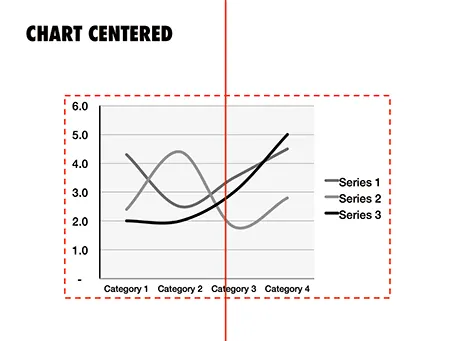
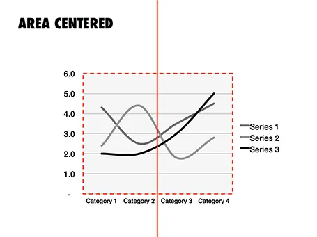
There are two ways to center a data chart on a slide: center the entire chart image including labels and legends, or center just the chart area, ignoring the labels. I prefer the latter.

·Images

Stress-inducing cover image?

A frightening, dramatic, stressful image can greatly enhance your message. But I would not use it on the cover page of your presentation. That page usually sits on the projector for a long time while the audience is walking in and you do not want to destroy their mood before your talk started. Use the stressful slide at a key moment inside your deck instead, it could even be one page 2, just not on page 1.

·Keynote

A double-edged sword

There are 2 benefits to using simple slides with little content and one focussed message:

  1. They are much more effective than busy complex slides (most of us believe this by now)
  2. They are a lot easier to design than busy complex slides (very few realize this)

Once you decide to adopt 1, your slide design skills have quadrupled instantly because of argument 2.

·Images

Putting things in perspective

It has hard to grasp the magnitude of something with cold statistics. For example, this waterfall that I recently visited in Iceland drops 60m, but it is hard to imagine, unless you pay attention to the tiny people standing next to it.

Another example is this TED video by Ramesh Raskar, about photographing light traveling through an empty Coke bottle at a few trillion frames per second. At 3:50 the key statistic comes out: it would take a bullet fired from a gun 1 year to travel through the bottle if it was slowed down as the same rate as the light beam.

Do the same in your presentations. Tell stories with analogies to make it easier for people to understand big (or small) numbers.

Off topic: when photographing landscapes I usually resist the temptation of making that completely clean shot without any evidence of human presence in it. That small house, car, or person adds that critical sense of size to an object. When making a shot of a long-distance view, keep something close to the camera in the composition (a tree branch or something) to maintain the sense of distance.

·Keynote

Behind her back?

If you are pitching to a big corporate, it is important to understand how their decision making process works. For example: going behind someone‘back and talk to her superior could back fire.

Big corporates can be big bureaucracies, but not all departments work like this. It could be that the junior team member you just skipped sits next to her boss who is forwarding the email she just received from you straight back at her. They do exist inside big corporates, proper functioning teams with an open work culture.

Some people who are very high up in the corporate hierarchy might actually not have that much decision power. It depends on the type of business. For example, someone can be global marketing manager of a big soft drinks brand, and have a lot of responsibilities. However, it could be that most tactical decisions are actually taken at the country level, in the local subsidiaries in wich the parent holds a minority stake. In short, understand how your big corporate target works before planning your pitch strategy.

·Concepts

Torn

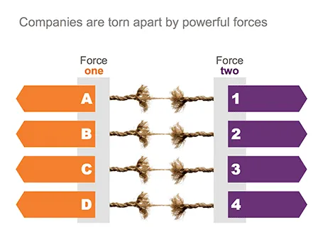
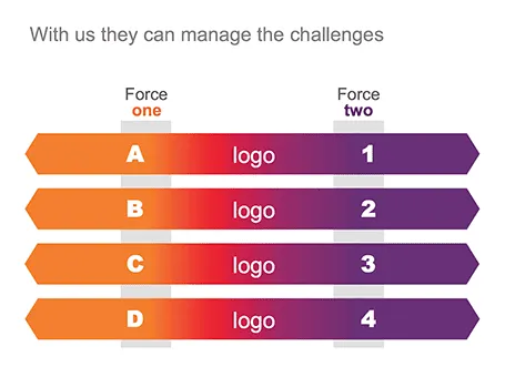
One of my clients is saving companies that are caught between two opposing forces. Here is the visual concept I used that explained the 4 contradictions.

·Keynote

Summer posting schedule

Over the next few weeks posting frequency will drop on the blog as I will be spending more time with my family and less time at the computer. I hope you all have a great summer as well.

Image credit: fridgeirsson

·Keynote

Got into a fight

I usually do not get draw into a fight, the exception was recently when a client asked me to design a presentation that was a response to a presentation by a competitor that was a direct attack on the company.

The competitor document consisted of 5 pages of dense text with long sentences written in a style of two children complaining in front of the head teacher: “She says, but that is not true, then I say, you see that I am right?”. Lots of quotes, lots of complicated arguments, no numbers, no visuals.

My design was different. One simple headline per slide, one simple fact or illustration to support it. I did not discuss any features of my client, did not repeat the sales story of my client. Just corrected fact after fact after fact. I think it works pretty well, it is just a bit a waste of all that negative energy that goes into aggressive presentations.