SlideMagic Blog

Frequent updates about all things presentations since 2008. Subscribe to never miss a post.

RSS
all posts

Category Keynote

·Investor presentation

Over-complicating a framework

Yesterday I posted about a way to visualize a complex comparison (a hedge fund). Sometimes thought, the best things is just to simplify. “Here is a competitive landscape. These guys are bigger. These guys use a wholesale model (we are retail). These focus mainly on Asia. These market to younger consumers.” Interesting for PhD students that study your market, too much information for a first pitch to a potential investor. Aggregate things up to a simple grouping of competitors and complicate things in later discussions.
·Concepts

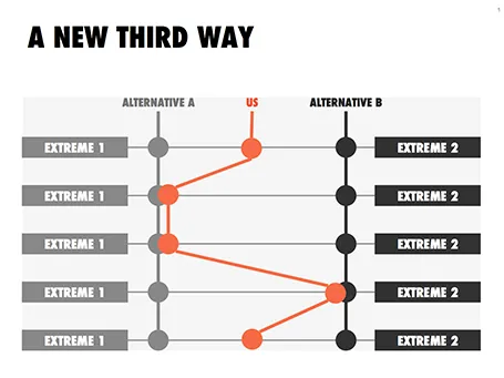
Concept: a third way

This slider chart is a great way to show a comparison between multiple concepts across multiple dimensions. I recently used it for a hedge fund with a new innovative investment process.

UPDATE: this slide concept can now be downloaded from the SlideMagic store

·Keynote

The screen shot workflow

On a Mac, you can create a screenshot of a specific part of your screen. Pressing CMD-SHIFT-4 brings up a cross hair and you can select the area you want to capture.

Screen shots have become an essential part of my workflow. Rather than worrying how import PDF files, web sites, video stills, or other images into my presentation I just snap a picture of them. The same for exporting PowerPoint slides, the images on my blog are usually screen shots.

No more looking for files, no more worrying about file formats. I heart screen shots.

·Delivery

1996 presentation training

In the bottom of my office drawer I just found a small card with personalised suggestions for better presenting that I had to fill out after a communication training at McKinsey all the way back in 1996. All the usual things are there: stance, eye contact, etc.

But one things stands out and is so 1996/McKinsey: “Introduce the slide before putting it up” (remember we were still in the time of the overhead projector). McKinsey slides were incredibly busy and filled with data, so plopping that overhead sheet on the projector without warning would overwhelm the audience.

Instead, we had to introduce the message of the slide, show it, talk people through the various elements of the slide (what is on the axes, what the line means, etc. etc.), and maybe repeat the key point one more time.

Now 16 years later, my approach has completely changed. When you put up a slide, it should be completely self explanatory, cutting out unnecessary clutter and spreading out content of multiple slides if needed.

·Investor presentation

From screenshots to use case

How do you showcase your application in a 20 minute pitch? Doing a full, live demo is hardly ever an option:

  • Murphy’s Law will strike, and your Internet connection will break down, and if not, another technical issue will hit you
  • Some aspects of your app are interesting to show, others are boring and time consuming (loggin in, entering some data, etc.)
  • It is hard to stay focussed and on script in a live application, before you know you have lost yourself in an interesting feature and spent far too much time on your demo.

In a short VC pitch, doing a live demo is likely to take the energy and momentum out of our talk. The other solution is showing a bunch of screen shots. But how can we transform a series of uninspiring screen shots into an exciting use case of your product? Some steps to consider:

  • Base the whole section on a story. The best stories are real: find an actual customer, disguise everything so it is impossible to expose private information and build the entire screen shot demo on her case.
  • Alternate between regular visuals and screen shots. Use a map to show locations, use images taken in the street to give things a sense of place.
  • When using screen shots, crop out all the clutter that is irrelevant: operating system window bars, icons, browser navigations and put huge arrows or circles to focus the viewer attention to what you want to see them. Use big text to emphasise what you are doing and why it is so great (“We open an account in just one click”).
  • Throughout your story, stay consistent: the same user, the same location, the same issue she is trying to solve.
Continue reading →
·Colors

Which color schemes work?

You cannot argue about taste, and there are no rules about what color combinations work or not. But somehow there are color schemes that come out great in a presentation, and with certain ones I have a very hard time making a deck look good. Here are my random experiences:

  • Colour schemes with fewer contrasting colours in it tend to work better. You can create beautiful minimalist shades with grey shades and black, with a dash of a bright accent color here and there. In case of three (or more) contrasting colours, I tend to pick one of the three as my main accent color, and reduce the prominence of the other 2
  • Deep colours work better than faded pastel ones. What looks great in print, might not work on a screen. Especially when you make the backgrounds of your slides white. Contradicting my first point, a series of deep colours can look great of they are related, and not contrasting. I have designed great looking decks with 5 to 7 related colours.

So, whenever you are thinking about new colours for your company, create a few presentation slides to evaluate options rather than deciding on the look of a logo. Logo colours can look great, but seeing them used in a business presentation is another challenge.

If you are going to work mainly with dark backgrounds, use that as your color testing ground. And vice-versa, if you find that your colours simply do not look good on white, switch to dark background presentations. I have applied this rescue trick a few times with clients.

·Concepts

Bullet points can be OK

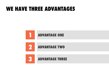
Some readers of my blog have become paranoid to use bullet points in a presentation (a good thing), but there are actually situations where putting 3 short sentences on a page is inevitable, or even a good solution for a slide.

These situations are when you want to express that something has a number of components. Breaking up those 3 advantages and give them one slide each enables you to explain them clearly individually, but the audience loses the overall perspective of how they are related.

In those cases - yes, it happens to the best - I revert to 3 short bullets.  But there are a few things you can do to keep things interesting:

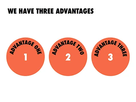
  • A massive visual anchor (like a big 1, 2, and 3) to show that you are talking about an overview slide
  • Really, really short descriptions just to introduce the ideas. The full explanations come in subsequent charts
  • Also, you can deviate from the traditional list and come up with other geometrical shapes ore layouts to make your three (short) points.

·Keynote

How to get started?

I recently answered a Quora question on what is the best way to get started with a VC/investor presentation. The answer applies to all presentations, not just investor presentations. Obviously, this is my preferred approach, yours might be different.

I use multiple approaches at the same time, in parallel:

  • Scribble a story line on paper, or an iPad mind mapping app (iThoughtsHD is good)

  • (Just because I like it) design a really beautiful cover page with a nice image and the right look and feel of the deck.

  • Dive straight in and try to craft that ultimate killer slide, the one that makes the most important point in your presentation and finish it all the way. BANG.

Then I continue to iterate: refining the story line, adding a chart here and there. I take lots of breaks in the entire process, designing a good deck can take a lapse time of about 2 weeks. This ensures that your creative energy stays fresh. Presentations made at gun point at 3AM before the 9AM meeting never look really good.

·Investor presentation

Speaking in Barcelona

I will be crossing the Mediterranean Sea and talking about designing a good VC/investor pitch presentation in Barcelona. It would be great to shake hands with readers in Spain.

The event is scheduled for October 3, at 19:00. The location still has to be finalised, maybe the campus of the IESE business school, or another central Barcelona location. The presentation will be in English, and is free of charge. You can sign up for the event here.

Thank you Conor Neill for connecting me to the Barcelona startup community. Thank you John  and Mel Kots for this nice and hazy picture of Gaudi’s master piece that is still under construction.

·Concepts

Lots of layers

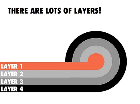
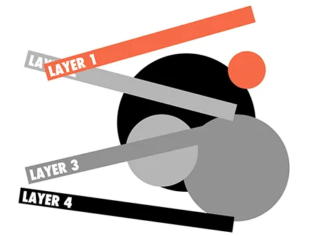
Here is a concept to label lots of layers in a circle without bending text, the second image shows with which components the first chart was created.