

SlideMagic Blog

Frequent updates about all things presentations since 2008. Subscribe to never miss a post.

RSS
all posts

Category Keynote

·Investor presentation

Too generic to sink in

Opening slide bullets:

  • Industry #1
  • 15 consecutive quarters with growth
  • 40% EBIT margin
  • Offices in 35 countries

Pretty impressive, but when you put on a slide like this the audience is unlikely to digest the numbers fully. Almost every opening slide of almost every corporate presentation has numbers that look like this (something about growth, something about margin, something about locations, we do not pay that much attention to the actual numbers).

Instead, break up the slide, show that you are bigger than IBM, show a column chart with growth in the past 15 quarters, show that competitors are struggling to achieve 5% EBIT margin, show a map with 35 dots. It takes the same time to present, but your audience will remember.
·Keynote

The conversation first

Yes, many of the slide decks I design for clients are meant as support for a stand up presentation. But I think these cases are the minority.

What most clients are after is a different concept: the documentation of their story. The idea in their head, captured, recorded, somehow. This story can then be emailed, shared online, discussed in a 1-on-1 meeting and yes, presented live.

And when I stand back and see from which perspective I design, I think - to my surprise - that it actually is the 1-on-1 personal dialogue. When that conversation is nailed, I make the adjustments for bigger audiences.

Maybe not so strange after all though. Everything starts with a simple human conversation.

·Delivery

Handling an unfriendly audience

Audience members are not always friendly. Unfriendliness comes in 2 types:

  1. the civilised audience who is reluctant to agree with your proposal (I faced many of those as a management consultant) and
  2. the heckler who is out there to interrupt and derail your presentation (probably on his own).

Audience 1. A fatal mistake with audiences that do not agree with you is to invite the full debate before you have had a chance to tell your story. Highlight all the points and data quickly before you get to some slide that presents the trade off your making. That trade off slide is very important. Many of these strategy debates go in circles and keep on repeating the same points. If you have written down the point on the slide you can point at it and say “You are right, I have captured that here.”. Group/isolate/give less space to the points everyone agrees to and focus on trading off the difficult ones.

Audience 2. Hecklers are difficult. The best strategy is to try to get the audience on your side. If you ask - after 3 detailed questions - whether the audience agrees that these points are better discussed one-on-one after the presentation, there is a good chance that the heckler will stay quiet.  In addition, after you answered the heckler’s question, turn away from her, and make eye contact with another person with a question.

·Keynote

Stick to your grid

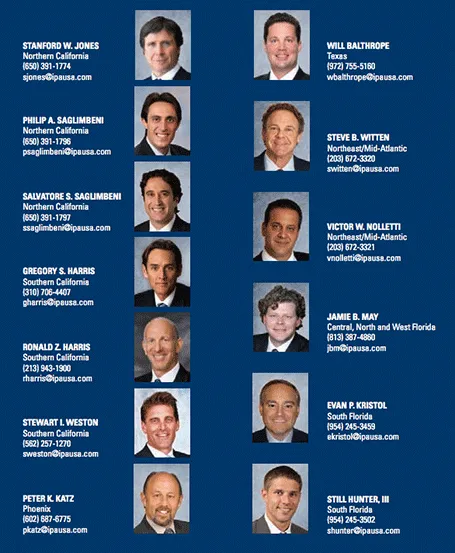
The grid is the imaginary set of horizontal and vertical lines along which the objects on your slides are aligned. Breaking the grid is a key tool that designers use to add an interesting tension to a page layout. But in most cases, it is better just to stick to it. See the example below, your eye will immediately pick up that there is something wrong with the layout of these head shots.

·Delivery

Do I actually need a deck?

Good question, and the answer is “Not always”. TED talks are a good example of people delivering complex messages without the support of slides. But:

  • In order to give that naked talk, you need to understand your presentation insight-out, you need to live and breathe your presentation. In the early phase of your learning curve, slides will give you a good backbone to hold on to. You start by presenting your slides, you end by telling your story. A lot of practice can of course make you jump straight to the end of this process.
  • Certain types of information have to be conveyed visually. Examples are graphs with data, the latest quarterly results, or an image of a surgical procedure.
  • In many cases the live presentation is actually not the main purpose of why we design slides, often we send out material ahead of our discussion. It is hard to avoid slides, unless you have the confidence to email a short recorded video of you explaining your idea (without slides).
·Delivery

4:3-ing that LCD screen

Most people design their slides for a the 4:3 aspect ratio of older TV screens and computer monitors (I still think it is actually better than 16:9).

Increasingly conference rooms are using large 16:9 LCD screens that are much brighter than the traditional on screen projectors. And most of these 16:9 screens are set to stretch 4:3 input signals. As a result your slides will look bloated.

Grab that monitor remote (you cannot control this from your computer) and set the aspect ratio to 4:3 before you start presenting. The tech person present usually will say “What, you want those black bars?”. You can answer affirmative. Your slides will look much better, and if you use a black slide background, no one will even notice the black vertical bars.

P.S. Ancient post that touches on slide backgrounds.

·Delivery

A deck for a 5 hr meeting?

After my presentation in Barcelona last night, one of the audience members came up to me and asked whether for 5-hour presentations, you should take a different approach from the one that I had been advocating for the 20 minute investor pitch. Two answers:

  1. Break up your 5-hour presentation in blocks of high-energy and well-designed 20 minute pitches and discussion sessions.
  2. But better still: cut that 5 hours. Give people the opportunity to read things beforehand and just do a discussion rather than going through details for 5 hours. Obviously this might require a culture change in your organisation if people usually do not do their pre-meeting homework.
Kicking off my talk in Barcelona last night
·Keynote

No watermarks please

When graphic designers start with the design of a PowerPoint template, they are faced with a white page. A common way to fill it is with a faded, washed out, water mark. It might look OK on an empty page, but it will clash with any other object than a text bullet point. To be avoided.

Unless other prescribed corporate template elements that are hard to change, a water mark can be easily taken out, simply delete the graphic on the page, or cover it with a white box.

·Keynote

The tiny legend

Many consulting charts feature a tiny legend in the top-right corner that explains what the shading in the bar chart means (for example “Have no access to clean drinking water”). Often that is the whole point of the chart and that legend deserve to be made a bit more visible.

·Data visualization

Making up some numbers

In many cases it is hard to give a real example of the cost savings someone can achieve with your product or service. Data is not public, or in case of a startup, you might not have that many customers yet. “Making up some numbers” does not sound like an ethical alternative, but it is a good strategy if you stick to some simple guidelines.

  • Explicitly say that it is a hypothetical example
  • Create a highly realistic artificial customer (1 owner, 3 trucks, 1 warehouse, $x million in annual revenues, etc.)
  • And most importantly: explain how you get to your cost savings. If possible break them down into a few simple categories, and use a highly simple and transparent way to quantify them (10 instead of 35 phone calls of 30 minutes each per week equals $x)
  • Make the spreadsheet as complicated as you want, but start with a blank PowerPoint/Keynote page to explain your calculation.
  • Add everything up and see whether the cost reductions make sense as a % of the total

The main purpose of the case example is to explain how you got to the savings, not the absolute point estimate.