

SlideMagic Blog

Frequent updates about all things presentations since 2008. Subscribe to never miss a post.

RSS
all posts

Category Keynote

·Delivery

Stage fright: tips from TV

The first ever guest post on my blog! The contribution below is by Roger Kethcart,  a writer for Cable.tv who “fell in love with public speaking watching courtroom dramas as a boy”.

Overcoming the Fear of Public Speaking: Tips from TV

Public speaking is perhaps one of the scariest, most frightening things that one can experience in their lifetime. Sweaty palms, shaking hands, stuttering, queasiness- all unfortunate symptoms that public speaking can have on you.

Whether you are a seasoned public speaker who still gets the occasional jitters, or an amateur seeking a way to stay calm through the storm, taking cues from beloved shows may be just the tranquilizer you need.

Go Slow

One of the reasons people suffer from public speaking is the feeling that they need to speak quickly to get the speech over with. In reality, however, the faster you speak, the more likely you are to mess up, stumble over your words, or skip parts of your speech. By simply slowing down, breathing and relaxing, as best you can, you will greatly enhance your speech. The King’s Speech was a great example of what slowing down can do for one’s public speaking. He’s a clip of the original speech by King George VI, where you can see his pauses when a stutter would have incurred.

Tip: If using note cards for reference, write “BREATHE” and “SLOW DOWN” at places where you find yourself speeding up. The written note will help you relax and focus on what you are saying and your speed.
Continue reading →
·Images

Flickr image search

Hey, Compfight is a neat Flickr image search engine.

·Keynote

Humanising the story

I discussed a presentation with a company the other day that was in the field of measuring and analysing human behaviour in companies. My main recommendation for their sales presentation: humanise your story and translate the pages and pages of cold statistics about people into case example and organisational behaviour situations that anyone can relate to. Because that is how people will use the tool in the end.

·Gadgets

iPad without the new car smell

Immediately after the iPad launch, doing a presentation on the device was cool and innovative. Now that the new car smell has worn off, the iPad has become another common device in our IT setup (light, small, touch, crappy file system). What are the implications for presentation design?

  • More people do not carry their lap tops everywhere anymore. As a result, you might find yourself running a presentation from an iPad in a 1-on-1 meeting. Not because of it is cool, but because it is the only screen around.
  • Increasingly, people open email on mobile devices. Remember that a PPT file does not look great when opened on an iPad without the right apps. And it is unlikely that your boss, or potential customer, or potential investor has this software installed.

So what I end up doing is saving a animation-free PDF version of my important presentations (no font rendering issues) and keep them in Dropbox alongside the PPT master file. The iPad has become a workhorse.

·Investor presentation

"I get it"

Yesterday, Seth Godin posted about us thinking that we can absorb anything in 140 characters. Part of it is true, but part of it is that we fail to fully immerse into something.

Busy venture capitalists often show this behaviour. In the first few seconds they try to put your idea inside the framework of other similar ideas in your field of business and they get it, they think.

Think about this when you prepare your investor presentation and put emphasis on those aspects that are different, not that obvious. Even to the point where you make it extremely explicit: “I see what you are thinking, but no, this is not the [FILL BLANK] for [FILL BLANK]. Let me explain why.”

·Investor presentation

Consultants cannot pitch

The other day I was asked to provide input on a pitch deck prepared by a respected consulting firm. The idea was the result of a consulting project, the results of which for document in a hefty, detailed, and structured document that everyone agrees was great for reading background material, but not really right for presenting/pitching. The team took the first step by cutting down the number slides (not changing them) in an executive summary presentation.

My advice for consultants who want to pitch: start from scratch and design a completely new presentation specifically aimed at selling, pitching, fundraising and leave the big data Bible as back up.

What goes usually wrong in executive summary decks that are created by chopping slides out of a master pack? Some examples.

  • The team has probably been working for months on the project and as a result, they see the discussion of the problem as totally trivial and cut down a lot on the charts that adress the issue, most of them probably generated early on in the project, or even during the project definition phase. The consultants forget that to the outsider who hears about the issues for the first time, it is not that trivial. On the contrary, it is often easier to pitch the problem, than to pitch the solution.
  • The problem section usually involves data, and consulting data charts are loaded with facts and figures and tables. Most consultants actually violate one of the cardinal rules of one message per slide. Go back to your drawing board and pick one statistic/trend that is really crucial to sell your problem and make a super clean/clear data chart that just shows that, nothing else
  • As we get to the solution the consultant often forget to describe what it actually is. We show histories of how the initiative has been used in other parts of the world, who is involved, but hey: what is it that you actually want to do? To the consultant it is obvious, to the audience not.
  • Describing the initiative or its impact can be done in dry text bullets with low emotional appeal. But why not use pictures? Show the project in action. Profile the people that benefited from it in big page filling images. Create human stories. People relate to this much better than dry data. Yes, I want to help this girl in the picture!
  • Consultants are always shy, and hesitant to take a strong position. (Yes, you could take option B but it has these disadvantages and it depends on this scenario C panning out that way). As a result, it is actually unclear what is expected from the audience: contribute this amount of money to do X, Y, and Z. Get over your shyness, and spell it out the call of action bluntly.
Continue reading →
·Data visualization

Micro economic charts

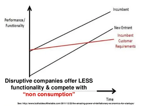
Line graphs with supply and demand shifts, pricing, are great for a round the table discussion of micro economics, but they are less suitable for presentations for large audiences. Take the example below. It takes time before you get the picture (what is on the axis, what do the crossing lines mean). Once you understand the framework you can have a great discussion about it. But in a big audience setting, not many people will get there, unless you build it up slowly, slowly one step at a time.

This image was taken from a presentation by Mark Suster, which in general was an excellent presentation. Not consistent in formatting, but I think the audience will forgive a busy VC harvesting charts from multiple sources, it is the content that matters.

·Keynote

First impression of iOS7 (design)

As I am making steady progress with the design of my PowerPoint killer app, I have become very interested in user interface design for mobile and big screen applications. Apple showed its new iOS7 design yesterday. (iOS7 is the operating system that runs iPhones and iPads). Some observations.

I love the flattening of the design, out with excessive shadows and fake textures. The use of transparency is clever, to get a sense of layers throughout any app you use on the phone.

But there are things that I think are less good. The color palette is very bright, almost screaming, and the home screen looks like a sparkling X-mas tree. The use of gradients is inconsistent, with different directions of light sources. Some icons have gradients, some have not. I am also no fan of the more pronounced rounded edges. Grids on some screens are not completely consistent. The thin font looks classy, but might be hard to read in glaring sun light. And finally, the look and feel is not consistent either across all applications (some apps look great, others less so).

In short, a big improvement over iOS6, but iOS8 might just iron out the current imperfections. Weirdly, I actually still think the minimalist design of Microsoft’s mobile platforms looks great in terms of use of grids, simple colours, and sharp edges.

But then, people say never to argue about taste…

The look and feel of PCs running Windows software has greatly influenced the design of PowerPoint slides. In the future, I expect the same influence from mobile platforms on the way the average amateur design will create presentation slides. Helvetica Neue Light will become a popular font.

·Delivery

Overcoming pitch fatigue

A post by VC Brad Feld about pitch fatigue: when people have told a story too many times, they get bored and lose the passion to present it with all they have got. Your audience hears the story for the first time though, and they probably evaluate you 50% based on content, and 50% on the emotional delivery of the story (your body language). A bored presenter will not convince. What can you do?

  • Do not run off a standard script like a tape recorder, but as you get more experienced with your story, deviate from predictable patterns
  • Make the story a dialogue rather than a monologue. Try to make it very specific to the audience. Use case examples, analogies that are tailor-made to that client, or that potential investor.
  • Now that you know the story in and out, you can rely less on slides and visuals. Make more eye contact, and tell your story verbally
  • Fire yourself up before the pitch, and think about the outcome you want to achieve, getting that investment or signing up that customer. The objective your meeting is not to deliver the pitch, it is to reach your objective. That should bring that spark of adrenaline back into your system
  • Make sure you are not physically tired (eat a snack 30 minutes before, have a coffee)
  • Do a make over of your deck, after 999 run throughs you have probably some pretty good ideas how to delivery the story better, but you somehow never have time to sit down and implement them. Create the time, and make more minimalist, bolder slides and create a piece of true art that makes you excited to deliver your pitch.
·Investor presentation

Prezi as an attention grabber

Sometimes, making the effort to communicate well is almost as good as doing the real thing. Effort gives you instant audience credit.

My wife is a venture capitalist and received her first Prezi investor pitch last week. “This movements make you a bit dizzy, but I must say that the team got points for trying something different”.

For this very short introduction presentation that was competing with an overloaded inbox full of other pitch decks, she was OK with some motion sickness. For a second, longer interaction this is probably not the case.