SlideMagic Blog

Frequent updates about all things presentations since 2008. Subscribe to never miss a post.

RSS
all posts

Category Keynote

·Keynote

You didn't know you need this

If you pitch your product as a direct alternative to something else, the purchasing manager might say that it is a nice solution, but we already spent our budget on something that is acceptable. Often, it is better to convince the buyer that this is a new market, a new product, that has no substitutes yet. An opportunity for startups that are out there to change the world.

·Images

Thomas Leuthard

Thomas Leuthard (web site, Flickr) is a street photographer who published his work under a Creative Commons license on Flickr (attribution is required). His work is of very high quality. His images make great backgrounds for presentations that need an urban setting.

Image by Thomas Leuthard
·Keynote

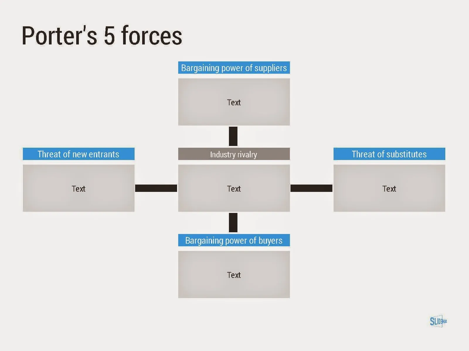
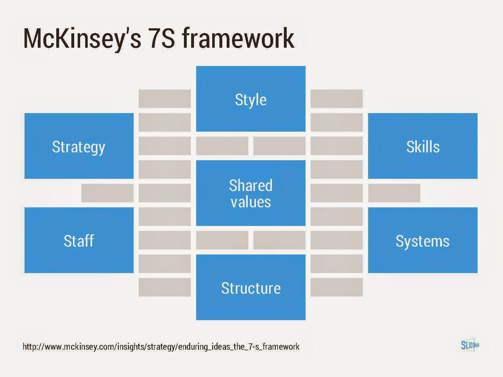
Consulting frameworks

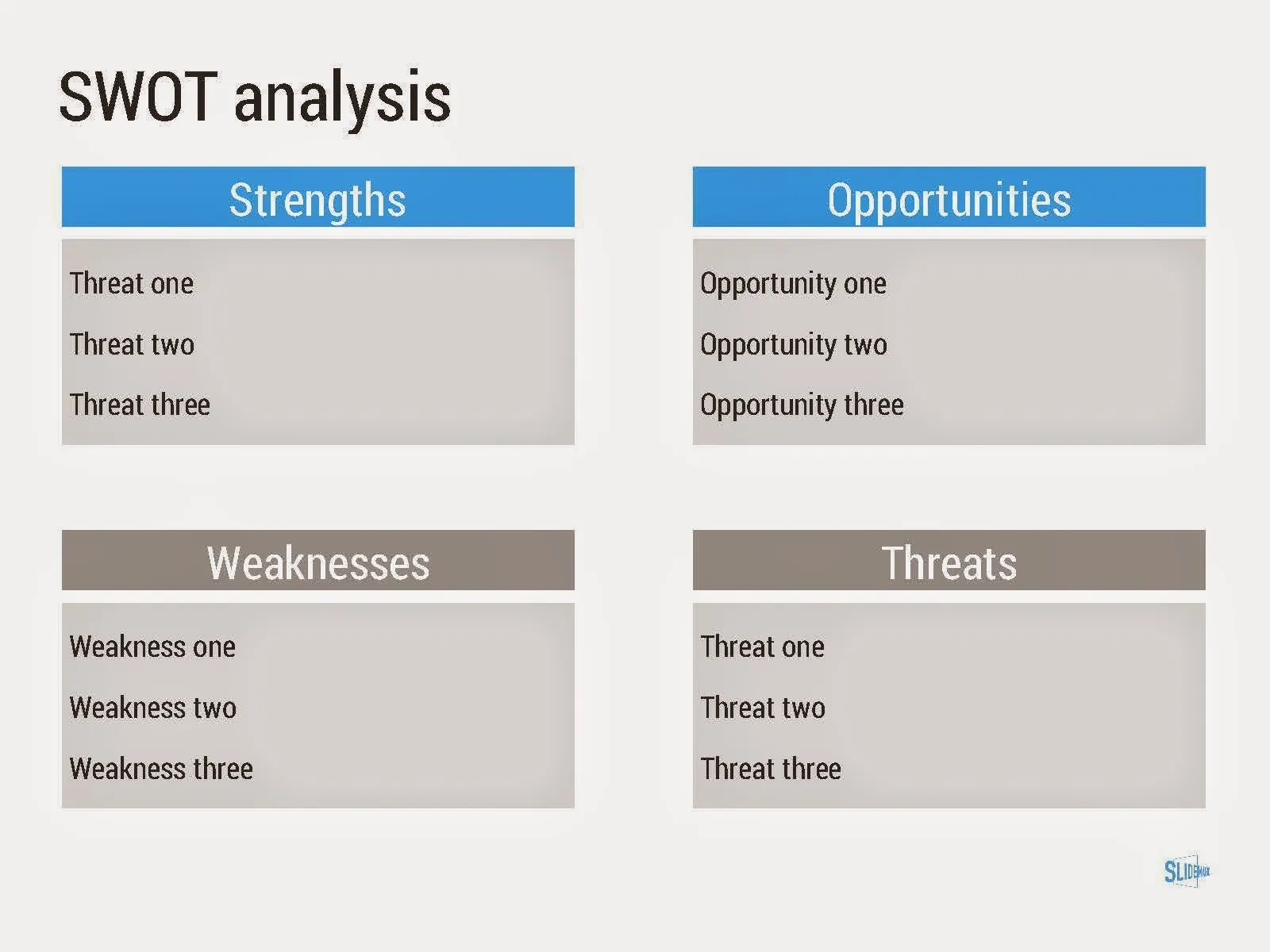
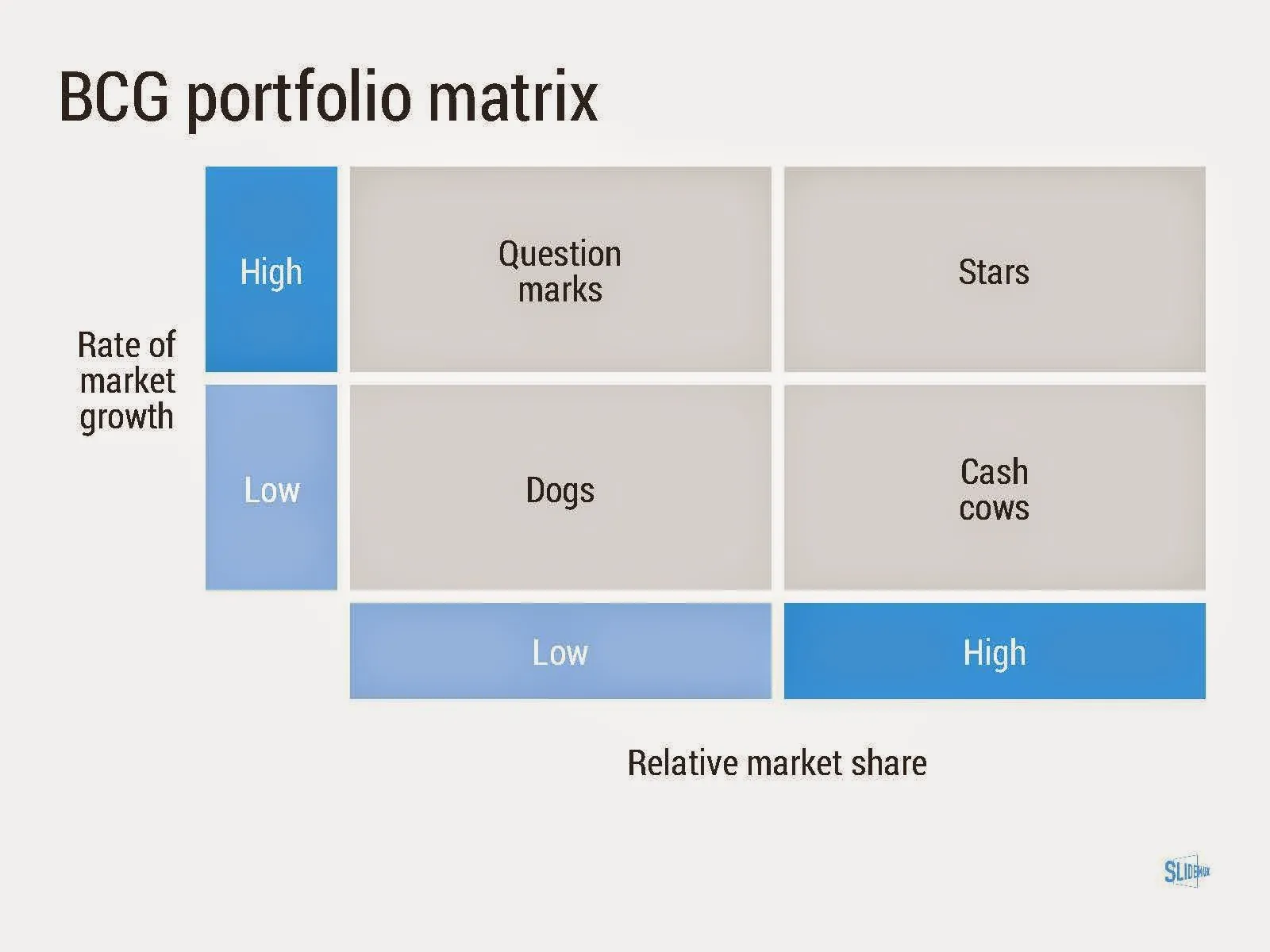
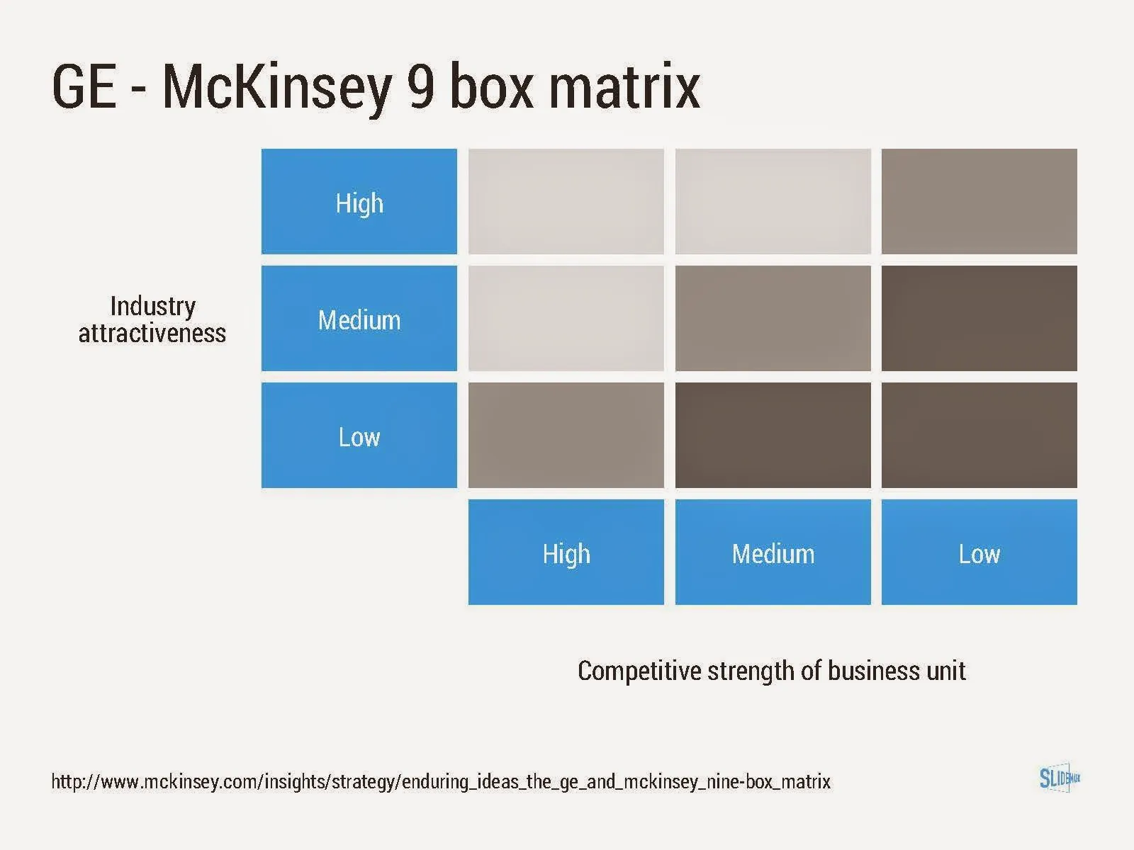
I added a new set of templates to my presentation design app SlideMagic: consulting frameworks. It was an interesting journey back in time (I used to work for 10 years at McKinsey back in the 1990s).

Putting them in SlideMagic was interesting, it shows exactly what SlideMagic is supposed to do for business presentations. Take unnecessary complexity out of visual designs down to a level that the chart still says what it needs to say, but that you do not need to have a degree in graphics design to make them. I had to make slight deviations from the original here and there (Both SlideMagic and layman designers do not like curved shapes for example), but the end result is pretty good.

As to the content of these frameworks. They are more tools to help you think about a problem than slides that will get your audience jumping out of their chairs. Many of them are linked to classic micro-economics theory (demand/supply/competition). I think the strategic issues of many companies today have moved beyond these problems. Still some frameworks can work to kick start a discussion, they good old SWOT works great in group white board discussions.

·Investor presentation

And also, and also, and also

There are so many wonderful things to say about your idea. all the problems it solves, all the things it can do, all the thought you have put in to make it perfect.

In the middle of the “and also, and also, and also, and also” the audience gets bored and wonders what it actually boils down to. In 99% of pitches I have designed, there is one original idea that is more important than all the other features.

Design your presentation around this. When describing the problem (always easier to do than selling the solution), focus on the most important issue. When presenting the solution, hammer in that one crucial innovation. After that is done, you can mention other elements of your story as a “by the way”. But, watch out not to get carried away here.

Prioritising that one big idea out of all your smaller ideas is not a matter of diluting things with generic terms: “we deliver ROI”. It should be highly specific.

·Keynote

Background overload

Professors, researchers, and teachers like to start their lectures with an extensive discussion of the background and/or context of an issue. Talking about the background is useful if it adds to the story, if it does not it is boring content that fills up those important first minutes of your talk where the audience is still sharp and awake.

Some examples of excess background:

  • Tangents, side steps
  • History that is important to you (when your company was founded), but irrelevant to the audience (unless you are a Champagne house that goes back to the 1700s)
  • Preaching to the converted: spending slide after slide with data the audience is already familiar with, or arguing about issues the audience already agrees with

You are not giving a lecture in economics or history, you are trying to sell an idea.

·Investor presentation

How to explain magic

Some technology solutions appear to be magic, almost too good to be true. Complicated algorithms that are hard to apprehend for example. Your audience might not believe you, because they cannot understand it, you are trying to sell snake oil. How to pitch magic?

  • Do not start of your audience on the wrong foot by claiming yourself that it is magic. It does magical things, but it is not snake oil, everything is science and engineering.

  • Use two stories:

  • One: a powerful analogy/story that explains the fundamental approach your system takes. This is to explain the concept.

  • Two: a super detailed, super in-depth deep dive on one aspect of your algorithm, show how it works on one micro example. This is to show that it is tangible and real

Many people try to make story 1.5: an analogy that is too forced and complicated to understand quickly, and a technology explanation that is too vague that it leaves people wondering whether they are looking at a magician instead of an engineer.

Strangely enough, it is a visual analogy that might drive you to story 1.5. A simpler, verbal story might do a better job here.

·Keynote

Making bullet points look good

Yes, you heard it from a pro: sometimes bullet points are hard to avoid!

  • In a document meant for reading rather than presenting
  • In a quick internal presentation that is more a decision document than a heart and mind captivating piece of visual art
  • In a document that you use to hammer out a legal agreement before handing it over to the lawyers who will expand the basic ideas into fine print
  • A first and/or last page in a presentation that summarises what you want to achieve

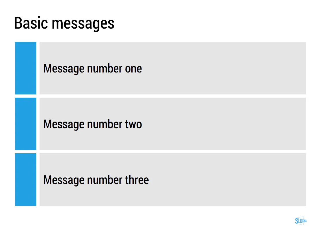
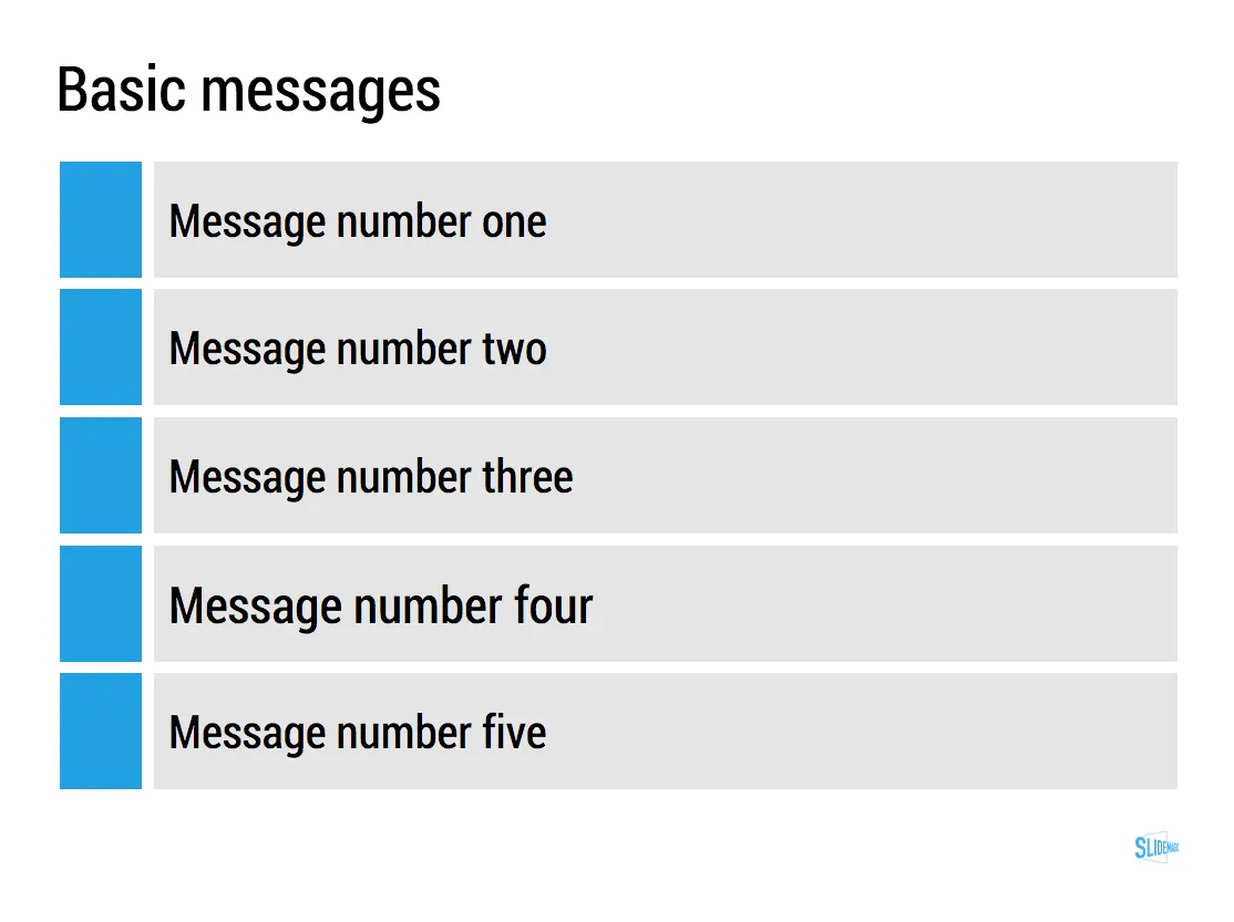
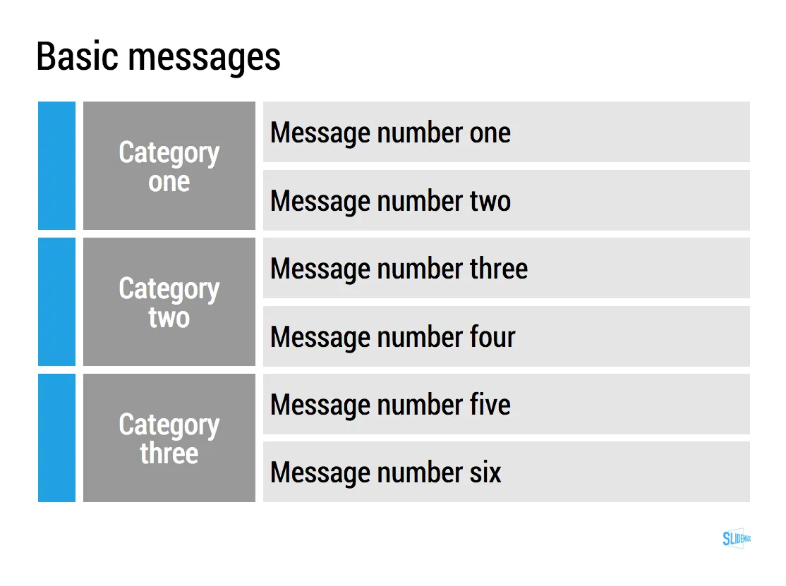
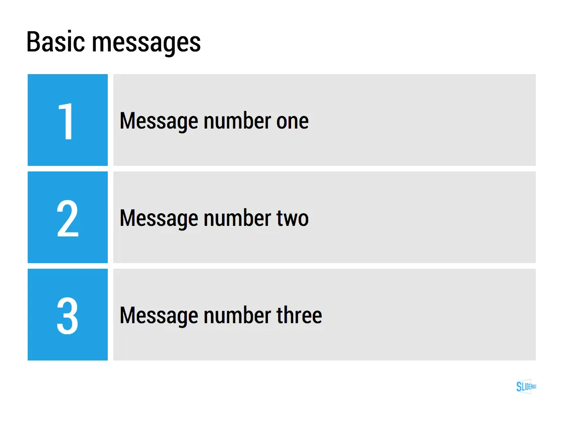
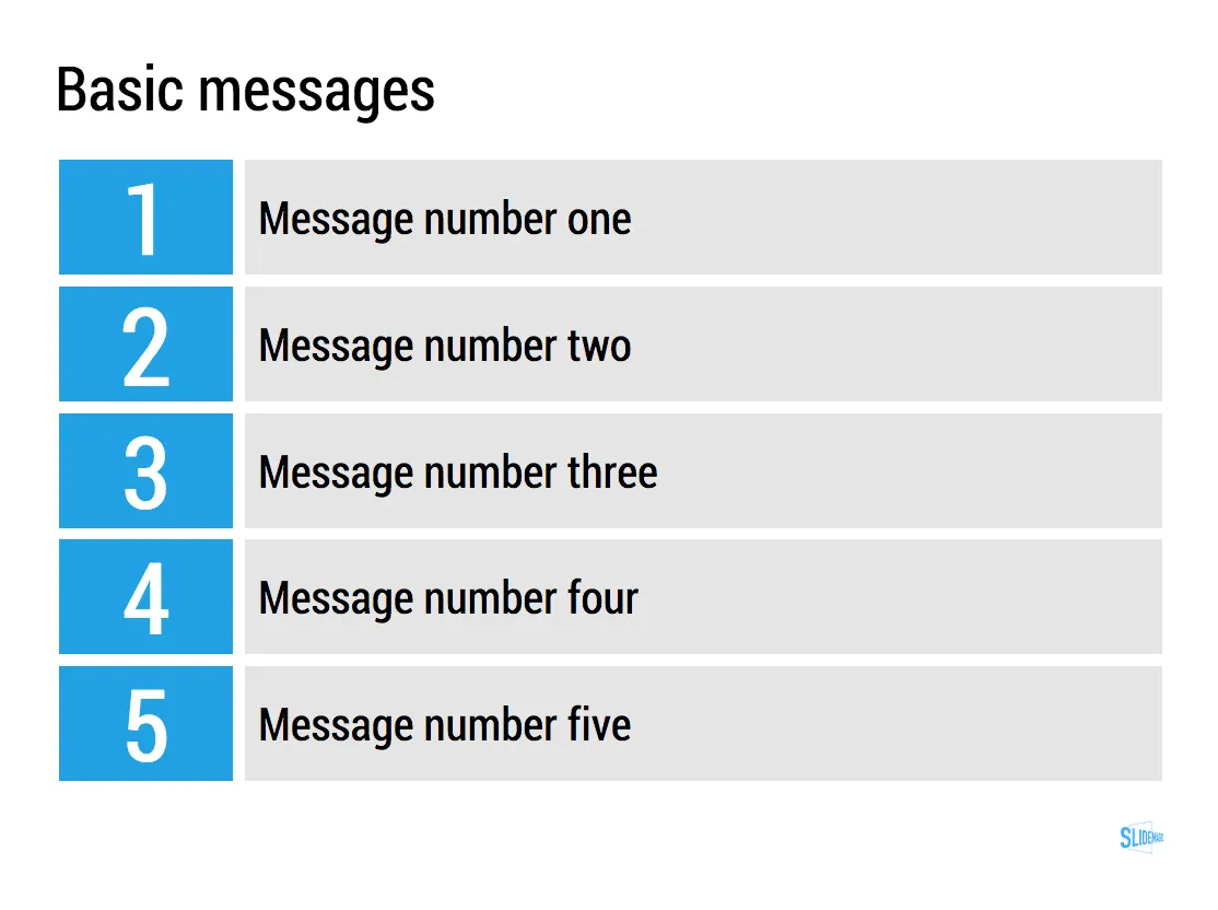
The key to make them look pretty is stop viewing them as text, but rather see each bullet as a slide object.

  • Use some light background colour to make them appear equal in size to the eye
  • Spread them out big over the entire page
  • Use as little words as you can, but use enough words not to sound generic

In PowerPoint or Keynote, you can use rectangular shapes for this. Even easier is it to use a table with fat white divider lines (the new

Keynote has lost some of its shine

, but the table editing functionality is really good).

In

SlideMagic, my presentation app

, it is really easy to do. Whatever you do, the app will force you to stick to a grid, it ships with a number of templates for text slides, which makes it easy to add and subtract lines.
UPDATE February 2018: I have no added many of the above bullet point slides to the SlideMagic template store, read the blog post about formatting bullet points here.


·Investor presentation

Getting used to the image

In conservative industry sectors such as finance, the use of images in presentation is not very common. When I put on in, the immediate reaction is one of: that is not how things work here. But usually, over time, people get somehow used to the image and realise that even serious presentations do not have to be boring.

This slide was created with  presentation design app SlideMagic for presentations that mean business

·Investor presentation

Confusing accounting

Accounting regulation and business reality can sometimes be far apart. A client could show incredible revenue growth because it was forced to recognise revenues early because of accounting regulations. At first sight, it looks great, but as soon as an analyst tries to dig in only a centimeter deeper (“Why does the cash flow not match?”) the story starts to unravel.

Yes, you can explain them how undo the accounting policies, yes a good analyst will probably ignore the profit and loss account (which is merely a tool to set tax rates), and focus on the cash flow. But, you left an impression of hiding the truth. And that leaves a bitter after taste with investors even if the company is actually doing very well (even without the help of obscure accounting policies).

You might have to come clean up front.

·Images

Sizing up the comet

A number out of contrast is hard to put in perspective. That is why our measurements originally were all somehow related to things we can compare to: feet, kilo (1 litre of water), inch (thumb). But when things get really big, or really small it is hard to absorb the scale of something.

In presentations, you would use bar or column charts to compare 2 numbers to each other. The best comparisons are those where the audience can relate to.

Many people tried to use images to put the size of Comet 67P in perspective (example, example). Below is my attempt, where I put the 4.1km height of the big blob in perspective to the 158m height of 26 Broadway in New York. I think the vertical compositions are much more dramatic than the juxtapositions on horizontal maps.