SlideMagic Blog

Frequent updates about all things presentations since 2008. Subscribe to never miss a post.

RSS
all posts

Category Images

·Art

Using impressionist painters in PowerPoint slides

My life and business partner Anat Naschitz has a strong interest in the arts. She recently created a chart for a client that needed to show how its solution makes it possible to see beyond the dots and construct the full picture (in a medical application).
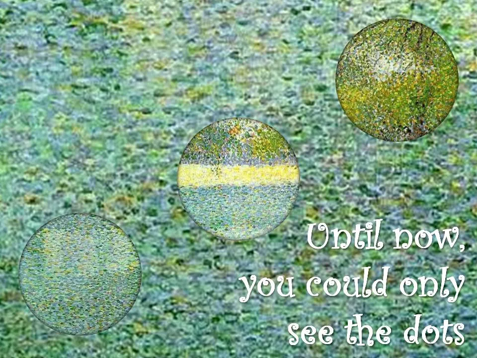
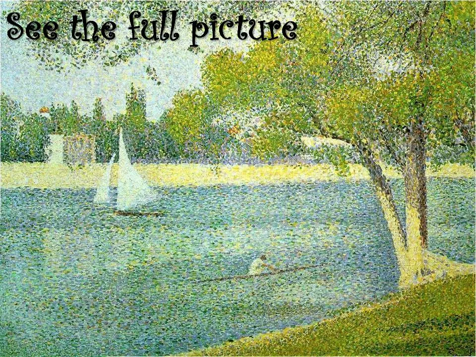
The painting “The Seine at La Grande Jatte” by Seurat is an example of the pointillism style. An approach similar to the CYMK technique used in many printers today. (Seurat starred in a previous post on this blog as well).

The round cutouts were made by setting the background of the PowerPoint shape to “slide background”. The curly font used is Curlz MT.
·Design

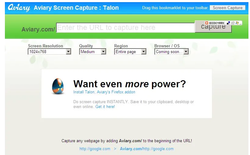
Screen shots made easy with Aviary

Mashable pointed to this usefull tool yesterday. Aviary is an “in-the-cloud” image manipulation utility (trying to take on Photoshop and others). To lure more users to their site, they have created a neat screen shot capture tool (bookmark this URL).

I use screen shots a lot, and until now relied on CTRL-PRT SCR, followed by a paste into a PowerPoint slide. (For example to extract tag clouds from Wordle) Two drawbacks:

  • A huge, very wide image (I have a large screen resolutions) gets plopped into your slide that you need to crop by switching the PowerPoint zoom to 33%
  • A partial web page image (PRT SCR only captures what’s on the screen)

The Aviary tool is more useful:

  • Simple: type in aviary.com followed by the URL you want to capture, for example aviary.com/http://ww.axiom.co.il if you want to make a screen shot of my corporate site www.axiom.co.il.
  • The image (covering the entire web page including parts that are not on the screen) opens up in a basic image editor for cropping.
  • You can save the image for future use
·Design

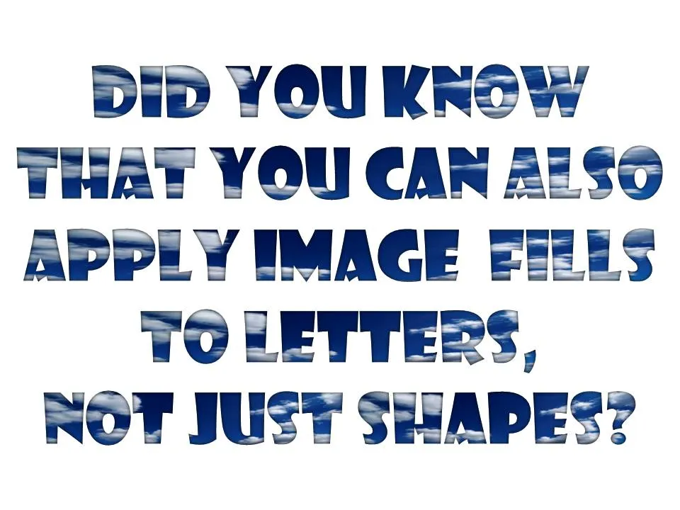
Filling PowerPoint letters with an image background

A neat trick. Select your text, go to “format” and select “text fill”. The font I used in the example below is “Showcard Gothic”.

·Design

Interior shadows can be a nice change

When people (ab)use shadows in PowerPoint, they mostly use the drop shadow, to make an object stand out from the canvas. The opposite, the interior shadow can give a beautiful effect as well. It makes the object, or letters fall back in the background.

See the example below of a slide taken from my presentation about fund raising presentations (explaining a bit about my personal and professional background).

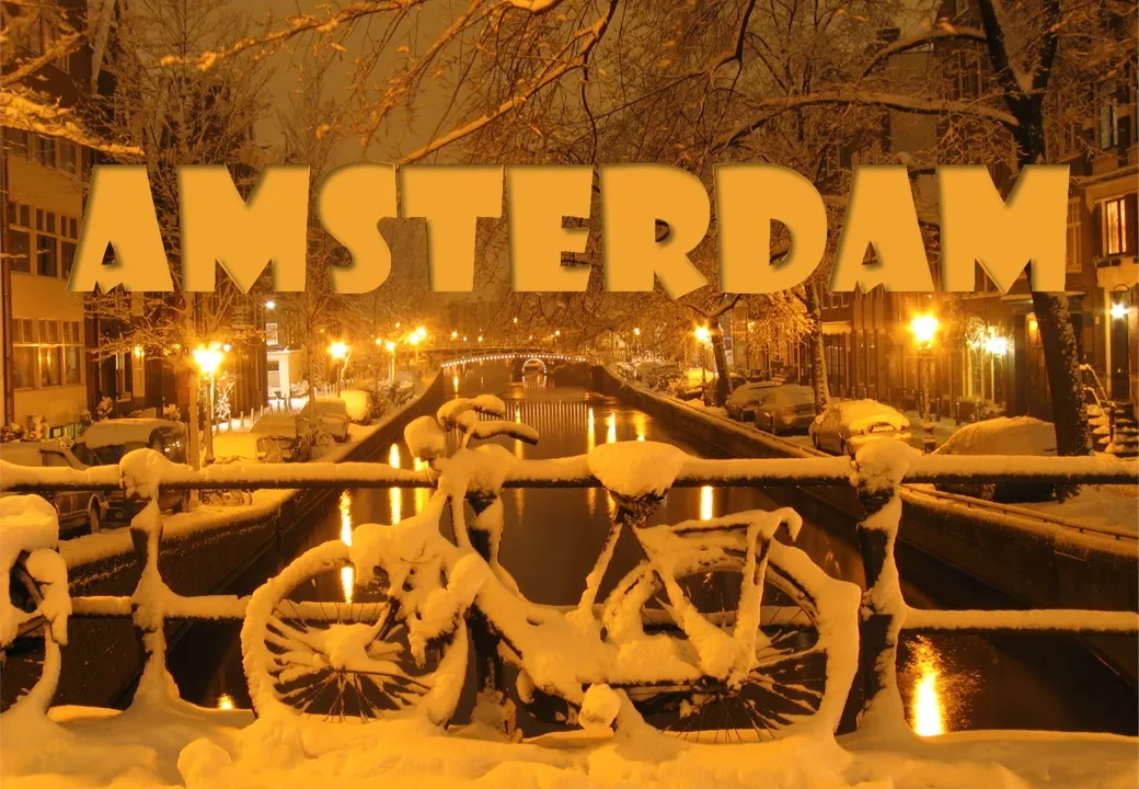
Make sure the direction of the shadow is always vaguely similar to the lighting in the background, the Amsterdam street lights in this case. Use a character color that is similar to the tone of the image.

·Advertising

The blunt photo composition

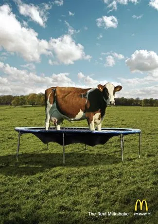
Technology allows you to create almost any photo composition. Professional use PhotoShop, but you can get some pretty good results in PowerPoint as well. As with many technology tools, the fact that they are available does not mean you have to use them.

Photo compositions that are “blunt” are more likely to invite a laugh from your audience than help you make a serious point. My opinion. What do people think? (McCow taken from Ads of the World)

For some great Photoshop creative work check out FreakingNews.com

(This post-flood New York image by Mandrak)

·Concepts

Chart concept - where do we go from here?

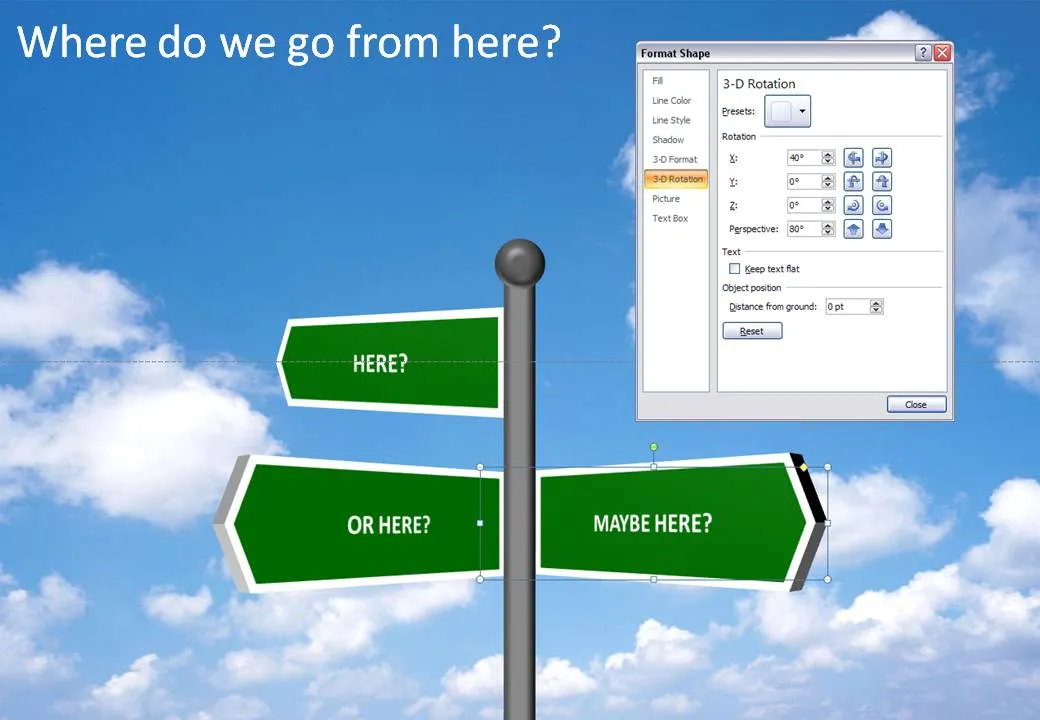
It is easy to make your own 3D road sign image, no need to buy a stock image, and you get the 3D text perfectly aligned. Click the image for a larger picture (with the settings in the “format shape” box).

·Design

Think of the 3rd dimension in stock images

99% of PowerPoint slides and 99% of stock images are 2 dimensional: showing an object or a shape on a flat background. When looking for your next stock image, try picking out those that add 3 dimensional depth.

The image of the flower field above (bought on iStockPhoto) is a good example. The whole point of the picture is the depth, not the objects in the photograph.

  • Taken very close to the ground
  • Focus close to the lens
  • Lines that come together to disappear at the horizon

A good image to support something that goes on and on and on, or a new and untapped source of information that all of a sudden becomes available.

·Design

Online tilt-shifting image manipulation tool

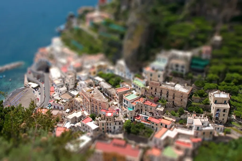
Tilt-shifting is a photographic technique that creates images with very narrow depth of field. It can be used to take real images and make them look like photographs of miniatures. The site tiltshiftmaker.com creates the effect for you. It works best with images with lots of detail on the foreground: houses, cars, people. An example from the tiltshiftmaker site, a town on the Amalfi coast in Italy.

Via GeenStijl

·Concepts

Chart concept: slowing down

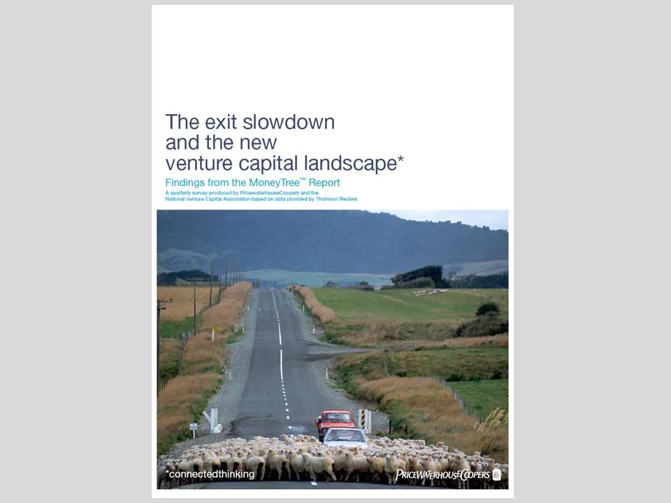
This cover of a PwC report is an example of an excellent use of images.

  • You get the point instantly, even from a far distance, the concept is right
  • Both the report cover and the image have lots of “white space
  • The image is a completely natural and real one, no artificial models, compositions
  • There is a great sense of depth and perspective in the image, search “sheep + road” in a stock photography site and you get a whole bunch of very unexciting pictures
  • The picture is cropped nicely, see the road running on the golden proportion
  • The image colors blend in with those used in the report (blue highlights)
·Advertising

Filling shapes with pictures

This ad from Ads of the World sparked some ideas.

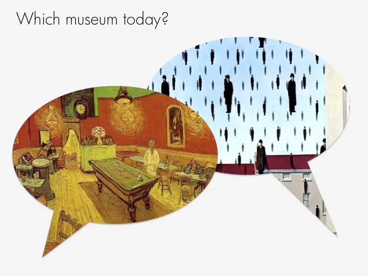
One, the image bubble with the contrasting thought is an interesting concept that can be used in PowerPoint charts.

Two, I am not using the ability to fill shapes with pictures enough. It’s easy. In format shape, go to fill, and choose texture or picture, and off you go. The effect is best used with irregular shapes (clouds, stars, etc.) rather than plain rectangles.