Keeping titles readable over busy images
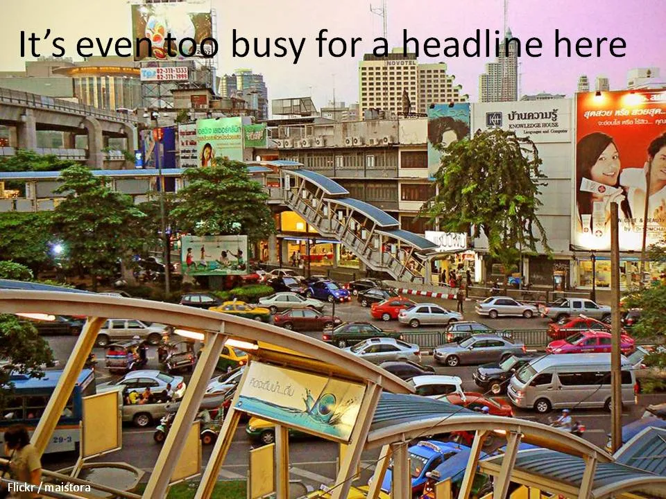
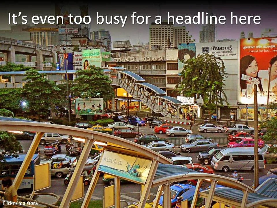
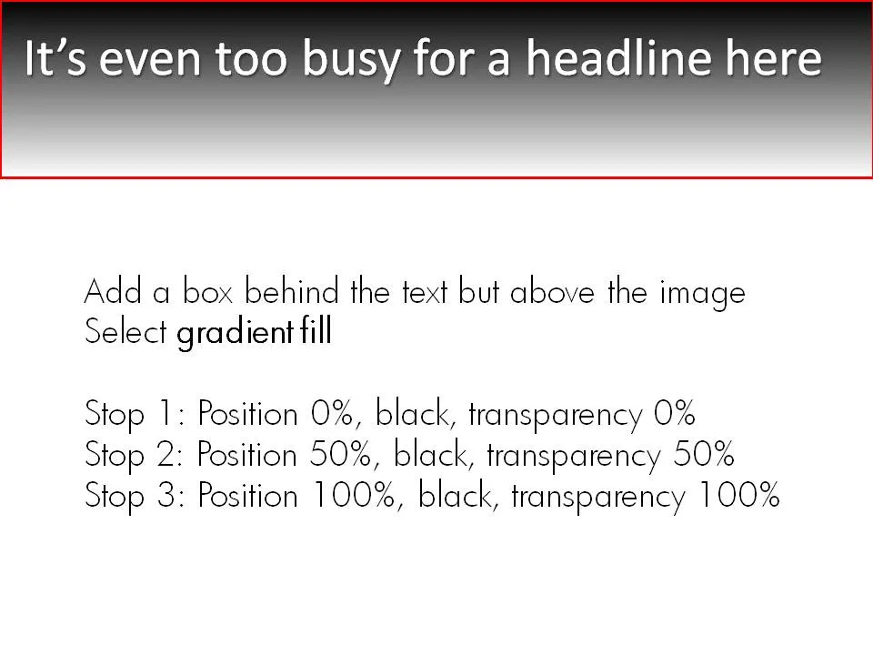
A simple gradient box behind an image title can make sure it stays readable, even if the background is very busy. Image under a CC license by maistora on Flickr.


Frequent updates about all things presentations since 2008. Subscribe to never miss a post.
A simple gradient box behind an image title can make sure it stays readable, even if the background is very busy. Image under a CC license by maistora on Flickr.
I just returned from a beautiful and relaxing family holiday in western France (apologies for limited posting and replies to comments). My 2 year old son’s fondness of cars required us to venture to the car museum in Chatellerault. (About the only thing to see in this town).
Lunch was in a local brasserie (not recommended). The placemat (click on the scan below for a larger image) reminded me of the slide sort sorter view of many poor PowerPoint presentations. Ads screaming for attention by using big, colorful and different fonts. With as much information crammed into it as possible.
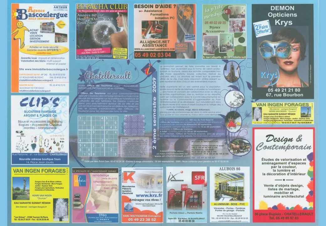
Few got it right with some exceptions. The power of pictures does work in France as well. Many men will be drawn to the Le Pacha Club, fashion-conscious women might check out the Krys optician. I was disappointed with the interior design study institutue though (bottom right).
Apologies for the lighter post content during the summer break. I scraped images of the various examples slides I have been using on this blog over the past year and put them on Flickr as one set.
More light summer posting. I only recently discovered that the weekly iStockPhoto free images expire after a number of weeks. Do not forget to download them on a regular basis, and pick the very large size enabling you to zoom in dramatically if needed.
The fact that they are picked by iStock editors adds a nice bit of randomness to the stream of images. For example, here is last week’s:

If you are not a PhotoShop artist, and use PowerPoint to take out the background of an image instead, the edges of the remaining edges can look a bit ruffled. Sometimes applying an interior shadow to the image solves this problem. Sometimes, because it works brilliantly for some images, and not at all for others. You have to try.
To apply an interior shadow in PowerPoint 2007: click the image, go to format/shape effects/shadows/inner and pick the middle one of the options.
Every VC pitch presentation needs to talk about distinctiveness. There are many slick stand-out-from-the-crowd images for sale on stock image sites. This ad from Comex paints (via Frederick Samuel) triggered another idea. The comic character blending in the background is a nice setup page to introduce the problem. After this slide, you can talk about how you are making a difference in the market.



Sometimes you need a fresh start, begin from a clean sheet of paper, do some serious house cleaning. Covering a busy messy image with a paint roller and some stripes of fresh paint is a great way to visualize this message.
Here is an example of images on iStockPhoto that could be that basis of such a chart (the yellow paint rollers, make sure to strip out the white background color in Photoshop or with this PowerPoint trick). This post was triggered by this ad on Ads of the World:

The weekend in Israel is starting, I am posting a bit early because of a busy social calendar. Recently I needed a large number of images of young people texting on their mobile phone. Flickr beats any professional stock image site completely in these type of situations where you need “real people”. Click through the presentation below to get a sense of the type of images I picked.
It is hard to find that one image that tells your entire story, especially when writing fund raising presentations for technology startups. This one comes pretty close: “Dont’ lose your contacts when you drop your phone”, and ad by Indian mobile phone operator Airtel for a phone address book backup service.

See how the composition of the image creates an enormous depth of field. Although it might clash with a minimalist approach to design, I would put the message in a big bold title on top of the image if I were to apply something like this in PowerPoint. Over-communicating is better just to make sure that everyone gets the point.
A larger image can be seen here on Ads of the World.
Certain industries do not seem to be subject to change (but maybe a new startup is about to change all this!). I like to use images of the moai on Easter Island to visualize this kind of market environment.
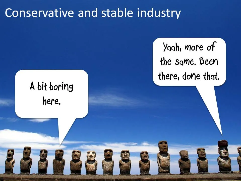
Photo credit: Natmandu. For these type of “real” images it is much better to go to sites like Flickr then to stock image sites (check the image license though).