SlideMagic Blog

Frequent updates about all things presentations since 2008. Subscribe to never miss a post.

RSS
all posts

Category Images

·Design

Help, not enough white space in my image!

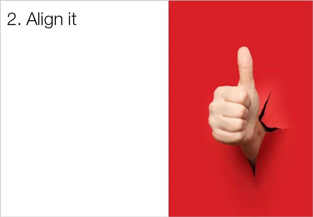
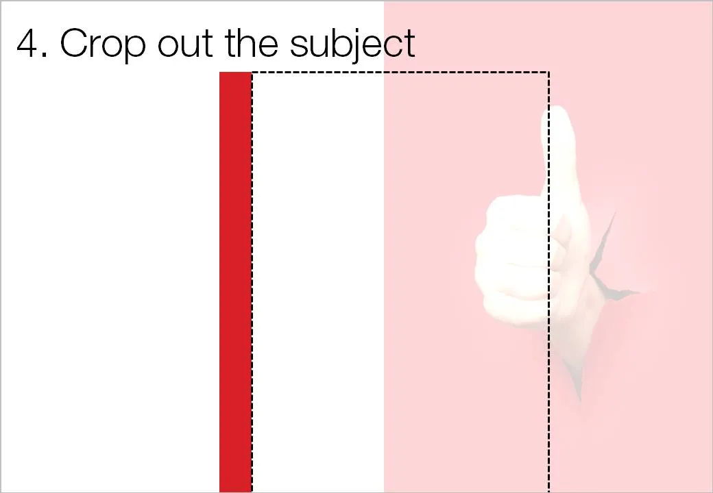
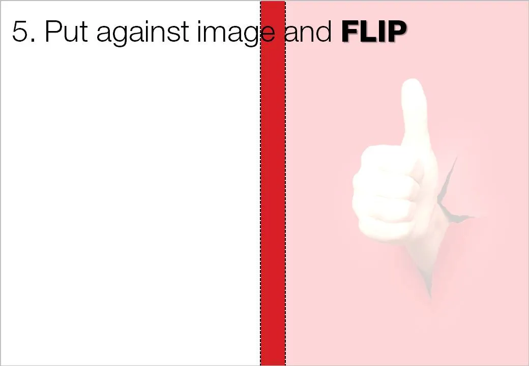
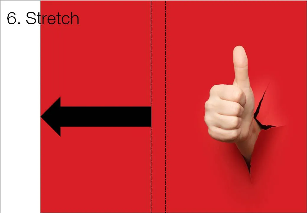
White space is a powerful element in slide design. An image with the subject in the center often does not leave enough space to let the slide breathe a bit. The following image sequence explain a work around. Basically, you stretch the background of the image without stretching and distorting the image subject itself. Flipping the cropped background makes sure that there is a smooth transition between original and stretched background.

Image via iStockPhoto.

·Design

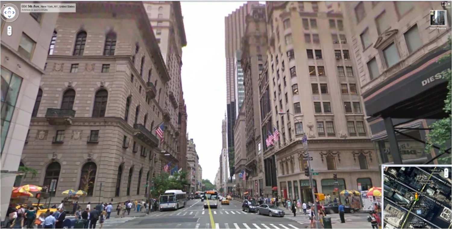
Google Street View - a great source of presentation images

For those who do not know: Google Street View lets you look at images taken in the streets of more and more cities. You walk around, look up, down, sideways. Like Google Earth (see an earlier post about how to tilt Google Earth maps), this is a fantastic source of images for presentations.

  • Images of landmarks that are much more natural and real than the ones you can find in stock image sites.
  • The ability to take unusual photo angles, most stock images are taken looking straight ahead.
  • Ultra-local: if your presentation somehow is set in a certain location, go there!
  • If your presentation is in the area of retail, urban planning, Street View is a great way to give examples of let’s say Starbucks stores in a few different cities, in a few different formats
  • People shots: doing a presentation about mobile phone use, youth fashion trends? Google Street View enables you to walk out in the streets of Paris and see what’s going on.

·Design

The trouble with 99% perfect photo compositions

See the ad below. Something is not right. It is hard to see what it exactly is, but the image is not natural. The light? The shadows? The 3D proportions?

Photo manipulations are increasingly easy to make, but the technology of image editing is not the problem. We already learn as a child that getting 3D to look right on a 2D canvas is hard. Architects and designers use a full 3D design environment to create realistic-looking simulations.

But, a 3D composition can look great even if the designer does not even bother to get the proportions right. Art would be have been incredibly boring if painters had stuck to the conventions all the time. Luckily they did not.

The problem are those compositions that are almost right, but not 100%. Look at the ad: very good technical execution, no ruffled borders around the sheep, drop shadows re-created, letters embedded in the fur: far better than most PowerPoint designers (including me) could do. Still the viewer is distracted: what is going on here? A distracted audience does not absorb messages.

In short: distort reality completely or forget about photo compositions all together.

Related, one of my earlier posts contains some useful links about photo manipulations.

Ad via Ads of the World.

·Images

Nobody likes to look at stressed people

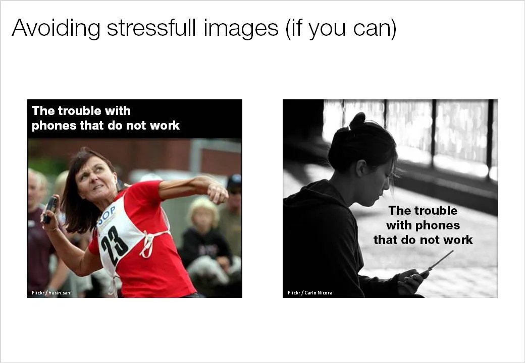
Almost all my presentations (fundraising, sales pitches) start with some sort of description of a “pain” that needs to be solved. It is very tempting to go to a stock image site and fill the first page with an image of someone who is clearly suffering big time. I have been guilty of this as well.

I am moving away from this. Nobody likes to look at pictures of people in trouble. (Maybe this is a deep instinct, I remember how they use sounds of birds under great stress around airports to prevent them flying into jet engines.) Often these images are acted out and not natural. Using them takes the aesthetics out of your presentation. Below an example of 2 approaches. The left image is a contestant in a mobile phone throwing championship about to toss her handset into the air, I replaced her with a more neutral-looking mobile phone subscriber. The text in the image is illustrative.

·Design

Grunge fonts

I must admit, I am ignoring my own earlier assertions about not using non-standard fonts in presentations. PCs do not come with Helvetica installed, and I love it. In most cases, embedding the font inside the PowerPoint presentation makes sure that people can use it on other computers as well.

Helvetica is a relatively tame font. Selectively you can go a bit wilder. The image below (taken from the excellent Google LIFE image archive) mixed together with the Boycott font gives that instant jeans commercial effect. Here is an example of a presentation that uses something similar. Obviously, these type of fonts are only to be used for big image/huge font presentations, and probably not in every presentation you make.

·Design

Making a photo cutout in PowerPoint (redux)

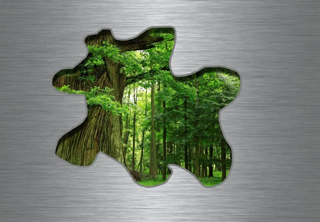
Readers from the early days will remember similar posts, but I want to bring up the subject of cutouts again. Recently, I started using them more, especially in combination with randomly drawn shapes.

  1. Fill the background of a slide with an image. Right-click the slide, select [format background], select [Picture or texture fill] and select a file. Note that this is different from simply copying a page-covering image on your slide.

  1. Copy another image over it.

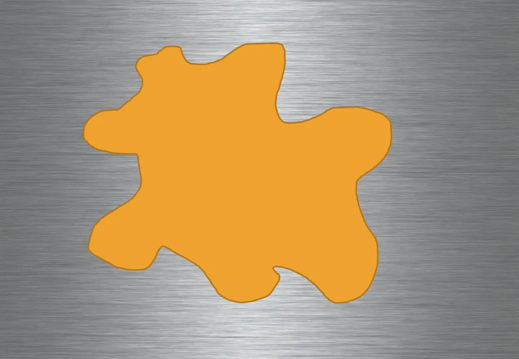
  1. Draw a shape, I like using random shapes.

  1. Right-click the shape and select [Format shape], [Fill], [Slide background fill], and add an inner shadow for additional effect.

Images found on iStockPhoto.com.

·Design

Five presentation images your audience will not understand

It is important that your audience “gets” the image on a slide immediately, otherwise they will be staring at it, thinking about it, trying to solve the puzzle, in short everything but return their attention to you as the speaker.

Some reasons why an image that makes perfect sense to you in your office might not work for a big audience:

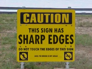
  1. The clue is in the small print (as in the image used in this post). Put a big marker to draw the attention to the sentence that matters
  2. Incredibly busy compositions, Times Square in New York, a screen shot of a video game
  3. Cartoons with a lot of text. Things get worse when a small cartoon image is scaled up, leaving a poor picture quality. Give your audience time to read it, and may black out the screen to focus attention back on you
  4. (Too) interesting people: an image of the red carpet during Oscar night might make people wander off and examine those beautiful dresses rather than listen to your story about Business Process Redesign
  5. Clever graphics such as an Escher drawing. “Hey, how did he do that?”
·Design

Creating depth of field on your slides

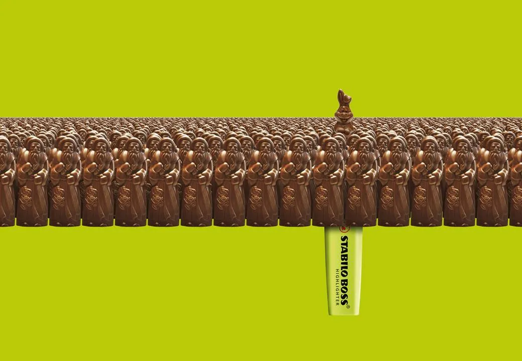
This ad on Ads of the World reminded me what a difference the angle at which an image is taken can make.The chocolate figures were repeated an almost infinite amount of time and stacked behind the front row. But to create the illusion of depth and infinity, the figures in the back stick just a tiny bit over the heads of the ones in the front row.

Think of this when picking your next image, especially roads or other concepts that need to show a long journey towards somewhere. The best images are those where the photographer was almost flat on the ground. Hopefully the photographer of this image (orangeacid on Flickr), managed to get up before the next train came by.

If you are interested: photographers refer to this effect as depth of field. If you look carefully at the image of the rail road, you see that the focus is narrow: the immediate front of the image is blurred, then follows a narrow strip of pin-sharp railroad beams, after which the rest of the image is blurred again.

Related: extreme use of depth of field to make images look like miniature toy scenes: tilt-shifting

·Design

Picking the right portrait images

Images of celebrities are like corporate logos: recognizable from a long distance. When selecting images for your presentation, think of the following:

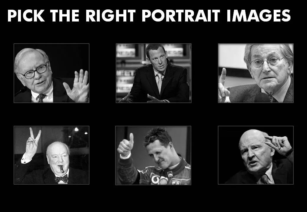
  • Re-size and crop the images in such a way that all of them have roughly the same scale, and that the eye line more or less lines up
  • Choose active pictures: people pointing, making a gesture
  • Have people look towards the center of the page
  • Harmonize the background (light or dark)
  • Harmonize the color, make them black and white if necessary

I stuck to most of these suggestions (not all) in the example slide below:

·Design

Harmonizing images using Photoshop filters

A presentation should have a consistent look and feel on each slide. When you are using just text and PowerPoint shapes, this is no problem: just use consistent fonts and colors. Images complicate things because they usually come from different sources and - as a result - have different styles:

  • Colors
  • Real” images versus studio shots
  • “Real” images versus computer-generated renderings
  • “Real” images versus “real” art versus stock image art
  • Vintage versus modern images
  • Portraits, landscapes, objects

Have a look at well-designed books with many images: the images are different but somehow fit together. You as a presentation designer can do a number of obvious things to harmonize image styles:

  • Actively pick an image style when you start out designing a presentation (or - like me - adjust the image style as you go through the design process, replacing images as you go)
  • Minimize the number of image sources
  • Use less images
  • Take out the color of all images, and just use black & white, or apply a color overlay

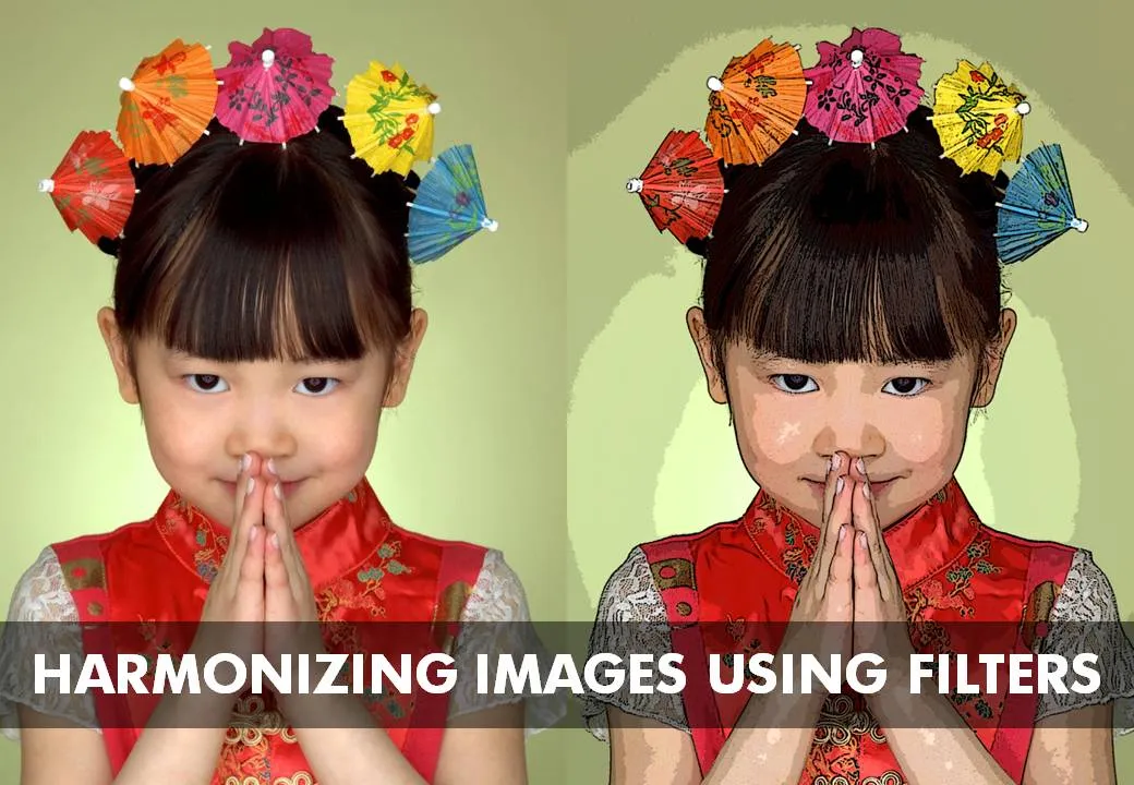
Recently I discovered another solution: applying consistent PhotoShop filters throughout your presentation. A slightly brutal way to harmonize images, but the result can be a presentation with a unique look and feel. The image below has been subjected to a “poster edge” filter, creating a pop-art style of presentation if you apply it consistently to every image in your presentation.

Image via iStockPhoto