

A presentation should have a consistent look and feel on each slide. When you are using just text and PowerPoint shapes, this is no problem: just use consistent fonts and colors. Images complicate things because they usually come from different sources and - as a result - have different styles:
- Colors
- “Real” images versus studio shots
- “Real” images versus computer-generated renderings
- “Real” images versus “real” art versus stock image art
- Vintage versus modern images
- Portraits, landscapes, objects
Have a look at well-designed books with many images: the images are different but somehow fit together. You as a presentation designer can do a number of obvious things to harmonize image styles:
- Actively pick an image style when you start out designing a presentation (or - like me - adjust the image style as you go through the design process, replacing images as you go)
- Minimize the number of image sources
- Use less images
- Take out the color of all images, and just use black & white, or apply a color overlay
Recently I discovered another solution: applying consistent PhotoShop filters throughout your presentation. A slightly brutal way to harmonize images, but the result can be a presentation with a unique look and feel. The image below has been subjected to a “poster edge” filter, creating a pop-art style of presentation if you apply it consistently to every image in your presentation.
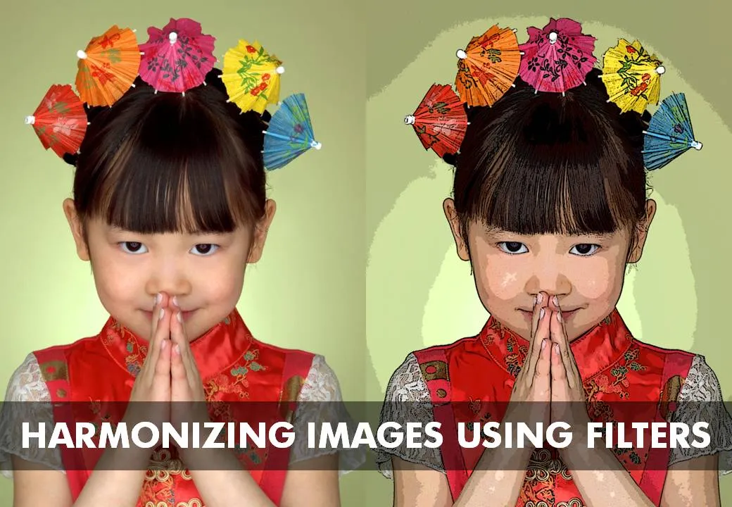
Image via iStockPhoto