SlideMagic Blog

Frequent updates about all things presentations since 2008. Subscribe to never miss a post.

RSS
all posts

Category Design

·Design

Using "paste as PNG" to wash out complex PowerPoint objects

Going a bit (only a bit) against the “Zen” presentation philosophy, I have argued before that overwhelmingly complex PowerPoint charts could be used in a large keynote presentation, if (big if) they are positioned well.

One way to use it is as follows:

  • Put up the overwhelmingly complex chart, message: “it’s complex, don’t even try to understand this now”
  • In a subsequent chart, wash out the original object
  • Start highlighting individual components for further explanation

You can use the “paste as PNG” function in PowerPoint to transfer any object (including complex groupings) into a picture and subject it to the regular picture manipulation tools available to you: resize (a pain for complex PowerPoint objects with text in them), crop, and of course re-color.

Recoloring the image with a very light overlay creates a wash out effect that you then can use as a background for subsequent highlights. I have tried to explain all this in the following SlideShare presentation (click on “screen” image at bottom right for full screen mode).
·Advertising

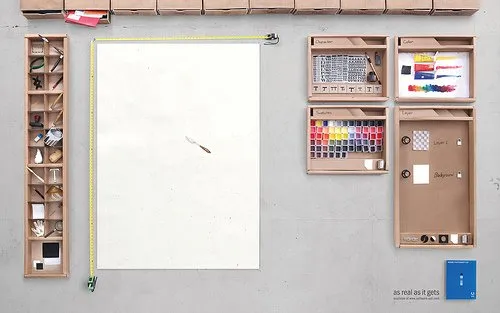
Brilliant visualization of a "real word" design user interface

Weekend reading (1 day earlier than the rest of the world in Israel). I stumbled on this great ad for Adobe Photoshop CS4.

It shows what graphics and presentation design is all about, a creative process working with shapes and colors and a blank piece of paper. Computers make it easier to work, but in our mind we should go “back to basics” now and then. Go to this Flickr stream for more detailed/hi-res images. Agency Bates141. Via Zurb.

·Design

Create a Twitter background using PowerPoint

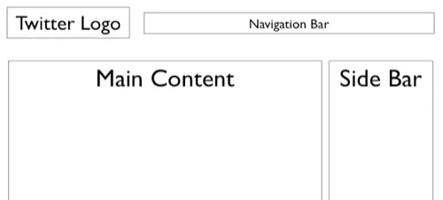
There is a lot of (white) space for self expression on Twitter in its background image. (Not implying that “cluttering it up” will make it look better though) The “The Closet Entrepreneur” posted a tutorial how to create a Twitter background in PowerPoint. It includes a template with the areas you should leave blank for Twitter’s own content.

P.S.: follow me on Twitter. Via Digital Inspiration

·Animations

Source file of the bouncing PowerPoint equalizer now online

I have put the source file of the happily dancing equalizer in PowerPoint now online. I uploaded it to Slideshare, you can see the animations if you download the presentation (a PPS file), the regular SlideShare embed does not support it.

·Design

You don't have to be dyslexic to benefit from these presentation design guidelines

Reading through a web site with guidelines for designing web pages for dyslexic users, I realized how valuable these recommendations can be for any audience, not just people with this condition.

This is a PowerPoint presentation design guide 101:

  • Choose a big, san-serif font
  • Avoid capitalization
  • Apply a calm background, no watermarks
  • Don’t righ-justify text
  • Minimize use of italics
  • Keep things short, write in a simple style
  • Use bullets (if you have to), don’t write proze
  • Refer to the reader as “you”
  • Stick to narrow columns, text lines
  • Use pictures
·Design

Seth Godin on "Blah, blah, blah, blah..."

No audience member […] has ever said, “it was exciting, useful and insightful but far too short.”

Read the full (short) post.

·Advertising

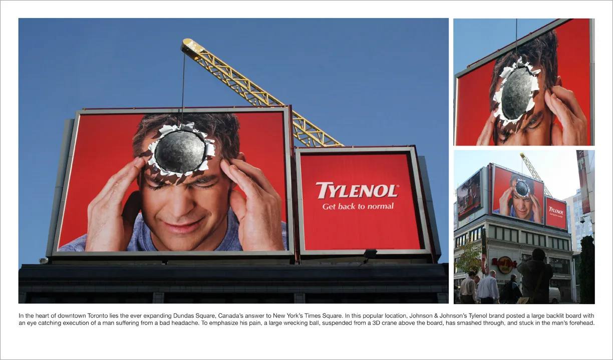
Great visual - you can almost feel the headache

I am adding adgoodness to my blog roll. This is another great find.

·Design

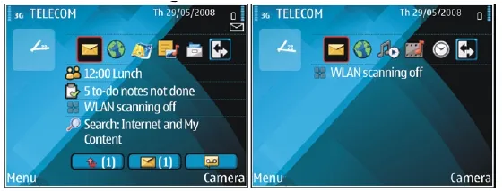
Nokia E71 - great phone, screen graphics could be more "Zen"

My wife had to swap her mobile phone because my 2 year old son decided to empty a bottle of water on her previous one. These things happen. The new phone is a Nokia E71. Phone reviews are a bit out of the scope of this site (it is a great phone by the way), but I can comment on the graphics of the user interface.

Nokia could have done so much better:

  • Like almost all mobiles, there is a busy wall paper crowding the display
  • Overly sophisticated icons with random colors
  • Different font (sizes), poorly aligned.

Mobile phone screens can also benefit from a “Zen” make-over to transform them into calmer and more minimalist user interfaces

PowerPoint and mobile phone interfaces are the same: the fact that you can make that sophisticated watermark background does not mean you have to use it!

·Design

Injecting a designer's personal touch into a presentation

All presentations I design are used by others - not me

All presentations I design have a serious, professional subject

Still, I like to add a personal signature to my work. How can you do that within the constraints of the presentation other than the little reference in 8pt font on the last page?

As a designer you can steer the choice of visuals you use with things you are passionate about:

  • When you need an urban street image: take one from Paris, even better Boulevard St. Germain, even better people sitting outside Cafe de Flore…
  • When you need to express harmony use a black and white image of Miles Davis playing a away…
  • When you need to visualize something agile and fast, take a bright yellow Mini car…
  • When you need a newspaper cover, take one from a memorable date…
  • The list can go on and on…
·Design

Not all presentations are "Zen" - different formats for different settings

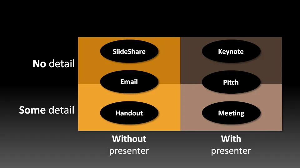
Not all presentation settings are the same. A “Presentation Zen” slide show with stunning images and the incidental word on a slide is great for a keynote, but might be a bit too much to discuss last quarter’s financial results. The 50 page deck with bullet point slides might be serve better as a printed business plan than the key communication tool for a 20 minute VC funding pitch. I have tried to describe 6 presentation scenarios and categorized them according to:

  • Whether the  presenter is present or not
  • The amount of detail/data inside the document

Here we go (click image for bigger picture):

  1. The key note is the classical “Zen” presentation. Huge fonts, dark background, few words, large images.
  2. The pitch is similar to the key note, with the difference that it might be shorter, and does contain some more data to answer questions from the much smaller audience.
  3. The meeting presentation is probably done on a light background, and contains much more facts and details. Over-simplified slides with beautiful pictures do not work in the small conference room with people ready to go through raw material. McKinsey and other consulting firm’s presentation often fit in this box.
  4. The slideshare (or online) presentation is something relatively new. People see it typically in small windows, i.e., fonts should be big, pictures should be nice. The audience of this presentation is highly impatient, clicking rapidly to reach the end, and aboning your presentation if it is not interesting enough. No animations here.
  5. The email attachment is similar to the key note presentatation with an important difference that it needs to stand on its own, titles need to explain the messages in the charts. Some animation could be used here (sparingly though). Detail is less than the handout.
  6. The handout contains the full detail, the full text. It should be prepared on a white background (people will often print it) and use no animation (again, does not come out in print). For VC pitch situations, the good handout makes the business plan “brick” obsolete (hardly anyone reads these anyway).
Continue reading →