SlideMagic Blog

Frequent updates about all things presentations since 2008. Subscribe to never miss a post.

RSS
all posts

Category Design

·Art

3D pavement art

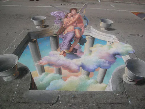
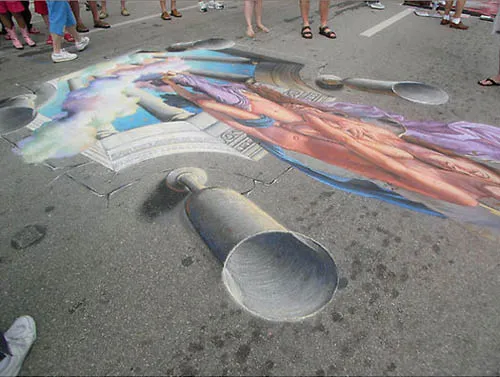
Three dimensional street artists try to create the illusion of a 3D composition jumping out of a flat surface. It results in some stunning pictures. Especially interesting are the images taken not from the viewing position but from the side, giving you an opportunity to see the enormous distortion the artist applies to make his effect work.
Some 3D pavement art links:

A video how Edgar Mueller goes about making one of his creations:
·Design

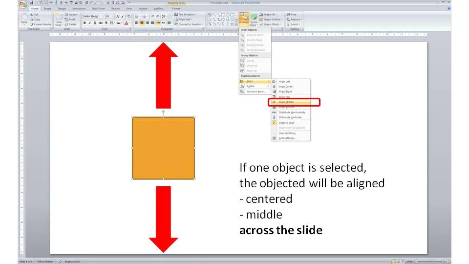
One click centering across the slide

Usually you use the align tool bar buttons (essential tool bar elements) to line up/center multiple objects. If you just select one object and hit a “Align Center” or “Align Middle” button, PowerPoint will center the object across the slide.

·Cartoons

Chart concept - Lucky Luke and low latency

Cartoons can enhance a presentation. You need to strike a fine balance though with inviting a laugh from the audience, and trying to get your point across. People do not have time to read through a cartoon plot. The idea behind a slide should be instantly recognizable. Using classical cartoons can help. People have seen them before. Here is one that can be used to describe the low latency of a technology product. Lucky Luke, the man who can shoot faster than his own shadow. That’s pretty low latency.

The extension of the cartoon with PowerPoint shapes is not perfect. I used the “oak” standard texture, and the “Playbill” font to give that nice Wild West feel.

·Design

Interior shadows can be a nice change

When people (ab)use shadows in PowerPoint, they mostly use the drop shadow, to make an object stand out from the canvas. The opposite, the interior shadow can give a beautiful effect as well. It makes the object, or letters fall back in the background.

See the example below of a slide taken from my presentation about fund raising presentations (explaining a bit about my personal and professional background).

Make sure the direction of the shadow is always vaguely similar to the lighting in the background, the Amsterdam street lights in this case. Use a character color that is similar to the tone of the image.

·Advertising

The blunt photo composition

Technology allows you to create almost any photo composition. Professional use PhotoShop, but you can get some pretty good results in PowerPoint as well. As with many technology tools, the fact that they are available does not mean you have to use them.

Photo compositions that are “blunt” are more likely to invite a laugh from your audience than help you make a serious point. My opinion. What do people think? (McCow taken from Ads of the World)

For some great Photoshop creative work check out FreakingNews.com

(This post-flood New York image by Mandrak)

·Design

A professional presentation does not mean a slick presentation

Seth Godin picked a T-shirt print provider based on a clean and professional looking web site and a straightforward pricing policy because it conveyed a sense of trust. There are lessons for presentation designers here.

It is good to invest in your presentation design. Over-doing the graphics though might give a negative return on investment:

  • Highly complicated and sophisticated slide backgrounds
  • Big graphical elements in the template, repeating on every page, leaving no space for the actual chart
  • Drop shadows, bevels, glows, gradient fills, and reflections galore
  • Professional, highly detailed, illustrations exported from Illustrator into PowerPoint
  • Spectacular animations and slide transitions
  • Beautiful, but too obvious/cheesy stock images

We can all imagine a slick sales person (cars, kitchens, insurance). Do we trust them?

·Animations

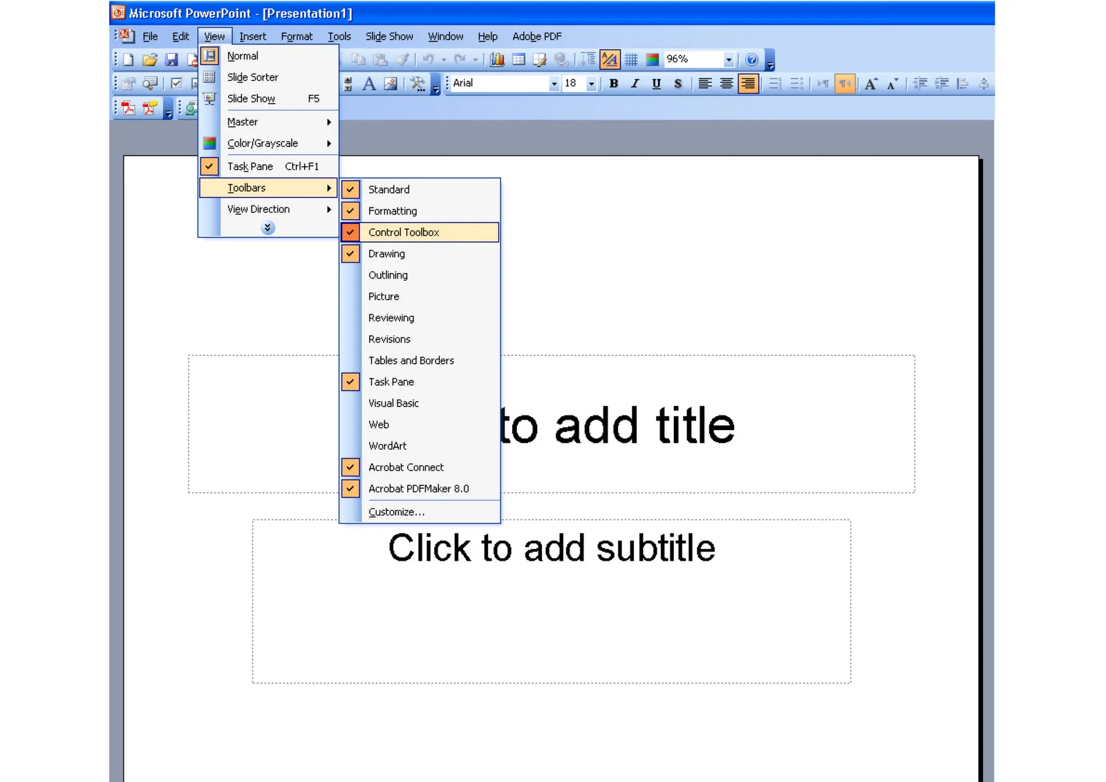
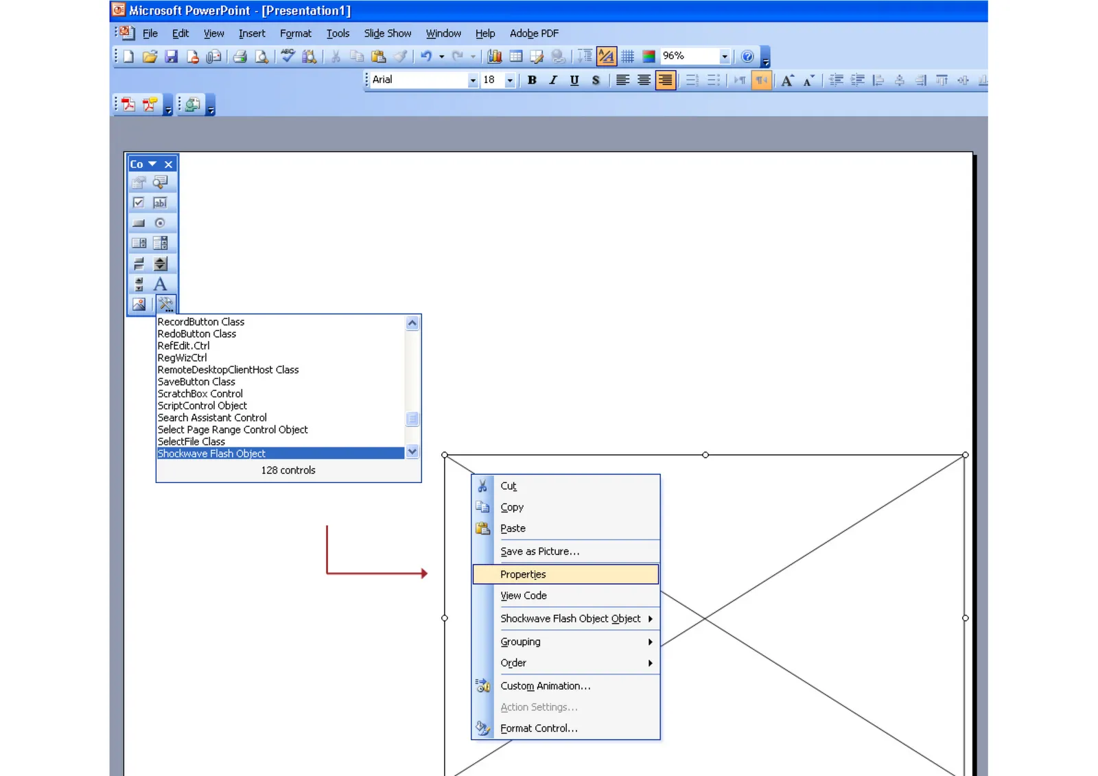
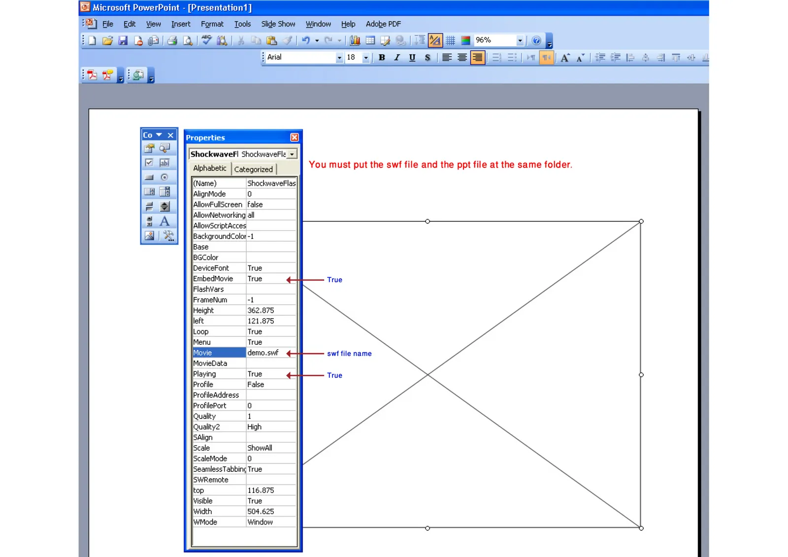
How into insert an Adobe Shockwave Flash animation into PowerPoint

Maybe because Flash files are not a Microsoft format, integrating them into PowerPoint is a bit tricky. Here is how to do it. Make sure that the .SWF file is in the same directory as the PowerPoint file. Click on the images for a larger picture.

When sending the presentation via email, it is best to ZIP the 2 files (PPTX and SWF) into one document. Still there is a high risk that the receiving party will not manage to see the Flash animation correctly. Do not use this for the critical slides in your deck. Thank you Karin Mazor for pointing this out to me.

·Concepts

Chart concept - Ahoy! Full steam ahead...

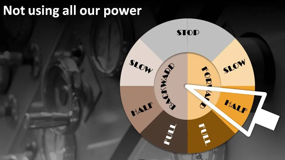
People are not using all the resources they have. Engines are running at half power. There is all this untapped potential out there. How to visualize this?

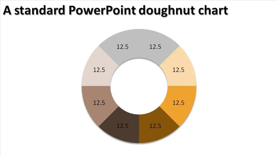
The engine room and a nice classical nautical engine control handle. You can use a standard PowerPoint “dougnut” chart (a pie chart but with a large hole in the middle) to create one.

Interesting, in the early days these handles would actually ring a bell in the engine room after which the people downstairs could adjust the power to the engine.

·Concepts

Chart concept - Fog! But I can see clearly now....

You have a great new business tool that makes everything and anything completely transparent instantly. How to put this in a PowerPoint slide? In comes the fog concept.

The secret:

  • Set a nice “Zen” image as the slide background (right-click the background, choose “Format Background” and select an image)
  • Create some clouds from the “Insert Shapes” menu. Give the clouds a gradient fill (“Format Shape”, “Fill”, “Gradient Fill”), set the gradient type to “Radial”, gradient stop 1 is 0% transparent white, stop 2 is 50% transparent
  • Draw a big rectangular shape (or any shape in fact) and - here comes the trick - set its fill to “Slide Background Fill”
·Design

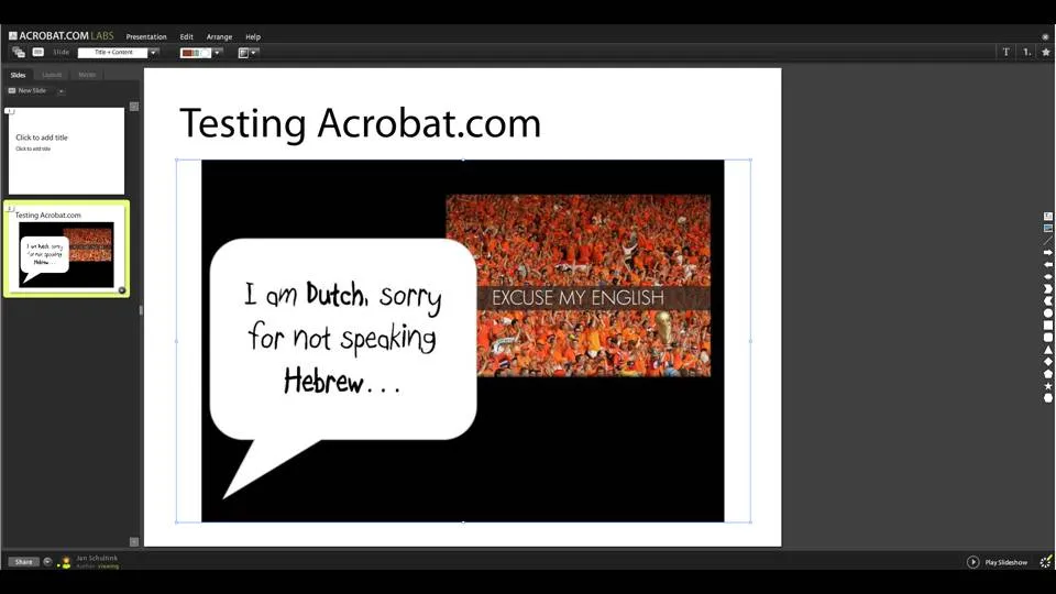
Testing acrobat.com in the cloud presentation tool

Acrobat.com is Adobe’s software-as-a-service initiative and it went live recently. The presentation tool is still in beta but can be tested here.

I am making a (small) u-turn on all these in the cloud office tools. A recent shift to part-Mac/part-PC working has showed me that (unlike spreadsheets and databases) the learning curve for working with a new presentation is actually not that high. Let’s whether either Adobe or Google docs can take on Microsoft’s dominant position in office software. I am less optimistic about the changes of completely new startups trying to do the same thing. Especially given that Microsoft will come with its own in-the-cloud offering with a user interface that is very similar to the desk top version.