SlideMagic Blog

Frequent updates about all things presentations since 2008. Subscribe to never miss a post.

RSS
all posts

Category Design

·Design

Fixating jumping objects

In the 1990s, when we were still relying on print documents at McKinsey, I would hold the deck against a strong light source to look through it to see whether repeating elements such as titles and page numbers were lined up properly. (Something like this cartoon machine)

“Jumping titles” are the result of slightly misplaced items on a slide sequence: when you hit page down and scroll through a series of slides quickly you see the titles moving up, down, right, and left. How to prevent it?

  1. Use drawing guides (excellent post on PowerPoint Ninja)
  2. Control-C object on one page, control-V on the next page. The element will appear in exactly the same location. Good for sequences of diagrams with buildups.
  3. Set the exact location of an object in PowerPoint (format ribbon, size, position)

·Design

Zap that lone bullet point

  • Bullet points are bad for presentations, so use the opportunity if you can get away with just one brief sentence on a slide: resist the urge to put a bullet point in front of it, even if the Microsoft PowerPoint template really encourages you to do so. Bullets are only for lists of 2 or more sentences, (and lists of 2 or more sentences should be avoided if you can).
·Design

Off topic - optical illusion

In the middle of the video, they show you how they did this. After you’ve seen that, you still don’t get it.

·Concepts

Chart concept - low hanging fruit (that's gone)

“Low-hanging fruit” is a term that is over-used in corporate meeting rooms. Recently I used a nice giraffe image to create a tongue in cheek slide explaining that all the easy opportunities have been picked away. (Yes I now giraffes eat leaves and not fruit…). Image found on iStockPhoto.

·Design

Should you put page numbers on PowerPoint slides?

I think yes, but really tiny ones, in a color with a very low contrast with the background. Standard PowerPoint templates put huge page numbers, dates, and other graphical distractions on every page. It looks ugly, and having a visible counter running on your pages might make your audience wonder how many more numbers there are before the end.

Why still put them on (in a very small font)? It makes it easer to discuss comments/improvement suggestions on your slides, it is easy to run a meeting with printouts and related to that, it makes it easier to put your print deck together if you drop your pages on the floor.

·Design

The summary page that does not stick

Many presentations start with a summary page, and most of them are stuck in the middle. They give a bit more information than “I am going to tell you why this is the best investment in cloud computing that you can make” and a bit less information than what is needed for the message to stick (the audience internalizing the logic in their head, and more importantly, their heart).

Worst case scenario: you give the presentation twice: spending 20 minutes on the summary page (which the audience does not understand), then repeating the whole story in the presentation (which bores the audience that misses the details and nuances “oh, we covered that already”). Blackberry on, attention off.

So, have the courage to keep the summary page really, really short. On the first page, tell the audience vaguely in what “box” they should put you in. “We do cloud computing platforms”. Then use a fast-paced sequence of slides to explain the idea that you try to get across. So, now your audience knows, feels, and understands.

After this, the more traditional stuff can come in, even summarized by an agenda page or summary.

·Design

Six-figure public speaking fees

Kaitlyn Cole of OnlineUniversities.com research a top ten of the world’s best paid public speakers.

Some of these amounts are pretty high, but hey, hiring a celebrity singer to your party will also cost you dear. Scott Berkun talks about public speaking fees in his book Confessions of a Public Speaker as well.

what do you think, value for money?

·Colors

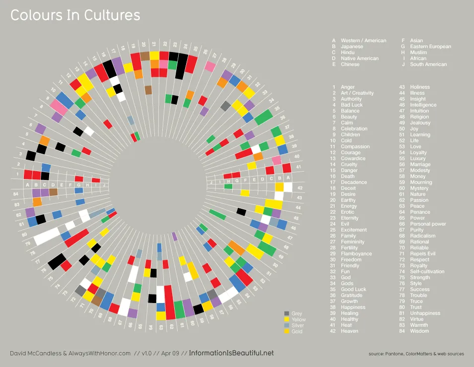
Colors mean different things in different cultures

A nice diagram on the blog Information is Beautiful (original post). Something to take into account when picking your next color template. click the image for a larger picture.

·Design

Kill procrastination

Productivity and creativity have a very weak correlation with the number of hours you put into your work. This presentation provides some useful lessons:

Kill procrastination

·Design

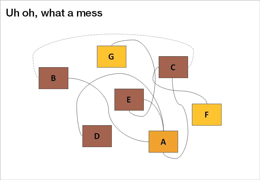
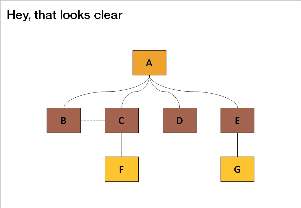
De-cluttering spaghetti charts

Sometimes, complexity is a visualization issue. When you design your slides, save the audience some work and do the disentangling for them. Example: there are 2 approaches to drawing a technology architecture:

  1. Start with the boxes, then draw the links
  2. Start thinking about the links, then draw the boxes

The second approach always gives a better result.

Thank you Jared Chung for emailing these charts to me in response to the post about the U.S. Army spaghetti chart (in a slightly different context though).