SlideMagic Blog

Frequent updates about all things presentations since 2008. Subscribe to never miss a post.

RSS
all posts

Category Design

·Design

Useful: 2010 calendar PowerPoint template

I do not use standard Microsoft PowerPoint templates very often, but I must admit that I was pleasantly surprised by this 2010 calendar template on the Microsoft web site. That saved me a lot of time in designing a kick off presentation for a new project. Tons more here.

·Concepts

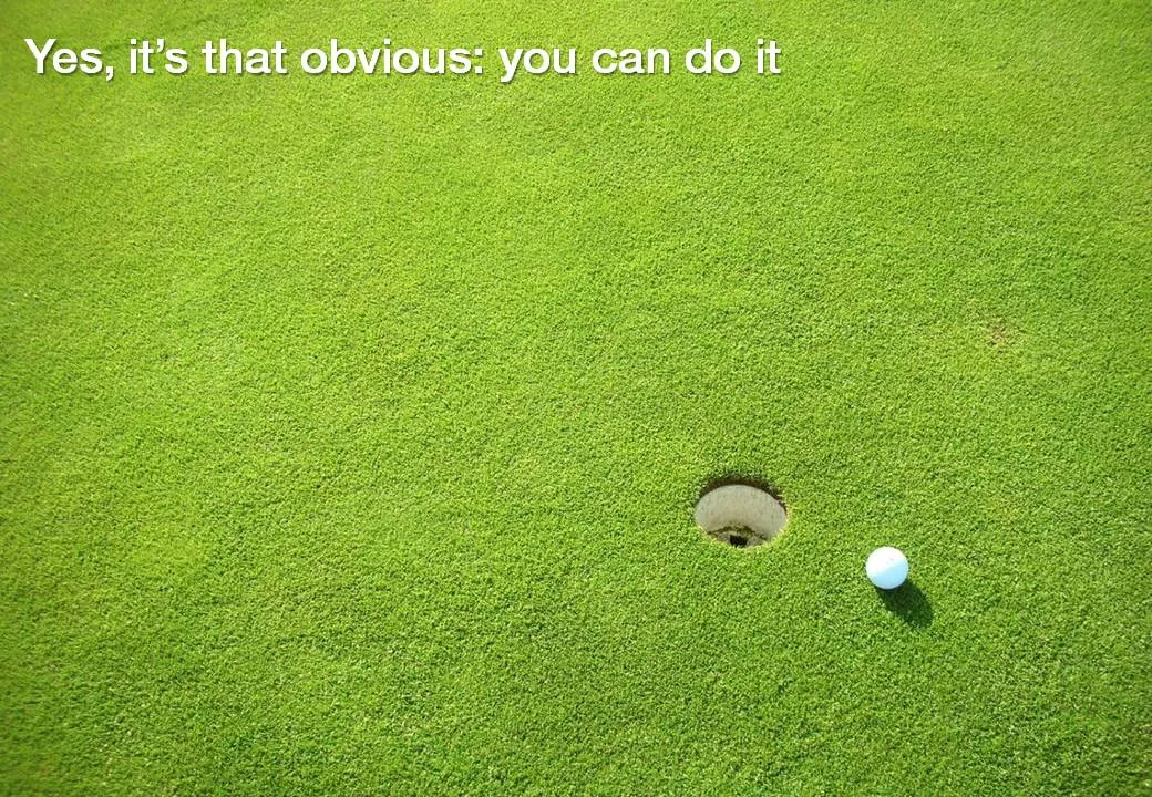
Chart concept - you can do it

Low hanging fruit, it is easy, a shot for open goal, come on: you can do it.

Image via iStockPhoto

·Design

The slides I used for my presentation at BizTec

Recently, I spoke for the finalists of the BizTec business plan competition in Tel Aviv on how to pitch to VCs. The slides were an adaptation from an earlier talk on the same subject. Here they are.

·Art

Depth in images

It is very hard to capture the sensation of a wide panoramic view in a photograph. Making a picture of that stunning view will look boring when you view it later. Not when you capture an object nearby as well.

Impressionist painters use this technique in the composition of their works. See this painting by Alfred Sisley (Village On The Banks Of The Seine at Villeneuve La Garenne). Unusually, the background of the scene is actually lighter than the foreground.

I used this lone tree in one of my own photographs of a recent visit to the ruins of the Masada fortress near the Dead Sea here in Israel.

Think about this when your pick your next stock image in your presentation.

·Design

Unstage

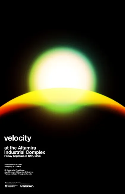
Most presentations are written by people without a professional graphics, design, or art background (including me). While it is almost impossible to catch up on the technical skills of these professional illustrators, it can pay off to take a daily dive in their work. The blog unstage (link here) is an example of a daily source of information that you should add to your RSS reader. Example below: a poster by Network Osaka. (I find poster designs especially useful as a source of ideas for slides.)

·Concepts

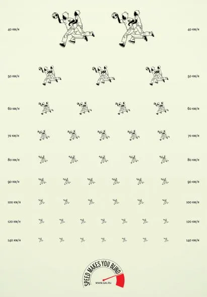
Chart concept: eye test

This ad about safe driving uses an interesting concept: the eye test. You can use it in a PowerPoint presentation exactly as it is used here: one variable is declining/increasing and visibility of another goes down.

Another use could be some sort of health check: “how well protected is your business?”, using a different image that repeats and gets smaller all the time.

Via Ads of the world.

·Colors

Out with the shape outline

Tel Aviv uses a very dominant street painting scheme: red-white and you cannot park, blue-white and you can park but have to pay. The colors are so bright that the city looks like one big Formula One circuit. Why not use more modest colors? Grey blue and olive green? The picture below gives an example, freshly painted pavements (you have to re-paint often in the sunny climate here).

The same is true for PowerPoint shapes. Whenever I can, I omit the lines around shapes (shape outlines). It makes your chart a lot calmer.

Image credit: Flickmor

·Design

Don't use the business plan to present the business plan

Finally the business plan is ready. You Googled and asked around to make sure everything is inside: the market pain, the technology solution, the team, the market size, the competitive differentiation, the financial forecast, the intellectual property and patents. The result: 150 pages of PowerPoint.

Do not use this business plan to present the business plan. OK, you used PowerPoint, but not to design a presentation. You used PowerPoint to write a document that is not suitable to put on a projector screen.

How can you figure out what presentation you do need? Invite a friend over without any knowledge about your business venture. Take an empty piece of paper or a white board. Start telling your story. Scribble things on the white board. If need, zoom deep into the business plan PowerPoint file and put one chart on the screen (i.e., an overview of the competitors). After 30 minutes take a step back and see:

  • What issues did you discuss, which topics did you ignore?
  • In what order did you discuss them?
  • What were the hand drawings you needed to explain your idea?
  • Which charts in the 150-page deck did you have to pull out?
  • What questions did your friend ask that caught you by surprise?

Here is the outline of your investor pitch presentation.

·Data visualization

Draw your ideas

Here is a video of Twitter co-founder Jack Dorsey explaining the success of Twitter and other ventures he is working on (with the benefit of hindsight). Interesting from a presentation perspective for 2 reasons:

  1. The importance of visualization to crystallize your ideas
  2. How a minimalist presentation approach (hardly any slides, restraint presentation style) still can inspire an audience.

Found via Fred Wilson

·Design

Filtering background noise in self-defense

I grew up next to a rail track and always wondered why friends who came over to play looked startled when a massive freight train would shake the house. Currently I live close to an airport and my guest are running to window to see whether that plane actually hit our building or not.

I hardly notice anything. The brain - in a form of self defense - is filtering out the noise.

The same is true in presentations. Endless bullet points, cliche language, we heard it so often that the audience is filtering things out. Speaking louder or using bright colors does not really help. Try to be different/original and people will start paying attention again.