SlideMagic Blog

Frequent updates about all things presentations since 2008. Subscribe to never miss a post.

RSS
all posts

Category Design

·Design

Location-based memory

The brain works in funny ways. Recently, I snapped a picture with my mobile phone of a busy and messy whiteboard after a long team discussion. It didn’t matter to me that I will not be able to read most of the text (poor handwriting, poor phone camera). Because of the location of the scribbles on the board I was perfectly able to recall the entire discussion without reading a single word.

What happened? The brain had assigned its memory of the entire rich discussion we had to locations on the whiteboard. “Going to a place” is enough to unlock the memory.

Presentation lesson? Credit to management consultants. Sometimes it is good to have that busy chart with all strategic options on one page, it does not have to be pretty, the axes you use to define that 2x2 framework do not really matter. The chart will become the mental map of the discussion. Even when you improve it later on, chances are that your audience will ask you: “hey, that’s the fat-cow option in the top right in our previous diagram isn’t it?”

·Design

Over-used adjectives

Create a slide that makes your audience feel and understand that something is extraordinary, huge, massive, revolutionary, game-changing, and/or enormous instead of writing these over-used adjectives in a bullet point.

·Design

In defense of the U.S. Army spaghetti slide

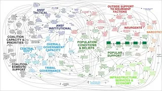
This PowerPoint slide by the U.S. Army is making the rounds on the Internet to ridicule ineffective presentations that stifle creativity and decision making.

The article in the NYT

does not actually talk about this busy slide specifically, it attacks the use of bullets points and the fact that the majority of time spent by staff in corporate/army headquarters is wasted on producing PowerPoint slides. Seth Godin is repeating today once more why bullet points are bad for you.

The spaghetti slide itself is not that bad, at least that is my opinion.

It makes the point that things are complex, that issues are related, all contributing to a highly unpredictable cause and effect sequence. Almost like the myth of chaos theory, and the butterfly in China that can cause a hurricane on the other side of the planet. Pretty good slide to visualize that.

I guess the source of the slide must have been some management consulting report that applied the technique of Business Dynamics to a complex problem (I recognize the many loops having used the tool in my previous life as a McKinsey consultant).

What is Business Dynamics? Business Dynamics tries to apply the physics of systems theory (electronic circuits, weather, ocean waves, etc.) to business. Complex problems consist of a number of forces. Forces influence each other. Forces can be good and bad, some cancel each other out, some reinforce each other. Everything is related to everything.

In some cases it is possible to model all these forces in a computer program and you get your hands on a very powerful tool: software can make simulations of what happens if you give the system 1 shock by studying the 2nd, 3rd, 4th, 7th order effect of your action.

Continue reading →
·Delivery

Presentation lessons from TEDx Tel Aviv

I had the privilege to attend TEDx Tel Aviv. It was a wonderful day. Some (random) observations:

  • 18 minutes are great: short enough to keep the audience attention, but long enough to cover the most complex subject material. Anyone can present their idea in 18 minutes, if you can’t, it’s the presenters fault, not the audience’s intellectual abilities
  • Personal stories are incredibly powerful, especially if they connect to the interests of the audience. “The doctor told me that my daughter will die soon. I did not accept this”. You are on the edge of your seat.
  • Polish is not everything. Imperfect English, glitches, as long as your story is passionate and genuine, your audience will forgive you.
  • Many different uses for slides, none of them were speaker notes/bullets: 1) relative proportions between numbers [$250m versus $250bn), 2) setting the mood [screen shots of mountain bike trip surroundings], 3) functional video [mosquitos getting zapped by lasers]
  • Building on that. Slides can be incredibly simple and still be effective. And I mean even more simple than stock image + a few words.
  • To keep a conference day interesting you need to shift gears all the time. Spectacular presentations, humor, emotional/touching content. Variety keeps up one’s attention
  • Related: the power of an emotional ice breaker presentation. My organizational behavior professor in INSEAD was a master at this: start a session with a deeply emotional topic or question, and it makes the audience forget their usual defenses, makes them more receptive/open to subsequent content. Hard to explain why, but it works.
  • Unlike you, yourself, the audience is not really interested in your personal background and history, they want to learn from your ideas and perspectives. Talk less about yourself, talk more about what the audience can learn.
  • Props are great (bottles of algae for example).
Continue reading →
·Delivery

Looking back at the UK election debate

I could watch the latest UK election debate live in Israel on Sky News and was fascinated to see these professional debaters in action. In the House of Commons, the UK parliament, debates are very lively and real. In this televised election debate I was a bit disappointed; candidates were hardly listening to one another and tried to find anchor to revert back to their scripts to make a key point.

Where does it get interesting and convincing? When the debaters go off-script and truly try to convince their audience from the heart. They should have the courage to debate like they do in parliament, and stop trying to nail that sound bite. Dry statistics do not move crowds.

The other interesting thing I noticed is the power of the face expression when an opponent makes a point caught by the ever-present cameras. Face expressions reveal one someone thinks an opponent made a really good point.

·Cartoons

Drawing stick figures

The original PowerPoint stick figure (screen bean) clip art has been overused (although I miss him sometimes). Hand-drawn stick figures can be the basis for an original presentation. This small presentation by Betsy Streeter provides some useful (and funny) suggestions on how to draw them.

Anatomy of a Stick Figure

Thank you Matt Jahl for pointing me to this.

·Design

HTML5 and presentations

HTML5 is a major revision of the HTML language that powers web pages (Wikipedia link for the details). You can find an example of a presentation designed entirely in HTML5 here. Use the cursor left and right keys to navigate between slides. The presentation does not have a good design, but it gives a flavor of the capabilities of HTML5.

Could HTML5 become the default file format for all presentations, decoupling software that creates presentations, environments that display them, and sites that build a social infrastructure for sharing on the web?

  • As file sizes become larger, and internet connections become always available, a “in the cloud” file format for presentations becomes more likely
  • I expect the position of Microsoft PowerPoint to go down somewhat, as smaller niche presentation design tools make inroads (Prezi, etc.)
  • New devices with touch interfaces will add a whole new dimension to animations in presentations, HTML5 seems very well suited to deal with those.

I am curious to hear the perspectives of readers which a stronger technical background than mine.

Thank you Eyal Sela for suggesting this link.

·Design

Your presentation is not a UN Security Council resolution

We have all been in meetings that went on and on about the exact wording of a phrase: legal contracts, mission statements, press releases, UN Security Council resolutions, and yes, also presentations. I am not arguing to be less precise when writing a presentation, but word smithing bullet points is not going to make your message clearer, the opposite is probably true.

  • Everyone knows that bullet point slides make bad presentations. And the more text you cut, the less ability you have to get that exact nuance right.
  • The details of text in a presentation do not register, what matters is the - partly improvised - story told by the presenter; and a good story does not include repeating memorized, carefully crafted sentences.
  • Hollow mission statements (earlier post) are the ultimate example of the information asymmetry between the presenter and her audience. It took months to develop, it contains everything the company stands for, people have thought about every word and punctuation mark in it, and still: nobody understands it.

Photo by Flickr/gruban.

·Design

Google's latest investor presentation (part 1)

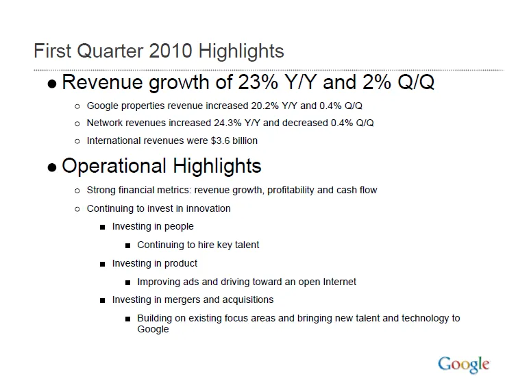
Quarterly results presentations are in the public domain, designed for an external audience. Below is the presentation that Google used to communicate the results for the first quarter.

These types of presentations are usually prepared under great time pressure, as there is very little time between the moment the accountants are producing the figures and the communication to the analyst community. Unfortunately, this impacts the quality of the presentation (form, not content).

I will use this presentation to provide some suggestions on how to improve corporate presentation design. Not that I am picking on Google (Skype was an earlier victim), this presentation is just a typical example of most analyst presentations I see.

Analyst presentations are slideocuments: they need to be packed with a lot of financial information and the audience (equity analysts), usually know the company and its financials very well and are keen to see this quarter’s update of last quarter’s figures that are already sitting in their spreadsheets. So, adding large images with huge font text is not really appropriate here. Also, I will forgive the use of bullet points in these documents. Still, the quality of the slideocument can be improved.

Let’s look at the opening page. The one thing I like is the minimalist template that Google uses: a tiny logo at the bottom right of the page. Great.

Some improvement suggestions:

  • Break it in two pages, one addressing the financials, one the operating highlights
  • Use horizontal bar charts to highlight the growth rates year-on-year and quarter-on-quarter
  • On the second slide, do not use bullets if you just need to make 1 point
  • Try to make the sentences shorter
Continue reading →
·Art

Christoph Niemann and LEGO presentations

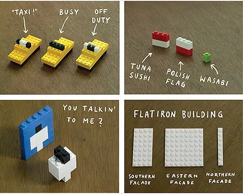
Christoph Niemann (web site) is a highly talented artist whose illustrations have appeared on magazine covers ranging from the New Yorker to Wired. He posts on a regular basis on his blog in the New York Times, where this set of cartoons based on Google maps caught my attention.

He recently published a new (board) book with snap shots of New York modeled in Lego bricks: I LEGO N.Y. (affiliate link). A sample image below.

Now here is a presentation challenge: construct your entire presentation in tiny Lego scenes, photograph them and paste them into PowerPoint. Not as crazy as it might sound.

UPDATE. One of my readers, Daniel Cabrera, used LEGO images to construct a presentation for a university project. In this case, the images were sourced from the web.

391 city workforce