

This 2x2 chart is hard to understand (source on HBR)
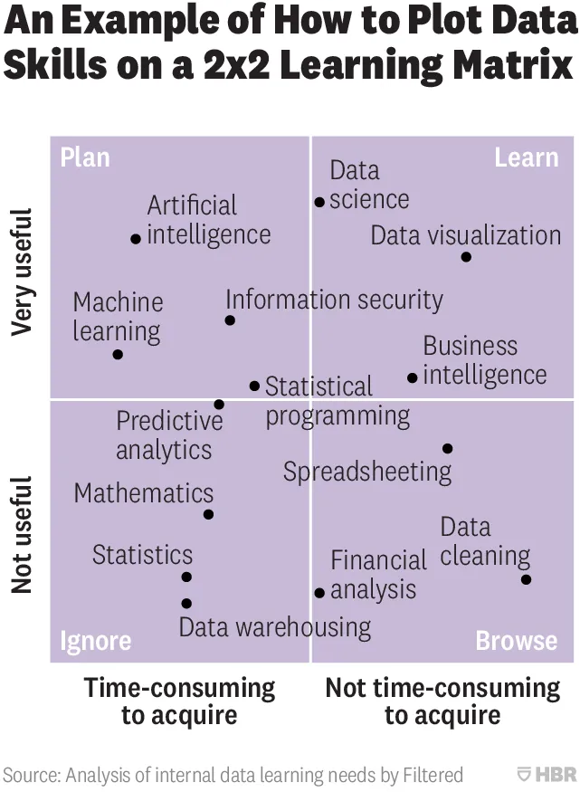
From a design point of view:
- Axes labels are hard to read
- Axes labels are too blunt, mathematics has its uses
- Too many dots at locations that are too precise
- Typography of the labels goes across the boxes
- The 4 quadrant labels do not stick out enough
And that’s the design part. More importantly, the content… The title of the chart seems to suggest that it is just an example of how to use 2x2 matrices, but I think people are serious about its content. A comparison of apples and oranges. I need to start casually learn how to do data cleaning, and not yet get into AI but be prepared for it, and to use AI, I don’t need to understand statistics at all.
Cover image by Nick Femerling on Unsplash