SlideMagic Blog

Frequent updates about all things presentations since 2008. Subscribe to never miss a post.

RSS
all posts

Category Data visualization

·Data visualization

Failing the 10 second test

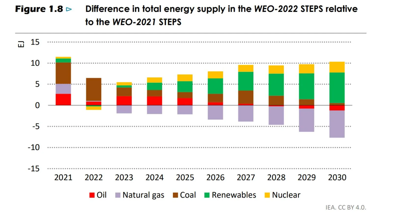
It is tricky to understand this stacked column chart I found here on Twitter, given the negative, below the horizontal axis boxes.

After a bit of studying, I get it (I think). Categories below the axis show a decline. But what does the height of the column above 0 represent, and the height of the total column (the sum of the absolute values of all the boxes).

Eventually, you will figure it out, but “eventually” takes too much time to put in a live presentation.

·Data visualization

Bar chart formatting

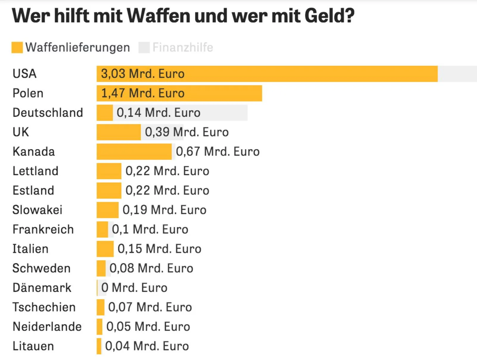
This chart can be improved in many ways (source), you can see it without understanding German…

  • No need to repeat “Mrd. Euro” (billions of Euros) at every data point, just put the unit at the top
  • The data labels of the second data series is missing, as is the total
  • The color of the 2nd data series is too light (probably to make the text readable)
  • I would right-align the row labels
·Data visualization

Follow the chart

For the analysts who are in the trenches crunching the numbers behind slides (often after 18:00).

Presentations of financial data often evolve. You start with a relatively naive model, create some slides and iterate the numbers. Slowly, your team starts understanding what actually matters and discovers with drivers to focus on.

Instead of the exact numbers in your spreadsheet, your manager asks you to group this, that, and that into one number, quickly offline. Then another scenario, put that number in, quickly off line. Then another one.

In each round, you re-run your model, take out a calculator, scribble the summarized numbers, and update your slides. This takes a lot of time and is prone to errors.

Instead, build a quick layer on top of your ‘old’ model that spits out the required numbers quickly. In fact, make it a habit that every number in your presentation is pulled directly out of a cell in a spreadsheet.

My financial models would usually have these layers:

  1. Data dump: straight copy-paste of raw input data, or data entered straight from a financial report without thinking, make sure the total is correct at the bottom. You get a new set of data: simply overwrite the entire worksheet, or add a column.
  2. Model engine, this one does the hard lifting and runs your analysis
  3. Bridge: this worksheet pulls numbers out of the engine and produces the required numbers for the charts (relevant to the scenario I described above)
  4. (Optional) Slides. A small box that matches exactly every page in your presentation, with the exact numbers that appear in each slide. Useful if you need to run periodical updates of your presentation (weekly, monthly, quarterly results for example).

·Data visualization

De-cluttering axes

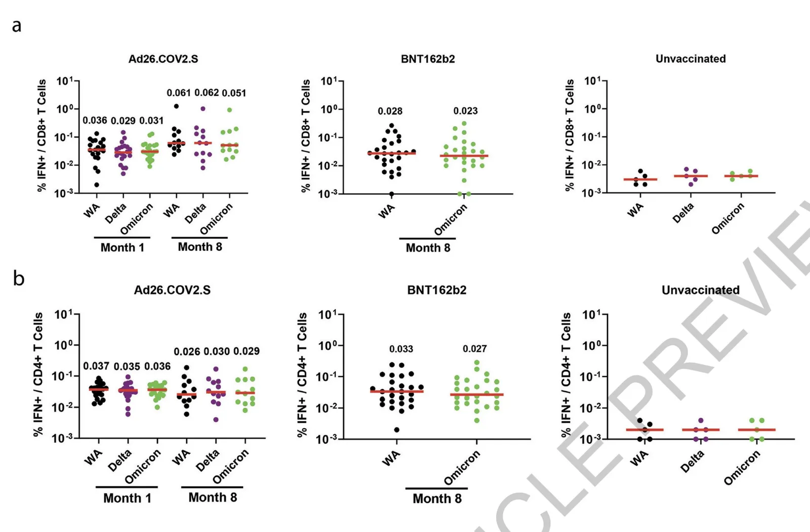
In scientific documents, there are chart making conventions that make sense, clearly labelled axes, titles, etc. etc. Use these charts in your article that you submit for publication in a prestigious paper. For an on-screen slide show however, you could deviate from this standard. Your objective is to communicate the findings as best as possible, referring to the paper for the details.

See the example below (source), lots of duplication in axis labels.

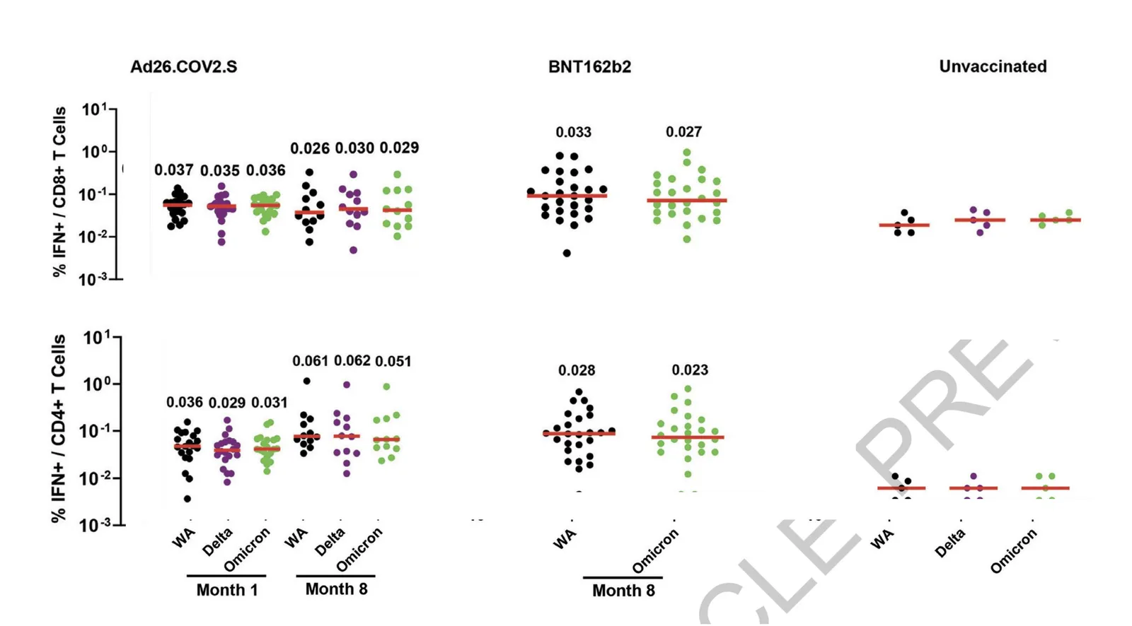
You can make the page a lot calmer be omitting some of these labels. I quickly cut and paste the elements in the image below. (This is not a makeover, just a super rough reshuffle to show you what I meant).

·Data visualization

Statistics: vaccine effectiveness might seem higher than it is

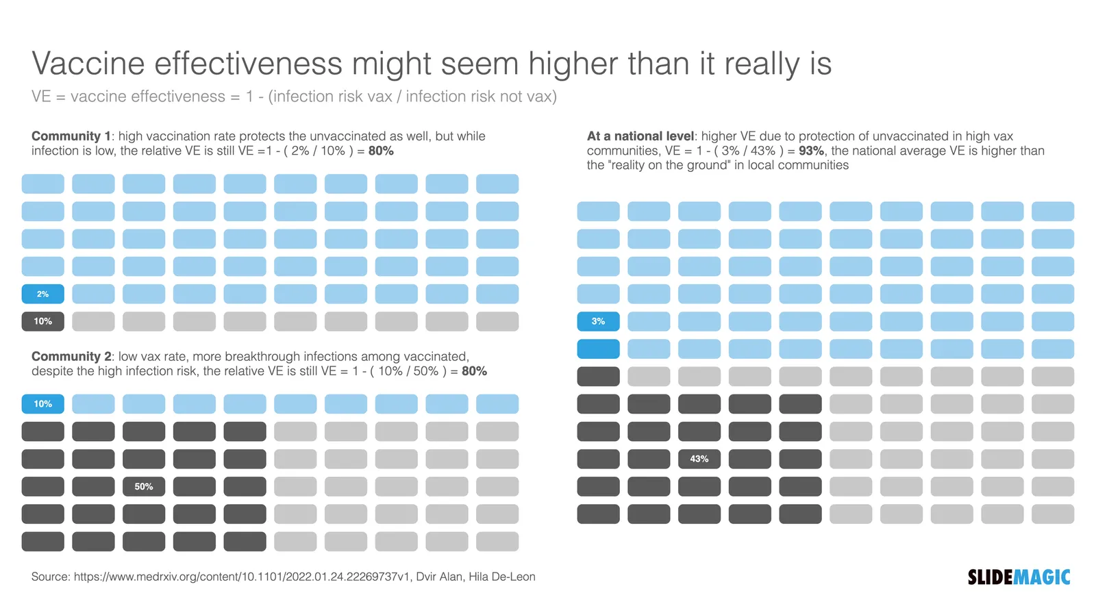
I love digging into COVID-related statistics. Recently, this paper was published that shows how vaccine effectiveness in local communities can be a lot lower than at the national level. Seems counter intuitive, but this chart explains the math.

I have added this slide to the SlideMagic library, so you could use it in your own presentations as well.

·Data visualization

Public corona data dashboards

BI (“Business Intelligence”) dashboards with data used to be a corporate thing. Firms such as my previous employer McKinsey would advice clients what metrics to put on them, and how to display them. This is tricky, there is an infinite amount of data to choose from, and even more options to slide and dice the figures.

The COVID outbreak has created many country-wide public dashboard with data. In Israel where I am based, a large tribe of “amateur” statisticians has emerged that runs and discusses analyses on Twitter. The other dashboard I had a look at is the Dutch one (part of my family still lives there).

The approaches are different, and I prefer the Israeli one.

  • The Dutch board looks very pretty, has lots of explanations in text, and has useful maps of regions with color coding. The problem is that it stretches out over many, many, pages, and priotises static data over time series.
  • The Israeli one is just one page, with lots of time series graphs, so you can see things develop over time. And not for basic statistics such as overall cases, benchmarks can get very specific. Benchmarks are normalised so you compare apples with apples (i.e., cases / 100,000 by vaccination status). Also, government policy and benchmarks are tightly integrated. The government wants to encourage parents to vaccinate children, so there are statistics specifically aimed at that target segment. Another example: after discussions whether to close the airport or not, stats about airport tests were published (split by country, so citizens can make the call to travel somewhere or not based on their personal risk appetite).
Continue reading →
·Data visualization

To stack or not to stack?

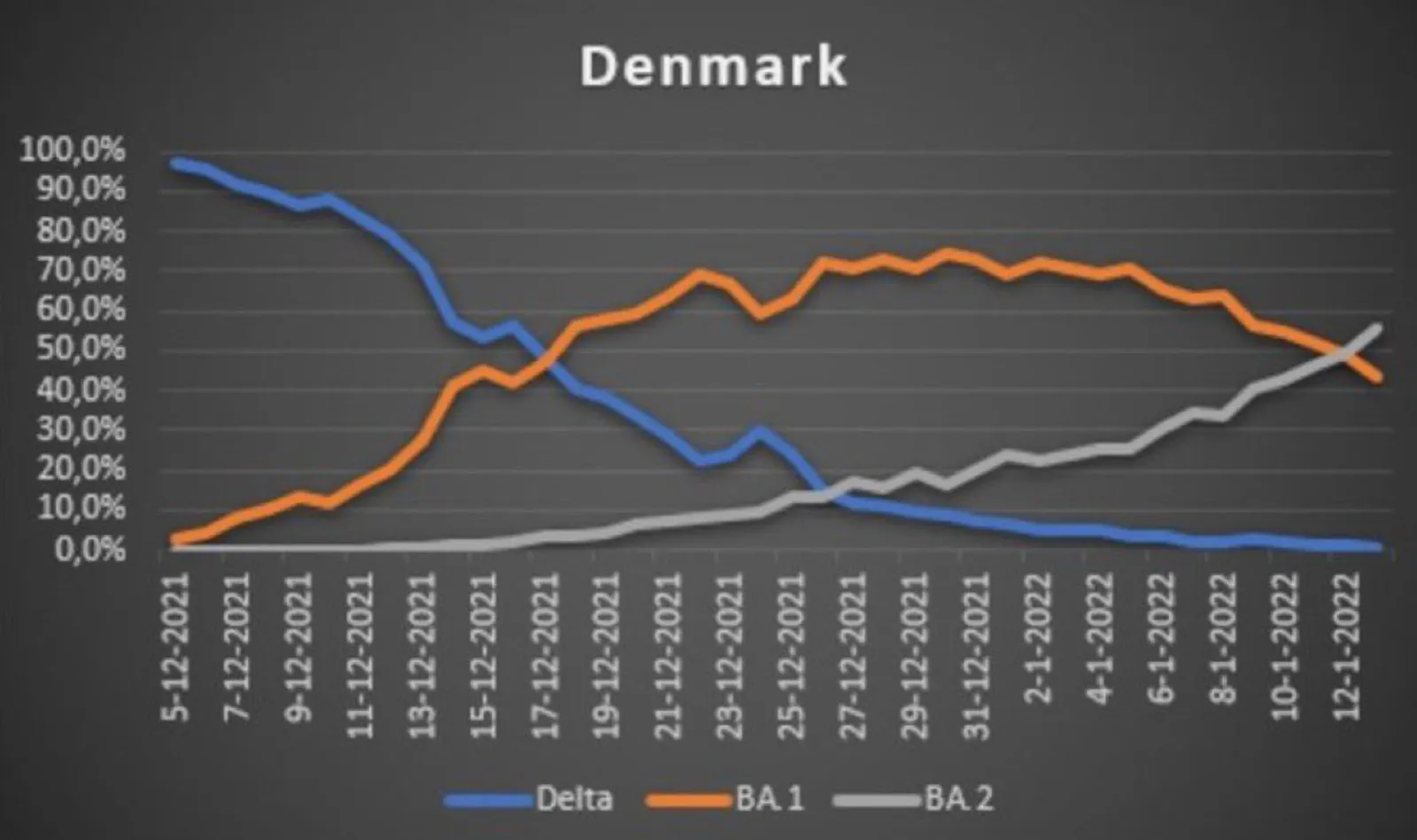
Two charts about a new sub-Omikron (BA.2) variant in Denmark. This line graph shows 3 variants as a % of all sequenced samples in Denmark.

  Source: https://twitter.com/DrEricDing/status/1485456877723045891

Source: https://twitter.com/DrEricDing/status/1485456877723045891

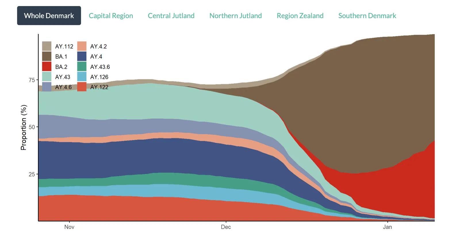
The chart below shows the total number of variants found in the samples. The stack approach does a much better job to give the full picture of what is actually going on,.

  Source: https://www.covid19genomics.dk/statistics

Source: https://www.covid19genomics.dk/statistics

With just one data series, showing a share of the total as a stack or line (column) is the same chart. As soon as you have more than one, pick a stack chart so the audience can see the data in context.

·Data visualization

Bar versus column chart

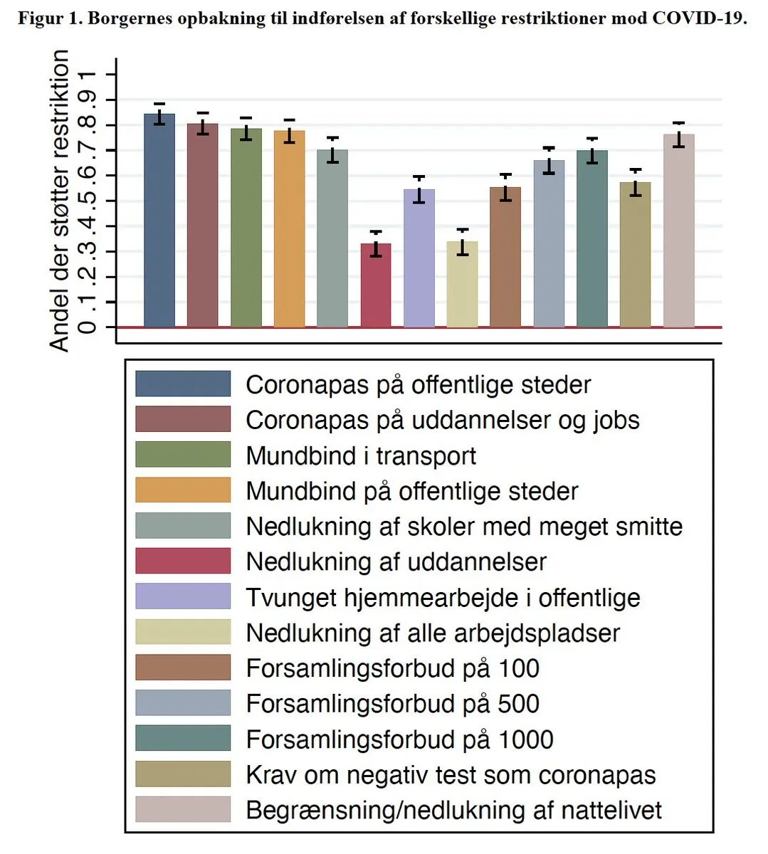
The chart below could have been made a lot better using a bar chart. You can avoid the many legend labels, which have a 1-to-1 relationship to the columns

Image source

·Data visualization

Even better than I did

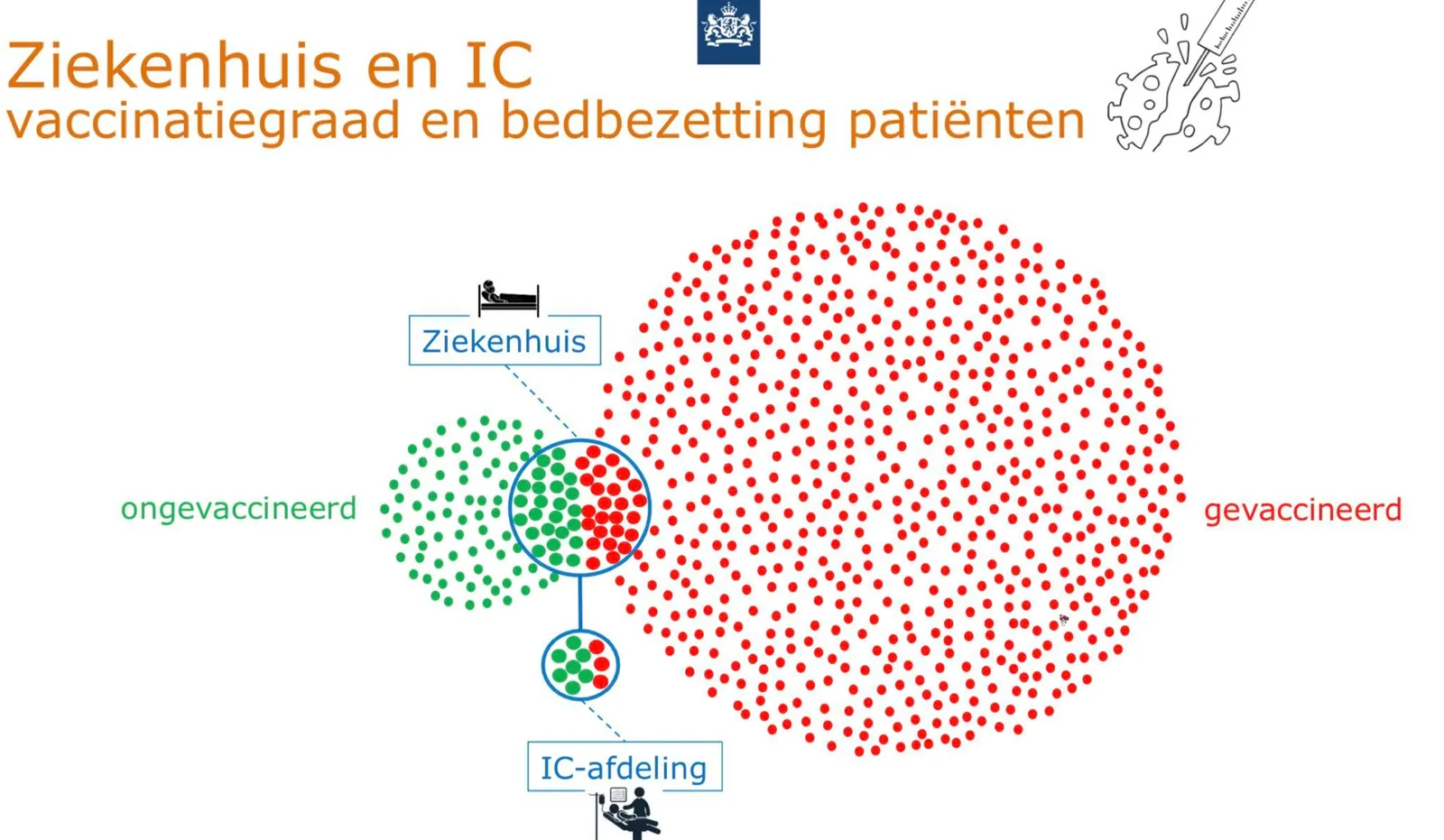
This Venn diagram is a great visualization of why you still see vaccinated people in the hospital.

I gave it a go myself a while ago, but this visualization is better. Source of chart: RIVM, source of image. One improvement suggestion: switch the colors red and green.

·Data visualization

The case for not rounding numbers

In 99% of slides, it is better to round financial data. $1.9m is easier to read than $1,898,456.34. Also the rounded number is more in line with a financial model that relies on rough assumptions. If you project your company sales in 10 year down to the dollar, you lose some credibility with your audience.

In some situations, the opposite approach can work. Look at this poster below of an Israeli anti-vax group who makes the argument that the money that is spent on encouraging hesitating Israelis to get a vaccine, could have been used better in a different way. (I leave pro and anti-vax debates out this blog, although you might guess in which camp I sit).

Here the big number actually works. Anyone looking at this big amount of money instantly starts comparing it to other lump sums you know: how much do you make as an individual in a year, how much does a car cost, how much does an apartment cost. Also, the precision and suggested accuracy of the number adds to the drama. This is a similar effect that National Debt Clocks try to convey.

The correct way to look at these numbers is to relate them somehow: $ per citizen, % of total corona-related cost, compared to other government advertising campaigns, etc. etc. After that, you might still conclude that it is high, but you used the correct metric.