

Infographics can look great, but can do a poor job in getting data across. This data could have been brought out better with simple bar charts. I am still struggling to get the point (15+ years of chart-decoding-experience as a strategy consultant is not enough in this case).
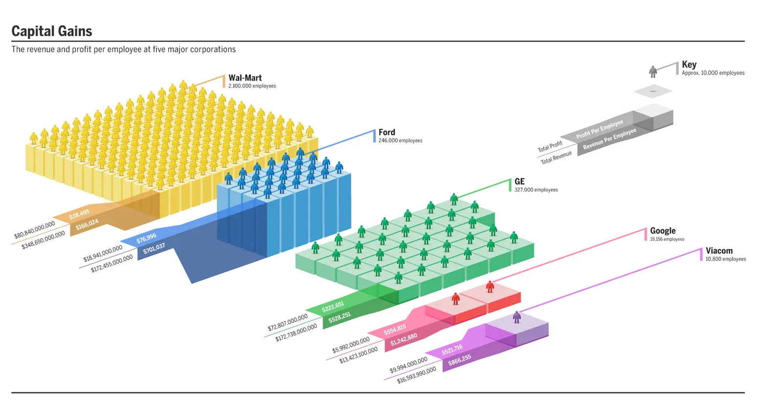
Original on Good Magazine. Click the image for a bigger picture.
4 comments
The other two dimensions seem correct. Number of people/boxes = number of employees (Wal-Mart has the most) and surface area of the top of the box = profit per employee (Viacom and Google are the largest and about the same).
Thanks for the blog -- just found it today and will be coming back.
I'm glad to read what you wrote. You interpreted it the same way as I did. The height of the boxes relative to one another is wrong.
Jan: great, great blog. You should consider a book, Jan...
-TW