

I was busy doing a chart makeover of the following chart:
To get to this result:
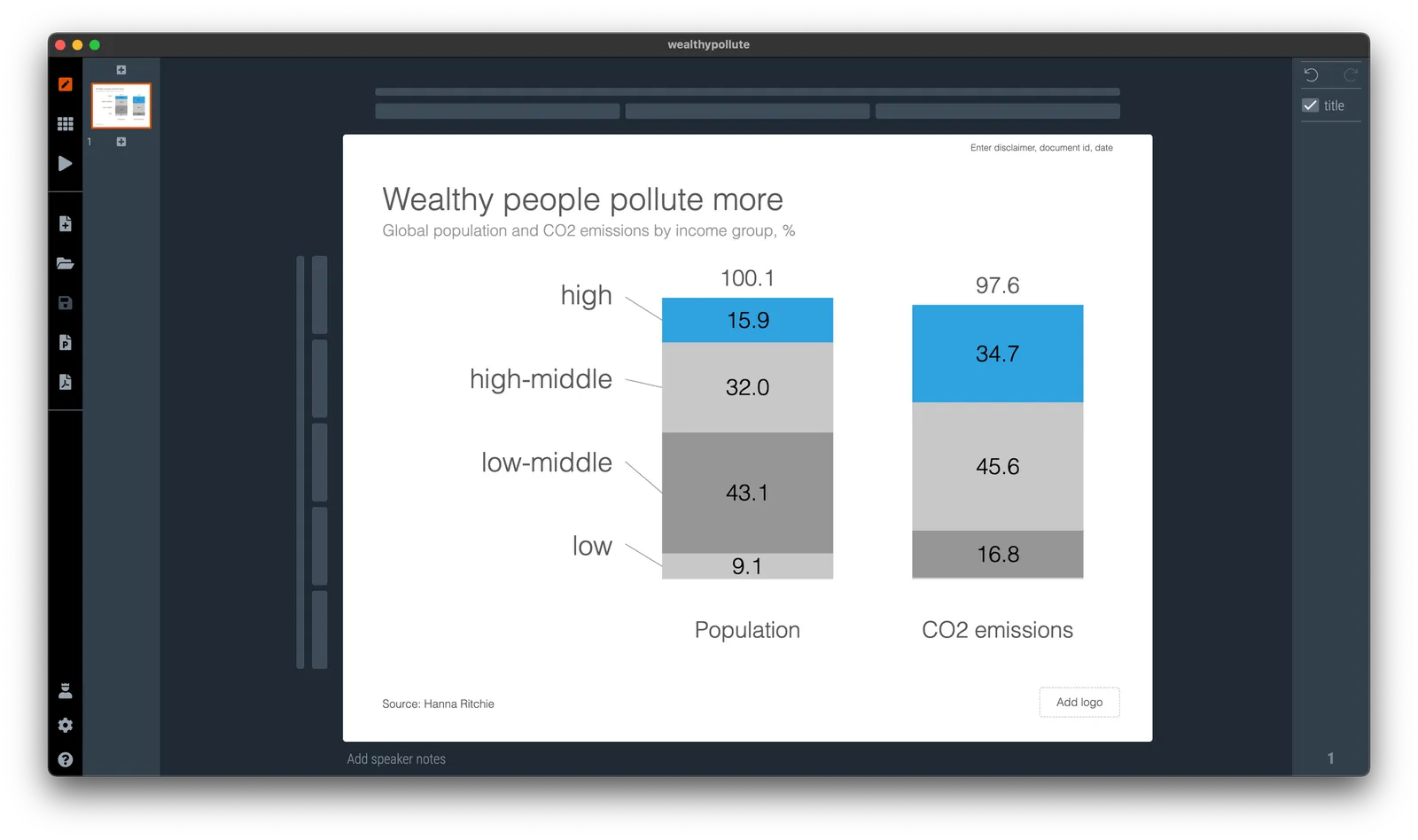
To found out that the columns don’t add up. In case of the left column, it is probably a small rounding error, but on the right, something got lost in translation.
About errors:
- Don’t blame the spreadsheet, you are presenting a chart, not your backup model. If there is a rounding issue, fix it manually (I usually adjust the biggest category, so 43.1 would become 43.0 in this case). I always argue to disconnect your chart from the spreadsheet for your final document.
- Even tiny mistakes can make people doubt all the numbers in your entire deck. Number charts should be simple, and it is a 5 minute investment to quickly check them on a calculator. Worth the investment!
In this case, the hidden calculation error shows the flaw in the type of chart chosen. The stacked column is more intuitive and shows how things are related. For the horizontal bar, I had to think for a second to understand what it means, and I did not instantly spot the error.