SlideMagic Blog

Frequent updates about all things presentations since 2008. Subscribe to never miss a post.

RSS
all posts

Category Concepts

·Concepts

Chart concept - kicking the competition out of the game

Anat created another great chart this week to visualize how a company is going to kick the competition out of the game. See the example below with the client-specific details and colors left out.
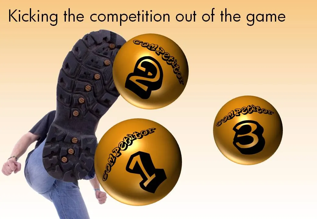
The image is purchased from iStockPhoto, the balls are standard PowerPoint circles with some “extreme bevel” added to it, gradient shading in the back, the font is Planet Benson 2.
·Concepts

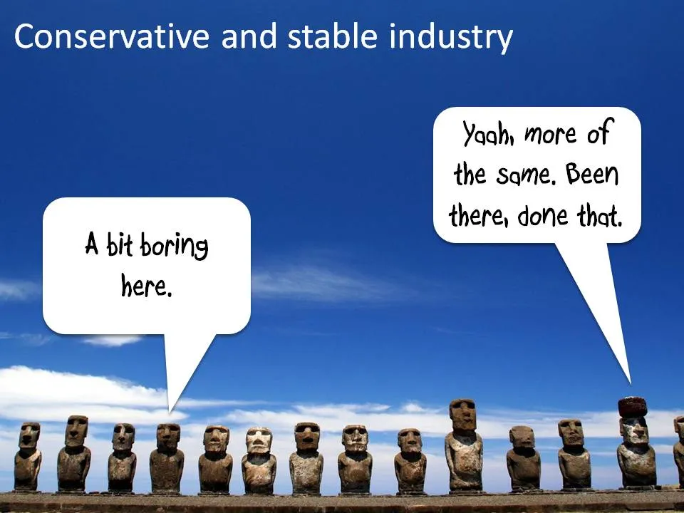
Chart concept - stable industries, not much going on here

Certain industries do not seem to be subject to change (but maybe a new startup is about to change all this!). I like to use images of the moai on Easter Island to visualize this kind of market environment.

Photo credit: Natmandu. For these type of “real” images it is much better to go to sites like Flickr then to stock image sites (check the image license though).

·Concepts

Chart concept - Ahoy! Full steam ahead...

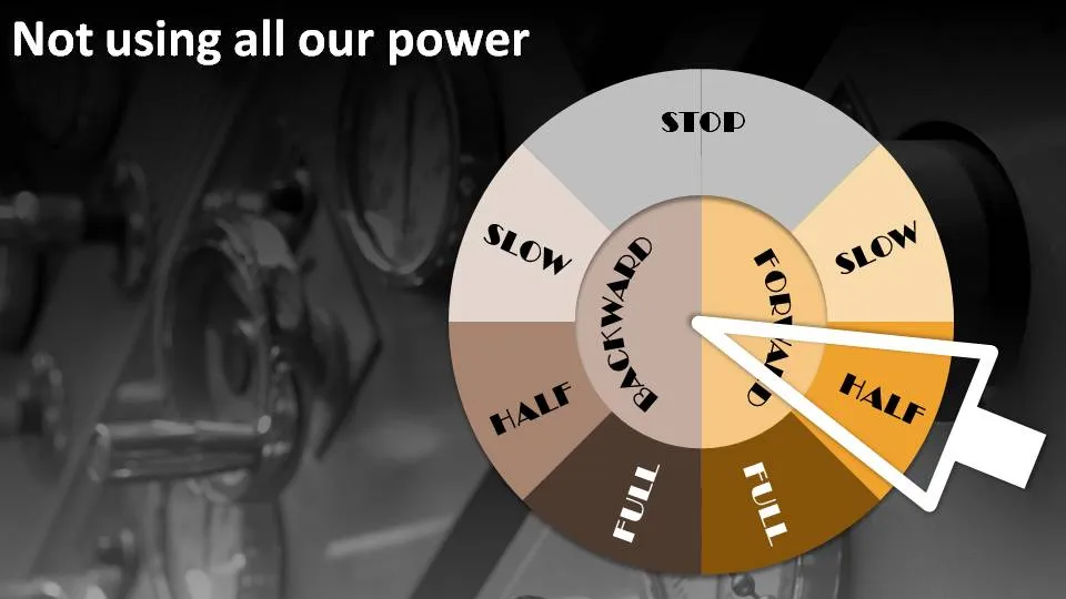
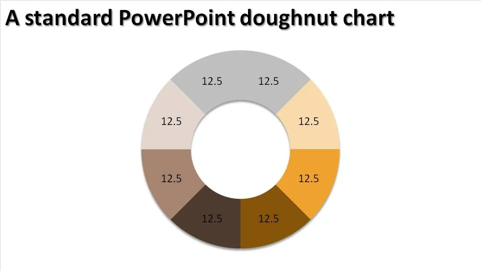
People are not using all the resources they have. Engines are running at half power. There is all this untapped potential out there. How to visualize this?

The engine room and a nice classical nautical engine control handle. You can use a standard PowerPoint “dougnut” chart (a pie chart but with a large hole in the middle) to create one.

Interesting, in the early days these handles would actually ring a bell in the engine room after which the people downstairs could adjust the power to the engine.

·Concepts

Chart concept - Fog! But I can see clearly now....

You have a great new business tool that makes everything and anything completely transparent instantly. How to put this in a PowerPoint slide? In comes the fog concept.

The secret:

  • Set a nice “Zen” image as the slide background (right-click the background, choose “Format Background” and select an image)
  • Create some clouds from the “Insert Shapes” menu. Give the clouds a gradient fill (“Format Shape”, “Fill”, “Gradient Fill”), set the gradient type to “Radial”, gradient stop 1 is 0% transparent white, stop 2 is 50% transparent
  • Draw a big rectangular shape (or any shape in fact) and - here comes the trick - set its fill to “Slide Background Fill”
·Concepts

Chart concept - where do we go from here?

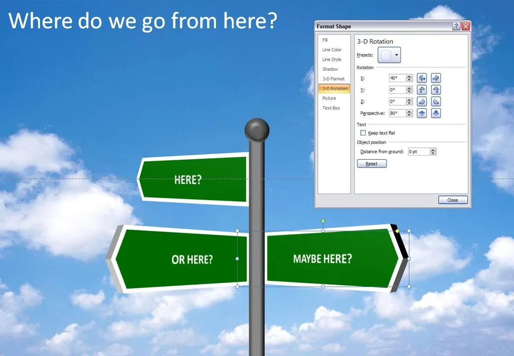
It is easy to make your own 3D road sign image, no need to buy a stock image, and you get the 3D text perfectly aligned. Click the image for a larger picture (with the settings in the “format shape” box).

·Concepts

Chart concept - bouncing ball

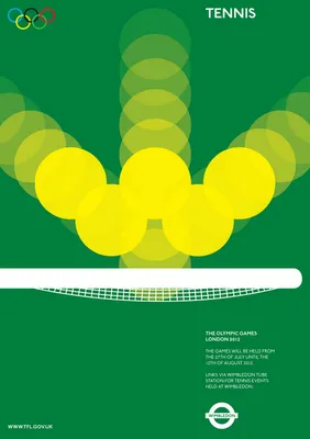
The best graphics design work is often the most simple one. Noisy Decent Graphics pointed to these beautiful Olympic posters designed by student Alan Clarke. (They were not adopted by the organizers of the Olympics though).

The bouncing ball in the tennis poster gave me inspiration for a concept that I can use in PowerPoint charts. Semi-transparent circles (with different levels of transparency) flying over the screen are great to show movement. Be sure to remember the law of reflection though,  :-).

·Concepts

Chart concept - look, they reinforce each other!

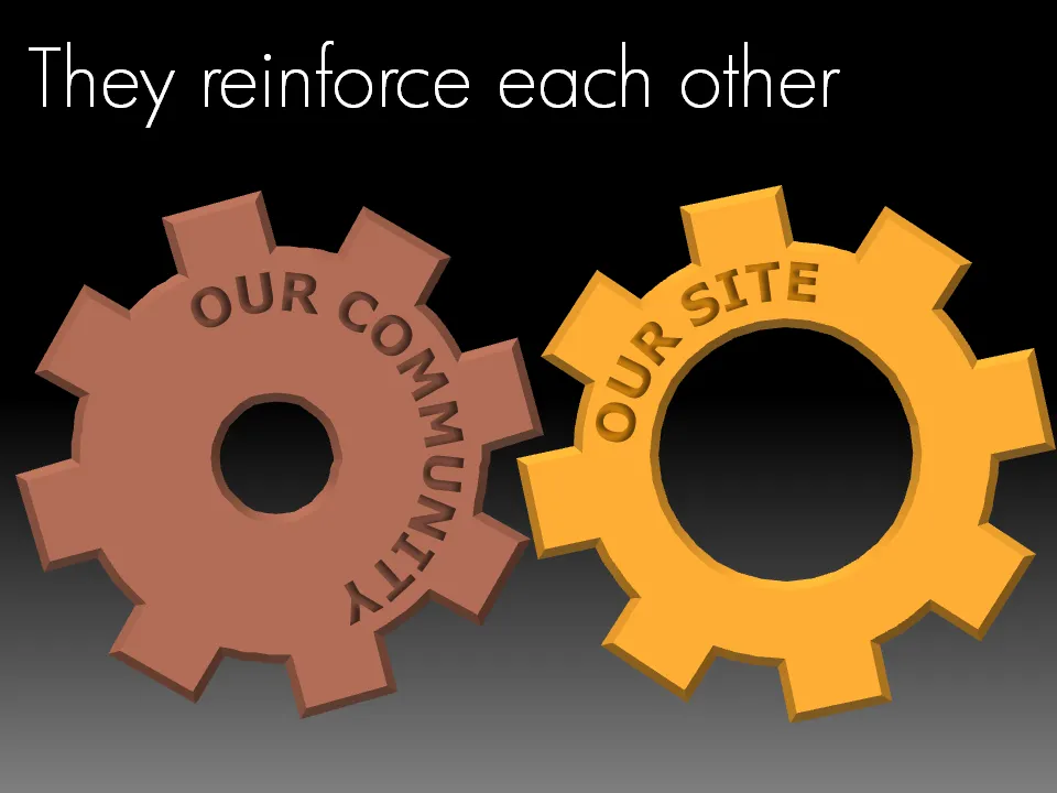
Sometimes two things go together hand in hand, they make each other stronger. Big interlocking wheels are a great way to show this in PowerPoint. Add some nice circular text and here you go. Resist the tempation to make them turn using an animation though…

·Concepts

Chart concept: slowing down

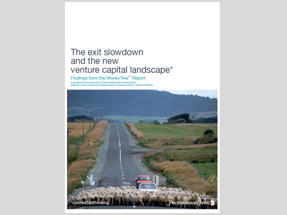
This cover of a PwC report is an example of an excellent use of images.

  • You get the point instantly, even from a far distance, the concept is right
  • Both the report cover and the image have lots of “white space
  • The image is a completely natural and real one, no artificial models, compositions
  • There is a great sense of depth and perspective in the image, search “sheep + road” in a stock photography site and you get a whole bunch of very unexciting pictures
  • The picture is cropped nicely, see the road running on the golden proportion
  • The image colors blend in with those used in the report (blue highlights)
·Concepts

They don't need to read it anyway

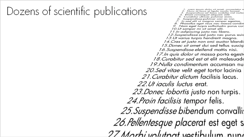
For some points you want to make in a presentation, it doesn’t really matter whether the audience can read the content or not. Example: “here is my long list of scientific publications”.

  • The text was simply “3-D rotated” in PowerPoint (make sure to set the perspective to the maximum 120 degrees).
  • I left the text (that nobody will read) “bleeding” off the page to leave room for white space around the title line (that should be read)
  • In my case I filled the text box with nice lorem ipsum, but these charts are most powerful when you use actual text (that nobody will read): my actual list of publications with ISBN numbers and publication dates for example
·Concepts

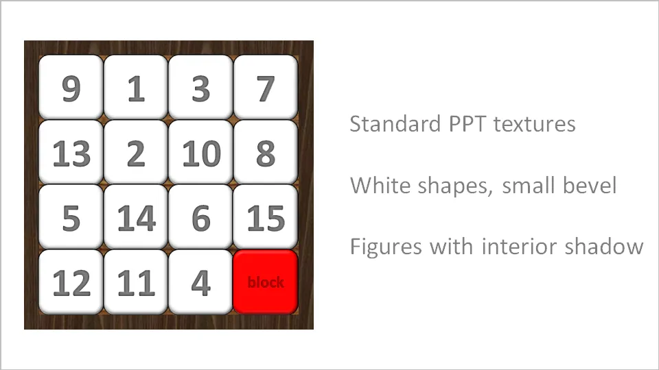
Stuck! - board games with simple PowerPoint shapes

The basic PowerPoint shapes and textures can be used to re-create realistic looking board games. Here is a concept I used for a client that needed to show how its potential customers are being hindered to move around their IT infrastructure freely.