SlideMagic Blog

Frequent updates about all things presentations since 2008. Subscribe to never miss a post.

RSS
all posts

Category Concepts

·Advertising

Chart concept - can't see the forest through the trees

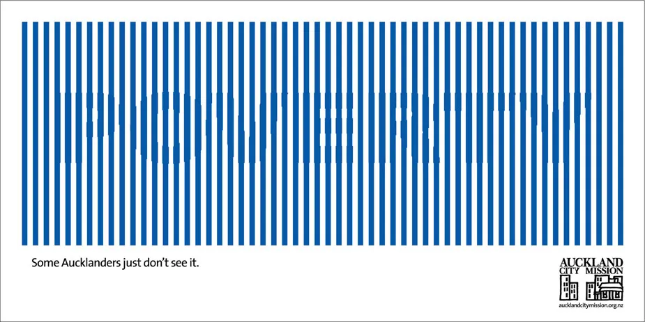
Sometimes you can’t see the forest through the trees. How to visualize this? The ad below uses a technique that can be copied easily in PowerPoint: a huge word/sentence in a bold font covered by a set of fat, spaced out stripes in the same color as the text. Via Ads of the World.

·Concepts

Chart concept - easier to get in than out

Some places are easy to get in, and hard to get out. (That one-off discount which becomes permanent for example). How to visualize this?

Things that come to mind (the one-way revolving door, permanent temporary structures such as the Eiffel Tower or the London Eye) are not obvious when you use them in a slide. “You see, your discount scheme is a bit like the Eiffel tower”. Blank stare.

Images of someone stuck in a well and looking up into the light do work. The idea was triggered when I found myself inside the double helix staircase in the Château de Chambord in France, and looking up. Stock image sites also have lots of “inside a well” images.

There is a bigger point in this: presentation designers should look at cinema direction to move audiences inside a scene or a situation and make them “feel” what your message means. A future blog post on this is in the pipeline


·Concepts

Cool - make your own picture mosaic

Many new technologies in enterpriseA software help you see the bigger picture that is hiding in various bits of information and data scattered across the organization. One option to visualize this in a presentation is through impressionism (painters such as Monet).

Another one is through a photo mosaic. This ancient post on Engadget still holds. You can download the software AndreaMosaic here. It’s freeware, as you as you give it credit when you use it. Hereby. Installation and use instructions can be found on the site.

·Concepts

Chart concept - the chain reaction

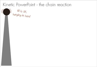
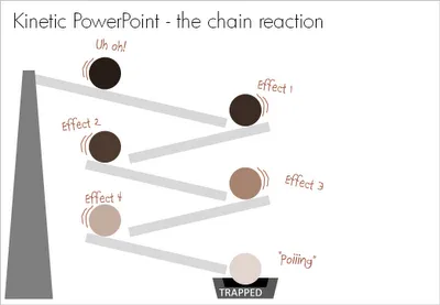
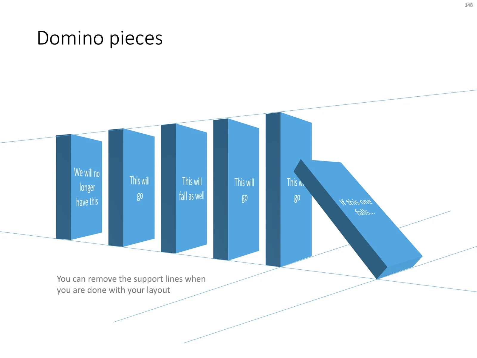
Sometimes a stable situation can easily be knocked out of balance, triggering an irreversible chain reaction of events. How to visualize this? A nuclear mushroom might be slightly too explosive. An image of a series of falling domino stones might be too cliche. Here is another idea based on a toy:

UPDATE: if you would like those domino stones, there is not a template with dominoes ready for download.

·Concepts

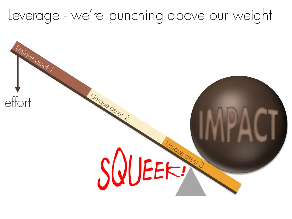
Chart concept - punching above our weight

OK, I admit, a previous chart concept on leverage might have been a bit hard to get for someone who forgot the physics of pulley systems that was discussed in highschool. This chart says the same thing, but simpler.

·Concepts

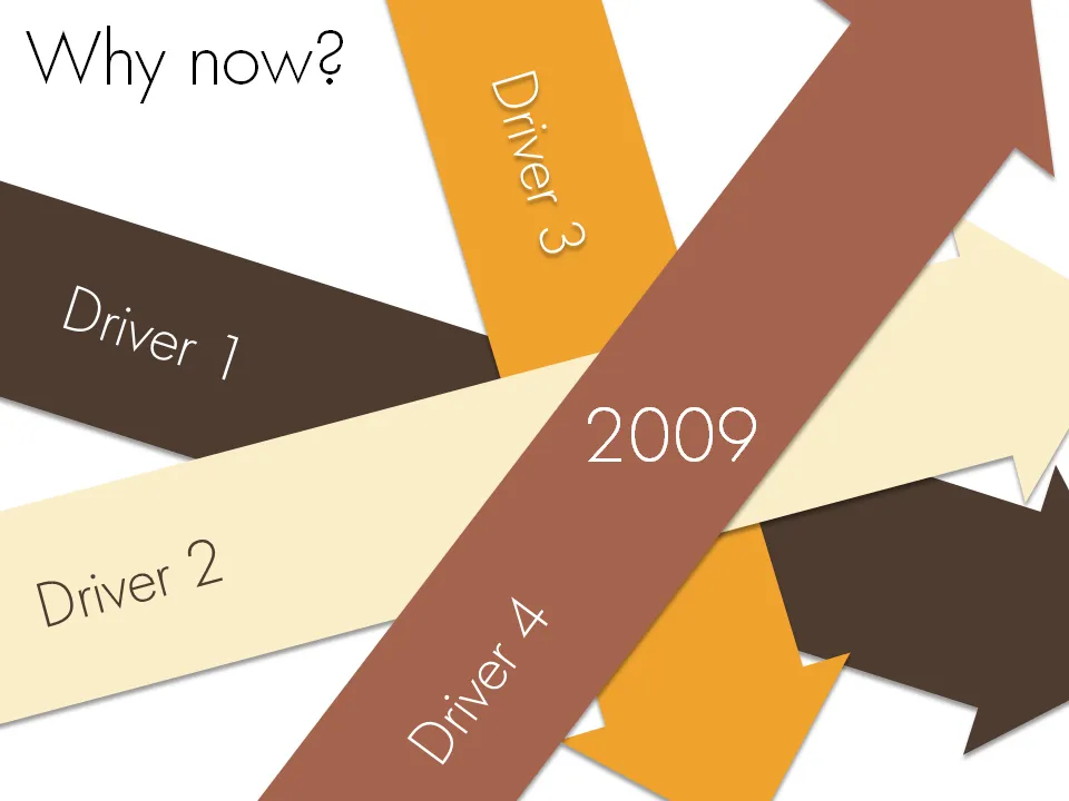
Chart concept - why now?

Sometimes it just comes all together, right now. Everything falls in place. And investors better move fast to benefit from the opportunity before it’s gone. A set of big simple arrows can visualize this.

·Concepts

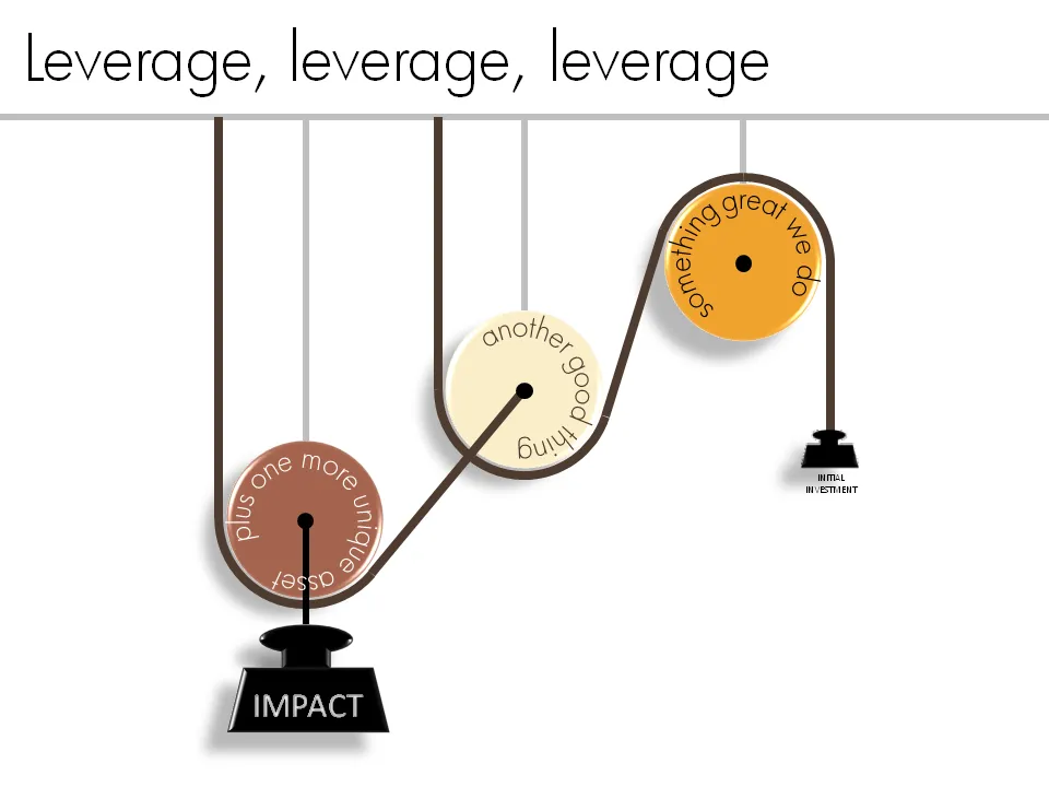
Chart concept - leverage and pulleys

Smart companies leverage money and man power invested in them to do great things. How to visualize this?

One option is to go back to high school physics class and use a good old pulley system.

See a previous post about how to get circular text in PowerPoint.

·Advertising

Chart concept: size does not matter, numbers do

This ad uses a concept that can easily be replicated in presentation slides. Find a silhouette of let’s say a shark, and fill it with small gold fish shapes and you’re done.

I used something like this once to show how small individual components of an information security architecture can create a formidable defense against cyber crime if they coordinate their activities well.

A larger image can be found on Ads of the World.

·Concepts

Most of my "chart concepts" on Flickr

Apologies for the lighter post content during the summer break. I scraped images of the various examples slides I have been using on this blog over the past year and put them on Flickr as one set.

·Advertising

Chart concept - giving it all a fresh new layer of paint

Sometimes you need a fresh start, begin from a clean sheet of paper, do some serious house cleaning. Covering a busy messy image with a paint roller and some stripes of fresh paint is a great way to visualize this message.

Here is an example of images on iStockPhoto that could be that basis of such a chart (the yellow paint rollers, make sure to strip out the white background color in Photoshop or with this PowerPoint trick). This post was triggered by this ad on Ads of the World: