SlideMagic Blog

Frequent updates about all things presentations since 2008. Subscribe to never miss a post.

RSS
all posts

Search results for “slideocument”

Good slideocuments versus bad bullet point slides

PowerPoint (and Keynote) can be very useful alternatives to word processors:

  • It is easy to set up a document quickly, using empty pages with headers to organise your ideas
  • It is easy to move things around
  • It is easy to combine text, graphs, images, and data
  • It is easy to collaborate with others in this well-known user interface

As a result, many of my clients use “slideocuments”, presentations that are meant for reading, discussing, and decision making, rather than being the backdrop of a stand-up presentation in front of an audience.

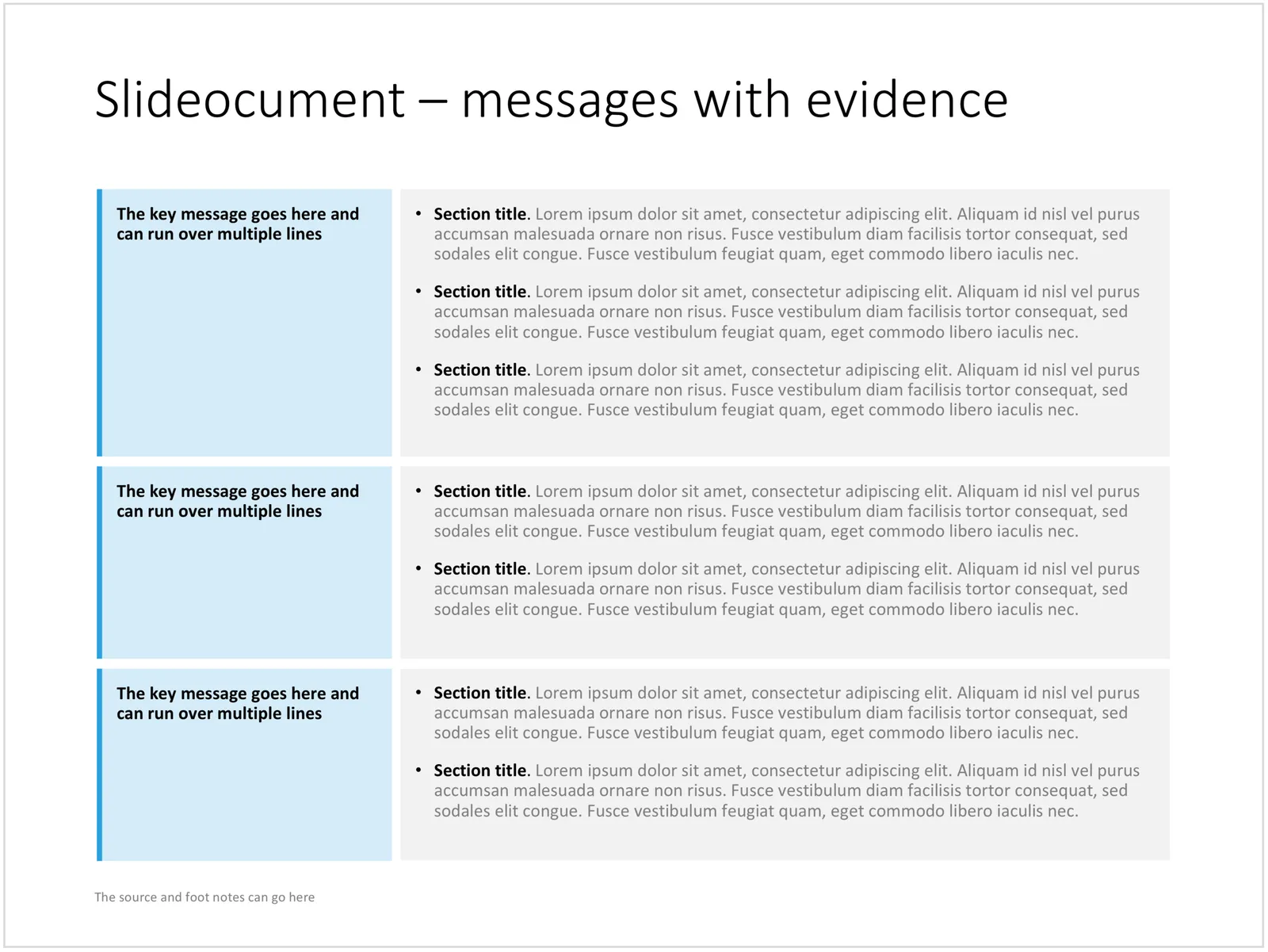
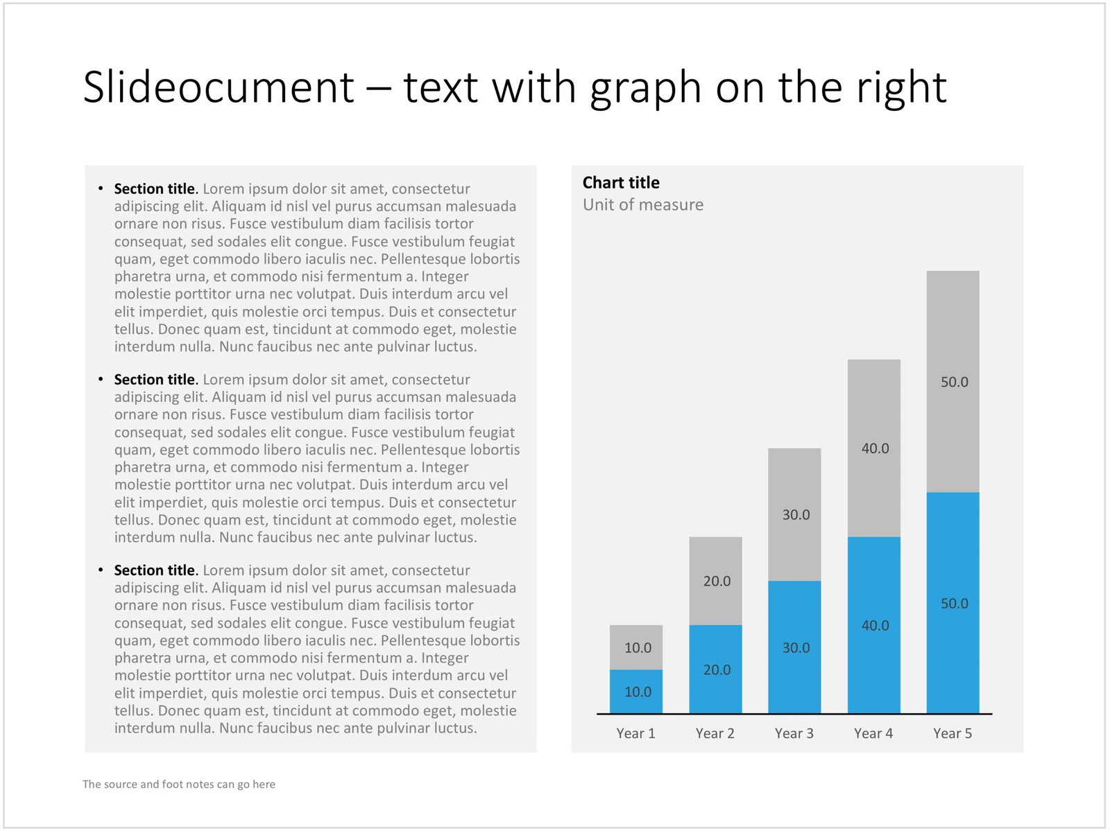
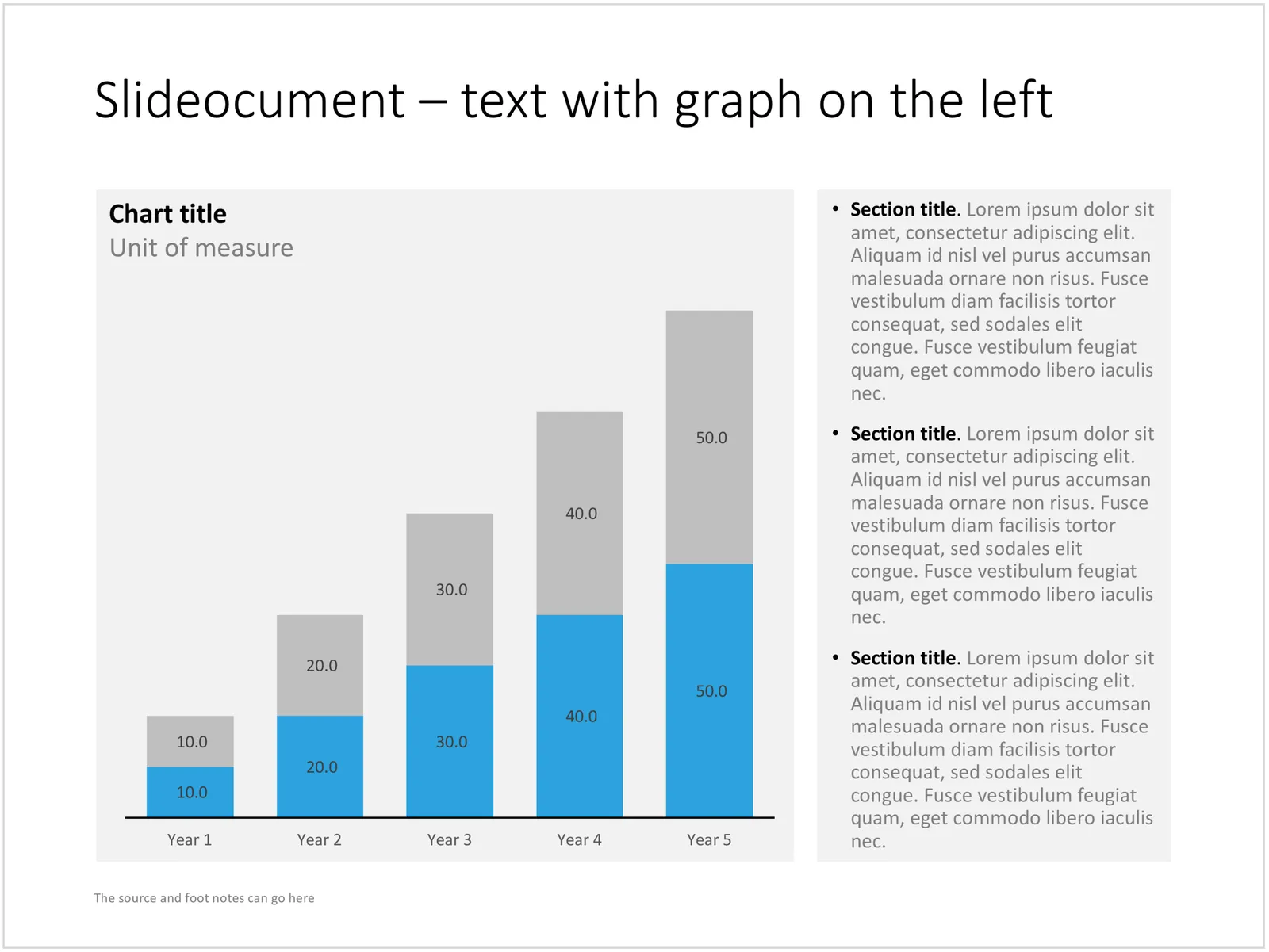
A good slideocument slide with dense text is different from a poorly designed bullet point slide (with dense text). It follows the layout principles of print design: white space, text in readable columns. Poor bullet point slides usually have a font size that is too small for a live presentation and too big for reading. Text runs from left to right across the entire screen, which makes it hard to read, especially in wide screen format. The structure of bullet points is not clear. The text of the bullet points is too long to be a headline, and too short to be a clear paragraph.

I added a few slideocuments to the SlideMagic store recently. Feel inspired to copy the design, or click on the images to purchase a ready slide. Of course, subscribers can add the slides to their collection at no cost.
Cover image by Laura Kapfer on Unsplash
·Design

Google's latest investor presentation (part 1)

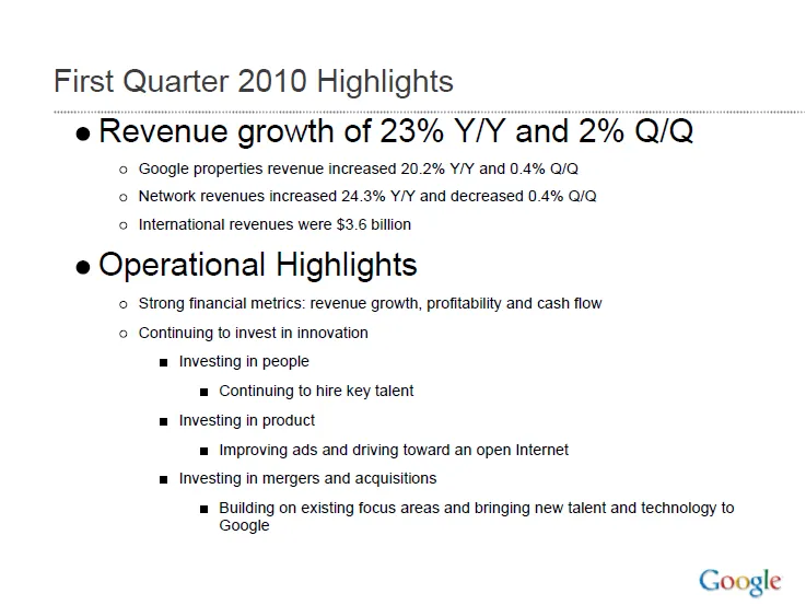
Quarterly results presentations are in the public domain, designed for an external audience. Below is the presentation that Google used to communicate the results for the first quarter.

These types of presentations are usually prepared under great time pressure, as there is very little time between the moment the accountants are producing the figures and the communication to the analyst community. Unfortunately, this impacts the quality of the presentation (form, not content).

I will use this presentation to provide some suggestions on how to improve corporate presentation design. Not that I am picking on Google (Skype was an earlier victim), this presentation is just a typical example of most analyst presentations I see.

Analyst presentations are slideocuments: they need to be packed with a lot of financial information and the audience (equity analysts), usually know the company and its financials very well and are keen to see this quarter’s update of last quarter’s figures that are already sitting in their spreadsheets. So, adding large images with huge font text is not really appropriate here. Also, I will forgive the use of bullet points in these documents. Still, the quality of the slideocument can be improved.

Let’s look at the opening page. The one thing I like is the minimalist template that Google uses: a tiny logo at the bottom right of the page. Great.

Some improvement suggestions:

  • Break it in two pages, one addressing the financials, one the operating highlights
  • Use horizontal bar charts to highlight the growth rates year-on-year and quarter-on-quarter
  • On the second slide, do not use bullets if you just need to make 1 point
  • Try to make the sentences shorter
Continue reading →