SlideMagic Blog

Frequent updates about all things presentations since 2008. Subscribe to never miss a post.

RSS

The "deck for sending" becomes more important

You used to design a deck for presenting live, and then tweak it a bit to make it suitable for sending / reading in an email. More and more, I end up doing the opposite (at least for fund raising pitches). You create a deck that can be understood without a live presenter, and then make adjustments for an in-person pitch.

  • Business communication gets more efficient in general: fewer, shorter meetings, informal communication
  • People (think they) know how to read a fund raising pitch, in a sense their structures are very similar
  • More and more pitches happen between fund raisers and investors in different locations (lots of pitches to Asian investors)

Your old enemy was the audience falling asleep, checking out by opening the smartphone, the new enemy is the mouse click (page down, or worse: “close”). Given this, it is as difficult to design a good deck meant for reading than it is to create a TEDTalk-style deck for stand up presentations.

Cover image by Kristina Tripkovic on Unsplash

Writing macros in PowerPoint

The last time I used macros in PowerPoint was probably back in the 1990s during my time as an analyst at McKinsey. Yesterday, I picked things up again where I left them of.

To my surprise, the record function is no longer available (at least on a Mac). This used to be my secret weapon: record something very roughly, analyse the automatically generated code, and re-write that in a better way. The fastest way to learn the macro language.

Now you have to go through the process of learning VBA via the MSDN website. For someone with a Computer Science degree (i.e., me), this is doable, but I am afraid, anyone else will get lost.

Macros are still very hard to make idiot proof. Giving non-technical users access to a neat button in their ribbon that does magic probably works 70%, but in 30% of the cases, it will either not work, or worse: do damage to their work.

I need macros to speed up my production time of slides for the template store. Highly repetitive work is the bottleneck: creating thumbnail images, creating the individual PowerPoint and Keynote slides, in different aspect ratios, and creating the product pages on the store.

I toyed briefly with the idea of outsourcing this to other designers, but after a few days of study, I might have found a way to automate the bulk of the work, which will save me a tremendous amount of time and reduce errors, and free up my hands to increase the speed at which I can add slides to the store dramatically.


Continue reading →
·Data visualization

Halving and doubling

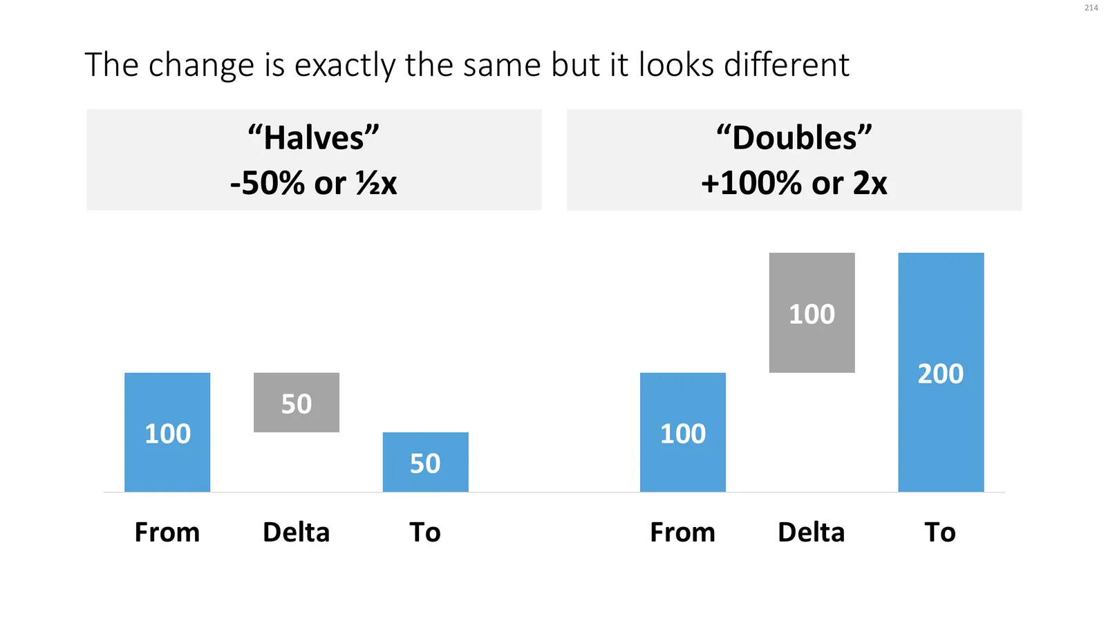
This tweet made me scratch my head, it seems so counter intuitive:

If you create a little waterfall, you can see the effect better. In both cases, the delta is half the size of the bigger column.

Yes, using logarithmic scales would be the correct mathematically thing to do, but they are very hard for people other than mathematicians to get their head around.

Read an earlier blog post about constructing waterfall charts in presentations. Cover image by Ross Findon on Unsplash

Clear legends to save the audience time

The standard Excel/PowerPoint legends for data charts are hard to decipher:

  • They are written in a small font
  • They rely on colours that the reader needs to match up with the corresponding data series
  • They are positioned away from the actual data

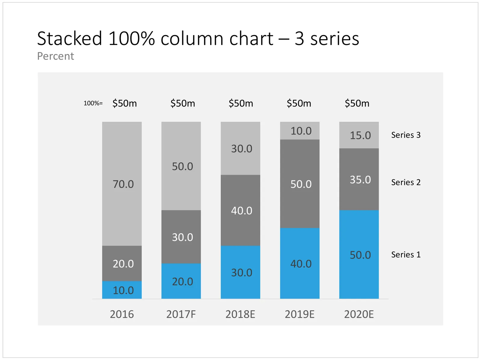
I usually switch off the legends and make them by hand. What I lose in automation, I gain in clarity. See in the example slide below:

  • I put the legend in big text to the right of a column chart (the last year is usually the most relevant for the audience)
  • Instead of color, I use the order of the legends to match them with the data. The color is received for highlighting a data series that is particularly important. This is easier on the eye, less clutter.

Click the image to see the column chart in the template store, subscribers can download it free of charge. Cover image by David Travis on Unsplash.

Survey results in PowerPoint

Survey data can be tricky to present. So much data, so many breakdowns, where to start? Here is my take.

First, let Excel make “dumb” data visualisations, simply use the automated tools of the spreadsheet to visualise the results somehow. Use this data to analyse / what is actually going on. While a chart for a live audience should be clear in 5 seconds, these charts are for you, and it might take you a couple of hours before you have figured out what the most important trends in the data are. When finished, all these charts go in an appendix of the document.

Now write down what the key messages of the survey are, and find the data that specifically support that message. One message per slide! Next, find the most appropriate data chart that can present that data. I often see people mix up columns (time series), pies (harder to read than stacked columns), and bar charts (rankings).

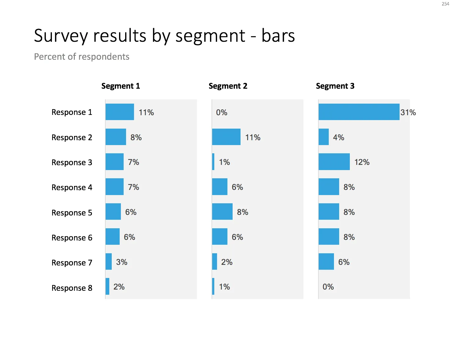
Below are 2 designs that can be useful for survey data that cut across different segments. The first is the classical approach: a series of column charts. The first one shows the entire population, the second and third give a breakdown for specific segments.

Here is a slightly unusual variation for this chart. I went back to table and duplicated the axis labels for each segment. This table highlights the order/ranking stronger than the value of the actual data point. To add more clarity, I colour-coded the ranked data for one sub segment (not the total!). This brings out the contrast between the segments better.

Continue reading →
·Images

Flying through

With a bit of Photoshop editing you can create an effect of a PowerPoint shape flying through some loop. I uploaded a new slide to the template store that uses this effect. Over the arrow, I positioned a second layer of the image, but just with a piece of rope with its background isolated. The arrow expanding outside the frame of the image (yes, I look those), adds to the motion feel in the slide.

Click the image to find the slide on the template store, subscribers can download it free of charge.

Cover image by Blake Wheeler on Unsplash

Looking into the future

I added a nice image background with binoculars to the template store. When looking for images in presentations, try to find ones that have a lot of white space and/or depth, pay attention where you place your text, taking into account the overall composition of the slide and the contrast of the letters with their background.

Click the image to be taken to it on the template store, subscribers can download it free of charge.

Cover image by drmakete lab on Unsplash

·Delivery

Take the junior analyst to the CEO meeting?

Yesterday’s meeting blog post made me think of an other topic: junior analysts (lots of them among my readers) and whether they should go to the meeting with the CEO or not.

During the early years of my McKinsey career, there were many, many occasions, where I did not get to go to meetings where my work would be presented, and it was explained to me that too many people in the room would harm the meeting dynamics. A valid point: sitting in a huge conference room full of consultants does not create the atmosphere for a candid discussion about strategy.

But there were other concerns my seniors might have had:

  • The junior analyst might not be able to present the slides, not having the right “CEO language”, going of on a tangent, explaining how he did the analysis, without the so what
  • And even if we did not let the junior analyst present, he might come in with odd remarks that throws the discussion in the wrong direction, vent his uncomfortable feeling with the broad assumptions that were made in the analysis (that were actually justified), thereby undermining the credibility of the whole deck.

If you are just starting out as a consultant, it is worth your while thinking about the above.

But there are advantages of taking a junior member to these meetings now and then (feel free to use the following with your seniors):

  • Taking turns makes sure that the entire 15 people team does not sit in the room at once
  • Analysts can actually learn a ton from these meetings that will make the whole team perform better:
    • You see how these analyses are actually used
    • You get to learn that CEO presentation skill that you can put to work even when presenting to more junior clients
    • You might come in handy when a very detailed question about the data comes up
    • You get credibility with your client team members
    • You will get a motivation boost
    • You will need less time briefing to follow up on next steps
    • (Junior analysts are always good at serving coffee, making copies when needed)
Continue reading →

Simply "walk out of a meeting"?

Elon Musk emailed some productivity suggestions for Tesla employees a few days ago:

[quote]

  • Cancel large meetings or if you have to have them keep them “very short”
  • Walk out of a meeting or end a phone call if it is failing to serve a useful purpose.
  • Avoid acronyms or nonsense words. “We don’t want people to have to memorise a glossary just to function at Tesla”
  • Sidestep the “chain of command” to get the job done. Managers insisting on hierarchies will “soon find themselves working elsewhere”
  • Ignore the rules if following them is obviously ridiculous.

[/quote]

Corporate management styles are changing. Emails become informal, memos turn into visual documents, more and more people know how to avoid boring bullet point presentations, and the attitude towards meetings changes as well.

It is easy to simply walk out of a meeting if you are the one paying everyone’s salary at the end of the month. A junior analyst is not expected to stand up say “my presence is not serving a useful purpose, goodbye”. Instead, these people would just mentally leave the meeting by glancing on their phones.

However, there is something you can do. Especially in smaller project teams, you could include and agree a walk-out policy in the kick off meeting of the work. In that case, your superiors might actually feel embarrassed when it is time to exercise that walk out option.

Photo by Samuel Zeller on Unsplash

On top of the world

I added another slide to the store that is border line PowerPoint cliche: man-standing-on-top-of-the-world-wondering-what-is-next. Click the image to be taken to the template store, subscribers can download the slide free of charge.

Cover image by NASA