

The standard Excel/PowerPoint legends for data charts are hard to decipher:
- They are written in a small font
- They rely on colours that the reader needs to match up with the corresponding data series
- They are positioned away from the actual data
I usually switch off the legends and make them by hand. What I lose in automation, I gain in clarity. See in the example slide below:
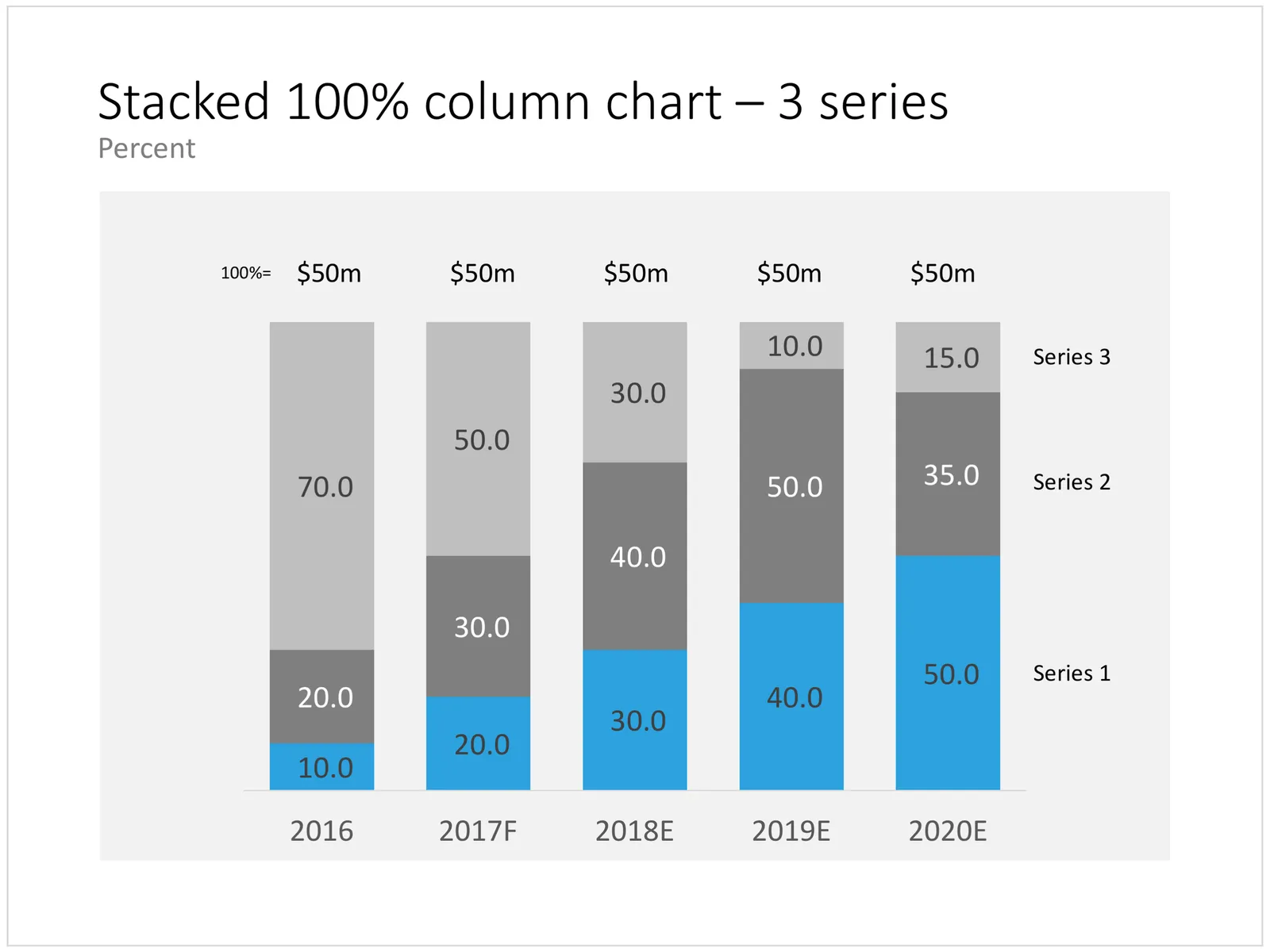
- I put the legend in big text to the right of a column chart (the last year is usually the most relevant for the audience)
- Instead of color, I use the order of the legends to match them with the data. The color is received for highlighting a data series that is particularly important. This is easier on the eye, less clutter.
Click the image to see the column chart in the template store, subscribers can download it free of charge. Cover image by David Travis on Unsplash.